Never be afraid to paint outside the lines

Tag: bust (Page 1 of 2)

Swiftie

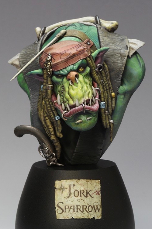
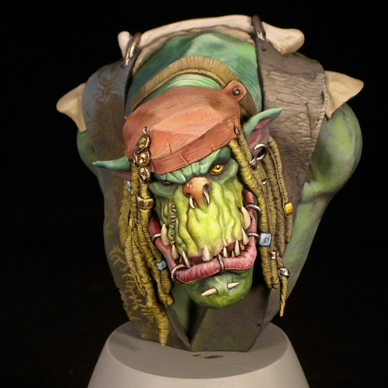
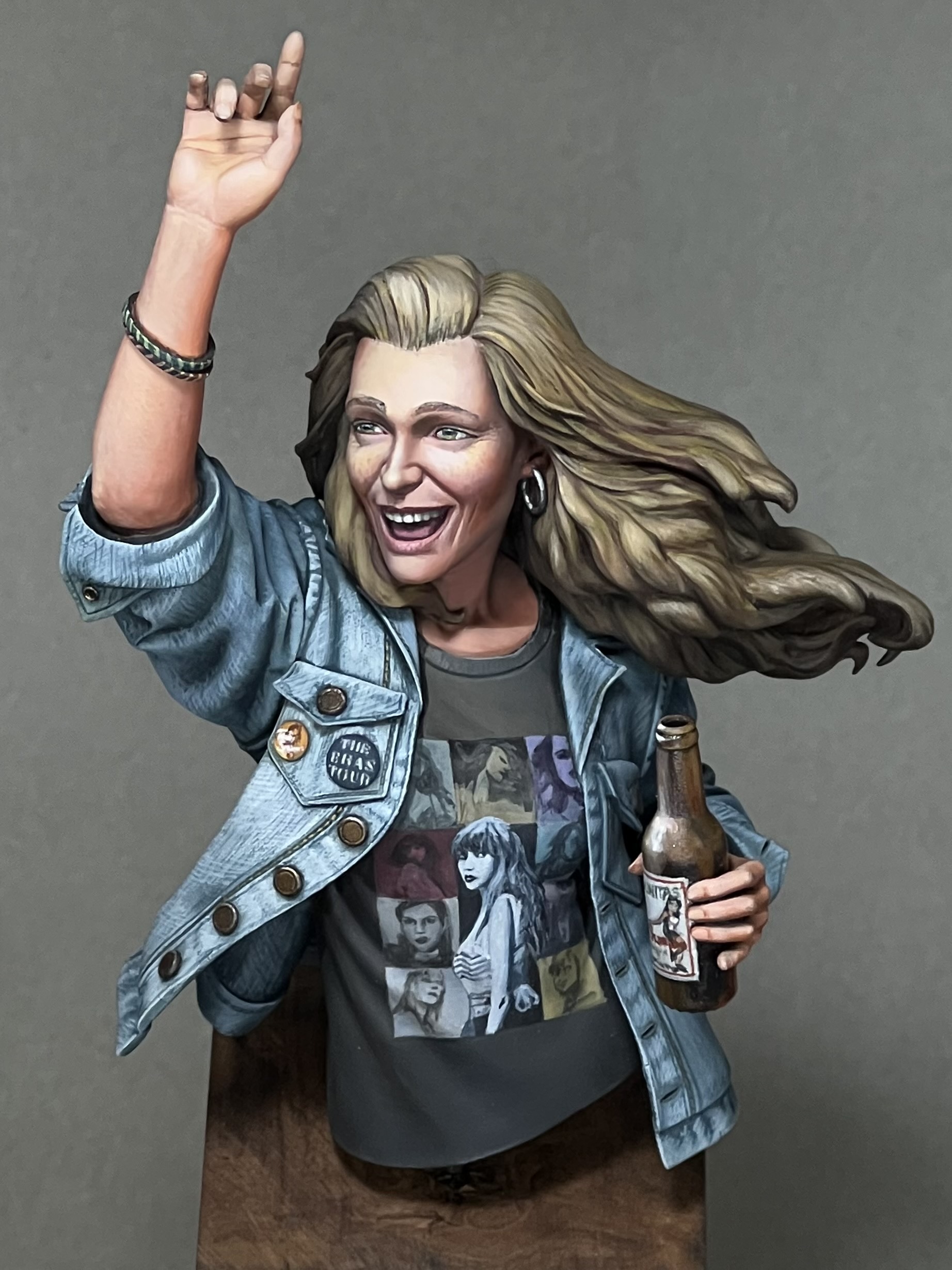
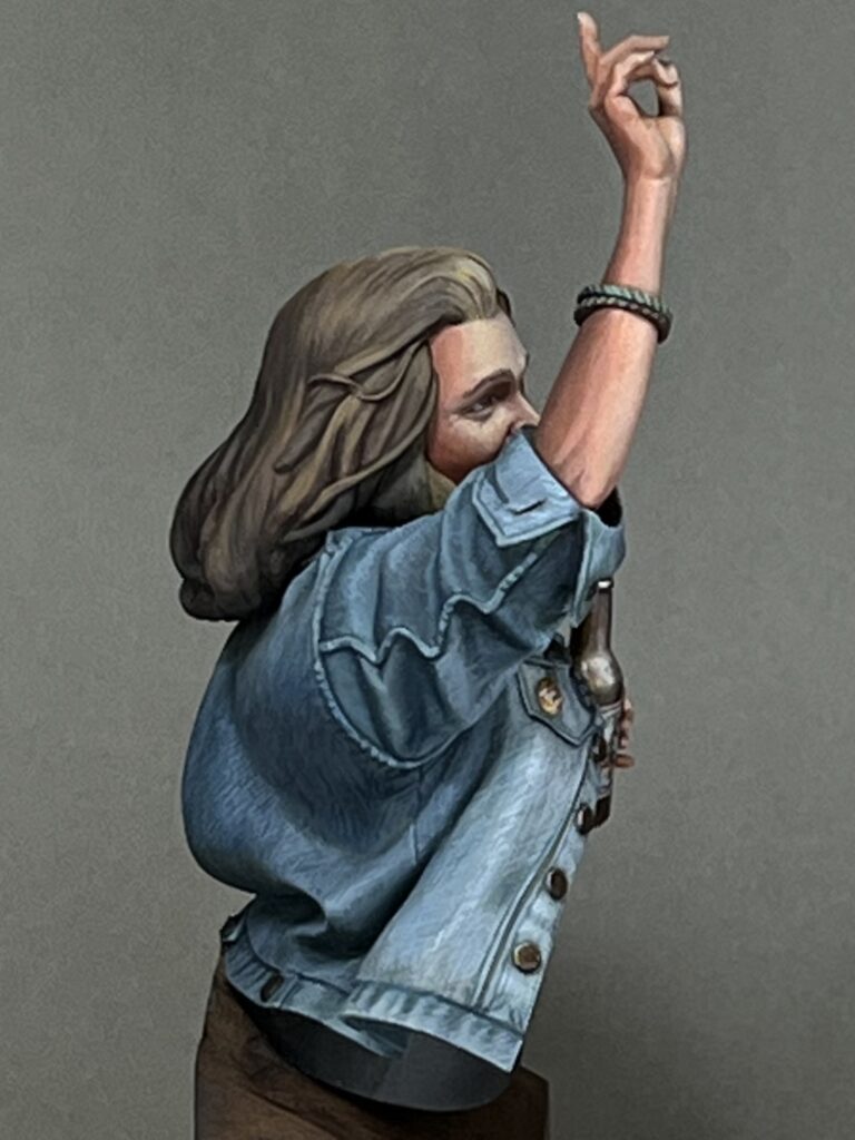
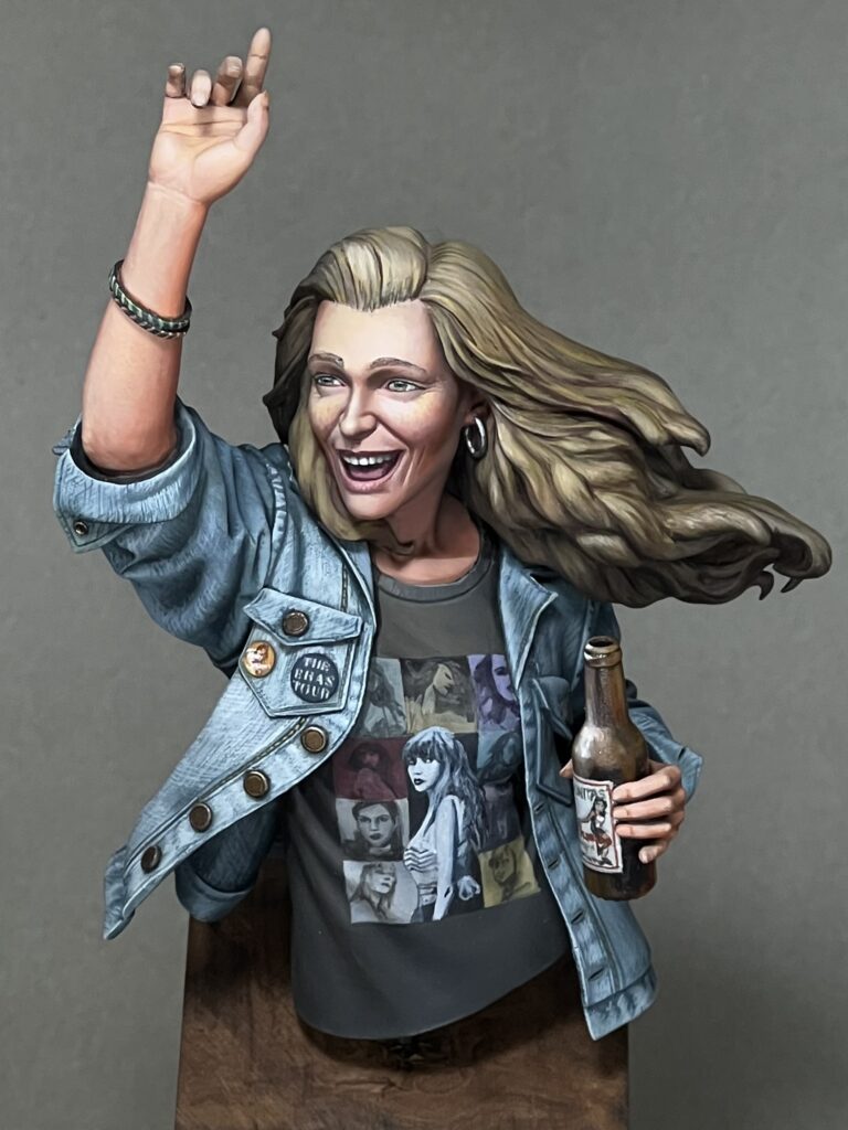
When I saw Masclans Miniatures new bust “The Joy,” I immediately wanted to paint it. It’s a great bust, full of positive emotion, and I thought it would be fun to do a contemporary subject rather than my usual fantasy fare. One of my first steps working on the mini was searching a reference for the t-shirt. I imagined this character at a concert or music festival of some kind, so I started by looking at shirts from all of my favorite bands. However, I couldn’t quite find one that grabbed me. Then, on a lark, I decided to search Taylor Swift. When I saw the official Eras Tour shirt design, I immediately thought that would be fun to paint. That’s how my version of “The Joy” became a Swiftie.

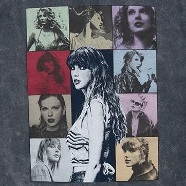
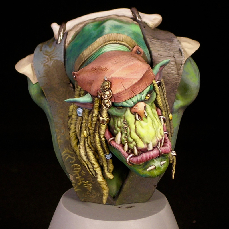
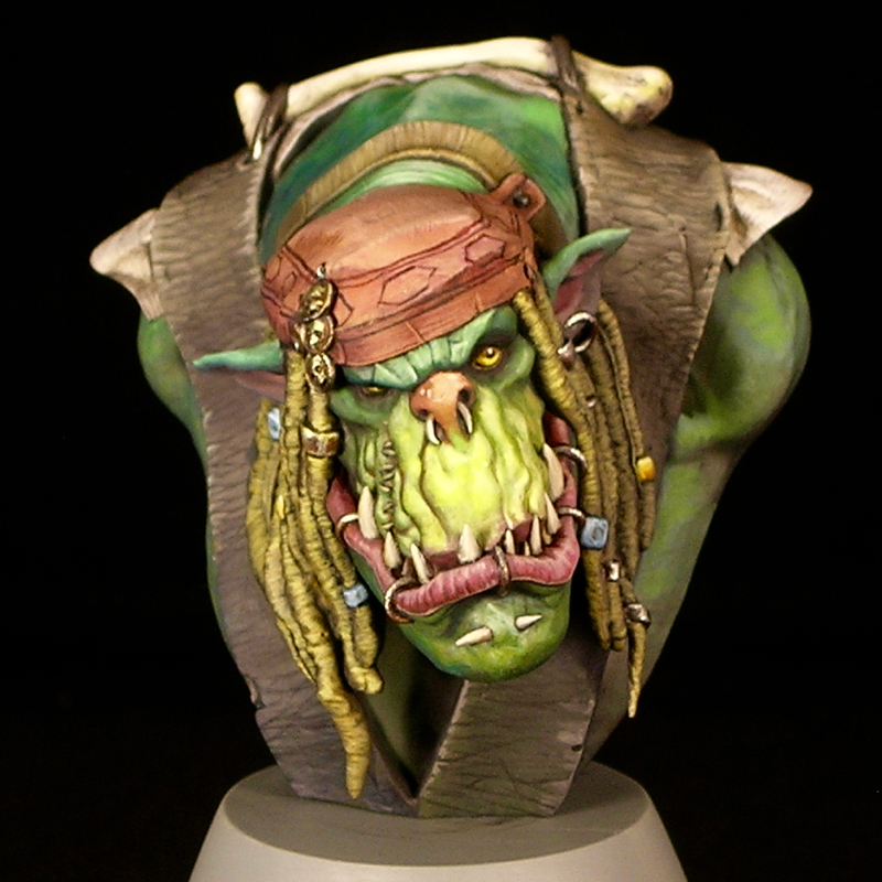
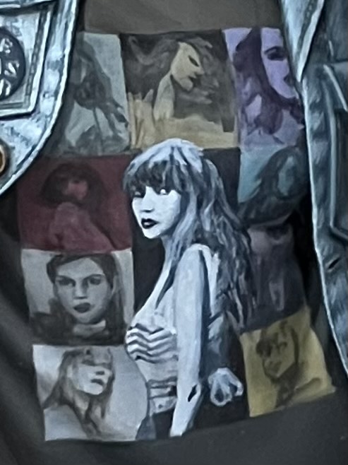
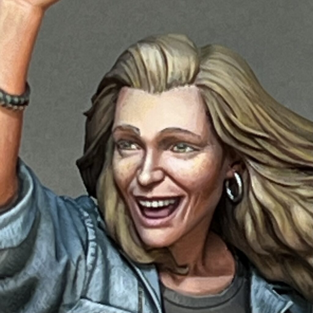
The shirt design translates well into miniature. I started by blocking in the colored grid, so I would know where to put each portrait. Most of the shirt was done in one evening, with the exception of the central Taylor. I left all of the side photos at the sketch stage, but I did spend a bit more time refining the main figure in order to get an acceptable reproduction of the original photo, as good as I could make it at this scale. Her face is only 6mm tall, far smaller than this photo, so I was limited by how well I could control paint at the sub-millimeter scale.

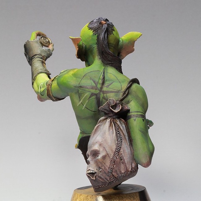
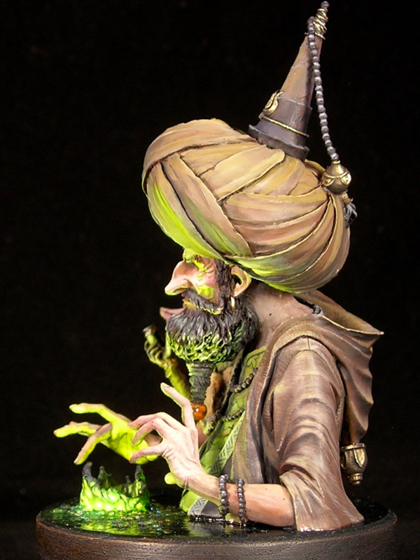
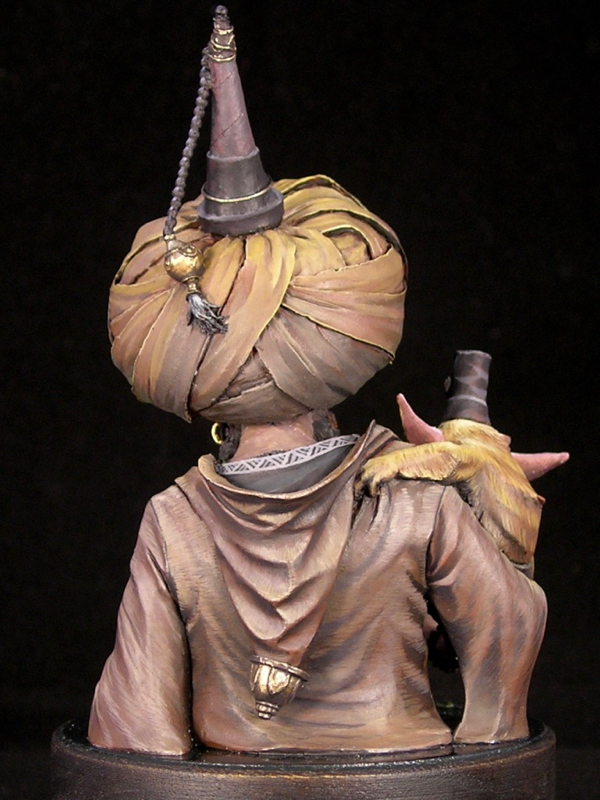
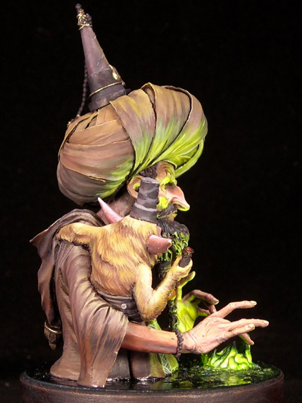
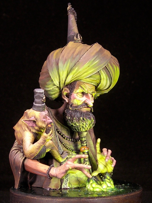
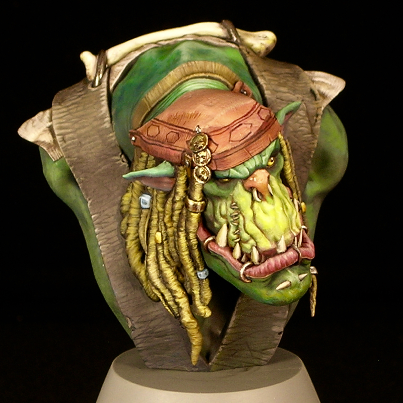
This figure has a ton of opportunities for freehand and textures. In addition to the t-shirt design, I had fun doing freehand and textures on the beer bottle, her pins, and the denim jacket. One of the cool things about Marc Masclans miniatures is he includes a tutorial video with each one, and I checked out the section where he talked about how he painted the denim. He shares a lot of useful ideas and reference photos, some of which I used in mine. I also did some things differently from Marc. He created his denim texture by stippling, while I mainly used cross-hatching for mine.

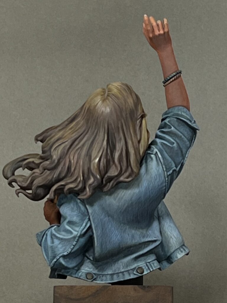
One thing that Marc didn’t mention in his video (or if he did, I missed it) is that denim is not a simple weave. Rather, it is a twill fabric. This means that even though the threads go vertically and horizontally through the weave, the vertical threads (the warp) are much more apparent than the horizontal threads (the weft), as they go over more often than they go under. Furthermore, the pattern of the weave creates the appearance of diagonal bands.

In a 2-1 twill weave, threads alternate over 2 and under 1. Denim is typically 2-1 or 3-1 twill.

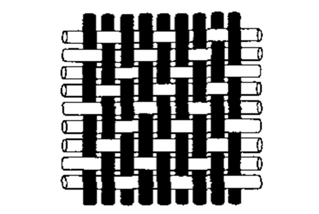
To get the right look for denim, rather than a simple vertical/horizontal cross-hatch, I did a vertical/diagonal cross-hatch, consistently following the directions of the vertical warp threads and the diagonal twill pattern.

Another thing about denim is that along the overlaps of material along seams and edges, the fabric bunches in waves, and the waves collect more dye in the troughs and fade at the peaks. I used lighter and darker cross-hatching to replicate this effect.

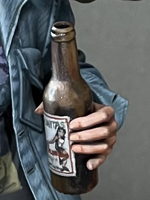
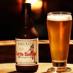
Another fun item was the beer bottle. I enjoyed painting both the brown glass effect and the label on the bottle. For the label, I copied a beer from Lagunitas, which is local to me here in the SF bay area. It has a cool label, I thought it struck a good balance between being too generic or too obscure, and I like the beer.

I feel the face came out well. I thought it would be fun to try to add a bit of age to the character with paint, and I think it works well for the piece. For me, it adds to the contemporary, realistic subject matter. It’s also fitting for the character, despite what some may think; Taylor Swift fans are all ages and genders.

I don’t consider myself a Swiftie, but I did end up listening to a lot of Taylor Swift while painting this bust, to be in the proper spirit. She’s a gifted musician. I don’t think I made my wife too sick of my listening habits, but she did give me plenty of shit about it. But she also pointed out there are only two types of people in the world: Taylor Swift fans and liars.

I entered this bust into the painting competition at Reapercon this year, and was delighted to win best in show. Reapercon is the largest competition where I’ve won that honor—there were over a thousand entries this year. To be chosen as best in a field that size is an achievement.

Steamthing, revisited

A couple years ago I decided to make a slight tweak to my Steamthing, IPIK-7 bust. He was originally sculpted holding a plant, and even though I replaced it with my own plant and added roots, I kept the sculptor’s original intent. More photos of my original version here.

When a friend gave me some laser-cut vellum butterflies to play with, I thought it would be cool to replace the plant with a butterfly. I really like what this does to the figure. It keeps the strange juxtaposition of some kind of weird post-apocalyptic creature perplexed by encountering nature, but in a non-destructive way (instead of the original uprooted plant).

IPIK-7 had never seen such beauty

Also, by replacing a green element with a yellow one, I ended up with an overall color-composition I’m happier with. The color scheme becomes something like a primary triadic one, rather than the original which was a bit all-over-the-place. I sometimes like all-over-the-place color schemes (the mermaid I just posted is a good example), but I find that I have a hard time integrating green into such a color scheme, and I am overall much happier if I only use green in simpler color compositions.

IPIK-7 is puzzled by the flapping wings

My favorite part of the paint job continues to be the coke can. I imagine Steamthing as a post-apocalyptic cyborg using found materials to replace components as they wear out, and I thought no object would represent that better than the iconic Coke can. I especially enjoyed including the regulatory labeling and only half the logo. If you’re curious, I shared a lot more thoughts about the painting in my original post on Steamthing.

IPIK-7 is entranced by the yellow

Also, some of the roots broke off while transporting him to and from conventions, so I had to do something. 😉😛

Treasure Hunter

This was one of my two entries for Crystal Brush this year, and made first cut in the toughest Crystal Brush field we’ve seen. The figure is Hobgoblin, from Beyond Miniatures. I imagine the Hobgoblin as a treasure hunter, so that’s how I titled my version of the bust.

One of the things I focus on with my miniature painting is light, and “Treasure Hunter” is no exception. I decided to set the figure in bright sunlight, and paint shadows cast by some parts of the figure on other parts. In this view, you can clearly see the cast shadow from both the hobgoblin’s head and his glove. I’m happy with how the shadows came out on both “Treasure Hunter” and my other Crystal Brush entry (which did not make first cut… but that’s a story for the next article).

Treasure Hunter was painted very quickly. The photo above was taken after the first day of painting, and already you can see that the face is almost how it looked the final version (albeit with much worse photography). In total, I probably put only about 25 hours of work into the piece, which is tiny for a competition entry. Really it’s not adequate when you are competing at the level of Crystal Brush. I was thrilled just to make first cut with this entry, and knew it wouldn’t get anything better.

The face was a huge amount of fun and almost painted itself, hence the fast progress. But I sort of ran out of steam on the other elements, especially the dragon tattoo. At a certain point, you just have to call something finished, even when you know there are things you could improve. Since painting is a hobby for me, it has to be enjoyable, and one thing that determines how much time I put into a piece is how much I’m enjoying the process.

My original vision for “Treasure Hunter” was a pirate treasure seeker with an Asian flavor, hence the multiple tattoos, including a dragon and a compass rose. Not only does this go with the pose holding up a gold coin, but it also suits the model. Unusually for a bust, Hobgoblin has two full arms and a large amount of torso, leaving plenty of room for tattooing.

Pedro Fernandez sculpted both Hobgoblin and my other Crystal Brush entry. His sculpts have an interesting style, with lots of gritty realism, despite the fantasy subject matter. I’ve enjoyed painting them. The other miniature, his Siren, will be the subject of my next two articles. I’m excited to show her off, and especially show how I built her a water base.

The Alchemist

The sculpt is “The Wizard of Agni,” by Ben Komets Miniatures (sculpted by Lucas Pina Penichet), but I call my version The Alchemist. This was one of those figures that I fell in love with the second I saw it, and immediately knew how I wanted to paint it. The figure practically screams for OSL, and with the magical, alchemical vibe he gives off, using a magical flame color just seemed natural.

When OSL is one of the main light sources, you can get very different results depending on whether the light is a natural light source (like fire, which gives off all colors of light) or a colored artificial light source, and if it’s colored, whether it’s a primary or secondary color. Using a light source of a secondary color, like the green fire I used for The Alchemist, lends itself to simple color schemes with a very limited color palette. This is because when green (or another secondary color) mixes with other colors, you will either end up with something quite similar to the original color, or a desaturated, muddy color.

For The Alchemist, I decided to pair a strong saturated yellow-green with mostly desaturated colors, generally reddish and purplish browns in order to play with complementary colors. I also made very limited use of a saturated orange in just a few places: the eyes of the monkey and alchemist, the monkey’s pipe, and the bead in the alchemist’s beard.

With a very large scale figure like a bust, you have the opportunity to add far more detail than you can in 25 or 30mm scale. So I think it’s important to play with textures and freehands to take advantage of that opportunity. I generally like to do some of each. I had a lot of fun with the textures, especially the monkey fur and wrinkled hands. The monkey fur was very simple to do, just lots of little lines, but came out extremely well. The sculpt even has a tiny bit of fur sculpted in some places, to suggest the direction. I found the appearance was better if I painted the fur to be a bit matted, rather than smooth.

For the freehands, I went with muslim geometric patterns, which I very much like and have used before. Not only do they go well with the Turkish vibe of the sculpt, they also fit the subject matter: alchemy and chemistry have a long history in the muslim world, and even the world alchemy derives from the Arabic al-kīmiyā’ (الكيمياء‎). The pattern on the alchemist’s shirt was a bit of a pain to get right, since the lines need to be very precise due to all the regularity. I started with a square grid, then added the triangles, and had to do a number of minor adjustments to fix imperfections. On the other hand, the border on the vest was simple and easy. Both were painted before adding the beard and arms to allow easy access for all that precision work.

I entered “The Alchemist” into the painting competition at Kublacon, and was lucky enough to take best of show amidst some of the stiffest competition I’ve seen there. If you would care to voice your own opinion, he’s up on Putty & Paint and CoolMiniOrNot, or leave a note in the comments!

J’ork Sparrow

I finished J’ork Sparrow just in time for Crystal Brush—literally. I did a few final touches the day of the deadline, and was even painting at the airport a bit on the way to Chicago.

When I last posted about Mr. Sparrow, he was mostly finished, but still missing his flintlock pistol. That was the slowest part of the project, as I am the world’s slowest sculptor. It was fun though – in addition to checking flintlock reference photos, I also read up on how flintlocks work so I could accurately depict the mechanism. I depicted it ready for loading, with the hammer down and the frizzen open, which I think is appropriate for a holstered ‘lock—but please correct me if I’m mistaken!

I sculpted more of the flintlock than I needed, so I could leave a crisp plane where I cut it off. I also sculpted the parts of the mechanism separately. This not only made it easier to get some of the shapes, it also let me glue on the pieces and have them really look like distinct parts.

The other main element I added since the last WIP is the label on the base. I usually don’t place title plaques on my figures, but for this one I wanted to highlight the Jack Sparrow connection, and I also thought it would be fun to do a little treasure map as the label. The map is sculpted out of green stuff and torn slightly, in an attempt to get a naturally weathered appearance. The map and lettering are freehand, which is why my kerning is slightly off and my glyphs aren’t nearly as perfect as I’d like them to be. I’ve never been a good calligrapher.

I added a couple of other pieces to reinforce the Jack Sparrow connection: Jack’s sparrow tattoo, which also serves to add interest to the ork’s otherwise rather plain back, and the bone shard on his head, which was another very simple sculpt. Other than that, the only changes since the last WIP are a bit of refining here and there, and obviously much better photographs. They really do a wonderful job of photography at Crystal Brush, and my poor home photo setup cannot really compare.

I’m really pleased with how this piece came out in the end. I think the sculpted additions I made are both characterful and also help to add some interest to the silhouette, and I think the piece works well compositionally, with a face that really grabs and holds your focus, but enough interest elsewhere.

Voting links: Putty & Paint, CoolMiniOrNot

From the Workbench: J’ork Sparrow, part 2

I started J’ork Sparrow in November, and so far I’m quite happy with his progress.

In the November post, all I’d painted was his face and started blocking in the color of the bandanna. The next step was blocking in the remaining colors, so that at least no primer was visible. That way you can see the overall composition which helps keep things consistent as you refine the individual areas.

As with many of my recent works, J’ork is heavy on the textures. Because busts are a relatively much larger scale than other minis, you can depict surfaces with a much greater amount of detail, so it’s really important to depict the textures of the various materials as well as their shapes and colors. You can see the neck wrinkles, the weave if the fabric in the cap. I’ve even tried to replicate the texture of sun-bleached dreadlocks (which is not easy, I can tell you!)

I wasn’t quite sure how I wanted to do the vest, so I tried out two ideas, one on either side. One option was a slightly tattered fabric with gold embroidery on blue, similar to Jack Sparrow’s vest in the movie. The other was a more orkish vest, weathered and textured black leather. In the end I decided to go with the leather texture, and keep my freehand limited to J’ork’s cap.

Even more textures! In addition to settling on black leather for the vest and starting the freehand printed pattern on the cap, I’ve also done some subtle texturing on the bone and the white fabric, which helps differentiate them. It’s pretty subtle, but subtle details like that can add a lot of realism.

At this point all of the surfaces are done to an acceptable level of detail, and the bust is approaching where I could call it finished. However, I have one large step remaining, which is that I really want to equip him with a musket, in a holster attached to his vest. So there’s some sculpting to be done, as well, obviously, as more painting.

Other than that, the main remaining work is simply refining the details I have already established, making them crisper and easier to read, and fixing any mistakes until I’m 100% happy.

From the Workbench: J’ork Sparrow

I started this fellow last night, and so far he’s coming along swimmingly. Here’s the face after one evening’s work (couple hours).

After getting the basic color composition down, I started refining. After a few more hours refining the face this morning, I’d say it’s about 80% done.

I don’t always finish entire areas like this before moving on. In fact I often like to put a bit of paint everywhere before finishing any areas, to test the overall composition. But in this case, all of the main colors are in the face, since the vest will be black and the other elements will be white, gray, or his skin color, so there’s no harm in it. Next I plan to block in all the other areas, then start in on the cap.

If you don’t know it, the bust is Papa Jambo, by Big Child Creatives. Quick tip: they have a good deal on a pair of busts from their pirate bust set—Papa Jambo, Sharki, and Capt. Albrecht—if you buy direct from them (though the shipping can be a bit pricy depending on where you live).

Abalám, revisited

When I posted Abalám on Putty & Paint, one of the comments I received was from Roman Lappat (of Massive Voodoo fame) who wrote,

Great piece. Love the light situation, even I think there are minor parts missing here and there, but this does not make the bust bad. If you want me to point out my thoughts about the light shot me an Emal 🙂

Let me just say I love this reaction. “I like this mini, but see some ways it could be better. I must tell the painter!” Constructive criticism is fantastic, and I’m thankful for all of it I can get, especially when it comes from as knowledgeable a source as Roman. As I wrote in Thoughts on painting competitions, constructive criticism is extremely valuable in improving your work.

When I emailed Roman, he sent me a very helpful diagram showing the areas he felt the light was missing or not strong enough.

Roman's critique

Armed with this sketch, my brush, and some red paint, I went back to my figure, and intensified.

abalam-before-after

Of course, the lighting is also rather different between the two photos. I’m terrible at miniature photography, sorry! I think the new pictures are somewhat closer to life, but this guy is really tricky to photograph.

abalam-revisit-5

I followed all but one of Roman’s suggestions, which was the back of the helmet. It’s just so recessed that I didn’t feel it would receive very much light, so the very strong light that Roman suggested would look out of place. Also, you have to be very careful painting lighting effects in heavily recessed areas of a miniature, because you are fighting against the shadows of the miniature itself. In the end, I did retouch the back of the helmet, but with a dull, dark red, instead of the strong effect that Roman suggested.

I did add light on the rivets, but it’s subtle, and hard to make out in these photos.

abalam-revisit-3

In addition to following Roman’s advice, I also intensified in some areas he didn’t highlight. I made the light on the neck much more dramatic, since it looked flat and poorly painted in the original. I added light on the lower-most armor plate, as that was one of the areas that lit up in my original study but where I had not added a glow effect. And I intensified the light on all of the ropes and the sash, and not only the parts Roman indicated.

Many people, when confronted with criticism, are resistant towards it, and try to find reasons to ignore it. I think this is a very good example of how one can benefit from not only being open to criticism, but trying to look further, and explore how you can use the insight in the criticism to improve upon things that the critique did not specifically identify.

abalam-revisit-4

Now that I’ve posted the back view, Roman’s probably going to point out all of the areas I’m missing here! I’m joking of course, but in truth, I think I can guess which areas he would point out.

I intentionally took a lot of shortcuts on the back, because a bust like this will normally be seen mostly from the front. Also, I have a policy never to retouch figures after they win awards!

abalam-revisit-2

I entered the bust into the KublaCon painting contest last weekend, and was fortunate enough to win Best in Show and one of the People’s Choice awards. This is my second KublaCon win in a row, as Tribe Chief Morrow won Best in Show last year. KublaCon is a Crystal Brush qualifier, which means that my award comes with round-trip airfare to Chicago for Crystal Brush. This will be my second time going, since I lived in Chicago for the first year of the competition, but moved away and missed the other years.

Word from the judges is that the decision between my entry and the second-place winner was very close. This just goes to show the importance of getting feedback on your work. Without Roman’s advice, I probably wouldn’t have won.

after

Thanks again, Roman!

Abalám

I finished painting this sweet little bust from Hera Models. I might still tweak a few things, so if you have any comments or critiques, please let me know in the comments!

abalam-3

The more I paint busts the more I find I enjoy them. They are large enough to give you lots of room to work and play with things like textures and freehand, but they still paint up very quickly, and you can focus on the fun bits like the face.


abalam-2

Abalám ended up quite close to my initial vision. There were only two minor changes that happened as I painted. Originally I planned to have an Oni Kanji on his breast plate. I tried painting it three times, once in red, once in black, and once in gold, and each time I decided I wasn’t really happy with it; eventually I ended up just painting over it and bringing back the beaten metal texture I had. The other change was the shirt, which was originally painted as brown leather, then became yellow, then green, before finally ending up as black cloth.

abalam-1

Unfortunately the large metallic areas make this guy difficult to photograph. This set of photos came from my third attempt. I’m still not entirely happy with them, but they’re a big improvement over the first two sets.

abalam-4

The lighting study I did before priming him didn’t end up being quite as helpful as I hoped, but I did make some use of it. I wanted the red glow to be much stronger than the one in the study (which was just reflected light from a red coffee mug, not an actual red light source). Still, it’s a useful trick and I recommend it for anyone who has difficulty painting lighting effects.

I’m really looking forward to my next bust!

« Older posts

© 2024 Light Miniatures

Theme by Anders NorenUp ↑