Never be afraid to paint outside the lines

Tag: gallery

The Alchemist

The sculpt is “The Wizard of Agni,” by Ben Komets Miniatures (sculpted by Lucas Pina Penichet), but I call my version The Alchemist. This was one of those figures that I fell in love with the second I saw it, and immediately knew how I wanted to paint it. The figure practically screams for OSL, and with the magical, alchemical vibe he gives off, using a magical flame color just seemed natural.

When OSL is one of the main light sources, you can get very different results depending on whether the light is a natural light source (like fire, which gives off all colors of light) or a colored artificial light source, and if it’s colored, whether it’s a primary or secondary color. Using a light source of a secondary color, like the green fire I used for The Alchemist, lends itself to simple color schemes with a very limited color palette. This is because when green (or another secondary color) mixes with other colors, you will either end up with something quite similar to the original color, or a desaturated, muddy color.

For The Alchemist, I decided to pair a strong saturated yellow-green with mostly desaturated colors, generally reddish and purplish browns in order to play with complementary colors. I also made very limited use of a saturated orange in just a few places: the eyes of the monkey and alchemist, the monkey’s pipe, and the bead in the alchemist’s beard.

With a very large scale figure like a bust, you have the opportunity to add far more detail than you can in 25 or 30mm scale. So I think it’s important to play with textures and freehands to take advantage of that opportunity. I generally like to do some of each. I had a lot of fun with the textures, especially the monkey fur and wrinkled hands. The monkey fur was very simple to do, just lots of little lines, but came out extremely well. The sculpt even has a tiny bit of fur sculpted in some places, to suggest the direction. I found the appearance was better if I painted the fur to be a bit matted, rather than smooth.

For the freehands, I went with muslim geometric patterns, which I very much like and have used before. Not only do they go well with the Turkish vibe of the sculpt, they also fit the subject matter: alchemy and chemistry have a long history in the muslim world, and even the world alchemy derives from the Arabic al-kīmiyā’ (الكيمياء‎). The pattern on the alchemist’s shirt was a bit of a pain to get right, since the lines need to be very precise due to all the regularity. I started with a square grid, then added the triangles, and had to do a number of minor adjustments to fix imperfections. On the other hand, the border on the vest was simple and easy. Both were painted before adding the beard and arms to allow easy access for all that precision work.

I entered “The Alchemist” into the painting competition at Kublacon, and was lucky enough to take best of show amidst some of the stiffest competition I’ve seen there. If you would care to voice your own opinion, he’s up on Putty & Paint and CoolMiniOrNot, or leave a note in the comments!

The Psychic’s Dream

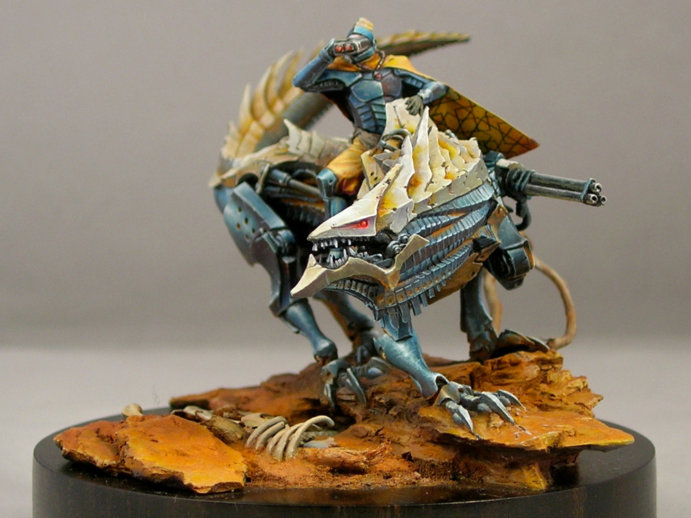
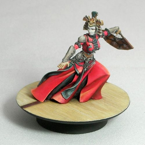
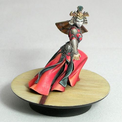
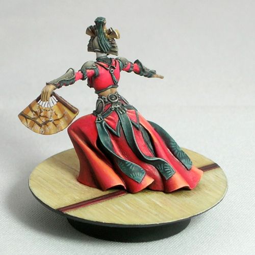
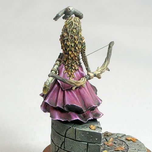
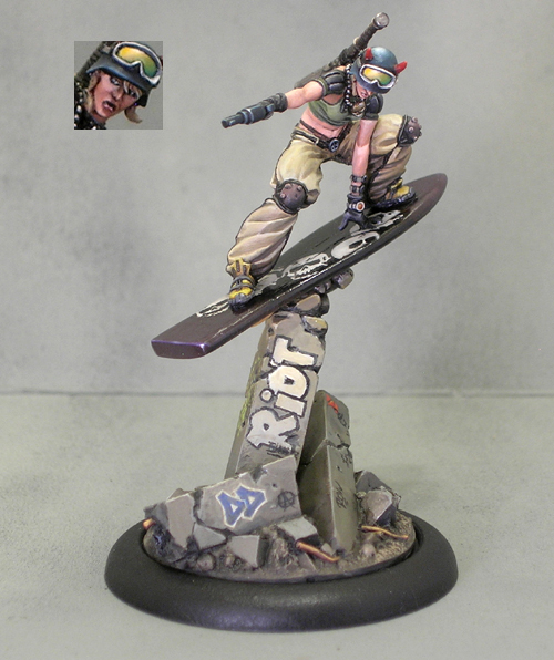
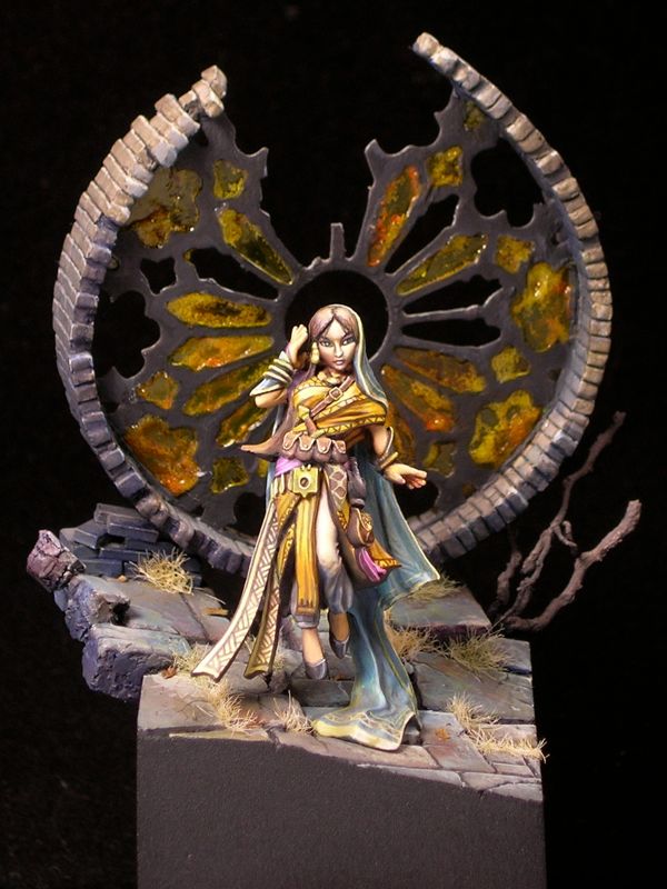
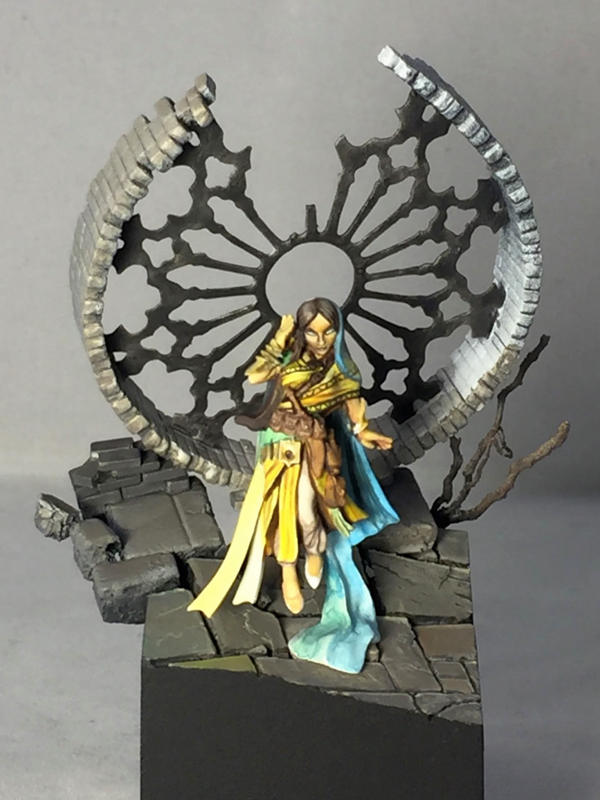
After I went for the first time last year, Reapercon immediately became my favorite convention to attend. It has a 100% miniatures focus, everyone is very friendly, and it is small enough that you can actually get to know a decent number of the attendees. Reaper is very welcoming of other manufacturers at their convention. Their painting contest is open to entries from any manufacturer and genre, and they have a number of awards for miniatures by other manufacturers, such as Dark Sword, Bombshell, and Scale 75. Nevertheless, I like to paint something by Reaper for the convention, partly to show my support, but mostly because they make some nice minis! Also, it makes you eligible to win Reaper Sophie trophies, which are pretty awesome. I chose to use Rivani, Iconic Psychic, sculpted by Bobby Jackson, for my entry this year.

I like to start all of my miniatures by building the base, before I do any painting and often before I even start planning the painting. This allows me to do a lot of test fitting without handling a painted miniature (always a bad idea for competition pieces), and allows me to plan the lighting in the scene with both the miniature and base in mind, which is important.

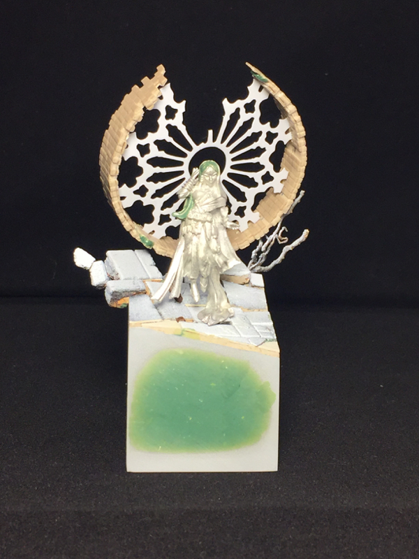
For me, bases are roughly equal parts composition and storytelling. I always start by thinking about what sort of story I want to tell. For Psychic, because the psychic herself is floating, I decided to emphasize that by building a base which feels like it is just hanging there, oblivious to the laws of physics. I built a ruined church, but consciously did it in a way that a real ruin could never happen. Large parts of the structure are missing, and yet the remaining parts somehow stick around exactly where they started even though they lack support.

Once I have my concept in mind, I start thinking about how to best convey that concept in miniature. This usually involves building components I think will be useful for that concept, and then testing out compositions with those components until I have something where the composition works, and the scene is sufficiently detailed and confined.

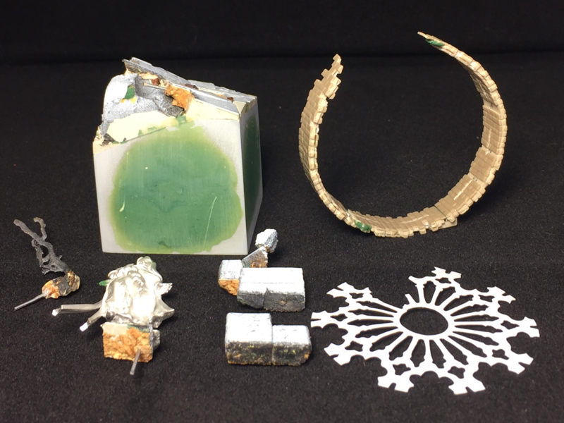
The base is basically scratch built, using juweela bricks, textured plastic card (stonework and bricks), cork tile, putty, roots, and a couple of paperclips to provide armatures for more fragile components, atop a Secret Weapon resin cube. I did use two off-the-shelf components: the stained glass support structure (the cames), and one of Scibor’s resin cast stone faces. The stained glass cames is a plasticard cutout from a prototype product line that a friend of mine, Seth Amsden, is working on, to be called “Sensei’s Scenics.” It will be available before the holidays, and you can find out more by following Seth on Instagram.

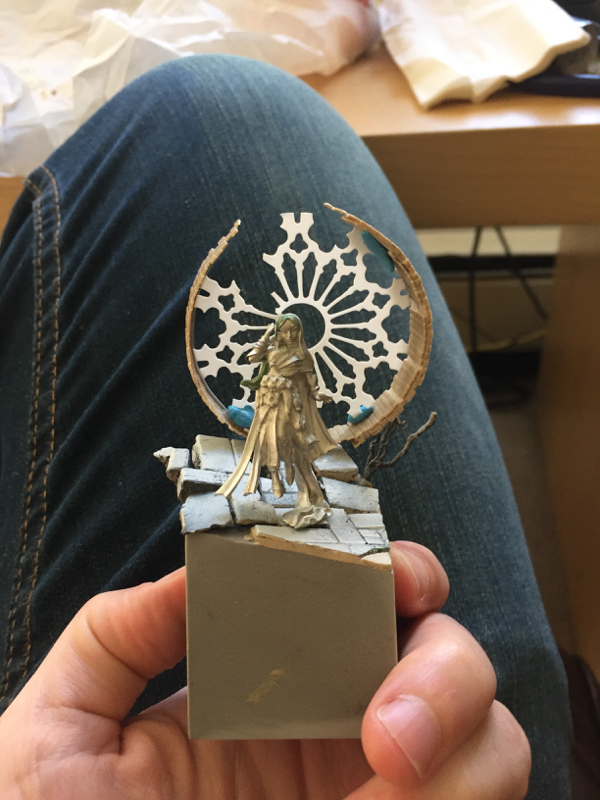
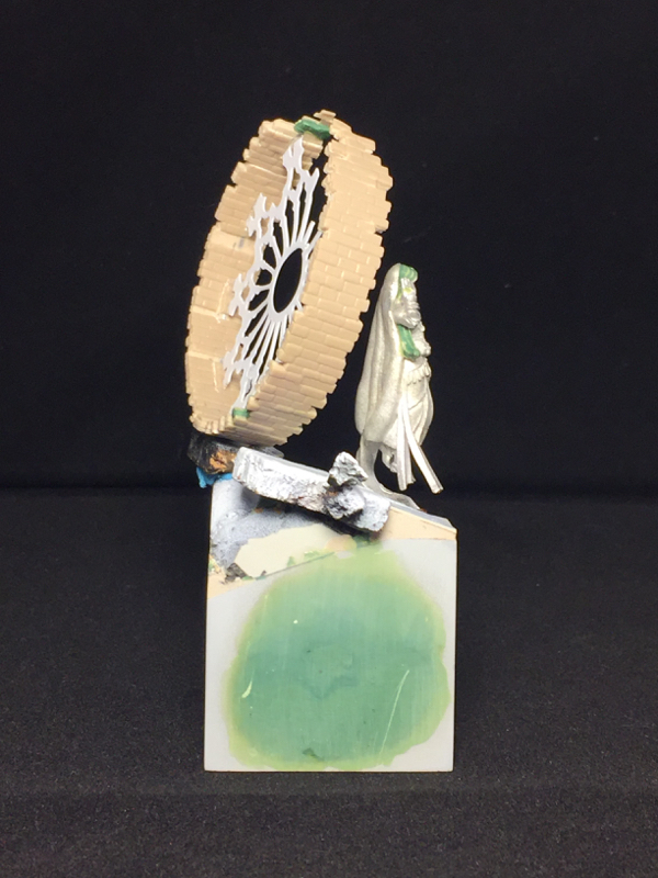
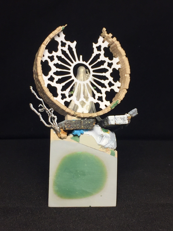
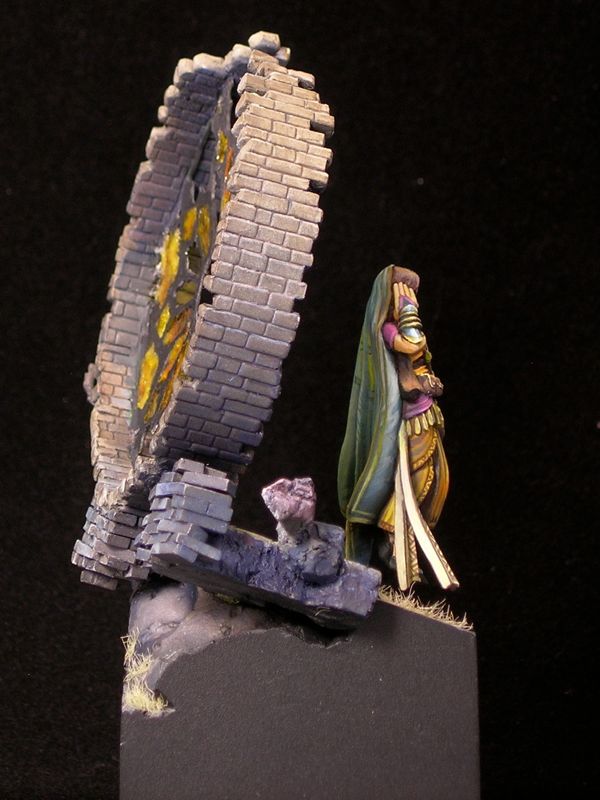
This picture, with my jeans in the background and lots of blue tac, shows the test fit where I finalized the basic composition of the piece.  I think I nailed the front view, with the figure nicely framed by the elements behind her, while leaving enough unusual angles and gaps to keep things interesting from other views.

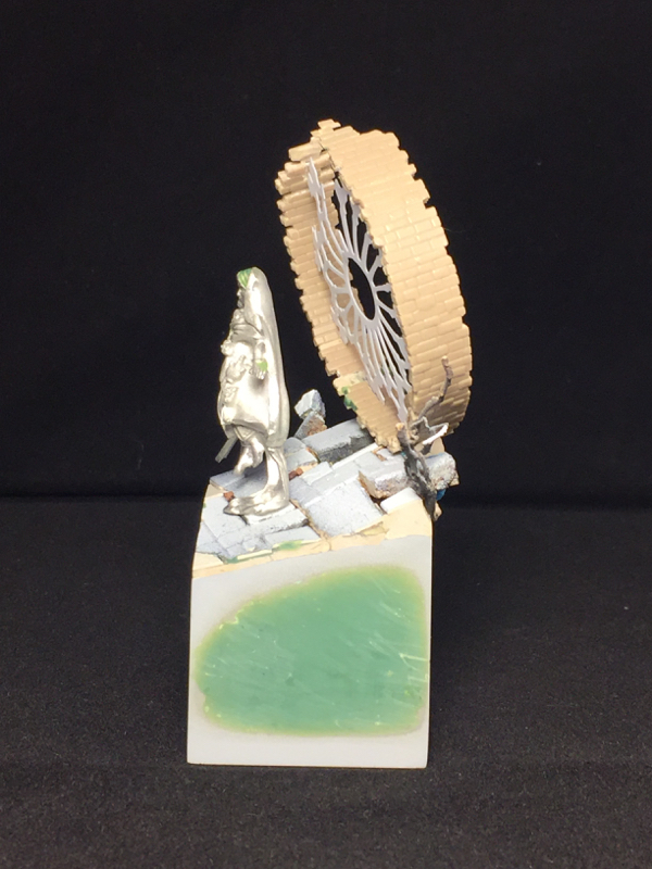
In order to get the sides perfectly smooth, I built the central part of the base and the protruding elements as separate pieces, with lots of test fitting. That way I could sand all of the walls of the central part until they were nice and flat. This sometimes involves a couple of rounds of sanding, priming, and sanding more, since priming will reveal flaws that you didn’t know were there.

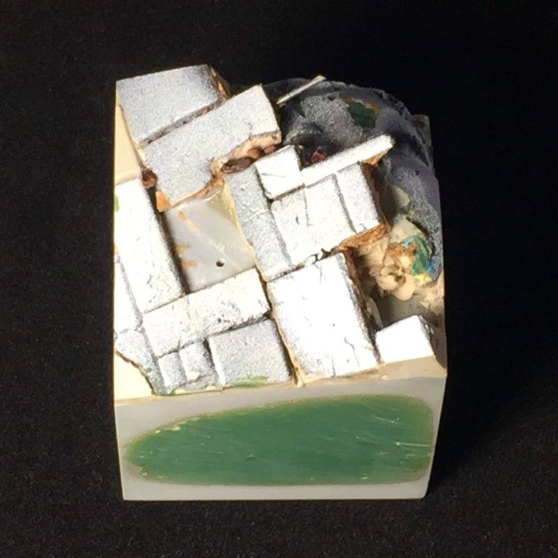
Once you have those nice flush sides, it’s best to get a nice thick coat of black primer and then a clear coat, with no brush-applied paint. This keeps things nice and smooth, and also primer & clear coat will stand up to handling better than brushed-on paint. The downside is you need to be careful not to mar the surface, as you will never be able to replicate that finish once the piece is completely assembled and painted.

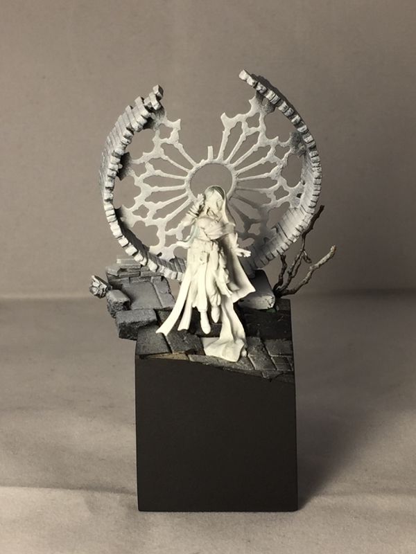
I chose to prime the psychic herself white, in order to get nice bright colors, while pre-shading the base with two-tone priming. This helps the psychic herself pop from a distance, and stand out from the base. I kept the psychic as a separate piece for painting, to allow easy access to all angles, and mounted her on one of the stone blocks from the base so I could easily mate the two parts when finished.

The painting itself was very quick, so unfortunately I only have three work-in-progress photos. Some painters like to keep the miniature very clean from start to finish, starting with very uniform base coats and building from there in a very controlled fashion. This is not my approach at all. I like to create contrast and overall impact quickly, which leaves lots of signs of my process, such as visible brushstrokes and “tide marks” from washes. Both types of process have their own pros and cons, but for me a more chaotic process is simply more fun, and that wins.

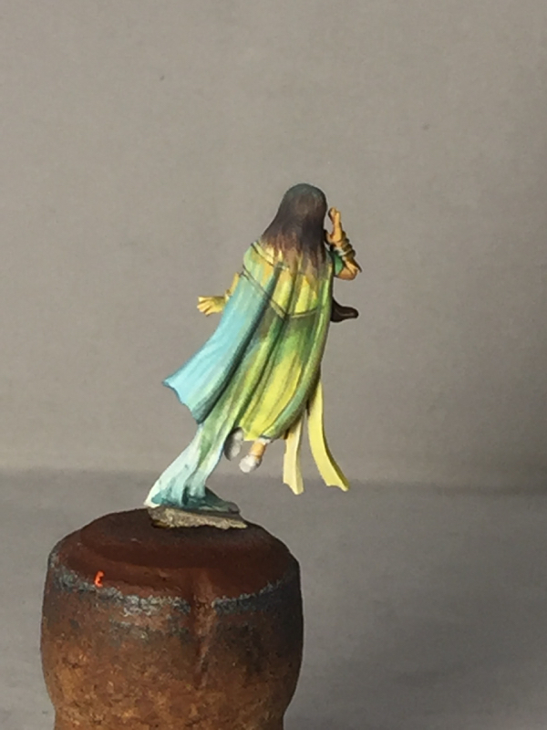
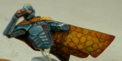
I initially planned a strong translucency effect for the psychic’s veil, so this early sketch from the back mainly depicts the psychic’s clothing under the veil, rather than the veil itself. As painting progressed, the veil ended up being much less translucent than my initial vision, although you can still definitely see through it in places.

One of the great things about Bobby’s sculpt is the number of smooth, relatively flat areas he left for freehand. Miniatures that leave some flat surfaces give the painter more flexibility than miniatures which are extremely detailed everywhere. I tend to prefer more geometrical freehands, so that’s mostly what I did. I also freehanded-in some folds in the fabric where I thought the sculpt was a bit too smooth.

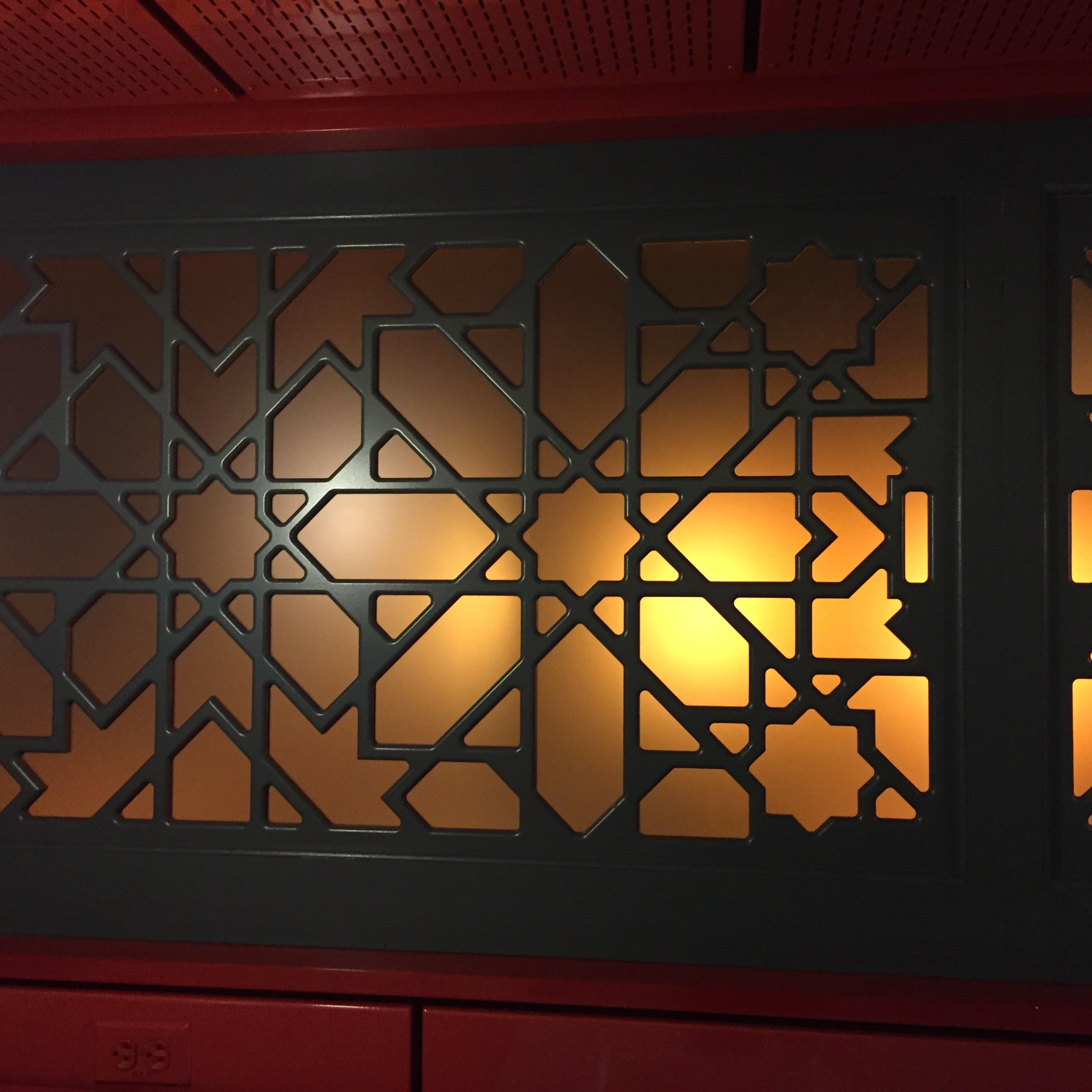
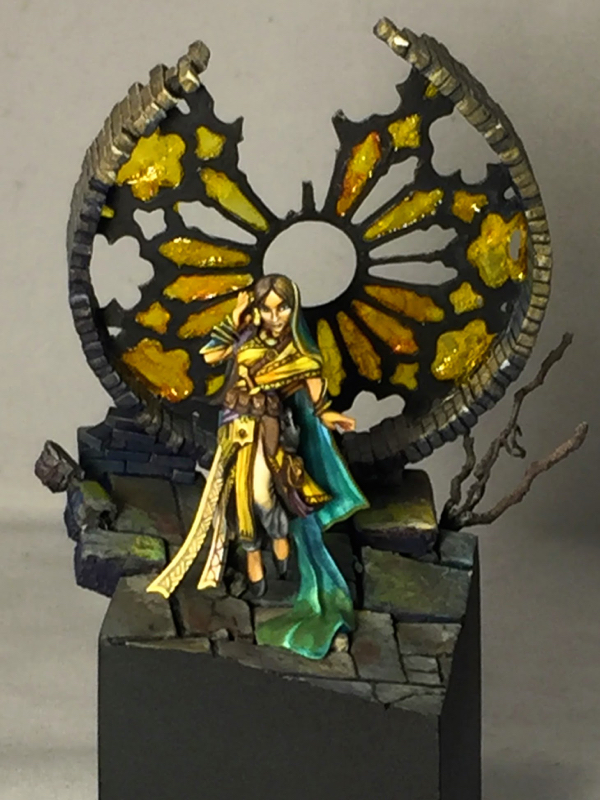
The stained glass itself is made out of Uhu, the german glue brand that some folks like to use for blood and goo effects. It is clear and sufficiently durable to hold its shape when covering windows like this. When used to create flat sheets, like I’ve done here, it picks up lots of bubbles and has extremely variable thickness. For some applications this would be a problem, but I think it works wonderfully for this sort of medieval glass window where the quality of the glassmaking would be somewhat primitive.

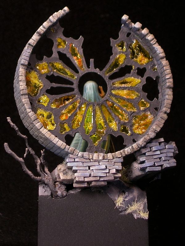
I colored the glass by waiting for the Uhu to dry, and then painting over it with a mixture of Tamiya clear yellow and Daler Rowney orange ink. By varying the mixture between orange ink and clear yellow, and the thickness of the paint over the Uhu, I was able to vary the color a bit, adding to the non-uniform appearance of the glass. Rather than worrying about painting inside the lines for this, I simply covered everything using a brush that was big and cheap (that tamiya stuff is bad for your brushes). I then went back with an off-black and carefully repainted the cames.

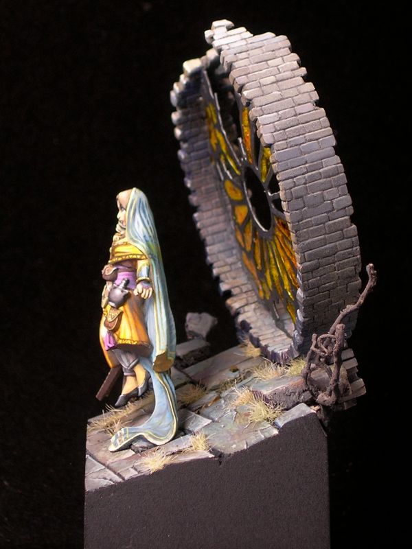
Psychic’s Dream won a gold medal in the open judging at Reapercon, and placed third overall in the Reaper painter’s competition.

Desert Wanderer

I began working on this miniature last fall, shortly after Gen Con 2015, but only recently finished it, for Gen Con 2016. (WIPs: part 1, part 2, part 3.)

desert_wanderer_01
It’s really a fantastic miniature, from the game Dark Age, and I love how much energy there is in the sculpt. I did some conversion work on the rider, twisting the cloak and moving the arm to give him a more three-dimensional pose, and also because I liked the feeling that binoculars gave the miniature (as opposed to a pistol).

desert_wanderer_02

As I mentioned back in October, I was thinking about using south asian or west asian fabric patterns to decorate the cloak. I did a lot of image searches looking for inspiration, and eventually ended up settling on an Islamic geometric design, even though those are more commonly seen in architecture rather than on fabrics. Amusingly, though I spent hours googling possible designs, the one I settled on was from my office cafeteria rather than image search.

costa_window

Before transferring the design onto the cloak, I did a sketch (and modified the pattern slightly, adding more symmetry).

desert_wanderer_cloak_sketch

The inside of the cloak has a large flat area, which is really perfect for this sort of intricate freehand design. Here is a work-in progress picture of the cloak. When this photo was taken, I still needed to make the line thicknesses more consistent. But first it’s more important to get the entire pattern laid out, since you don’t want to spend a lot of time getting a line straight and even only to realize it’s in the wrong place.

desert_wanderer_cloak_wip

The green spot on the cloak is actually intentional, though it looks totally weird in this picture. Once the rider is mounted, that part of the cloak is right above a piece of blue metal, the back of the shoulder-mounted gatling gun. So it’s an entirely natural place to see reflected blue light; yellow and blue makes green. I’ve been thinking about light a lot in my miniature painting for the last couple years, and I’m a big fan of reflected light. In some of the other pictures, you can also see ground reflections in the metals, particularly on the legs. The effect is quite subtle, but I think it adds a certain amount of realism and keeps things from being too cartoony.

desert_wanderer_03

The other big change since the last in-progress post, besides the freehand on the cloak, is the addition of a lot of dirt and grime to the mount. I have a friend who I like to ask for critiques, and he always tells me my miniatures are too clean and I need to make them dirtier. But he is helpfully specific in how I need to make the miniature dirtier, so his comments are very useful. For this mini, he complained that someone wandering through the desert riding a powerful beast would churn up a lot of dirt, so why does the mount look so clean? He was absolutely right, as usual.

desert_wanderer_04

I used the same pigments I used on the base in order to add the dirt. I kept it focused around the joints and in the cracks between armor plates and other mechanical elements. This is, of course, where you would expect dust to accumulate. But I also didn’t want to obscure the beautiful blue metals, and the brilliant white reflections, and keeping the dust confined to joints and cracks helps this happen. It’s sometimes a tricky balancing act, trying to get a realistically weathered appearance while still maintaining strong contrasts and making shapes that are easy to read at miniature scale. I think I was able to reach a good balance with this miniature.

desert_wanderer_05

The dead tree is just some cool roots I found while walking near my office. Roots tend to work better than above-ground parts of plants in miniature scale, since they look like miniature versions of the above-ground bits. This piece was really cool and twisted looking, which I thought made it look like it had been warped by powerful winds.

desert_wanderer_06

The sculptor did a fantastic job on the drapery on the back of the cloak, so I decided not to add freehand to the back, which would only distract from the great sculpt. Instead, I used very strong highlights and shadows to really bring out the details of the drapery work. It’s lovely when you get a beautiful sculpt like this which doesn’t need any freehand decoration, but I’m also happy that the sculptor left a broad flat surface on the inside of the cloak which was perfect for adding a pattern.

desert_wanderer_07

I did add a bit of texture to the fabric to add some interest to the lower half where the sculpt is less detailed. Smooth blends are for smooth surfaces only, and I imagined my desert wanderer would need a coarse garment which could stand up to sandstorms.

desert_wanderer_08

The bones on the base are mostly rodent bones from ebay. I assume they came from an owl pellet, but I bought pre-cleaned bones since I didn’t really want to dissect an owl pellet. The exception is the ribs—I really wanted a ribcage sticking up out of the dirt, but there weren’t any appropriate bones in the set I ebayed so I sculpted some out of green-stuff.

desert_wanderer_09

In this picture  you can see where I added some control panels for the rider to see readouts from the mount’s sensors. These were added with freehand. That surface is smooth in the sculpt, but I figure that robotic dragons need dashboards so I added some screens.

desert_wanderer_10

I entered this figure into the painting competition at Gen Con, where he was eligible for both the overall awards and the Rainbow Brush competition. Rainbow Brush, which is organized by one of the best miniature painters in the world, was started last year to express support for groups facing oppression and marginalization in the wake of anti-gay legislation that was passed in Indiana, where Gen Con is held. This year the theme was Islam, chosen because of the extreme and appalling anti-Muslim sentiment which has been particularly virulent this election season. As it happens, I had already decided on the Islamic pattern for the Desert Wanderer’s cloak before the theme was announced, but I thought he made a fitting entry.

desert_wanderer_11

Desert Wanderer won a gold medal in the open judging at Gen Con, and placed first in the Rainbow Brush competition.

You can also see him on CoolMiniorNot and Putty & Paint, where you can rate him if that’s your jam.

Steampunk Leia—finished

Sorry I’ve been so quiet lately. The holidays are always a busy time of year, and this will be my last post of the year.

In honor of Star Wars, I’m finally posting the finished shots of Steampunk Leia. I posted the initial WIPs over a year ago, and finished her last summer, but it took a long time to finally post photos. Sorry!

Without further ado, here are the pictures.

steampunk-leia-2

steampunk-leia-1

steampunk-leia-6

steampunk-leia-5

steampunk-leia-4

steampunk-leia-3

After the second WIP post, I ended up painting over all of the non-metallic metals with metallics. At this large scale, I just couldn’t get NMM that I was happy with. I’m much happier with how the metallics turned out. But my favorite part is the orange light effect – I think I learned a lot about how to pull off a realistic glow effect by trying to execute it at this large scale.

Tribe Chief Morrow—finished

tribe-chief-morrow-final-5

tribe-chief-morrow-final-1

tribe-chief-morrow-final-2

tribe-chief-morrow-final-4

tribe-chief-morrow-final-3

I only made a few changes since the last workbench post, the most significant being the addition of a plinth. This was done by a friend of mine, and it came out great. Thanks!

I managed much better photos this time, which is kind of amazing since I never take good photos. I’m still kind of shocked by how well they came out. So I did something I never do, which is upload really high res pictures. You can see all the brushstrokes!

I also entered him into the painting competition at KublaCon, and was thrilled to take home best in show, despite some other very nice stuff in the case. Now I have a cool dragon trophy.

New photo setup

I finally have a more-or-less permanent photo setup in my apartment, which should make it a bit easier to post photos for the blog. I broke it in by taking some new photos of miniatures I painted a while ago, but never had any decent photos of. Hope you like them!

Akarui – Studio McVey

akarui-1

akarui-2

akarui-3


Ar-Fienel – Studio McVey

ar-fienel-1

ar-fienel-2

ar-fienel-3


Kifaro – Studio McVey

kifaro-3

kifaro-4

kifaro-1

kifaro-2


Queek – Games Workshop

queek-1

queek-2

queek-3


Ur-Fildyr – Studio McVey

ur-fildyr-1

ur-fildyr-2

ur-fildyr-3


Comments and critiques are always welcome.

Welcome to Althai Paints!

I’m a miniature painter best known by my online moniker “Althai”. I thought about saying a bit about myself, but I decided I’d rather let my work speak for itself.

Ruby – Studio McVey; Photo Courtesy Crystal Brush

Ruby – Studio McVey

"Riot Grrrl" Lisbeth – Studio McVey

“Riot Grrrl” Lisbeth – Studio McVey

Troll Axer – Privateer Press

Troll Axer – Privateer Press

Commander-Adept Nemo; Photos Courtesy Privateer Press

Commander-Adept Nemo – Privateer Press

© 2024 Light Miniatures

Theme by Anders NorenUp ↑