Never be afraid to paint outside the lines

Tag: sci-fi (Page 1 of 2)

Crystal Brush Entries, part 2

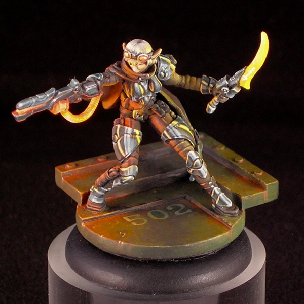
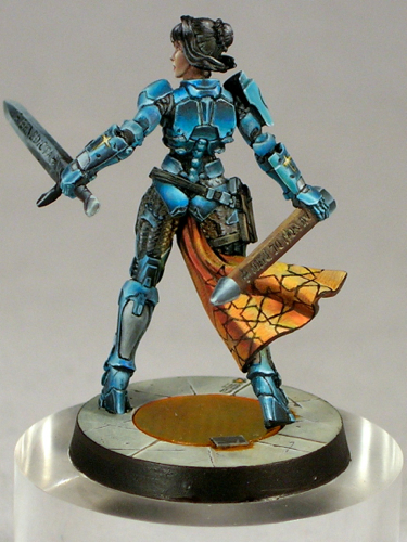
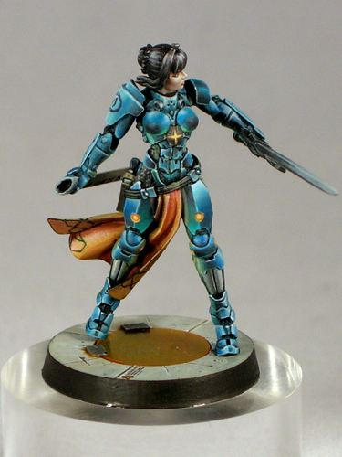
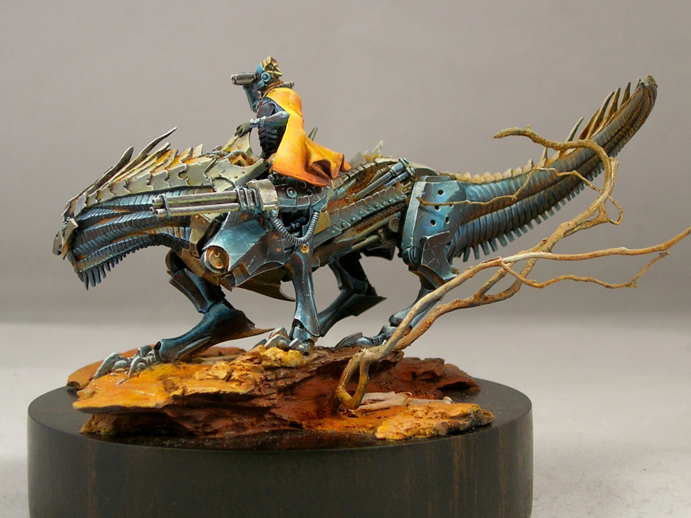
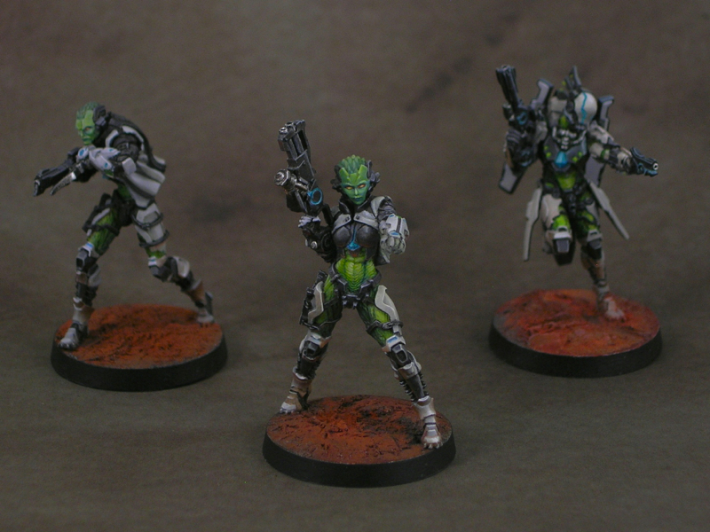
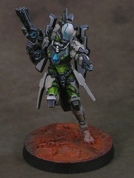
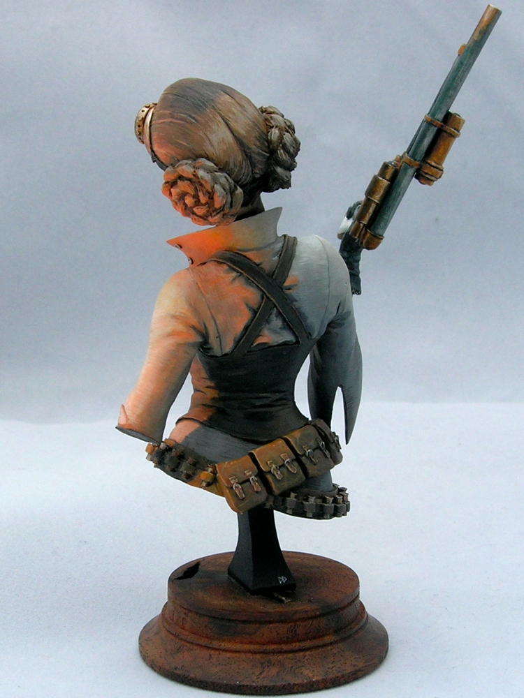
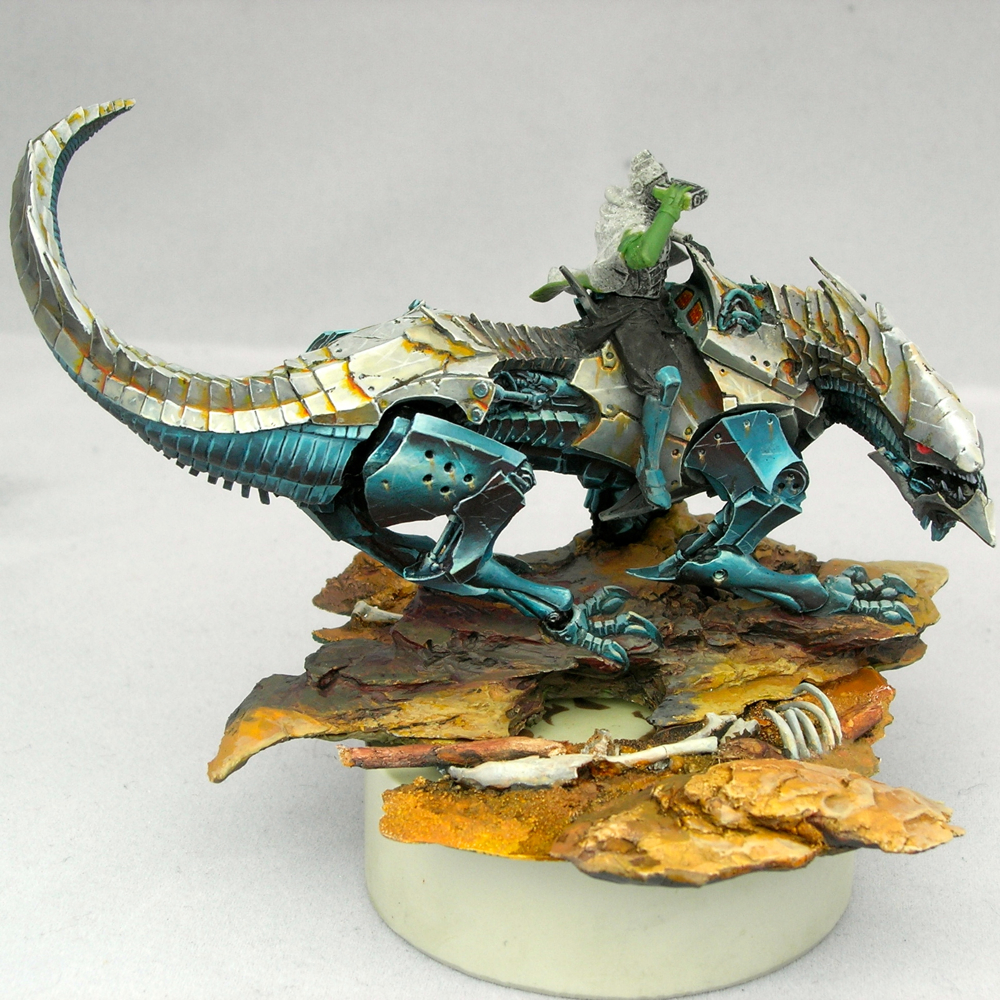
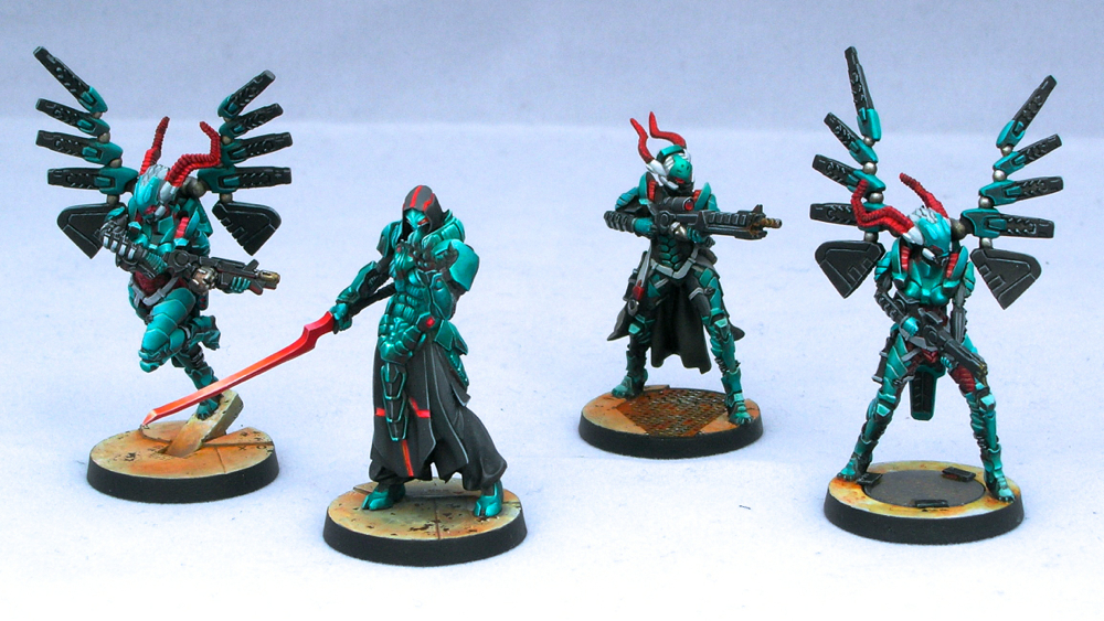
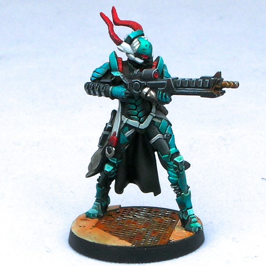
Today I’m continuing my three-part series on my Crystal Brush entries with my single figure entry. If you missed part 1, please check it out here. This figure is titled “Space Pirate Kaelyssa.”

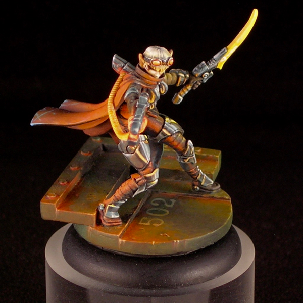
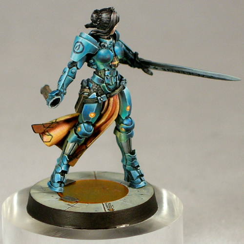
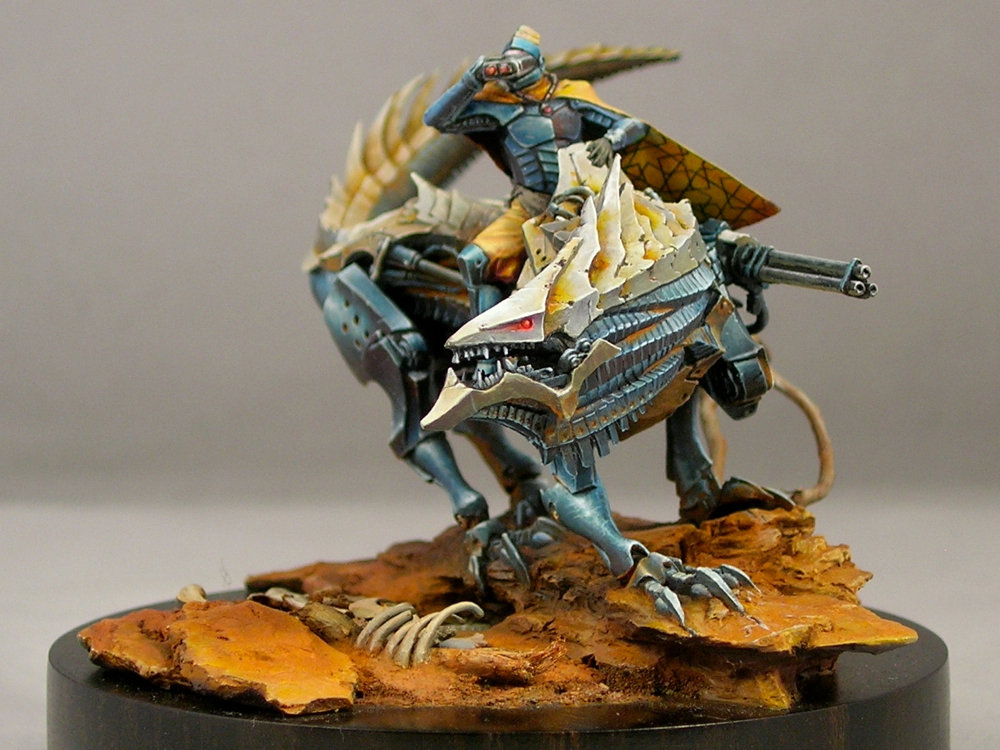
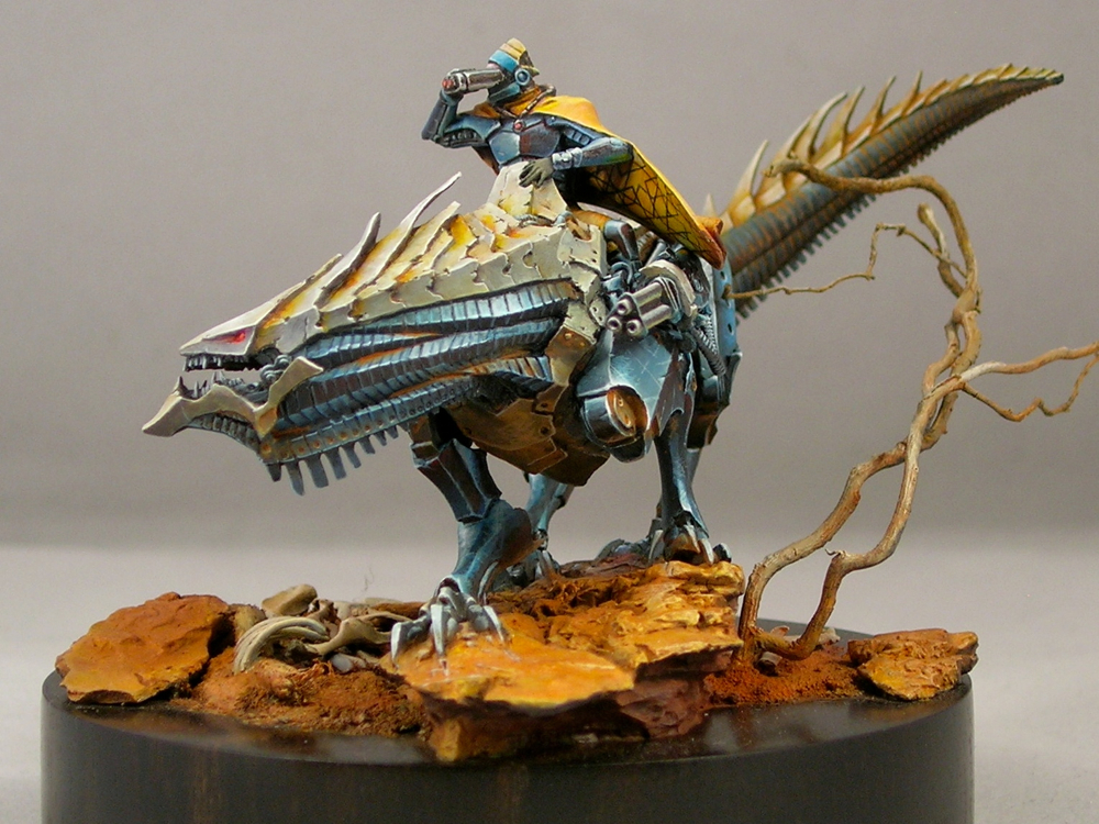
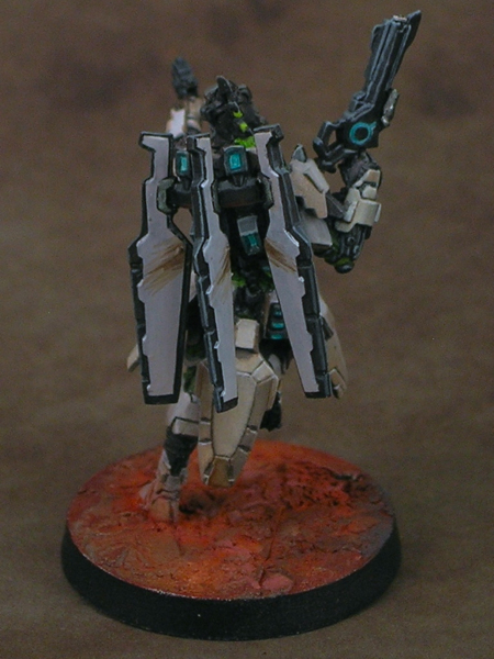
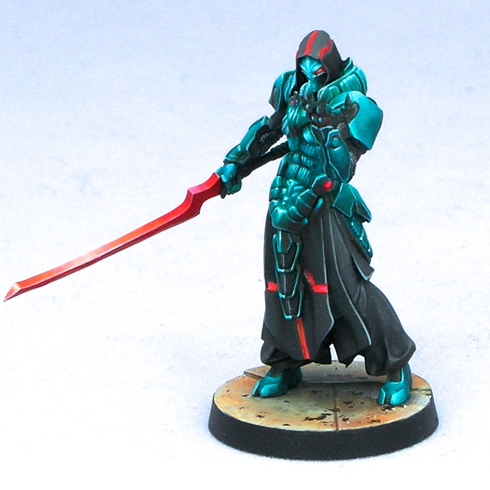
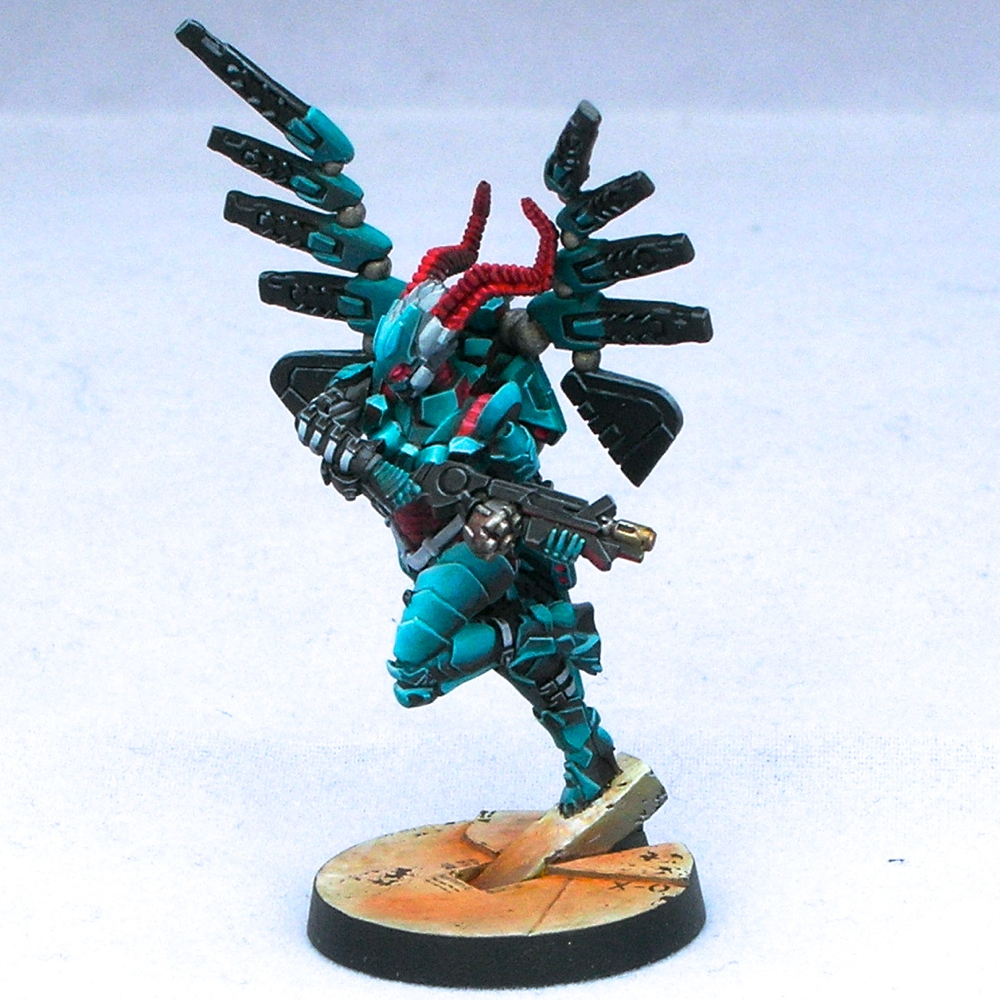
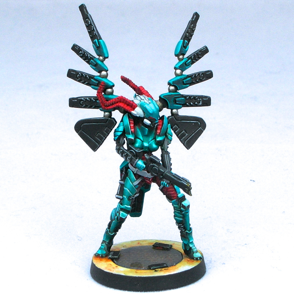
The figure is Kaelyssa, from Privateer Press’ steampunk game Warmachine. I got a big kick out of doing her up in true sci-fi fashion, not at all steampunk. Since she belongs to the Retribution faction, which already have a rather sci-fi look, this was quite easy. All I did was a very simple conversion to add a hose connecting her gun and backpack. The only other thing it took was paint. I was amused how many people asked me if it was an Infinity figure.

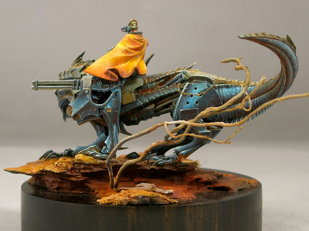
Part of the inspiration came from James Wappel’s excellent Professor Karrick. I absolutely love dramatic lighting and glow effects, and James’ take on Professor Karrick’s two light sources is excellent. The base he did complements it really well, providing a nice backdrop to catch the light. For my version, I kept the base but used a different figure from the same sculptor (Patrick Keith), converting it slightly to have a similar hose.

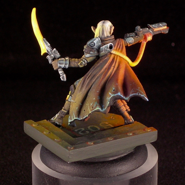
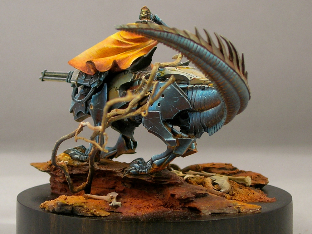
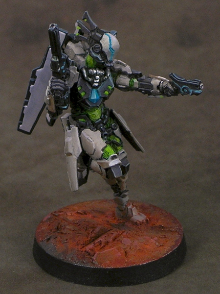
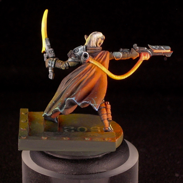
I tend to do simpler color-schemes on most of my figures, with two or three main colors dominating. In my experience, the easiest color-schemes to pull off are those that have at most two bright colors in them, and the rest of the colors are more muted. Here I was able to come up with a more complicated color scheme, with many very saturated colors in it, and I still think it works.

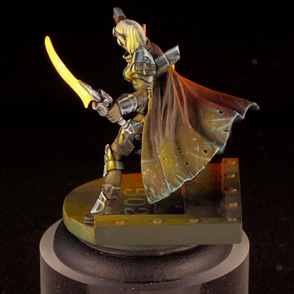
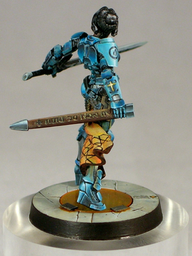
I was really surprised when Kaelyssa didn’t make first cut. I spoke with one of the judges, and he said that she was right on the bubble but the judges felt that the blending on the orange was not smooth enough and that kept her out. I’ve never been the smoothest blender, preferring to take my time creating textures and dramatic ambiance rather than glazing and glazing until I have really really ridiculously smooth blends. I think that hurt me here.

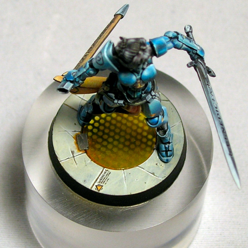
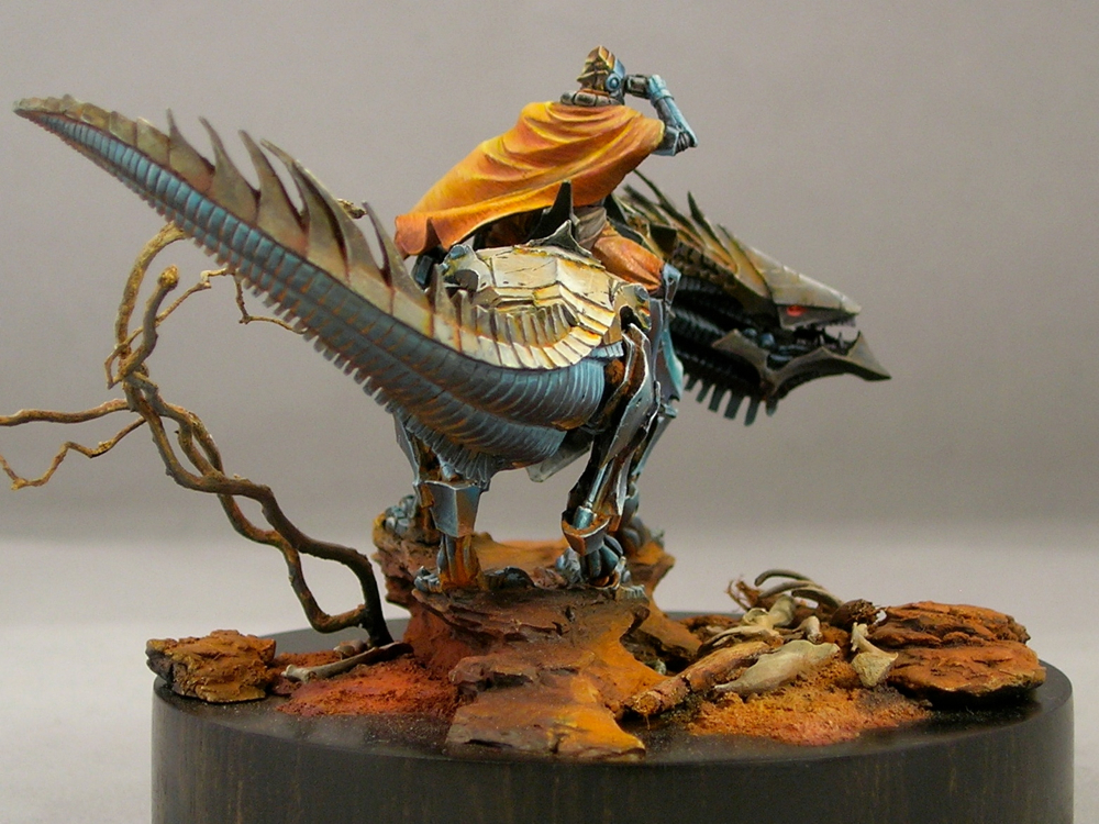
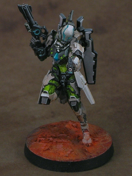
While I think there are some weaker elements, like her left arm and sword, I’m really happy with how the ambience and light effect came out. I think that overall Kaelyssa is good work, but given her poor result in Crystal Brush I plan to rework some of the weaker elements and enter her in another competition in the future (probably the Privateer Press competition at Gen Con).

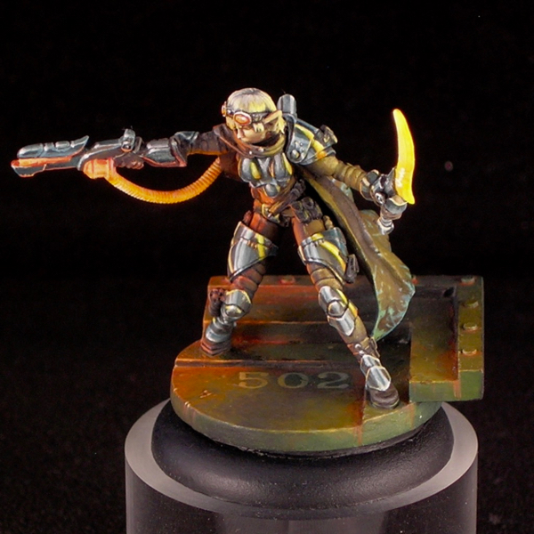
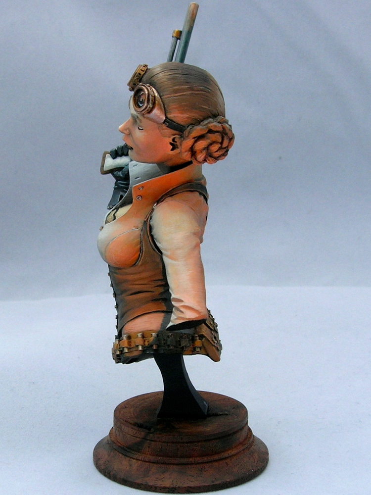
Kaelyssa is sculpted with some fairly simple, round armor plates. Simple surfaces can be wonderful for an ambitious miniature painter, because they provide a good opportunity to make them much more complicated and interesting using paint. I took the opportunity to do a comic-book-style chrome effect, reflecting the glowing sword and ray-gun. I think the comic-book style art complements the sci-fi vibe really well.

There are a lot of debates between non-metallic metals vs. the use of metallics in miniature painting, with hard-line adherents on either side arguing their way is “better”. Personally I use both, but I think this miniature is a good example of some of the advantages of non-metallic metals. I could never have portrayed the interaction of shiny metals and a light source using metallic paints, the way I was able to do it here using nmm.

Crystal Brush Entries, part 1

I’m back from Crystal Brush, and wanted to share my entries!

I came with a bust, a unit, and a sci-fi single, putting the most time into the bust. Disappointingly, the bust was the only one which made first cut. I think that means that when you go to Crystal Brush, either you need to go all-out on your entry, or you might as well not bring it! That seems fitting for a contest as competitive as it is.

In sharing my entries with the blog, I’m going to start with the unit, which was definitely the weakest of the three entries. These are really gaming models, although I do have high standards for my gaming models. I didn’t even do any basing for them, just painting the 25mm bases they come with and calling that good enough!

I went with a classic red-and-military-green color scheme, which is really a very effective color scheme (yay color theory!) For the reds, I went with a high-contrast NMM look, which I think works really well for infinity models. The green cloth is subtly textured to better complement the shiny metals.

I still have another 4 models from this group to paint, since I got the Operation: Icestorm box set. Doing small tabletop gaming figures can be a nice break from larger projects, so I will probably finish the unit gradually in between other projects.

Next up is my sci-fi single entry, which I’ll be posting later this week!

Jeanne d’Arc

Infinity miniatures have come a long way since their first releases. For the last couple of years, they are doing all digital sculpts, which is perfect for sci-fi figures with their machined power-armor and gadgets. Their line is 100% metal, and are among the nicest metal casts I have worked with.

jeanne_d_arc_1

For this miniature, I was inspired by the beautifully smooth non-metallic metals on the version by Gareth “glazed over” Nicholas. The resemblance is quite apparent, although my blends are not nearly as smooth. I just don’t have the patience for that much glazing. I’m pretty happy with the effect I was able to get.

jeanne_d_arc_2

Although I stayed quite close to Gareth’s version for the metals, for everything else I decided to go my own way. I painted this while I was still working on Desert Wanderer, and decided to go with the same color scheme and Islamic-inspired freehand, since it worked so well for Wanderer. Because of the Islamic freehand, I ended up entering Jeanne along with Wanderer in the Rainbow Brush competition, but when Wanderer won, she was out of the running. Yes, I did end up entering two figures named after Christian saints in an Islam-themed painting competition. Irony is ironic that way.

jeanne_d_arc_3

The fine texture of the cloth came out really well I think. I like to contrast different textures in my miniatures, in this case the weave of the fabric against the smooth metal of the armor.

jeanne_d_arc_4

I’m a big sucker for reflected light, and love including it in my figures. Non-metallic metals are a great opportunity for this, especially when the metal surface is right next to a brightly colored element, as is the case with Jeanne‘s loin cloth. You can see it in this view on the silver woven metals, and in other views on the blue armor plates. In most places you see just the color, but on the flat plates immediately adjacent to the loin cloth you can also see the shape of the fabric in the reflection.

jeanne_d_arc_5

I had a lot of fun with the base. I often like simple bases for my miniatures, especially gaming figures, but which are evocative enough to provide a setting for the figure. To make this base, I used a standard Infinity gaming base, but cut a big hole in the middle of it, which I replaced with a brass-etch grating and a clear piece of blister pack that I painted with transparent orange ink. I really enjoy using negative space when basing miniatures.

jeanne_d_arc_top

I used a clear acrylic plinth from TAP Plastics to accentuate the negative space in the base.

jeanne_d_arc_6

I frequently ignore the manufacturer awards at Gen Con, because I’m more interested in painting what I want to paint rather than maximizing my chances to win awards. This year I lucked out though, and when I went to enter the painting competition I found out that Infinity was supporting it with manufacturer awards.

I went down to the Infinity booth later on, and was seriously tempted to get Operation Red Veil. I think the sales guy was a bit miffed when I said I’d wait, “just in case” I won their manufacturer award (which included the game). He may have been astonished at my hubris, but I thought I had a pretty good shot at winning.

jeanne_d_arc_7

It turns out I was right to hold off, since I was awarded best Infinity figure with this model. 😉

Voting links, for those who want them:

Desert Wanderer

I began working on this miniature last fall, shortly after Gen Con 2015, but only recently finished it, for Gen Con 2016. (WIPs: part 1, part 2, part 3.)

desert_wanderer_01
It’s really a fantastic miniature, from the game Dark Age, and I love how much energy there is in the sculpt. I did some conversion work on the rider, twisting the cloak and moving the arm to give him a more three-dimensional pose, and also because I liked the feeling that binoculars gave the miniature (as opposed to a pistol).

desert_wanderer_02

As I mentioned back in October, I was thinking about using south asian or west asian fabric patterns to decorate the cloak. I did a lot of image searches looking for inspiration, and eventually ended up settling on an Islamic geometric design, even though those are more commonly seen in architecture rather than on fabrics. Amusingly, though I spent hours googling possible designs, the one I settled on was from my office cafeteria rather than image search.

costa_window

Before transferring the design onto the cloak, I did a sketch (and modified the pattern slightly, adding more symmetry).

desert_wanderer_cloak_sketch

The inside of the cloak has a large flat area, which is really perfect for this sort of intricate freehand design. Here is a work-in progress picture of the cloak. When this photo was taken, I still needed to make the line thicknesses more consistent. But first it’s more important to get the entire pattern laid out, since you don’t want to spend a lot of time getting a line straight and even only to realize it’s in the wrong place.

desert_wanderer_cloak_wip

The green spot on the cloak is actually intentional, though it looks totally weird in this picture. Once the rider is mounted, that part of the cloak is right above a piece of blue metal, the back of the shoulder-mounted gatling gun. So it’s an entirely natural place to see reflected blue light; yellow and blue makes green. I’ve been thinking about light a lot in my miniature painting for the last couple years, and I’m a big fan of reflected light. In some of the other pictures, you can also see ground reflections in the metals, particularly on the legs. The effect is quite subtle, but I think it adds a certain amount of realism and keeps things from being too cartoony.

desert_wanderer_03

The other big change since the last in-progress post, besides the freehand on the cloak, is the addition of a lot of dirt and grime to the mount. I have a friend who I like to ask for critiques, and he always tells me my miniatures are too clean and I need to make them dirtier. But he is helpfully specific in how I need to make the miniature dirtier, so his comments are very useful. For this mini, he complained that someone wandering through the desert riding a powerful beast would churn up a lot of dirt, so why does the mount look so clean? He was absolutely right, as usual.

desert_wanderer_04

I used the same pigments I used on the base in order to add the dirt. I kept it focused around the joints and in the cracks between armor plates and other mechanical elements. This is, of course, where you would expect dust to accumulate. But I also didn’t want to obscure the beautiful blue metals, and the brilliant white reflections, and keeping the dust confined to joints and cracks helps this happen. It’s sometimes a tricky balancing act, trying to get a realistically weathered appearance while still maintaining strong contrasts and making shapes that are easy to read at miniature scale. I think I was able to reach a good balance with this miniature.

desert_wanderer_05

The dead tree is just some cool roots I found while walking near my office. Roots tend to work better than above-ground parts of plants in miniature scale, since they look like miniature versions of the above-ground bits. This piece was really cool and twisted looking, which I thought made it look like it had been warped by powerful winds.

desert_wanderer_06

The sculptor did a fantastic job on the drapery on the back of the cloak, so I decided not to add freehand to the back, which would only distract from the great sculpt. Instead, I used very strong highlights and shadows to really bring out the details of the drapery work. It’s lovely when you get a beautiful sculpt like this which doesn’t need any freehand decoration, but I’m also happy that the sculptor left a broad flat surface on the inside of the cloak which was perfect for adding a pattern.

desert_wanderer_07

I did add a bit of texture to the fabric to add some interest to the lower half where the sculpt is less detailed. Smooth blends are for smooth surfaces only, and I imagined my desert wanderer would need a coarse garment which could stand up to sandstorms.

desert_wanderer_08

The bones on the base are mostly rodent bones from ebay. I assume they came from an owl pellet, but I bought pre-cleaned bones since I didn’t really want to dissect an owl pellet. The exception is the ribs—I really wanted a ribcage sticking up out of the dirt, but there weren’t any appropriate bones in the set I ebayed so I sculpted some out of green-stuff.

desert_wanderer_09

In this picture  you can see where I added some control panels for the rider to see readouts from the mount’s sensors. These were added with freehand. That surface is smooth in the sculpt, but I figure that robotic dragons need dashboards so I added some screens.

desert_wanderer_10

I entered this figure into the painting competition at Gen Con, where he was eligible for both the overall awards and the Rainbow Brush competition. Rainbow Brush, which is organized by one of the best miniature painters in the world, was started last year to express support for groups facing oppression and marginalization in the wake of anti-gay legislation that was passed in Indiana, where Gen Con is held. This year the theme was Islam, chosen because of the extreme and appalling anti-Muslim sentiment which has been particularly virulent this election season. As it happens, I had already decided on the Islamic pattern for the Desert Wanderer’s cloak before the theme was announced, but I thought he made a fitting entry.

desert_wanderer_11

Desert Wanderer won a gold medal in the open judging at Gen Con, and placed first in the Rainbow Brush competition.

You can also see him on CoolMiniorNot and Putty & Paint, where you can rate him if that’s your jam.

Infinity – Tohaa

Infinity are a lot of fun to paint up. They are all very finely cast metal minis, with lots of bits so that you get interesting, three dimensional poses. The models are on the small side, so they paint up relatively quickly, but they are packed with detail which makes them look bigger than they are.

For this little Tohaa group, I decided to stay fairly close to the official color scheme, but I swapped the usual orange for green to give them my own spin.

tohaa_group

They are not painted to a super-high standard, as I was focusing more on the color scheme and overall light situation rather than making all of the details perfect. I’m really pleased with how they came out though!

tohaa_rasail_1

The leader was the most fun to paint up. She has a very nice face, and all of the areas are easily accessible when fully assembled making her easy to paint.

tohaa_rasail_2

It’s kind of subtle in these photos, but I threw some red into all of the shadows on the white armor. With a giant red planet underneath her, you would expect some of the reflected light to show up in the whites of her clothing!

tohaa_rasail_3

I decided on very simple basing—I really just scraped some putty around to give a rough texture, painted them quickly with mostly black and white, and then applied a bunch of red pigments to give a martian desert effect.

tohaa_rasail_4

Apart from the neutral colors of the armor, the main colors are green and turquoise, so red was a natural color for the base as it’s a complementary color to both, making the overall color scheme “split complementary”. Adding red into the whites of the armor, as well as being ‘correct’ from the perspective of physics, helps tie everything together.

gao_tarsos_1

This guy was super fiddly to paint. He has a bajillion tiny details, and many areas are impossible to reach with a brush when he’s fully assembled while still being annoyingly visible. Also, there are six different fins that are too small to pin and all attach with an area of one square micron. I think I broke the fins off three times each while painting him.

gao_tarsos_4

He came out really well, but I basically needed to design a display base for the group just to avoid handling him any more and breaking more fins off. I wouldn’t want to use this guy in a game ever! Maybe I just need smaller drills so I can pin tiny Infinity bits.

gao_tarsos_3

Decided to add some quick weathering from the rocket exhaust. To Infinity and Beyond!

gao_tarsos_2

I would not want to run into this guy on a lonely rock in deep space. He looks hostile.

This group is one of my entries into the painting competition at Gen Con. I have six entries total (and maybe even time to finish one more), split between the general competition and the Privateer Press one. But I’m going to wait to share most of them after the convention. Sorry I’m such a tease, but I don’t want to give up the element of surprise for my main entries!

Steampunk Leia—finished

Sorry I’ve been so quiet lately. The holidays are always a busy time of year, and this will be my last post of the year.

In honor of Star Wars, I’m finally posting the finished shots of Steampunk Leia. I posted the initial WIPs over a year ago, and finished her last summer, but it took a long time to finally post photos. Sorry!

Without further ado, here are the pictures.

steampunk-leia-2

steampunk-leia-1

steampunk-leia-6

steampunk-leia-5

steampunk-leia-4

steampunk-leia-3

After the second WIP post, I ended up painting over all of the non-metallic metals with metallics. At this large scale, I just couldn’t get NMM that I was happy with. I’m much happier with how the metallics turned out. But my favorite part is the orange light effect – I think I learned a lot about how to pull off a realistic glow effect by trying to execute it at this large scale.

From the workbench: St. Mark on Dragon, part 3

I reached an important milestone since part 2. There’s no more primer showing! There’s still lots of work to be done, but all of the main elements are now in place, so you can see how it all looks together.

st_mark_dragon_3rd_wip_1

I can’t decide which side is the front of this mini. I’m not sure if that’s a good or a bad thing, but I think it’s good. There’s a lot of energy moving in several different directions, which I think is one of the things that drew me to the mini originally.

st_mark_dragon_3rd_wip_6

The most obvious change since the last post is the rider of course. Originally, I painted his cloak and pants pink rather than orange. The color worked okay in the color scheme, I think, but I couldn’t get over my societal hangups about pink.

st_mark_dragon_3rd_wip_5

Fortunately a thin glaze with yellow ink was enough to change the color completely without destroying all of the highlighting and shading, and my careful texturing work.

st_mark_dragon_3rd_wip_4

The other main change is the addition of pigments to the base. I don’t think it photographs as well now, but it looks way better in person and that’s the main thing. Pigments create a wonderful dusty effect which makes the base look much more realistic as dirt and stone.

st_mark_dragon_3rd_wip_3

The pigments I used are mostly from the Secret Weapon “wet earth” set, which is somewhat ironic since I created a dry dusty effect using the pigments. Just goes to show you never to take names too seriously, since at the end of the day they are just colors. I used terracotta as the main color for the lit areas and violet (which is an awesome color!) in the shadows, with a few spots of red brick to provide variety.

st_mark_dragon_3rd_wip_2

I screwed up when I added the pigments, since I added the pigments first, then sprayed the whole mini with dullcoat (which it needed to kill the shine from the inks I used). Unfortunately the dullcoat ruined the lovely dusty effect. I added another layer of pigment, but that pretty much obliterated the highlighting and shading I had done before. So I had to re-paint the highlights and shadows over the pigment, and then add pigments a final time. Oy.

At least thick paint is not much of an issue for the rocks and dirt. But next time it’s definitely dullcoat first, then pigments, rather than the other way around.

From the workbench: St. Mark on Dragon, part 2

st_mark_dragon_2nd_wip_1

There’s been a lot of progress since part 1. The dragon body is nearly finished, and I’ve built out the base a bit.

st_mark_dragon_2nd_wip_3

I haven’t really put any paint on the rider yet, but I converted his arm holding a pistol into binoculars, which involved a fair amount of resculpting.

st_mark_dragon_2nd_wip_4

The round resin plinth he’s sitting on is only temporary, for holding him while I paint. I’m planning on putting him on a larger wood plinth eventually.

st_mark_dragon_2nd_wip_5

I’m not sure about the highlighting I did on the back leg in this shot. It doesn’t really make sense from a physics standpoint, but it also provides a sense of energy and motion which I like (and which was inspired by something Alfonso “Banshee” Giraldes said in a class I took from him). I’m going to leave it for now, and see how I feel about it when the rest of the mini is closer to finished.

st_mark_dragon_2nd_wip_2

On to the rider! I’m off to Google some fabric reference for his clothing, since I still haven’t figured out what I’m going to do with it. I’m thinking about doing something inspired from West Asian or South Asian fabric patterns. I visited the Victoria and Albert Museum in London a couple of weeks ago while traveling for work, and there was a show on the Fabrics of India which got me thinking along those lines.

“Negative Space”—finished

Negative Space

As soon as I saw the new Infinity—Combined Army starter pack in my local game store, I wanted to paint it. In fact, that was the box that ended up getting me started on my recent Infinity kick. I have to say the models are fantastic, light-years ahead of the older Infinity models; they are very easy to clean, and tremendously fun to paint.

Negative Space

The base was the first thing I built, and is primarily composed of parts of the optical drive and heat sink from my old MacBook (which I replaced once it started constantly crashing), mounted on a resin block from Secret Weapon miniatures. The base presented some interesting engineering challenges, to make it structurally sound where a thin piece of plasticard was sticking out from a resin block and just attached at the edge, so I added some plasticard braces and carved a groove in the resin block for extra support.

Negative Space

The miniatures are all magnetized to the base, so that they can be removed to be usable as gaming pieces or just be appreciated on their own, but snap nicely onto the base in the appropriate position and orientation for group display. This was especially nice for entering into the Gen Con competition, which requires units to be presented together on a display base. Making everything nice and stable as a unit also makes things safer when being handled by the judges and their minions.

Negative Space: Fraacta, Umbra Legates, Maakrep, Fraacta

From left to right: Fraacta, Umbra Legates, Maakrep, Fraacta.

Negative Space: Umbra Legates

Originally I intended to paint the entire box up as a unit, but ended up dropping the Unidrons and adding an extra Fraacta. The base I built was not really large enough for six models, I wasn’t really happy with the first Unidron I painted up, and I really liked the new Fraacta model that had just come out.

Negative Space: Fraacta

The running Fraacta was the last model I painted, and turned out the best because I had the color scheme down at that point. In the sculpt, the Fraacta is jumping off of some weird, pseudo-organic piece of rock. In order to make it match the base, I had to completely resculpt that rock to look mechanical, and then incorporate it into the base in such a way that it looked at least plausible for it to be mounted at that angle. I ended up cutting a big hole in the base to make it look like a part which could be rotated out to provide access to something underneath.

Negative Space: Fraacta

It’s hard to appreciate from the photos, but three of the four models have holes going all of the way through the bases. My favorite is the base of the standing Fraacta, where I carved out a circle from the middle of the base, and mounted a brass-etch grate and a clear piece of plastic (from a blister pack). I think incorporating negative space into most of the miniatures’ bases as well as the group display base makes them hang together really well as a unit.

Negative Space: Maakrep

The Maakrep was the first miniature I painted of the group, and ended up much greener than the others. I painted the standing Fraacta second, and that was when I really nailed the color scheme down. I ended up having to go back to the Maakrep and add a lot of turquoise glazes so that the colors would match.


This piece won first place in the unit category of the Gen Con painting competition, and was awarded a gold under their open judging format. Additionally, Angel Giraldez, the studio painter for Infinity, was at the con, and told me that he really liked my entry, which was very flattering. Thanks Angel!

Infinity – Iguana

I painted a iguana to go along with my Nomad force. I decided to enter it in the “Machines of War” category at Gen Con, so I painted it to a somewhat higher standard than the other Nomads, which are just painted to a fast gaming standard.

iguana1

I still took a lot of shortcuts though – for example, the blending on the black is not very smooth.

iguana2

Like the other Nomads, this is painted in an Aleph color scheme (which confused a couple of people at Gen Con).

iguana3

As an extra detail, I painted a lot of warning labels everywhere, sort of like you see on fighter jets.

iguana4

Here’s a group shot with my other Nomads.

nomads

My iguana was awarded a silver, and took first place in the “Machines of War” category.

« Older posts

© 2024 Light Miniatures

Theme by Anders NorenUp ↑