If you are taking my “Painting a Realistic Bust” class at Pigment Miniatures Show 2026, or are just curious about the material, the slides can be found here. If you would like to purchase your own copy of the bust and follow along, it can be purchased on Artstation here or Cgtrader here.
Author: David (Page 1 of 8)
Once again I’m teaching classes at KublaCon and Reapercon this year. At Kubla, I’m teaching my class on tricky colors covering black and white, and you can sign up here. At Reapercon, I’m teaching two sections of my popular OSL class, as well as Advanced Shading and Highlighting.
Class descriptions (with presentation slides!) are below the fold.
Continue readingThis year I’m planning to teach classes at KublaCon and Reapercon. I’m teaching Two-Brush Blending at Kubla, and you can sign up here. At Reapercon, I’m teaching two sections of my popular OSL class, as well as Advanced Shading and Highlighting, and a class on tricky colors covering black and white.
Class descriptions (with presentation slides!) are below the fold.
Continue reading
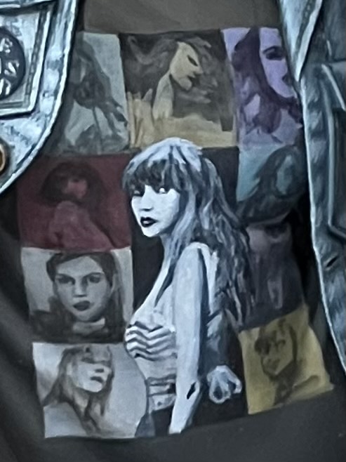
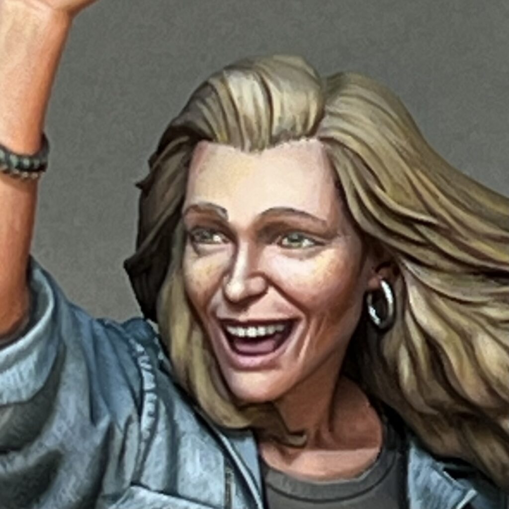
When I saw Masclans Miniatures new bust “The Joy,” I immediately wanted to paint it. It’s a great bust, full of positive emotion, and I thought it would be fun to do a contemporary subject rather than my usual fantasy fare. One of my first steps working on the mini was searching a reference for the t-shirt. I imagined this character at a concert or music festival of some kind, so I started by looking at shirts from all of my favorite bands. However, I couldn’t quite find one that grabbed me. Then, on a lark, I decided to search Taylor Swift. When I saw the official Eras Tour shirt design, I immediately thought that would be fun to paint. That’s how my version of “The Joy” became a Swiftie.
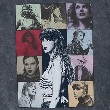
The shirt design translates well into miniature. I started by blocking in the colored grid, so I would know where to put each portrait. Most of the shirt was done in one evening, with the exception of the central Taylor. I left all of the side photos at the sketch stage, but I did spend a bit more time refining the main figure in order to get an acceptable reproduction of the original photo, as good as I could make it at this scale. Her face is only 6mm tall, far smaller than this photo, so I was limited by how well I could control paint at the sub-millimeter scale.
This figure has a ton of opportunities for freehand and textures. In addition to the t-shirt design, I had fun doing freehand and textures on the beer bottle, her pins, and the denim jacket. One of the cool things about Marc Masclans miniatures is he includes a tutorial video with each one, and I checked out the section where he talked about how he painted the denim. He shares a lot of useful ideas and reference photos, some of which I used in mine. I also did some things differently from Marc. He created his denim texture by stippling, while I mainly used cross-hatching for mine.
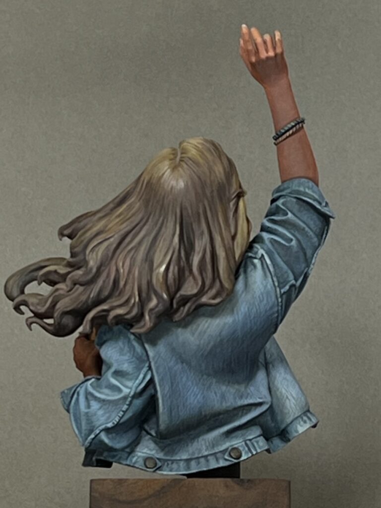
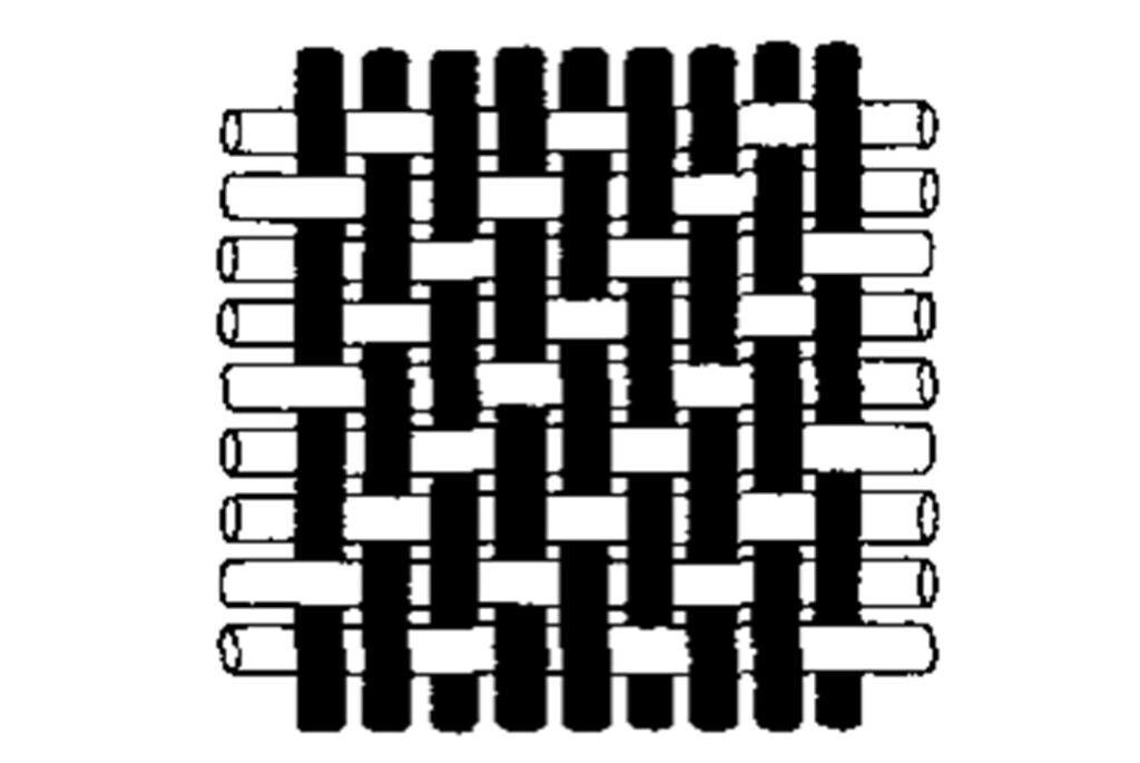
One thing that Marc didn’t mention in his video (or if he did, I missed it) is that denim is not a simple weave. Rather, it is a twill fabric. This means that even though the threads go vertically and horizontally through the weave, the vertical threads (the warp) are much more apparent than the horizontal threads (the weft), as they go over more often than they go under. Furthermore, the pattern of the weave creates the appearance of diagonal bands.
To get the right look for denim, rather than a simple vertical/horizontal cross-hatch, I did a vertical/diagonal cross-hatch, consistently following the directions of the vertical warp threads and the diagonal twill pattern.
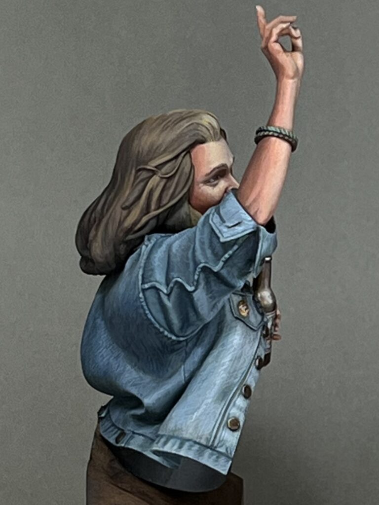
Another thing about denim is that along the overlaps of material along seams and edges, the fabric bunches in waves, and the waves collect more dye in the troughs and fade at the peaks. I used lighter and darker cross-hatching to replicate this effect.
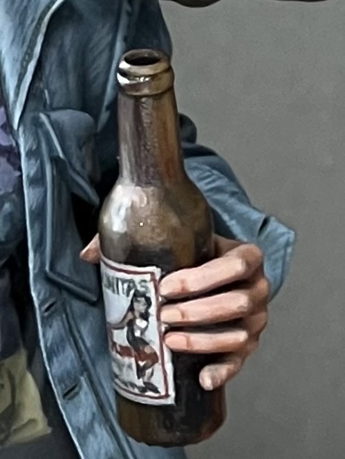
Another fun item was the beer bottle. I enjoyed painting both the brown glass effect and the label on the bottle. For the label, I copied a beer from Lagunitas, which is local to me here in the SF bay area. It has a cool label, I thought it struck a good balance between being too generic or too obscure, and I like the beer.
I feel the face came out well. I thought it would be fun to try to add a bit of age to the character with paint, and I think it works well for the piece. For me, it adds to the contemporary, realistic subject matter. It’s also fitting for the character, despite what some may think; Taylor Swift fans are all ages and genders.
I don’t consider myself a Swiftie, but I did end up listening to a lot of Taylor Swift while painting this bust, to be in the proper spirit. She’s a gifted musician. I don’t think I made my wife too sick of my listening habits, but she did give me plenty of shit about it. But she also pointed out there are only two types of people in the world: Taylor Swift fans and liars.

I entered this bust into the painting competition at Reapercon this year, and was delighted to win best in show. Reapercon is the largest competition where I’ve won that honor—there were over a thousand entries this year. To be chosen as best in a field that size is an achievement.
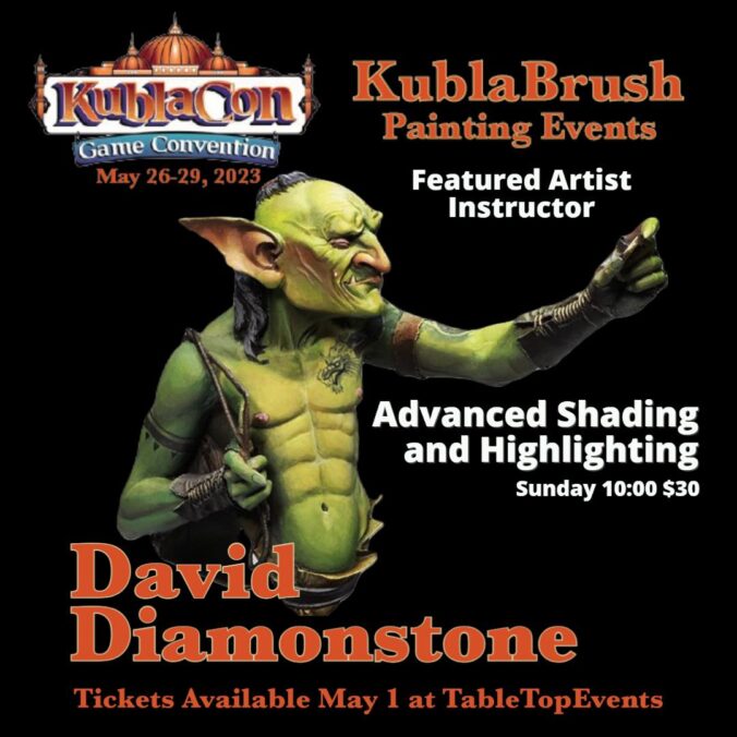
This year I’m planning to teach classes at KublaCon and Reapercon. I’m teaching Advanced Shading and Highlighting at Kubla: you can sign up here. Reapercon classes are not fully decided yet. I will likely be teaching my Advanced Shading and Highlighting again, as well as my OSL class. I’m also thinking about teaching a third class, and haven’t settled on a topic for it yet. If there’s something you’d like me to cover, please leave suggestions in the comments!
Class descriptions below the fold
Continue reading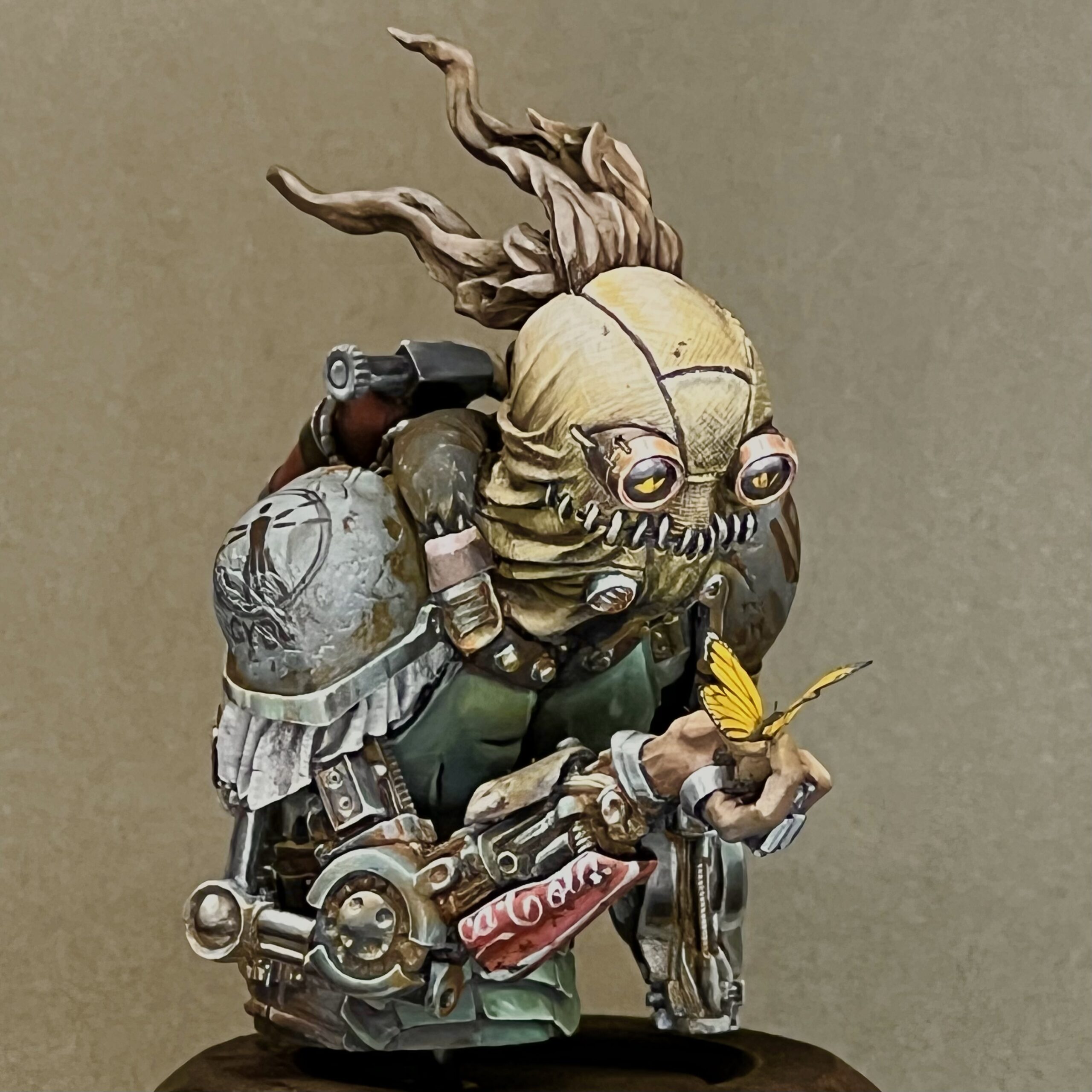
A couple years ago I decided to make a slight tweak to my Steamthing, IPIK-7 bust. He was originally sculpted holding a plant, and even though I replaced it with my own plant and added roots, I kept the sculptor’s original intent. More photos of my original version here.
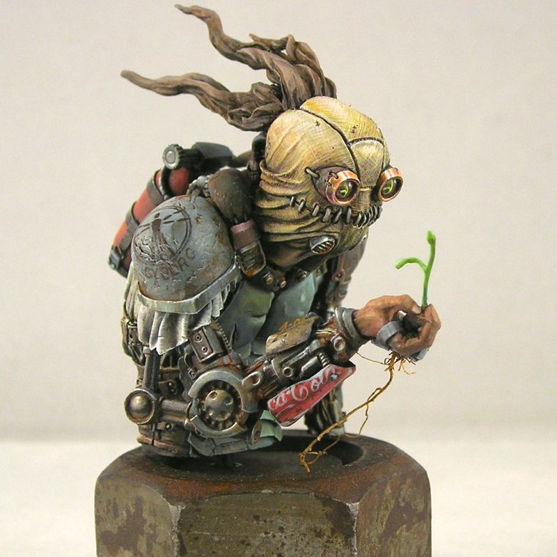
When a friend gave me some laser-cut vellum butterflies to play with, I thought it would be cool to replace the plant with a butterfly. I really like what this does to the figure. It keeps the strange juxtaposition of some kind of weird post-apocalyptic creature perplexed by encountering nature, but in a non-destructive way (instead of the original uprooted plant).
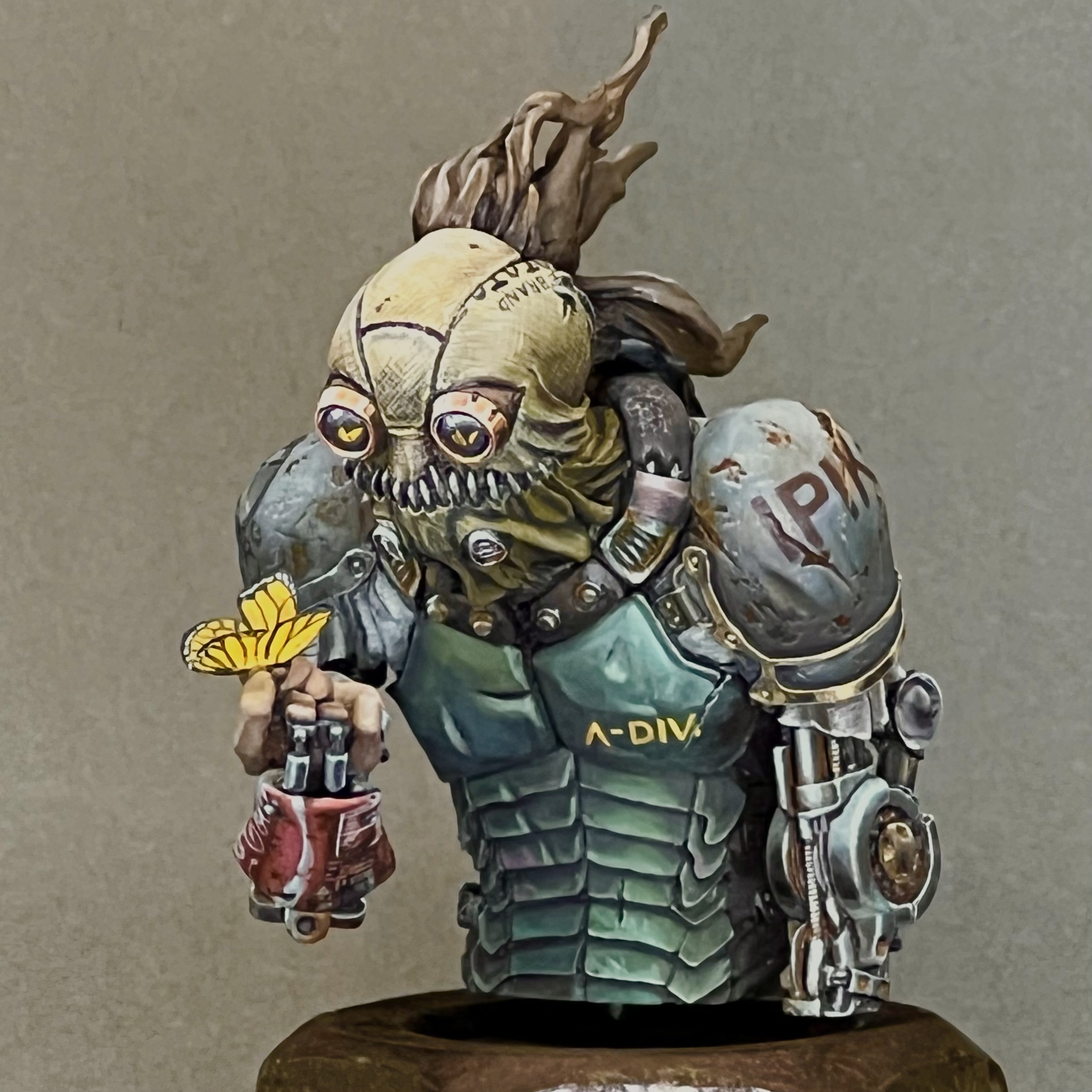
Also, by replacing a green element with a yellow one, I ended up with an overall color-composition I’m happier with. The color scheme becomes something like a primary triadic one, rather than the original which was a bit all-over-the-place. I sometimes like all-over-the-place color schemes (the mermaid I just posted is a good example), but I find that I have a hard time integrating green into such a color scheme, and I am overall much happier if I only use green in simpler color compositions.
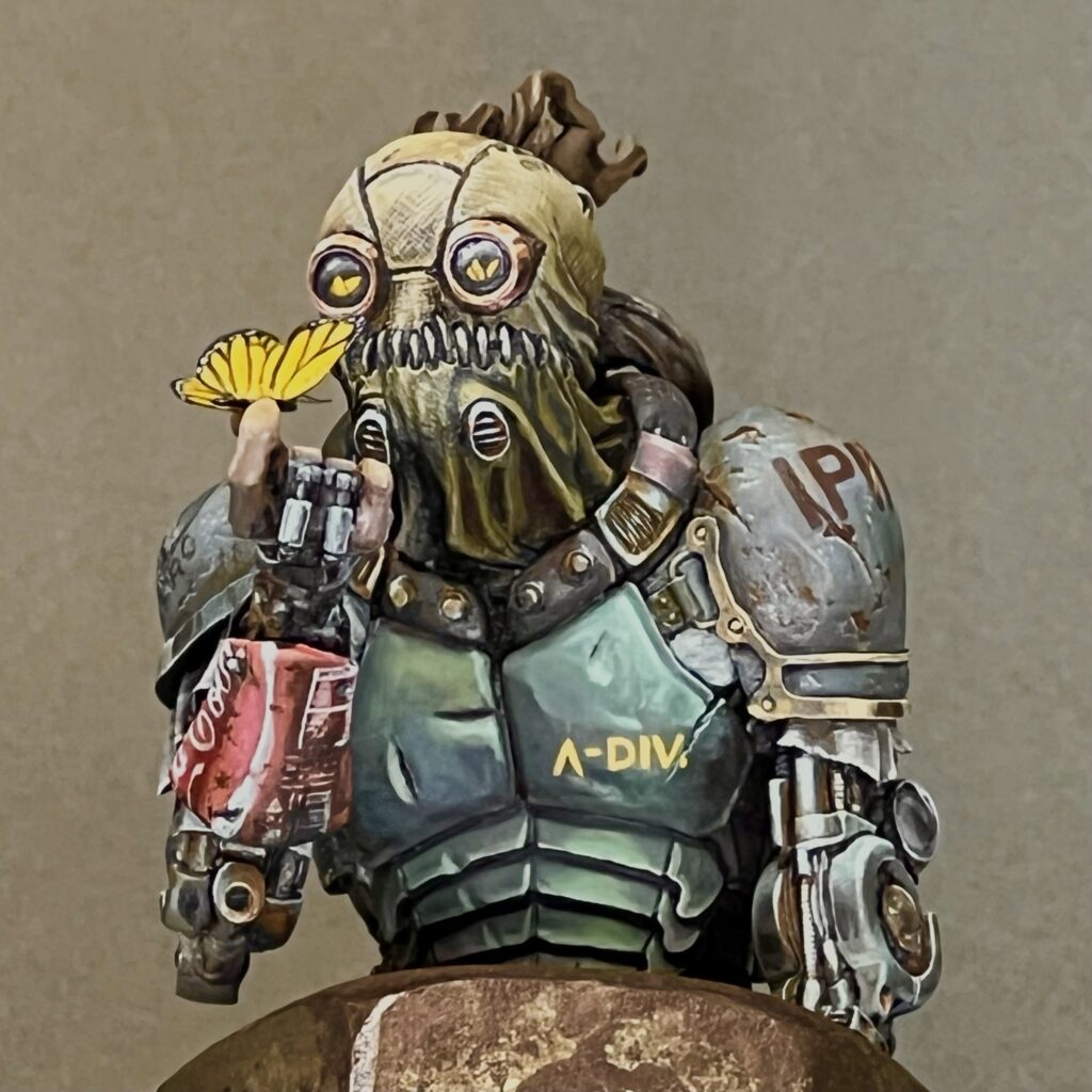
My favorite part of the paint job continues to be the coke can. I imagine Steamthing as a post-apocalyptic cyborg using found materials to replace components as they wear out, and I thought no object would represent that better than the iconic Coke can. I especially enjoyed including the regulatory labeling and only half the logo. If you’re curious, I shared a lot more thoughts about the painting in my original post on Steamthing.
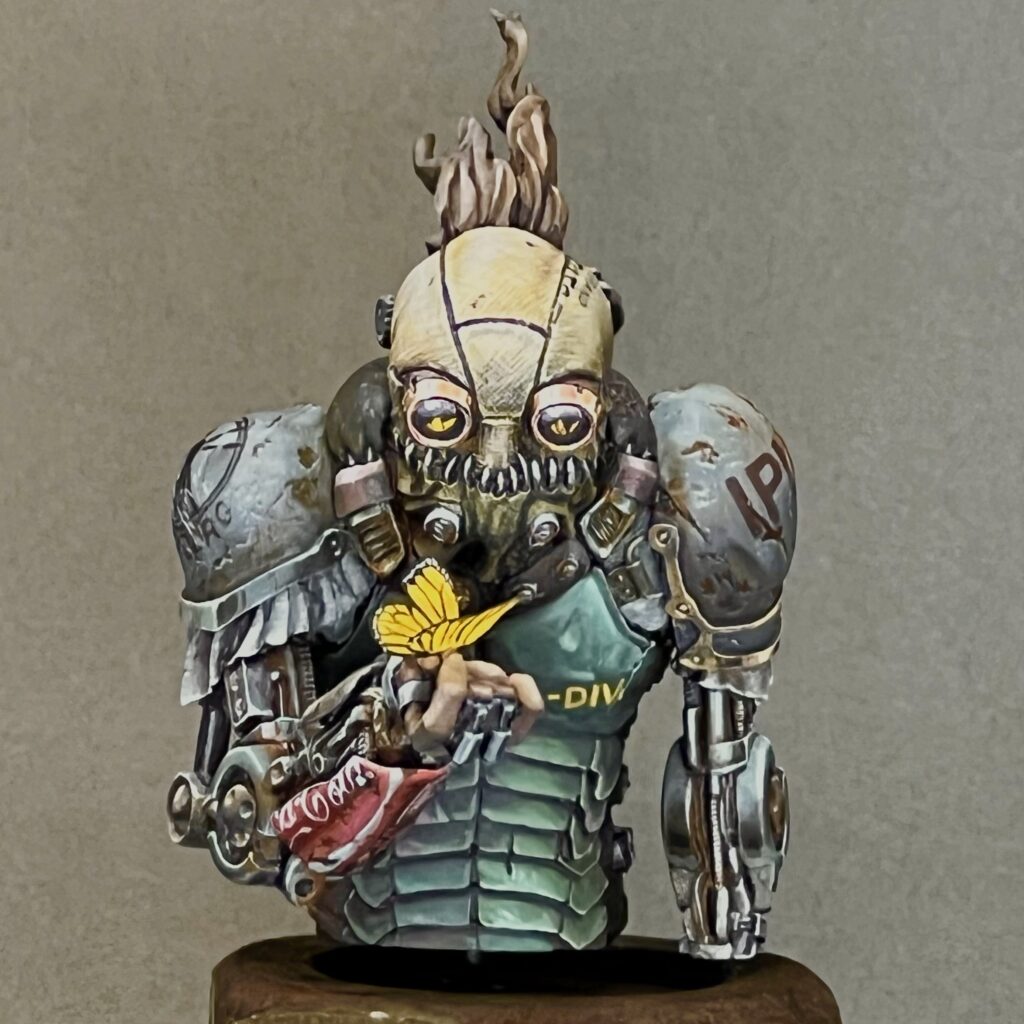
Also, some of the roots broke off while transporting him to and from conventions, so I had to do something. 😉😛
I’m not someone who believes in always priming black or always priming white. I usually have a vision for a model before I start painting it, and then prime using whatever technique I think will make it easiest to achieve that vision. Which is not to say that things always end up matching my initial vision, but at least that’s how they start.
Red oxide primer was an obvious choice for the mermaid’s giant rusty shipwreck, and I dusted white over it to start suggesting light and bringing out shapes. I primed the mermaid herself white, since I wanted her to be bright and colorful.
After putting all that effort into the water, I decided to start on the base first. I used a natural sponge to start putting in texture and adding different colors. I really like natural sponges, as they have a lot of interesting textures which are very different from the sponge-painting textures you would get using synthetic sponges or foam.
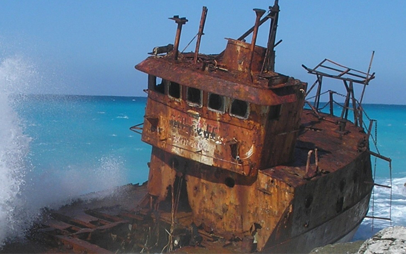
I looked at a lot of reference of shipwrecks to get an idea how to paint it realistically, and one thing they all had in common was a lot of different colors, from yellows to oranges to reds to browns, and even some purple and gray. I used this first to inform the colors of my sponge-painting, and then later when it came to start refining with a brush.
Once both pieces of shipwreck were fully sponge-painted and the highlighting and shading was started, I put them together and hid the join with greenstuff. Sponge-painting works best on flat surfaces, so I wanted to finish that step before attaching the pieces. But I also like to get things assembled as quickly as possible so I can refine all of the parts together and see the composition as a whole.
When I attached the shipwrecks to the base, I also added a few barnacles. Eventually I would decide a lot more barnacles were needed.
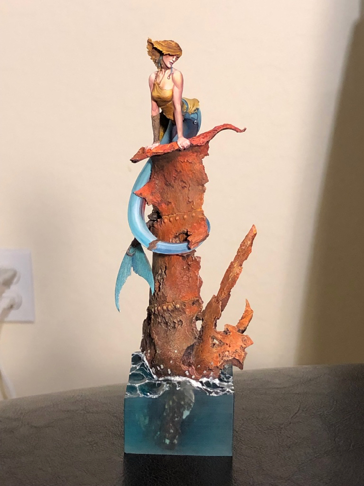
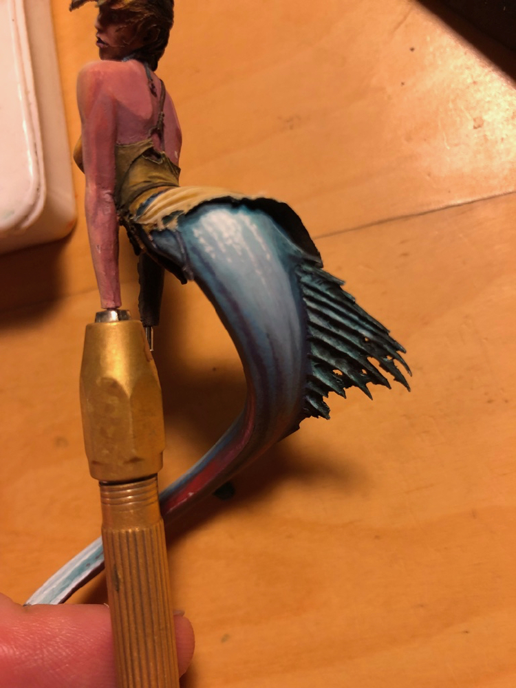
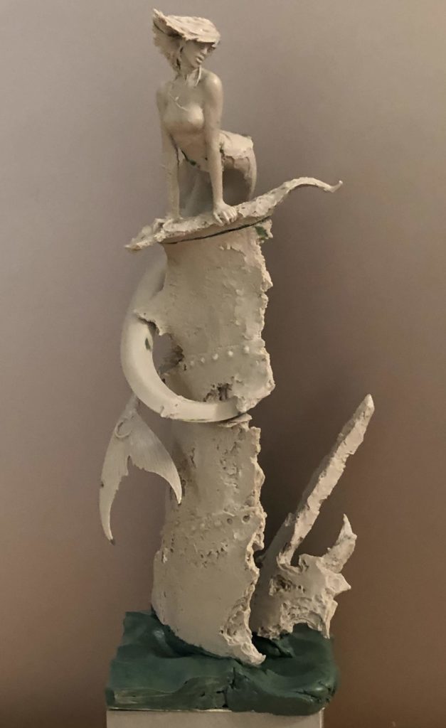
I prefer to start very sketchy, and refine gradually. Working this way I think helps a lot with composition and establishing overall contrast. Here (above) is the “initial sketch” – the first point where all of the primer is covered with paint, the model is fully assembled, and I can start to judge the composition and determine where I may need to make adjustments. In this photo, the mermaid is just pinned into the shipwreck, and her tail is two pieces just pinned together. I knew I wanted to do a lot more work on the tail especially, and would want easy access.
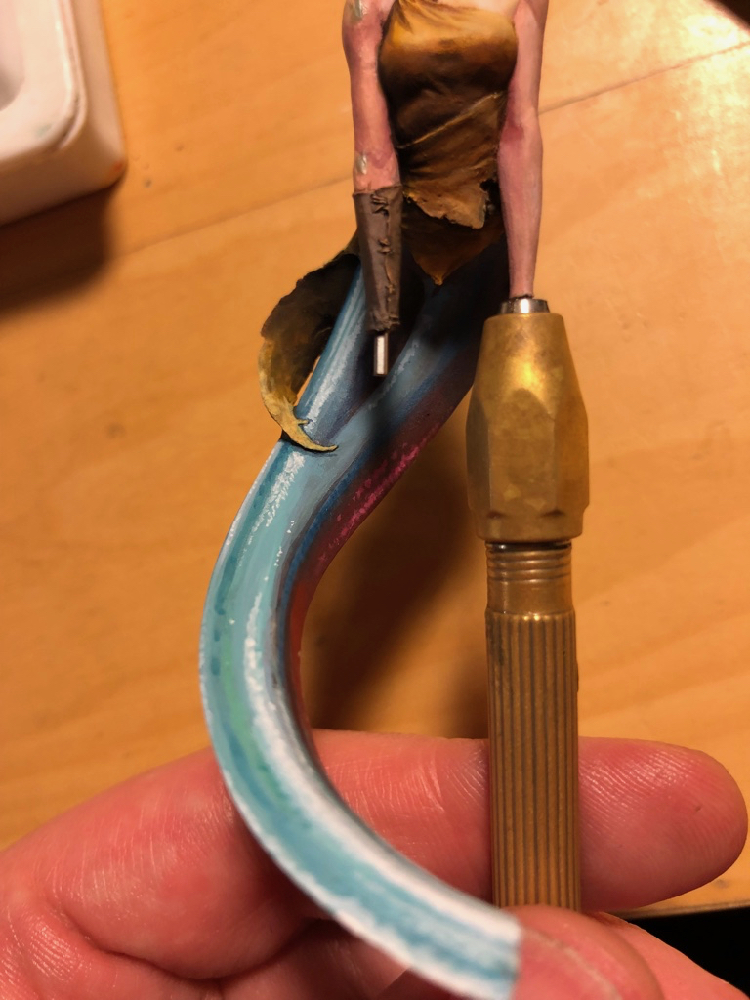
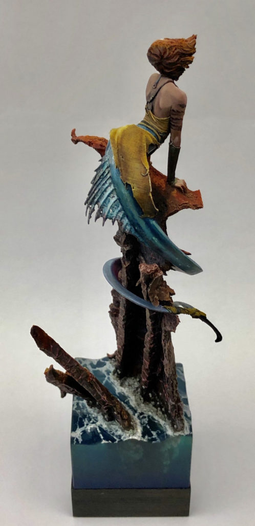
I wanted the tail to look very sparkly, with suggestions of iridescent scales, so I painted with lots of bright colors and small dots. I used magenta and red on the side that would be towards the rusty shipwreck, to suggest a reflection from the red rust.
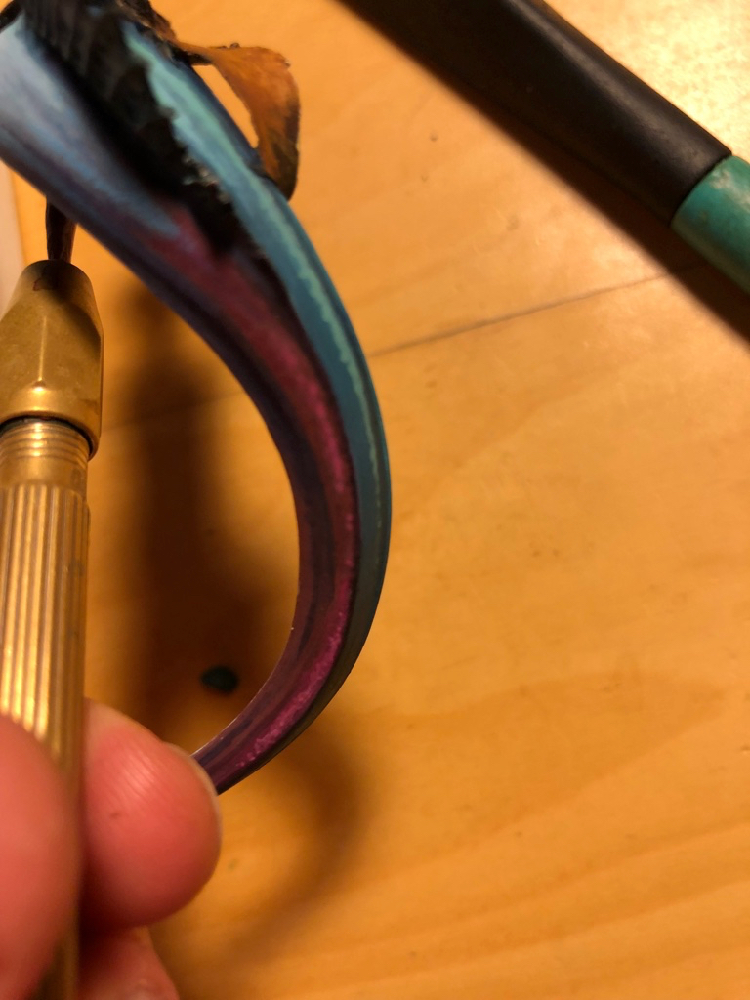
Here is another angle on the purple reflection. Initially, I planned to use non-metallic paints to suggest a shiny tail, but I was never 100% happy with this approach. In the end, I decided to do thin glazes of metallics over the nmm, which I was much happier with. I used the scalecolor metallics set for this, since it has lots of interesting colors, with a very fine, translucent flake, which worked well for this purpose. I also used some pearlescent inks from Daler Rowney, which worked well for a similar reason.
This stage is the last WIP photo I took. In fact, a ton more work went into the mermaid after this stage. But since I paint very organically, often there are not big obvious changes that happen after the initial sketch phase, just slow, gradual refinement, which makes it less obvious when to take photos.
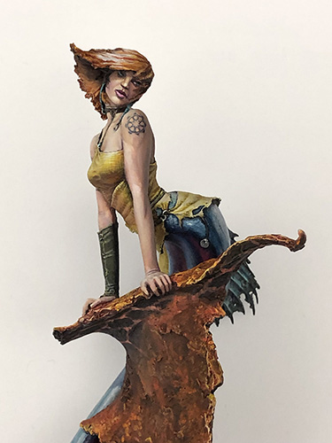
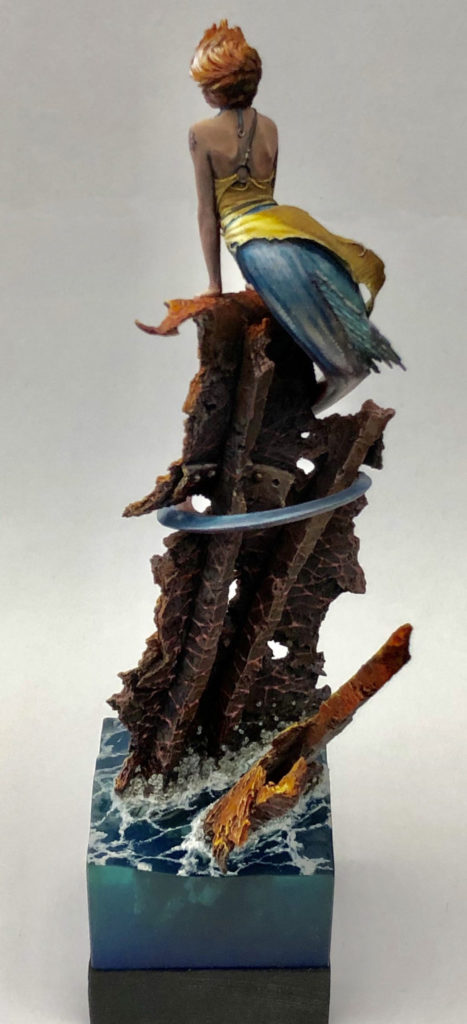
And here’s the finished figure! I took her to Crystal Brush 2019, where she did not make first cut (unlike my other figure). I solicited a number of critiques after this disappointment, and followed a number of suggestions as a result. The first change was the hair color. My initial idea, was to do sun-bleached hair, but it didn’t read that wall and generally looked bad. Instead, I made her a redhead, which worked a lot better on its own terms, and also helped to connect the color palette of the figure with the base.
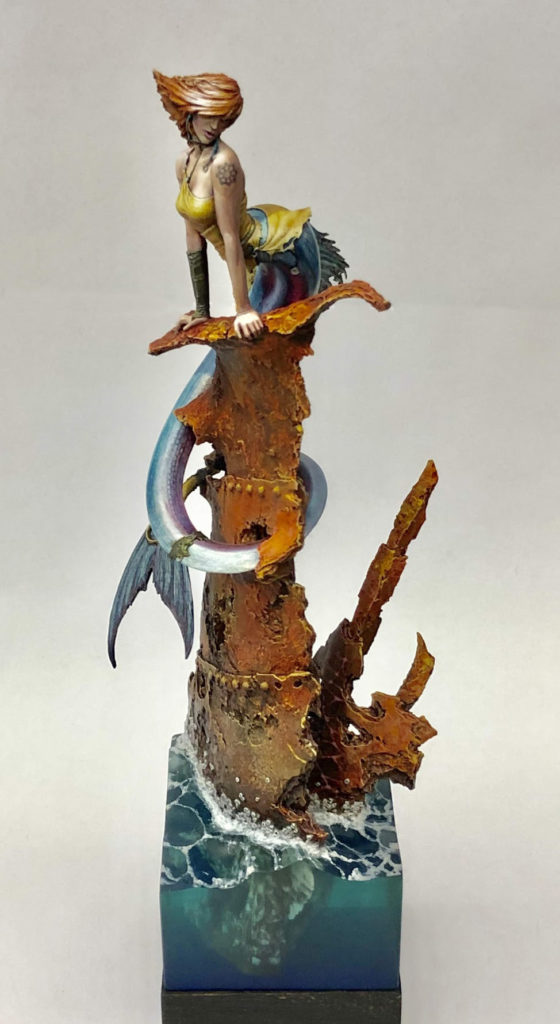
The second big change after Crystal Brush was using a blow-dryer to heat the entire shipwreck enough that I could twist it. Yes, this was as nerve-wracking as it sounds. But one piece of feedback I got was that the best viewing angle was not edge on, so I wanted to twist the figure enough to make the best viewing angle match with one of the flat sides.
Whenever you put a figure on a base or plinth with flat sides, you should always design the layout so that the best viewing angle is edge on, rather than facing one of the corners or some other angle. You want the viewer to look at the figure from the right angle, don’t you? Most folks’ natural habit is to look at figures from one of the flat sides. Don’t try to get people to deviate from this habit; instead, use it to your advantage.
I did plan in advance for the best viewing angle to be edge-on. I was just wrong about what the best viewing angle would be once she was painted. Hence the twist to compensate.
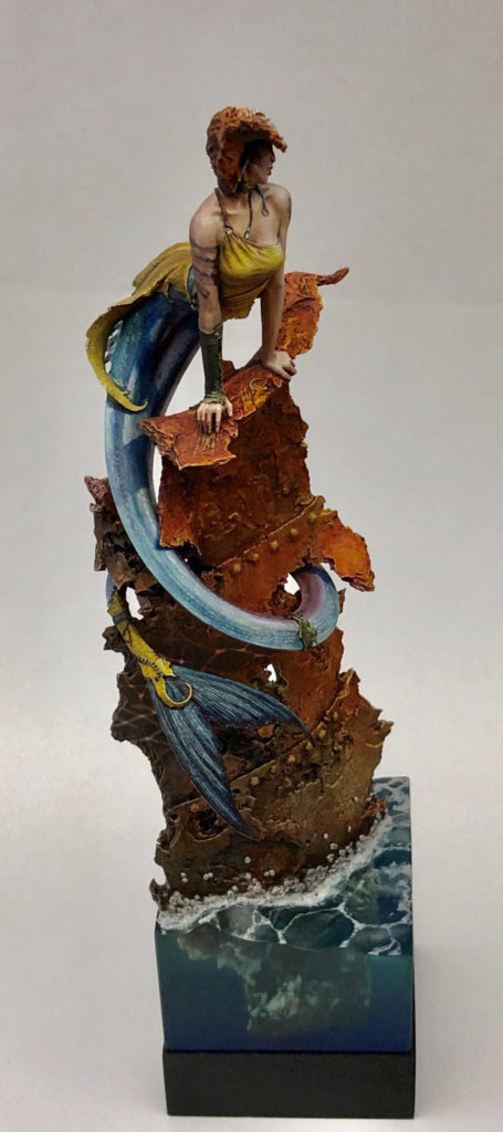
Another change I made after crystal brush was adding the caustic reflections. This was great fun to do, and IMO makes for a cool little detail.
I also painted caustic reflections in back. They don’t actually make physical sense, since the sun is at the wrong angle to bounce light in that direction. But they look cool, and add interest to what is otherwise a less interesting viewing angle. Rule of Cool trumps physics.
After the revisions, I entered her in another painting competition, Kublacon (my home turf). The Kublacon painting competition was especially competitive that year, with both Steve Garcia and Matt DiPietro visiting to teach classes, and also Anne entering her Crystal Brush entry, Sacrifice [NSFW]. I was very pleased to take Best of Show with such a stacked field.
So, I haven’t updated this blog since March 2020. Seems like a lot has happened since then… I thought with working from home and isolating, I would have nothing better to do than paint miniatures and update the blog. Instead, the opposite happened. I moved in with my then-girlfriend at the start of the pandemic, which sounds like a terrible idea, but actually went swimmingly, and now we’re married.
I’d say I’m going to update the blog more (and mean it this time), but the sad thing is I probably won’t. Looking back, I was great about updating the blog when I had a 1+ hour commute where I could work on it, and not so great once I moved close to work and didn’t have that commute time any more. Still, a 3 year gap is kind of egregious, so I’ll try to keep the update schedule to at least a few a year. Starting with part 2 of the mermaid article, which I’ve finally finished and will post right away! After that, I have an nmm tutorial in progress which I need to finish at some point, and two years worth of Golden Demon entries to talk about. So stay tuned!
If you want quick hits between blog posts, follow me on insta.
I’ve wanted to paint the Origen Art Siren for ages, but getting my hands on the figure itself proved a challenge. How I hate limited edition figures!
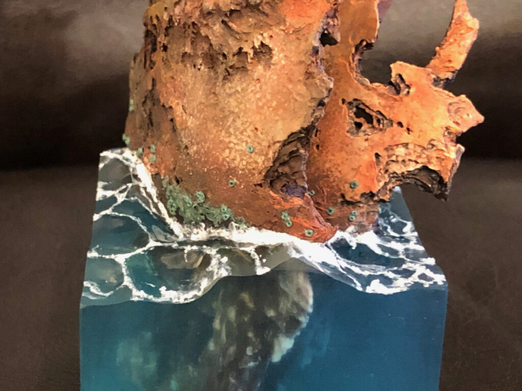
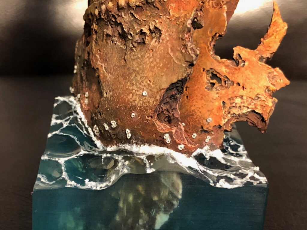
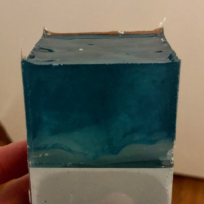
One of my goals with this figure was to achieve a really realistic water effect on the base. Since I’d never done anything like this before, I knew this would involve a fair bit of trial-and-error. I looked for water tutorials online, and while I found several on YouTube and elsewhere, none had quite the look I was going for. To get the result I wanted, I felt that two things would be critical: the transparency, and the shape of the waves. All of the tutorials I found failed on one account or the other. Some had you sculpting waves out of an opaque material and varnishing them, which lets you get the shape right but not the transparency. Others involved sculpting with layers of thick gloss gel over the flat surface of a resin pour, which gives the right transparency but not a realistic shape.
Instead, I chose to follow an approach which was not in any of the online tutorials I found, but which must be something like the way Robert Blaha did the water for Frutti di Mare. My approach was to first sculpt the waves out of Kneadatite putty, use that sculpt as a master to make a mold, and finally make a cast using clear resin. Since I was using a technique that was totally new to me, and working without a tutorial, I knew it would take a few tries to get the effect I wanted.
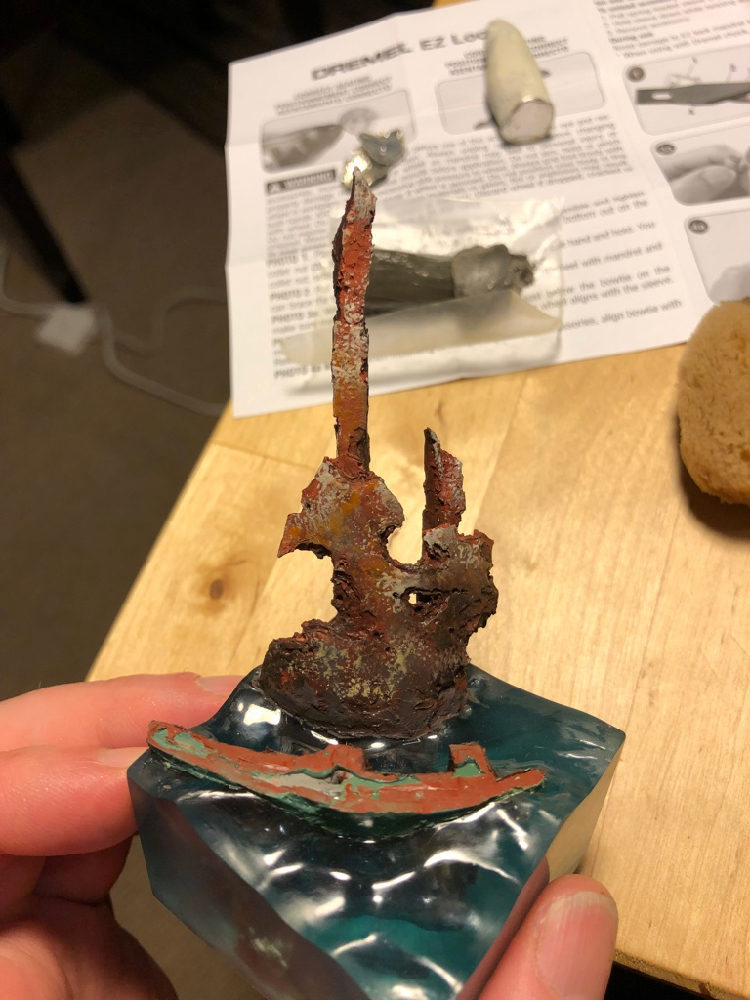
The sculpt of the wave forms was fairly simple. I made sure to look at examples, keep it from being too regular or symmetric, and sculpt more than I needed in each direction so I could cut it down to the size I wanted. In addition to sculpting the water’s surface, I also sculpted a bit of the rusted iron shipwreck to mate with the pieces that came with the figure. I decided against casting those figures into the block, since I wasn’t expecting to get things right with the first attempt.
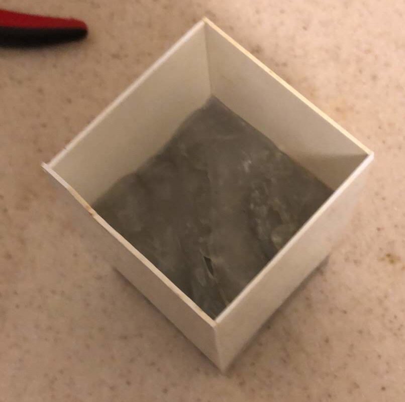
To cast the water, I took the easy way by using instant mold. Instant mold is great for ease of use, but doesn’t produce a very accurate cast, and doesn’t work at all if you need more than a one-sided mold. For the water, neither of those drawbacks mattered. I used plastic card for the sides of the water, cut to rectangles of the right width to slightly overlap each other, and forced the instant mold down as hard as I could to fill all the recesses, using a second resin cube as a plunger.
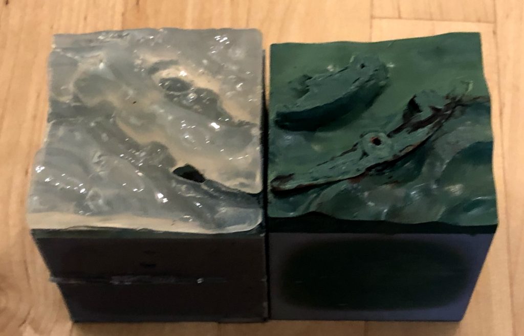
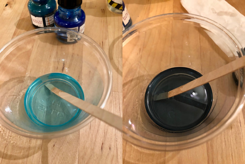
In the end, it took me three attempts to get the water looking right. In all three casts, to get some color variation in the final result, I mixed up resin in two separate cups, colored them differently, and mixed them together in the mold. In the first attempt, for the darker resin, I used a mixture of process cyan and payne’s gray inks from Daler Rowney, and for the lighter I used a mixture of process cyan and dark green inks, with a drop of white acrylic paint.
This one had three issues: it was too dark, it was too thin, and it had flecks from the white paint I used. For my second attempt, I tried oil paints instead of acrylics in the hopes that resin would mix better with an oil-based material than a water-based one, but actually it was even worse.
So for the third attempt, I left out the white entirely, skipped the payne’s gray, and just went really easy on the inks to maintain a lot of the transparency of the plain resin. This proved to be the right approach, and I was very happy with the third pour.
My one challenge at this point was how to manufacture the submerged part of the shipwreck. The obvious way to do it would be to sculpt and paint it ahead of time, and do a fourth the resin pour around it, now that I had figured out how to get the resin pour to work correctly. But I figured, I have a successful resin pour, so I might as well use it if I can. So I decided I would try to hollow out the right shape with a dremel tool, and fall back on the other approach if that didn’t work.
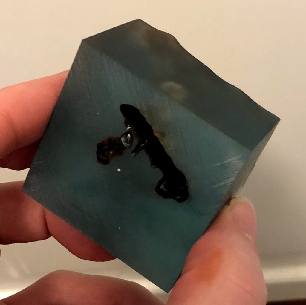
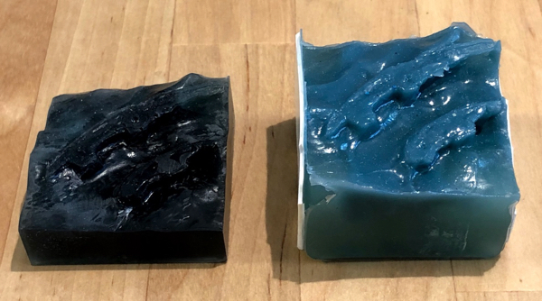
In the end, the dremel approach worked quite well. I tried to make the shape really random and disguise the shape of the tool I used, and it mostly worked. Once the shape was hollowed out, I shoved a bunch of different rust-colored paints inside the hollowed-out volume, using lots and lots of paint and a large crappy brush I was not afraid to abuse. Then, to give a solid anchor for the rest of the shipwreck, I filled in the hole (using a kneadatite brown in case any of it showed through the resin), before mounting the rest of the shipwreck above the water using a nice thick brass rod pin. Finally I hid the join and matched the surface texture of the shipwreck with putty.
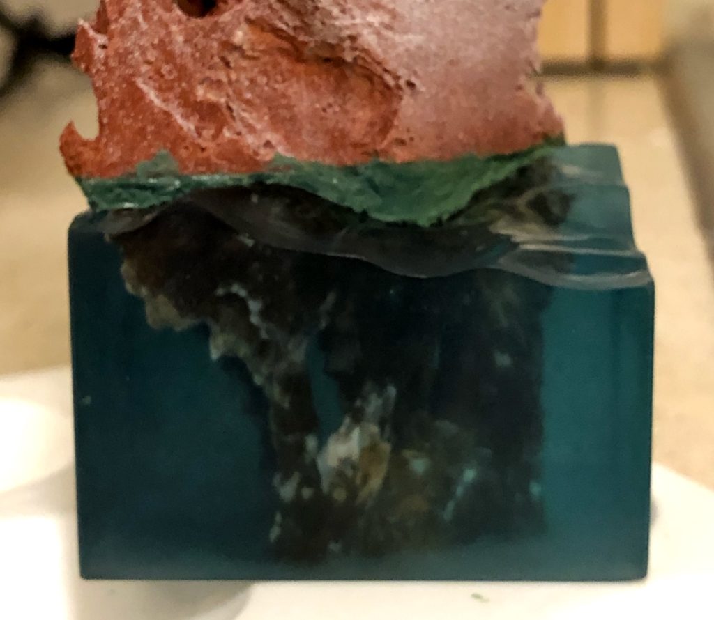
To prevent one of the disasters of the second pour, where I couldn’t even get the water free of the plastic card mold sides, I used clear shipping tape to cover the plastic of the mold. This worked well to make the walls of the mold release the resin, but the packing tape wasn’t quite flat and it showed in the cast. I wanted the resin sides to be perfectly smooth, so I had to sand them down to remove the imperfections. I then used finer and finer grits of sandpaper, down to 2000 grit, followed by polishing compound to get the sides as smooth and shiny as possible. I couldn’t completely remove all of the sanding lines, so I made sure to do my final round of sanding (with the 2000 grit sandpaper) against a metal ruler to keep all of the lines horizontal.
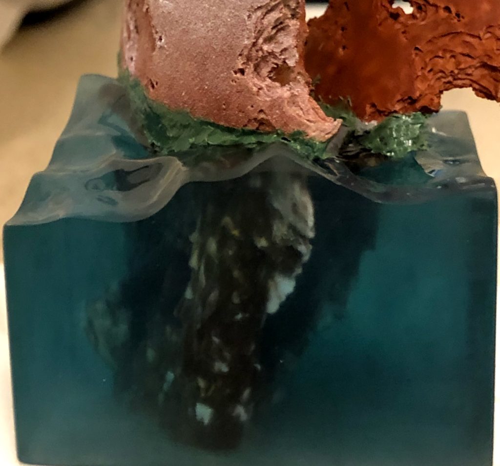
The final step to complete the look of the water was to finish the surface. For this, I used a mixture of white paint, gloss gel medium, and snow effects, painted onto the water’s surface to match reference photos I found online. This was a relatively quick and easy step compared to the rest.
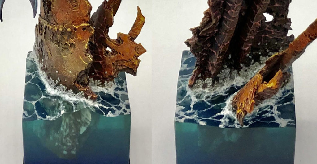
I’m really happy with the effect I was able to get through this approach. Eventually I may write a tutorial with a more step-by-step explanation, but sometimes it’s more interesting to read about the process of figuring things out.
Wow, it’s been almost a year since I updated the blog! I’m really sorry about that, but between moving and my social life for the last year, I haven’t had as much time to blog as I would like. At least it’s been for good reasons. But since I’m #socialdistancing and staying home this weekend, it seemed like a good time for an update.
I haven’t been completely unproductive. I have been working hard on a two-part article on a mermaid piece I finished last year, which won best in show at KublaCon 2019. The first part focuses on the water, which came out really well, and I hope readers will find it interesting and potentially useful. Expect to see that within the next week.
In the meantime, I thought I would share a quick little primaris marine I painted.
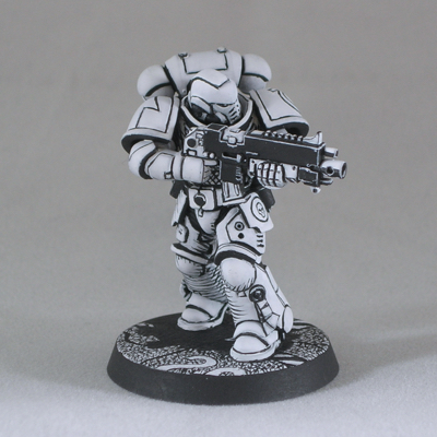
The inspiration was the “three-color rule” that some tournaments use to judge when an army is “fully painted”. Some people seem to regard this as a challenge, rules-lawyering a legally “fully painted” army with the minimum amount of effort.
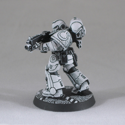
I decided to tackle the reverse challenge: how can I get a good looking result with only two colors, so it’s still not legally “fully painted”. I used only two colors, black and white, with no blending, and I even tried to apply the paint as opaquely as possible so there’s not even the slight blending effect you get when translucent layers overlap.
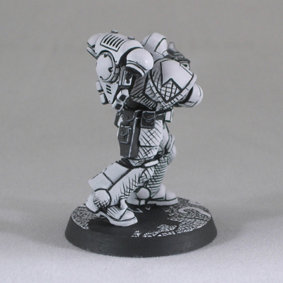
I think it’s interesting what sorts of effects you can get with miniatures when you decide to depart from the usual style. The model looks really interesting in person, almost like a three-dimensional pen-and-ink sketch. I had planned to incorporate this marine into a joke diorama to enter into the US Golden Demon at Adepticon, but alas that is not to be. I’ll just have to satisfy myself with sharing him online instead.
Recent Comments