I’m not someone who believes in always priming black or always priming white. I usually have a vision for a model before I start painting it, and then prime using whatever technique I think will make it easiest to achieve that vision. Which is not to say that things always end up matching my initial vision, but at least that’s how they start.
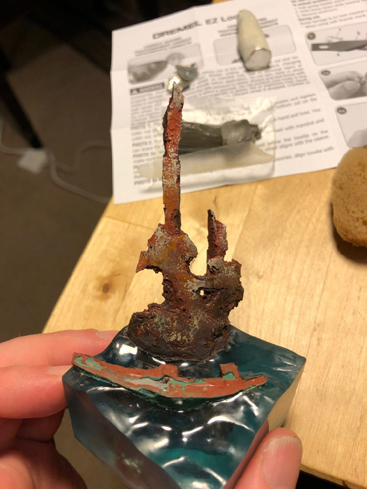
Red oxide primer was an obvious choice for the mermaid’s giant rusty shipwreck, and I dusted white over it to start suggesting light and bringing out shapes. I primed the mermaid herself white, since I wanted her to be bright and colorful.
After putting all that effort into the water, I decided to start on the base first. I used a natural sponge to start putting in texture and adding different colors. I really like natural sponges, as they have a lot of interesting textures which are very different from the sponge-painting textures you would get using synthetic sponges or foam.
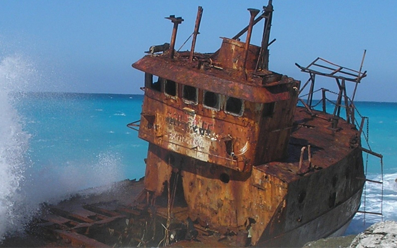
I looked at a lot of reference of shipwrecks to get an idea how to paint it realistically, and one thing they all had in common was a lot of different colors, from yellows to oranges to reds to browns, and even some purple and gray. I used this first to inform the colors of my sponge-painting, and then later when it came to start refining with a brush.
Once both pieces of shipwreck were fully sponge-painted and the highlighting and shading was started, I put them together and hid the join with greenstuff. Sponge-painting works best on flat surfaces, so I wanted to finish that step before attaching the pieces. But I also like to get things assembled as quickly as possible so I can refine all of the parts together and see the composition as a whole.
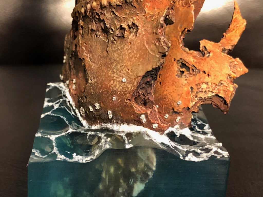
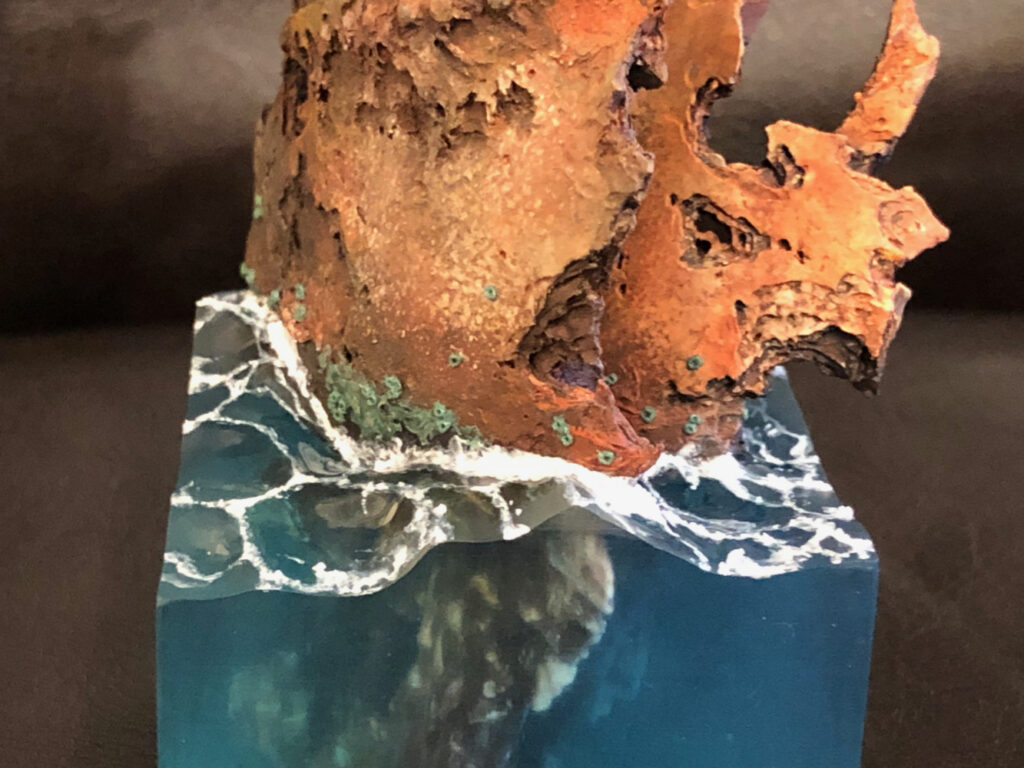
When I attached the shipwrecks to the base, I also added a few barnacles. Eventually I would decide a lot more barnacles were needed.
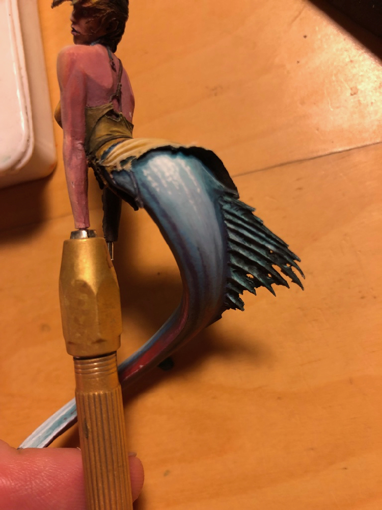
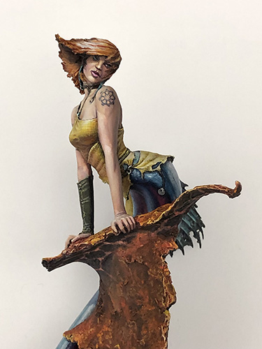
I prefer to start very sketchy, and refine gradually. Working this way I think helps a lot with composition and establishing overall contrast. Here (above) is the “initial sketch” – the first point where all of the primer is covered with paint, the model is fully assembled, and I can start to judge the composition and determine where I may need to make adjustments. In this photo, the mermaid is just pinned into the shipwreck, and her tail is two pieces just pinned together. I knew I wanted to do a lot more work on the tail especially, and would want easy access.
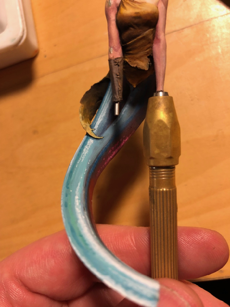
I wanted the tail to look very sparkly, with suggestions of iridescent scales, so I painted with lots of bright colors and small dots. I used magenta and red on the side that would be towards the rusty shipwreck, to suggest a reflection from the red rust.
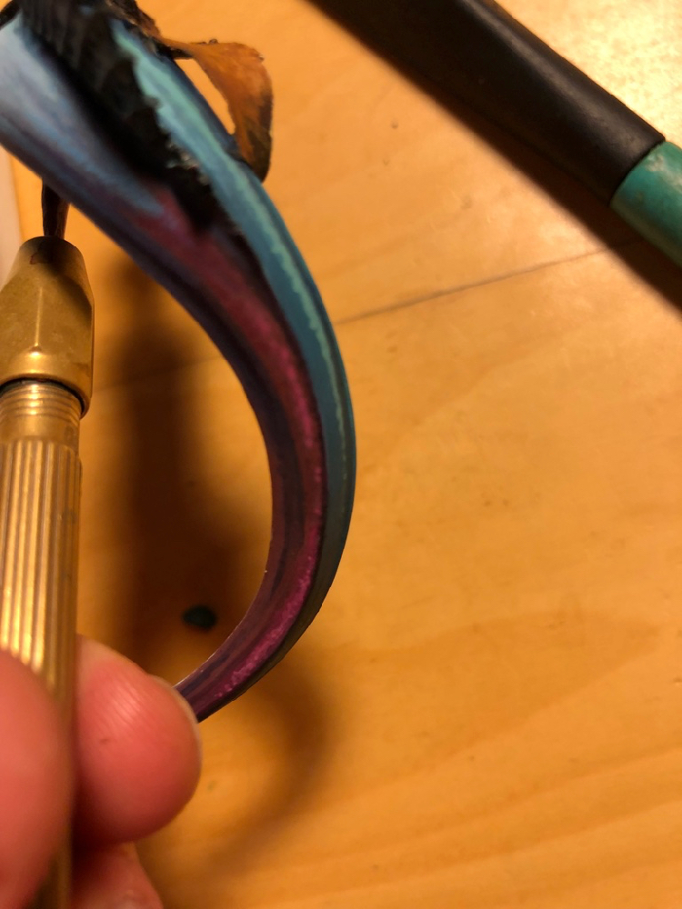
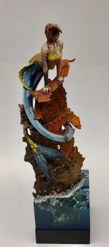
Here is another angle on the purple reflection. Initially, I planned to use non-metallic paints to suggest a shiny tail, but I was never 100% happy with this approach. In the end, I decided to do thin glazes of metallics over the nmm, which I was much happier with. I used the scalecolor metallics set for this, since it has lots of interesting colors, with a very fine, translucent flake, which worked well for this purpose. I also used some pearlescent inks from Daler Rowney, which worked well for a similar reason.
This stage is the last WIP photo I took. In fact, a ton more work went into the mermaid after this stage. But since I paint very organically, often there are not big obvious changes that happen after the initial sketch phase, just slow, gradual refinement, which makes it less obvious when to take photos.
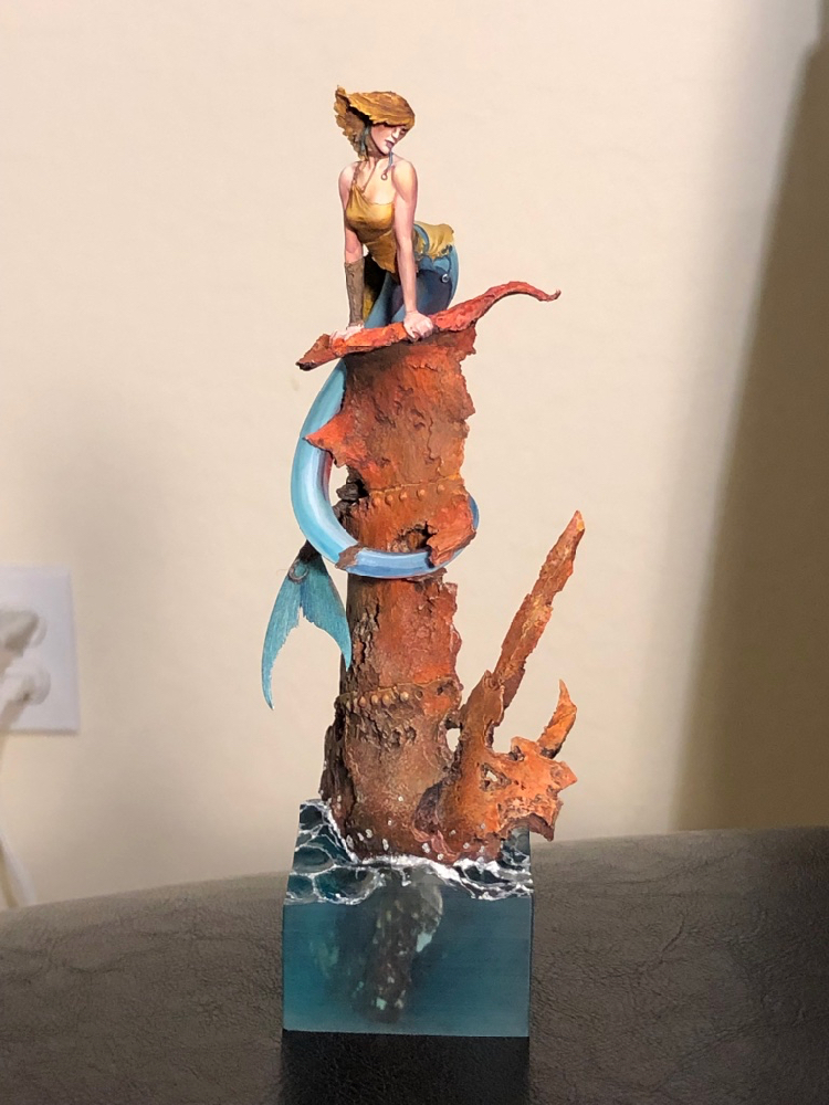
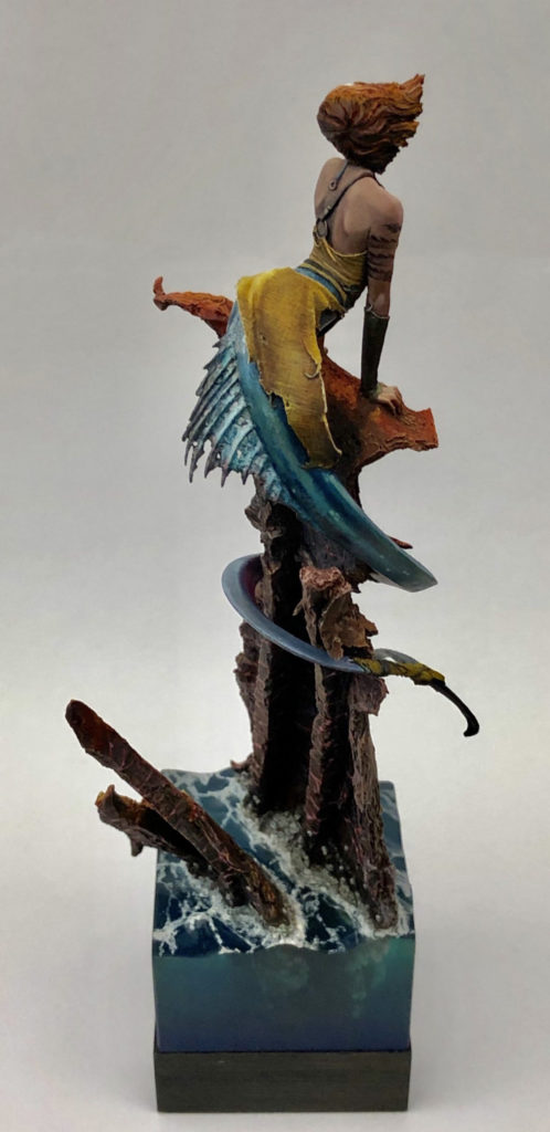
And here’s the finished figure! I took her to Crystal Brush 2019, where she did not make first cut (unlike my other figure). I solicited a number of critiques after this disappointment, and followed a number of suggestions as a result. The first change was the hair color. My initial idea, was to do sun-bleached hair, but it didn’t read that wall and generally looked bad. Instead, I made her a redhead, which worked a lot better on its own terms, and also helped to connect the color palette of the figure with the base.
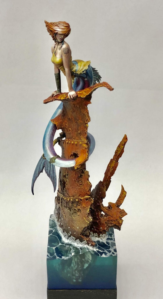
The second big change after Crystal Brush was using a blow-dryer to heat the entire shipwreck enough that I could twist it. Yes, this was as nerve-wracking as it sounds. But one piece of feedback I got was that the best viewing angle was not edge on, so I wanted to twist the figure enough to make the best viewing angle match with one of the flat sides.
Whenever you put a figure on a base or plinth with flat sides, you should always design the layout so that the best viewing angle is edge on, rather than facing one of the corners or some other angle. You want the viewer to look at the figure from the right angle, don’t you? Most folks’ natural habit is to look at figures from one of the flat sides. Don’t try to get people to deviate from this habit; instead, use it to your advantage.
I did plan in advance for the best viewing angle to be edge-on. I was just wrong about what the best viewing angle would be once she was painted. Hence the twist to compensate.
Another change I made after crystal brush was adding the caustic reflections. This was great fun to do, and IMO makes for a cool little detail.
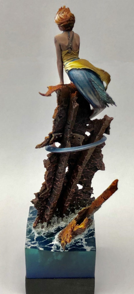
I also painted caustic reflections in back. They don’t actually make physical sense, since the sun is at the wrong angle to bounce light in that direction. But they look cool, and add interest to what is otherwise a less interesting viewing angle. Rule of Cool trumps physics.
After the revisions, I entered her in another painting competition, Kublacon (my home turf). The Kublacon painting competition was especially competitive that year, with both Steve Garcia and Matt DiPietro visiting to teach classes, and also Anne entering her Crystal Brush entry, Sacrifice [NSFW]. I was very pleased to take Best of Show with such a stacked field.
Leave a Reply