Never be afraid to paint outside the lines

Category: Showcase (Page 1 of 3)

Swiftie

When I saw Masclans Miniatures new bust “The Joy,” I immediately wanted to paint it. It’s a great bust, full of positive emotion, and I thought it would be fun to do a contemporary subject rather than my usual fantasy fare. One of my first steps working on the mini was searching a reference for the t-shirt. I imagined this character at a concert or music festival of some kind, so I started by looking at shirts from all of my favorite bands. However, I couldn’t quite find one that grabbed me. Then, on a lark, I decided to search Taylor Swift. When I saw the official Eras Tour shirt design, I immediately thought that would be fun to paint. That’s how my version of “The Joy” became a Swiftie.

The shirt design translates well into miniature. I started by blocking in the colored grid, so I would know where to put each portrait. Most of the shirt was done in one evening, with the exception of the central Taylor. I left all of the side photos at the sketch stage, but I did spend a bit more time refining the main figure in order to get an acceptable reproduction of the original photo, as good as I could make it at this scale. Her face is only 6mm tall, far smaller than this photo, so I was limited by how well I could control paint at the sub-millimeter scale.

This figure has a ton of opportunities for freehand and textures. In addition to the t-shirt design, I had fun doing freehand and textures on the beer bottle, her pins, and the denim jacket. One of the cool things about Marc Masclans miniatures is he includes a tutorial video with each one, and I checked out the section where he talked about how he painted the denim. He shares a lot of useful ideas and reference photos, some of which I used in mine. I also did some things differently from Marc. He created his denim texture by stippling, while I mainly used cross-hatching for mine.

One thing that Marc didn’t mention in his video (or if he did, I missed it) is that denim is not a simple weave. Rather, it is a twill fabric. This means that even though the threads go vertically and horizontally through the weave, the vertical threads (the warp) are much more apparent than the horizontal threads (the weft), as they go over more often than they go under. Furthermore, the pattern of the weave creates the appearance of diagonal bands.

In a 2-1 twill weave, threads alternate over 2 and under 1. Denim is typically 2-1 or 3-1 twill.

To get the right look for denim, rather than a simple vertical/horizontal cross-hatch, I did a vertical/diagonal cross-hatch, consistently following the directions of the vertical warp threads and the diagonal twill pattern.

Another thing about denim is that along the overlaps of material along seams and edges, the fabric bunches in waves, and the waves collect more dye in the troughs and fade at the peaks. I used lighter and darker cross-hatching to replicate this effect.

Another fun item was the beer bottle. I enjoyed painting both the brown glass effect and the label on the bottle. For the label, I copied a beer from Lagunitas, which is local to me here in the SF bay area. It has a cool label, I thought it struck a good balance between being too generic or too obscure, and I like the beer.

I feel the face came out well. I thought it would be fun to try to add a bit of age to the character with paint, and I think it works well for the piece. For me, it adds to the contemporary, realistic subject matter. It’s also fitting for the character, despite what some may think; Taylor Swift fans are all ages and genders.

I don’t consider myself a Swiftie, but I did end up listening to a lot of Taylor Swift while painting this bust, to be in the proper spirit. She’s a gifted musician. I don’t think I made my wife too sick of my listening habits, but she did give me plenty of shit about it. But she also pointed out there are only two types of people in the world: Taylor Swift fans and liars.

I entered this bust into the painting competition at Reapercon this year, and was delighted to win best in show. Reapercon is the largest competition where I’ve won that honor—there were over a thousand entries this year. To be chosen as best in a field that size is an achievement.

Steamthing, revisited

A couple years ago I decided to make a slight tweak to my Steamthing, IPIK-7 bust. He was originally sculpted holding a plant, and even though I replaced it with my own plant and added roots, I kept the sculptor’s original intent. More photos of my original version here.

When a friend gave me some laser-cut vellum butterflies to play with, I thought it would be cool to replace the plant with a butterfly. I really like what this does to the figure. It keeps the strange juxtaposition of some kind of weird post-apocalyptic creature perplexed by encountering nature, but in a non-destructive way (instead of the original uprooted plant).

IPIK-7 had never seen such beauty

Also, by replacing a green element with a yellow one, I ended up with an overall color-composition I’m happier with. The color scheme becomes something like a primary triadic one, rather than the original which was a bit all-over-the-place. I sometimes like all-over-the-place color schemes (the mermaid I just posted is a good example), but I find that I have a hard time integrating green into such a color scheme, and I am overall much happier if I only use green in simpler color compositions.

IPIK-7 is puzzled by the flapping wings

My favorite part of the paint job continues to be the coke can. I imagine Steamthing as a post-apocalyptic cyborg using found materials to replace components as they wear out, and I thought no object would represent that better than the iconic Coke can. I especially enjoyed including the regulatory labeling and only half the logo. If you’re curious, I shared a lot more thoughts about the painting in my original post on Steamthing.

IPIK-7 is entranced by the yellow

Also, some of the roots broke off while transporting him to and from conventions, so I had to do something. 😉😛

Mermaid – Part 2 – Painting

I’m not someone who believes in always priming black or always priming white. I usually have a vision for a model before I start painting it, and then prime using whatever technique I think will make it easiest to achieve that vision. Which is not to say that things always end up matching my initial vision, but at least that’s how they start.

Red oxide primer was an obvious choice for the mermaid’s giant rusty shipwreck, and I dusted white over it to start suggesting light and bringing out shapes. I primed the mermaid herself white, since I wanted her to be bright and colorful.

After putting all that effort into the water, I decided to start on the base first. I used a natural sponge to start putting in texture and adding different colors. I really like natural sponges, as they have a lot of interesting textures which are very different from the sponge-painting textures you would get using synthetic sponges or foam.

I looked at a lot of reference of shipwrecks to get an idea how to paint it realistically, and one thing they all had in common was a lot of different colors, from yellows to oranges to reds to browns, and even some purple and gray. I used this first to inform the colors of my sponge-painting, and then later when it came to start refining with a brush.

Once both pieces of shipwreck were fully sponge-painted and the highlighting and shading was started, I put them together and hid the join with greenstuff. Sponge-painting works best on flat surfaces, so I wanted to finish that step before attaching the pieces. But I also like to get things assembled as quickly as possible so I can refine all of the parts together and see the composition as a whole.

When I attached the shipwrecks to the base, I also added a few barnacles. Eventually I would decide a lot more barnacles were needed.

I prefer to start very sketchy, and refine gradually. Working this way I think helps a lot with composition and establishing overall contrast. Here (above) is the “initial sketch” – the first point where all of the primer is covered with paint, the model is fully assembled, and I can start to judge the composition and determine where I may need to make adjustments. In this photo, the mermaid is just pinned into the shipwreck, and her tail is two pieces just pinned together. I knew I wanted to do a lot more work on the tail especially, and would want easy access.

I wanted the tail to look very sparkly, with suggestions of iridescent scales, so I painted with lots of bright colors and small dots. I used magenta and red on the side that would be towards the rusty shipwreck, to suggest a reflection from the red rust.

Here is another angle on the purple reflection. Initially, I planned to use non-metallic paints to suggest a shiny tail, but I was never 100% happy with this approach. In the end, I decided to do thin glazes of metallics over the nmm, which I was much happier with. I used the scalecolor metallics set for this, since it has lots of interesting colors, with a very fine, translucent flake, which worked well for this purpose. I also used some pearlescent inks from Daler Rowney, which worked well for a similar reason.

This stage is the last WIP photo I took. In fact, a ton more work went into the mermaid after this stage. But since I paint very organically, often there are not big obvious changes that happen after the initial sketch phase, just slow, gradual refinement, which makes it less obvious when to take photos.

And here’s the finished figure! I took her to Crystal Brush 2019, where she did not make first cut (unlike my other figure). I solicited a number of critiques after this disappointment, and followed a number of suggestions as a result. The first change was the hair color. My initial idea, was to do sun-bleached hair, but it didn’t read that wall and generally looked bad. Instead, I made her a redhead, which worked a lot better on its own terms, and also helped to connect the color palette of the figure with the base.

The second big change after Crystal Brush was using a blow-dryer to heat the entire shipwreck enough that I could twist it. Yes, this was as nerve-wracking as it sounds. But one piece of feedback I got was that the best viewing angle was not edge on, so I wanted to twist the figure enough to make the best viewing angle match with one of the flat sides.

Whenever you put a figure on a base or plinth with flat sides, you should always design the layout so that the best viewing angle is edge on, rather than facing one of the corners or some other angle. You want the viewer to look at the figure from the right angle, don’t you? Most folks’ natural habit is to look at figures from one of the flat sides. Don’t try to get people to deviate from this habit; instead, use it to your advantage.

I did plan in advance for the best viewing angle to be edge-on. I was just wrong about what the best viewing angle would be once she was painted. Hence the twist to compensate.

Another change I made after crystal brush was adding the caustic reflections. This was great fun to do, and IMO makes for a cool little detail.

I also painted caustic reflections in back. They don’t actually make physical sense, since the sun is at the wrong angle to bounce light in that direction. But they look cool, and add interest to what is otherwise a less interesting viewing angle. Rule of Cool trumps physics.

After the revisions, I entered her in another painting competition, Kublacon (my home turf). The Kublacon painting competition was especially competitive that year, with both Steve Garcia and Matt DiPietro visiting to teach classes, and also Anne entering her Crystal Brush entry, Sacrifice [NSFW]. I was very pleased to take Best of Show with such a stacked field.

Treasure Hunter

This was one of my two entries for Crystal Brush this year, and made first cut in the toughest Crystal Brush field we’ve seen. The figure is Hobgoblin, from Beyond Miniatures. I imagine the Hobgoblin as a treasure hunter, so that’s how I titled my version of the bust.

One of the things I focus on with my miniature painting is light, and “Treasure Hunter” is no exception. I decided to set the figure in bright sunlight, and paint shadows cast by some parts of the figure on other parts. In this view, you can clearly see the cast shadow from both the hobgoblin’s head and his glove. I’m happy with how the shadows came out on both “Treasure Hunter” and my other Crystal Brush entry (which did not make first cut… but that’s a story for the next article).

Treasure Hunter was painted very quickly. The photo above was taken after the first day of painting, and already you can see that the face is almost how it looked the final version (albeit with much worse photography). In total, I probably put only about 25 hours of work into the piece, which is tiny for a competition entry. Really it’s not adequate when you are competing at the level of Crystal Brush. I was thrilled just to make first cut with this entry, and knew it wouldn’t get anything better.

The face was a huge amount of fun and almost painted itself, hence the fast progress. But I sort of ran out of steam on the other elements, especially the dragon tattoo. At a certain point, you just have to call something finished, even when you know there are things you could improve. Since painting is a hobby for me, it has to be enjoyable, and one thing that determines how much time I put into a piece is how much I’m enjoying the process.

My original vision for “Treasure Hunter” was a pirate treasure seeker with an Asian flavor, hence the multiple tattoos, including a dragon and a compass rose. Not only does this go with the pose holding up a gold coin, but it also suits the model. Unusually for a bust, Hobgoblin has two full arms and a large amount of torso, leaving plenty of room for tattooing.

Pedro Fernandez sculpted both Hobgoblin and my other Crystal Brush entry. His sculpts have an interesting style, with lots of gritty realism, despite the fantasy subject matter. I’ve enjoyed painting them. The other miniature, his Siren, will be the subject of my next two articles. I’m excited to show her off, and especially show how I built her a water base.

Come back to me, my love…

Adriana and Nymera’s relationship with the other villagers had always been poor. Two women living together inevitably branded the pair outcasts and brought on whisperings of witchcraft. In this case, the rumors were true. Not that they had ever used their powers to harm anyone. In fact, on two separate occasions, villagers had miraculous recoveries from death’s doorstep thanks to Adriana’s unseen interventions. But far from helping the couple’s reputation in the village, these miracles had instead cemented the power of the rabble-rousing preacher Fillius. As his sermons against the witches became filled with fire and brimstone, Nymera and Adriana made preparations to find a new home.

* * *

When Adriana approached the house and saw the door ajar, a spear of ice stabbed her heart. Silently chanting, “please, no, please, no,” she peered through the doorway. The disarray inside confirmed her worst fears. Turning on her heel, she rushed towards the church. Maybe there was still time to save her love. The blackened stake in front of the church burned that last hope to cinders, replacing the ice in her heart with fire.

Listlessly, not knowing her purpose, she sifted through the charred wood and ashes. When she found the bones she needed, she realized why she had been searching. There was a book she had read in her youthful researches: one filled with spells she had sworn she would never use. One spell in particular, blacker than the darkest night, required a human heart for its workings. Life could be restored, but only at deadly cost.

She knew just whose heart she would use…

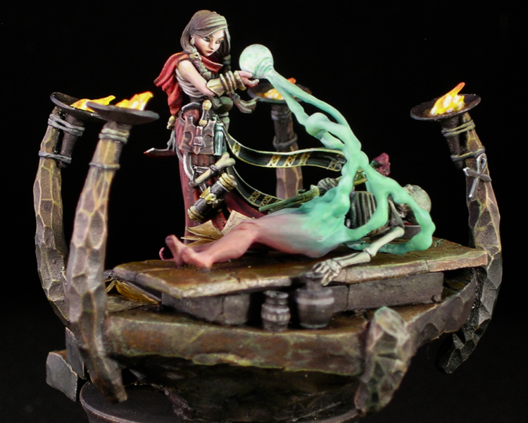
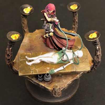
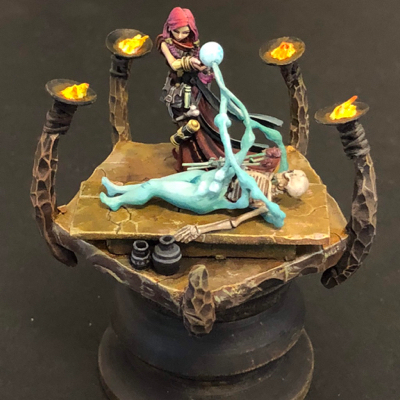
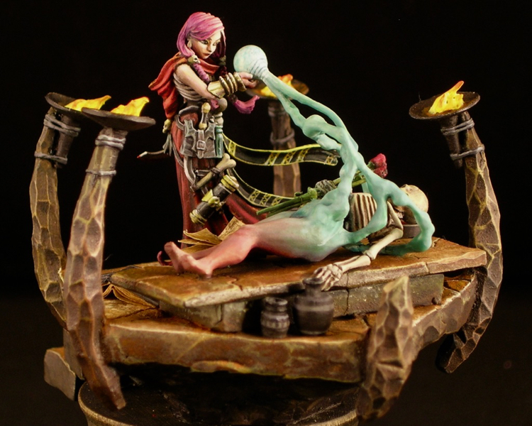
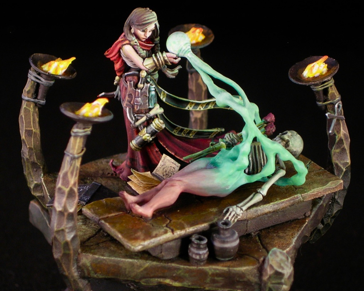
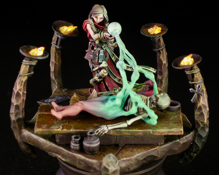
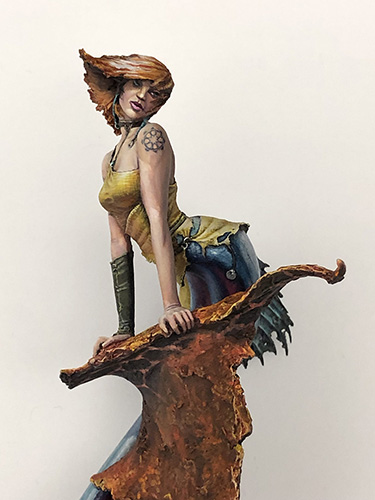
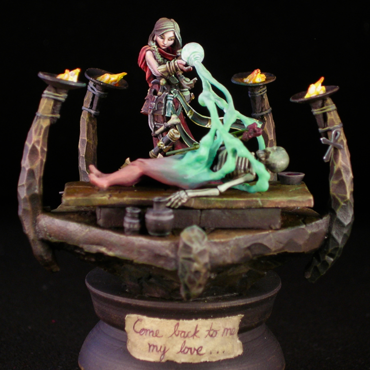
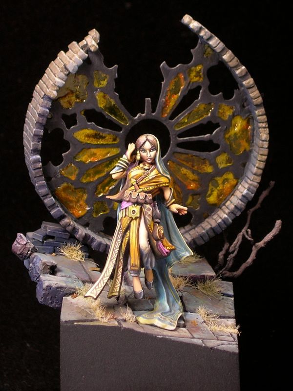
This was a really fun project. When I was thinking about ReaperCon projects this year, and settled on painting this lovely necromancer (03784: D’Vandra Lukesia by Bobby Jackson), I decided to do something a bit ambitious. D’Vandra comes equipped with a shovel, and something about a shovel-wielding necromancer just cries out to be raising the dead. I began mentally composing a graveyard scene, but in the end I decided that I just didn’t want to deal with all that dirt. So I swapped the shovel for a ritual blade, and replaced the graveyard with an unholy altar, upon which our heroine would resurrect her lost love.

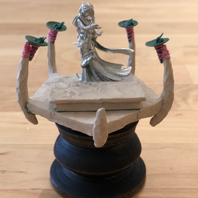
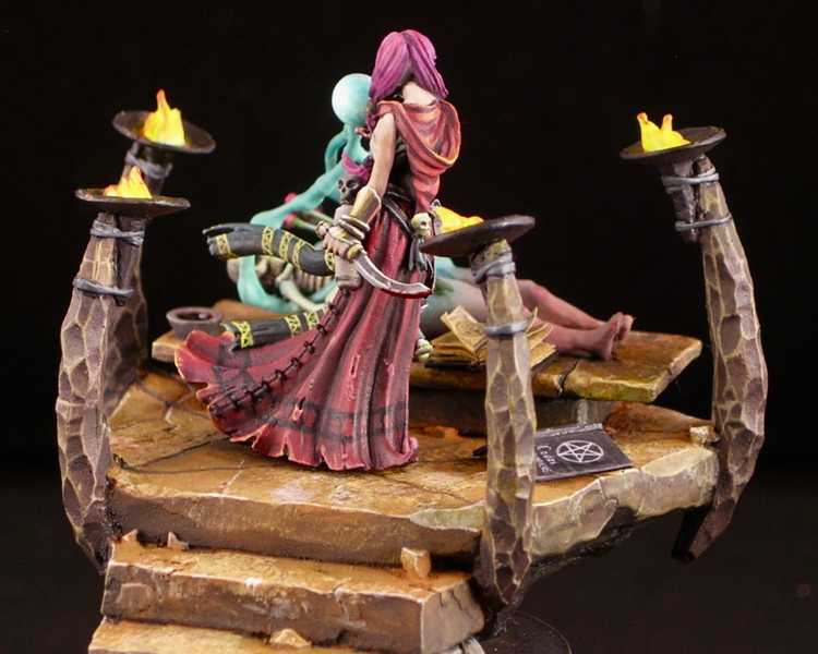
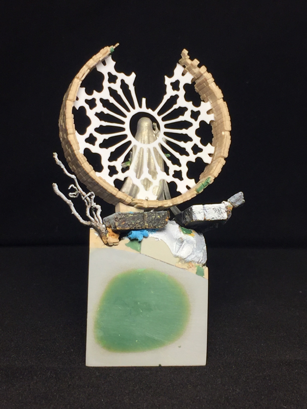
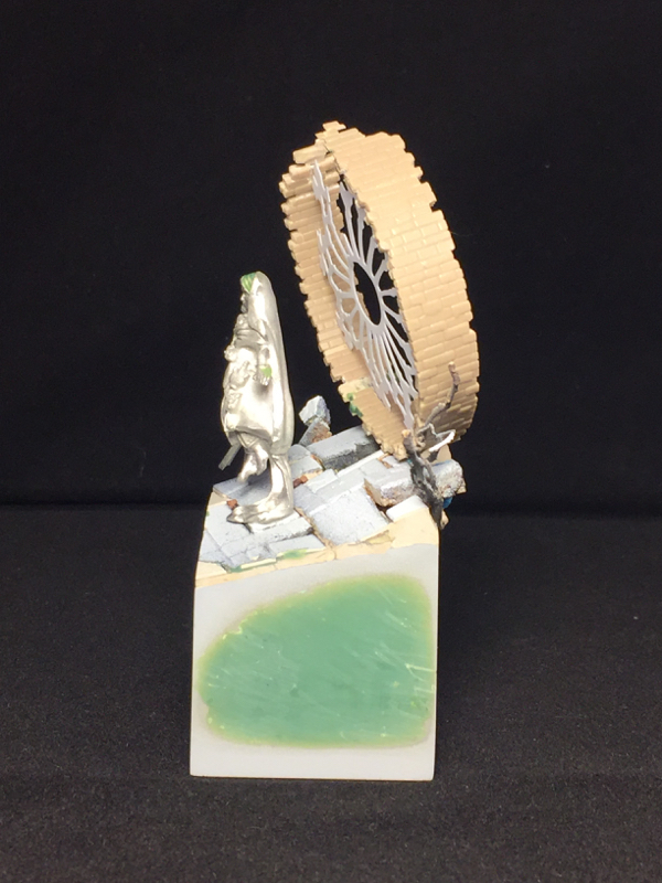
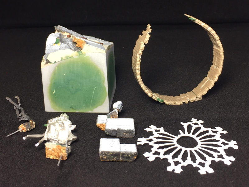
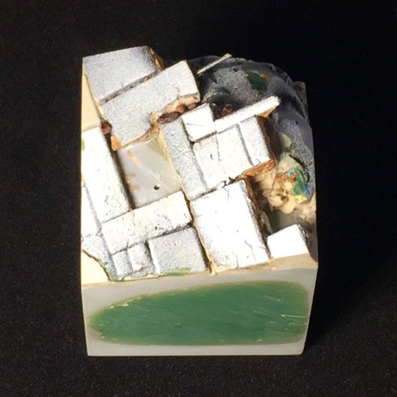
With the exception of the two figures and the urns, the scene is entirely scratch-built. The altar is composed of PC-Lumber two-part epoxy putty over a frame of cork tile. I like to use cork tile to test out shapes quickly and easily, and also save on putty. PC-Lumber is a great putty to use for terrain construction. It hardens very quickly, it cures rock hard, and it holds texture reasonably well. Its hardness makes it ideal for structural use, where a more flexible material like green stuff would bend slightly. It also means it holds crisp corners, which is useful for doing architectural details. For stone work, I like to alternate between adding material and subtractive sculpting, where I carve or break away material. I find that this process results in more natural shapes and textures. Because this particular putty cures hard enough to carve in about 45 minutes, I can do several cycles of this alternation in a day’s work.

The torches themselves are green stuff, as you can see in the photo above. Originally, I tied them to the stone pillars with thread, which is what you see in the photo. However, the thread was noticeably fuzzy when primed, so in the end I had to replace it with green stuff ties.

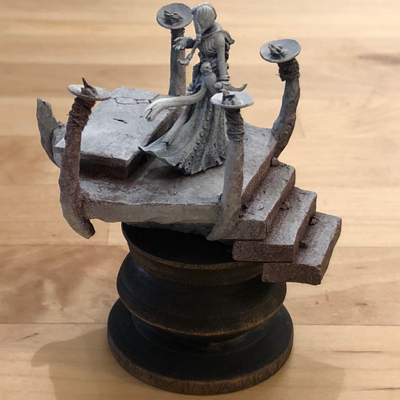
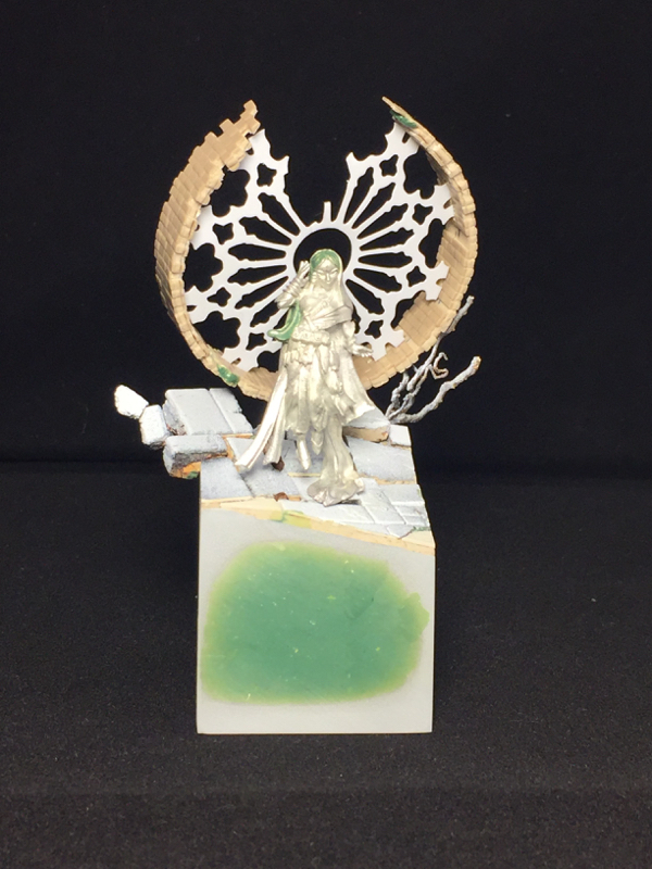
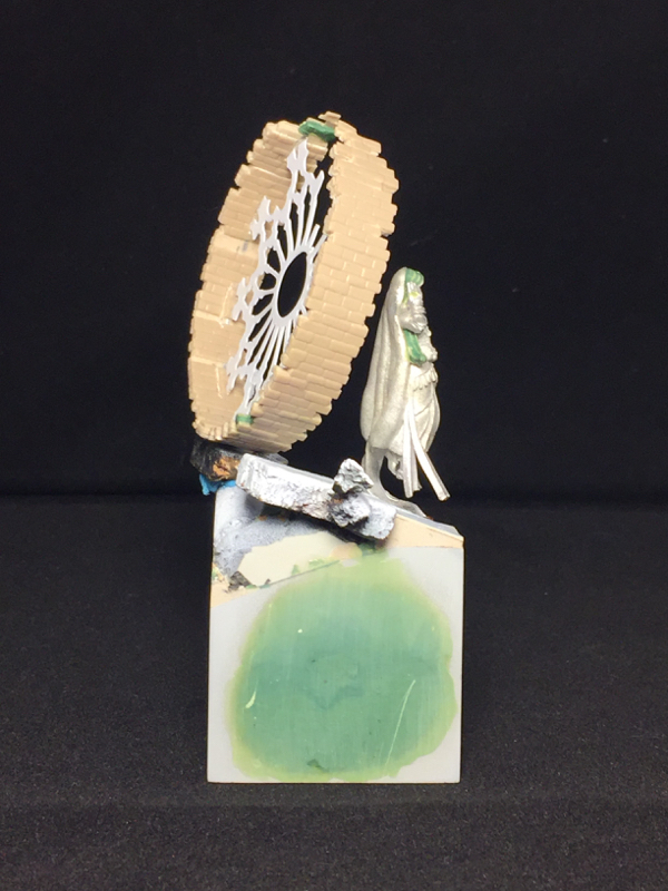
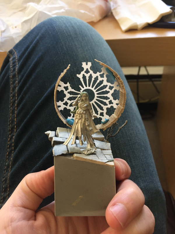
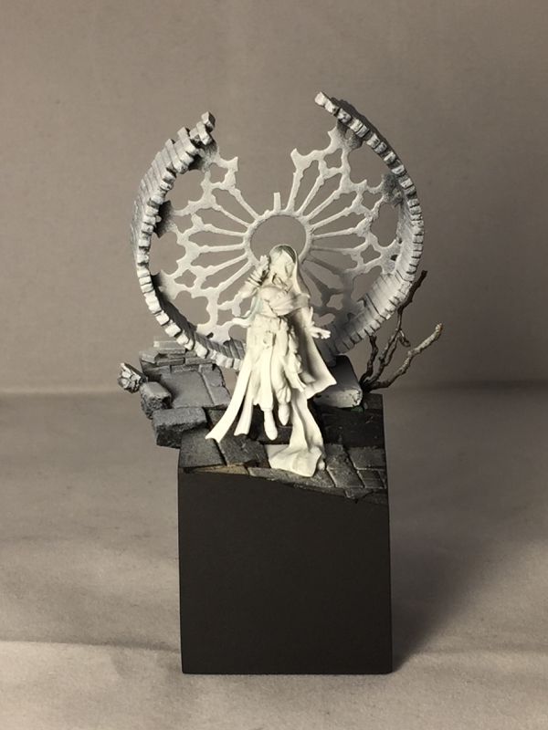
I used zenithal priming for both necromancer and base, as I do for most of my figures. With the base, I did an intermediate step with a red oxide primer, after the black and before the white. I deliberately made the red oxide primer fuzzy and lumpy, by holding the nozzle of the paint can only part-way down. This makes the paint spray in larger droplets, creating a texture over the surface. This texture would be a disaster when priming a figure, but actually works quite well for rock and corroded metal. It was a bit of a problem for the flames however, and I ended up needing to use gloss varnish to smooth out the texture on the flames before painting them. Were I to do this over again, I would cover the flames with little blobs of blue tac when priming, in order to avoid that problem.

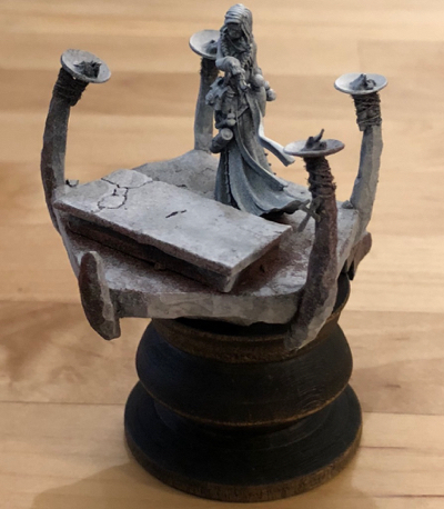
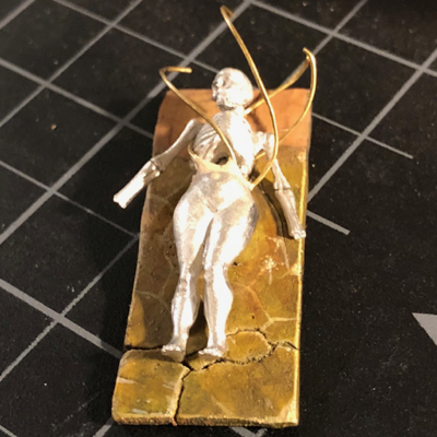
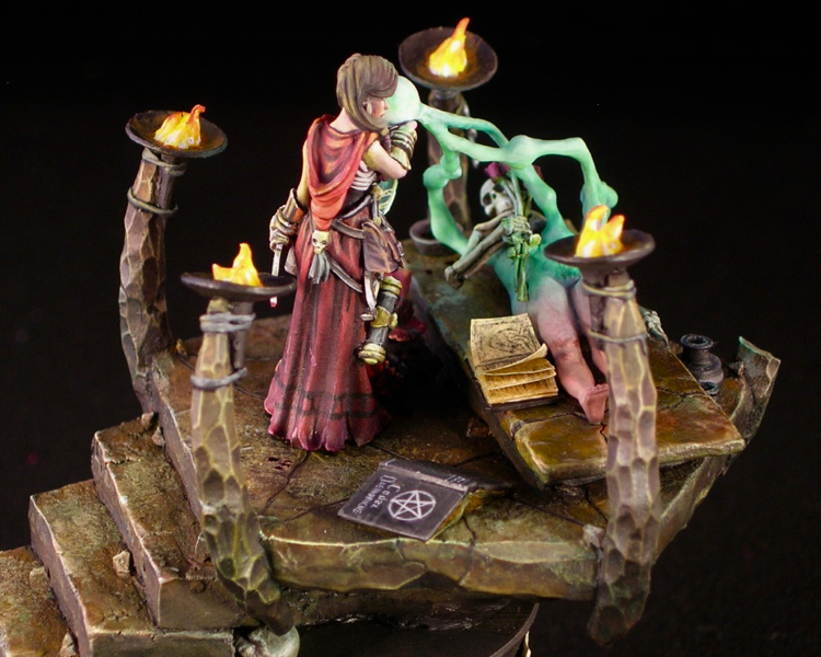
I started painting with just the basic structure in place, and added more details as I went, such as the resurrected body, urns, and books. Partly that was because things were easier to paint separately, but mostly it was because I didn’t have the parts I needed for the corpse when I started working on the project, and I didn’t get the idea for the books until half-way through painting.

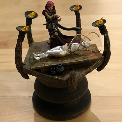
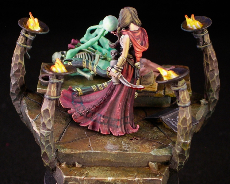
The corpse is converted from 03639: Bella, Succubus by Patrick Keith, and Secret Weapon’s skeleton kit. The spell effect I used to merge the two, showing flesh forming over bone out of ectoplasm, is made from putty over a brass wire armature.

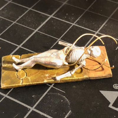
After anchoring the wire to the corpse, I ended up playing with it quite a bit in order to find a design I was happy with. Originally it was spiraling out from left to right, but I decided I wanted more interaction between the corpse and the necromancer. Then it went through a phase where it it was coming in from her general direction in thin wisps.

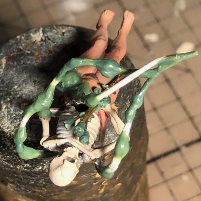
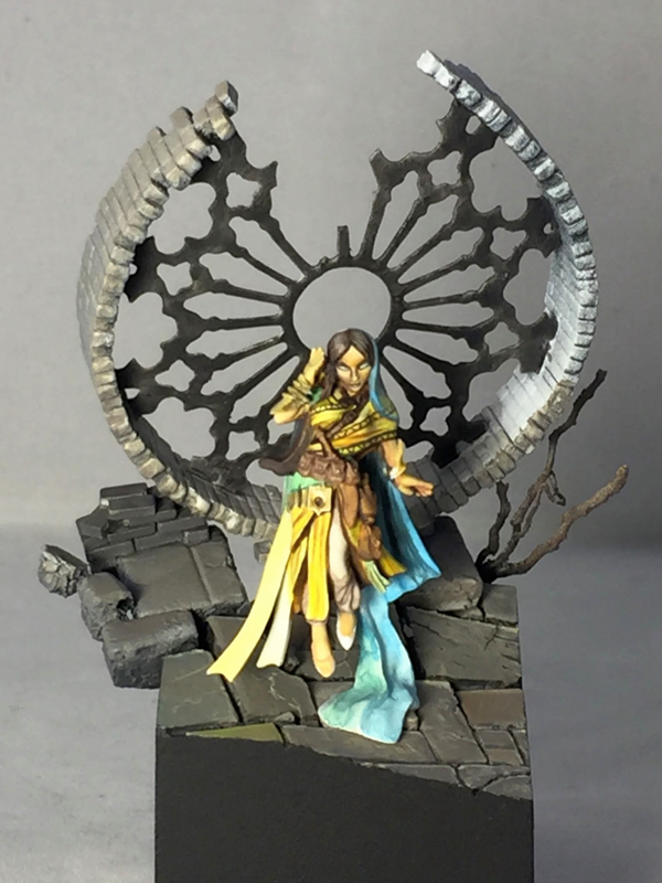
One problem I had to solve was how to ensure the viewer interpreted the spell being cast as resurrection, and not disintegrate. I combined several ideas in order to make this as unambiguous as possible. The first idea was to have the body forming from left-to-right in the main view, since English readers are used to things starting on the left. The second idea was using a cloudy spell effect, which I thought would look more like matter being formed from vapor, rather than being blasted into dust. I was also happier with the spell effect once I added a bit more structure to it, making it look like clouds rather than wires. The third idea (suggested by Chris Suhre) was to make the flesh parts quite red and lively looking. And the fourth was to put roses in the corpse’s hand, which fits well with the theme and should dispel any notion of violence.

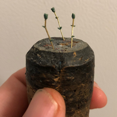
Making the roses was actually surprisingly easy. I just bent some brass wire (since stems are never perfectly straight) and sculpted the leaves and petals with color shapers.

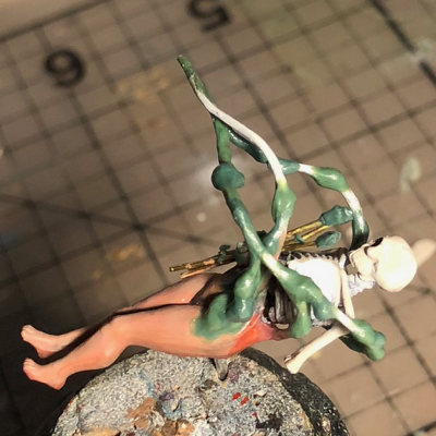
In addition to sculpting the spell effect, I also had to sculpt the corpses hands and collar-bones, since those are not part of the Secret Weapon kit.

It was a bit of a disappointment to go from a miniature were all surfaces were decently far along to one with bare metal and green stuff, so it was a huge relief when I had everything covered in paint again.

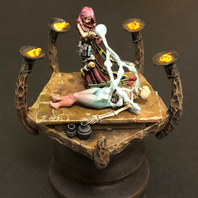
The colors changed many times as I was feeling my way towards a composition I was happy with. Sometimes you just have to try stuff out and see how it looks to see what you’re happy with, as visualizing miniatures in your mind’s eye can only go so far. Even though I was fairly happy at this point, significant changes were still in store, including completely redoing the top surfaces of the rock, changing the color of the spell effect, and adding the books.

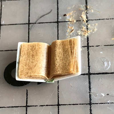
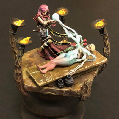
Both books are scratchbuilt, using thin plastic card and a hint of putty for the covers, and parchment paper for the pages. Parchment paper, in addition to being smoother than normal paper, is more durable, and slightly translucent. I was lucky enough to have some brown parchment lying around which was a perfect color for old, worn pages.

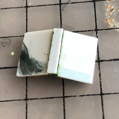
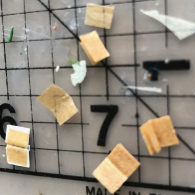
Lots of careful tweezer work during construction! Getting all of the pages the same size and lined up was a bit of a pain, but worth it.

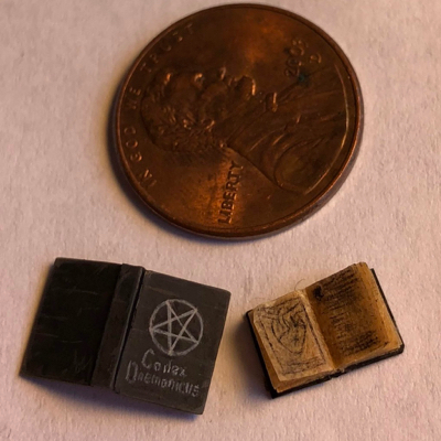
Of course painting these was extremely fiddly as well. This is damn close to the maximum resolution I can wield a brush at.

With the addition of the books and some final work to bring everything together, I was ready to call her finished. But I’m also a big believer in critiques, so I circulated photos to a number of my mini painter friends in order to get their takes, before calling things finished.

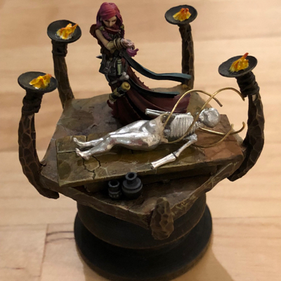
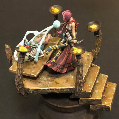
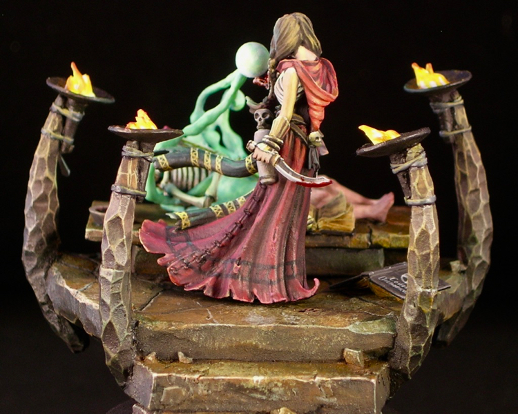
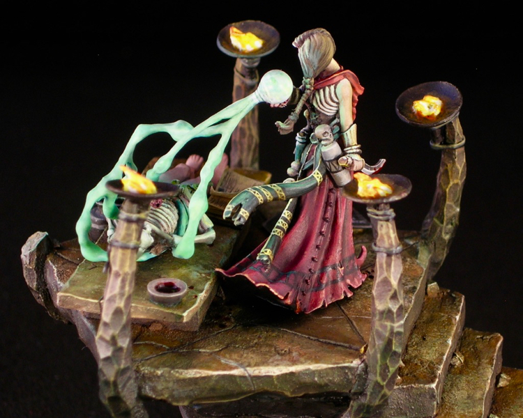
The resounding comment from everyone I showed photos to was that they wanted some OSL. Even though there were four torches and a spell effect that could be casting light, I had depicted the scene as if the ambient light was bright enough to overpower the object sources. Ben Kantor’s critique, in particular, was extremely helpful. He used photoshop to suggest a darker, grittier ambience, with much more of the light coming from the sources in the scene. I debated back and forth whether I should follow this advice, but in the end I decided to go for it.

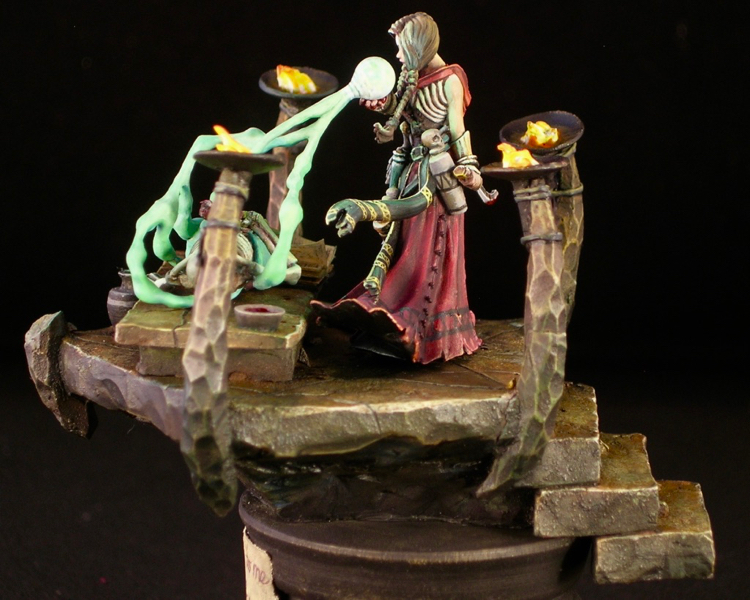
In order to make the OSL work, I needed to make the stone work much darker, with a bit of a greenish hue from the spell effect. This actually was not hard to accomplish: I grabbed a large brush, mixed some Reaper green liner with black pigment, and put a thin glaze over almost all of the stone. I avoided covering the upper parts of the columns with the torches, as I imagined they would receive some orange light from the torch glow to cancel out the green. I also used nightshade purple instead of green liner in the glaze in the places where the green light from the spell effect wouldn’t reach.

I also added a label to the base. This has two purposes: it clearly indicates what side is the front, and it informs the viewer of the title of the piece, which adds to the story. On the occasions when I include a title plaque, I try to tie it in with the piece somehow. In this case, I painted it as if it were a handwritten note from the necromancer to her beloved.

I tried to squeeze in a lot of storytelling elements, which rewards the attentive viewer.

I kept the OSL itself relatively subtle, in order to keep the focus on other elements. I made it most noticeable on the hair. It makes sense to do that because hair is shiny and tends to reflect light, and it’s an effective thing to do because it makes the head more of a focus.

I received many nice compliments for this piece at ReaperCon, and was lucky enough to end up with runner-up for Reaper Best of Show, and gold Sophie for best Reaper Diorama. I was hoping to improve upon the bronze Sophies I received in the last two years, so I was super excited to end up with not only a gold Sophie, but actually snagged one of the best-of-show awards, finishing after the legendary Doug Cohen. You can see all the entries and awards here.

Number of blood sacrifices involved in constructing Come back to me, my love…: One. Of course I sliced my thumb open at one point, since that’s pretty much inevitable for any serious miniature project. I think it was while I was building the base. And of course I made sure to spill some on the model. For luck, and/or to appease the dread god Osiris. Shockingly, no blood sacrifices were needed to construct either Codex Daemonicus or Codex Necronomicon (the two books).

The Alchemist

The sculpt is “The Wizard of Agni,” by Ben Komets Miniatures (sculpted by Lucas Pina Penichet), but I call my version The Alchemist. This was one of those figures that I fell in love with the second I saw it, and immediately knew how I wanted to paint it. The figure practically screams for OSL, and with the magical, alchemical vibe he gives off, using a magical flame color just seemed natural.

When OSL is one of the main light sources, you can get very different results depending on whether the light is a natural light source (like fire, which gives off all colors of light) or a colored artificial light source, and if it’s colored, whether it’s a primary or secondary color. Using a light source of a secondary color, like the green fire I used for The Alchemist, lends itself to simple color schemes with a very limited color palette. This is because when green (or another secondary color) mixes with other colors, you will either end up with something quite similar to the original color, or a desaturated, muddy color.

For The Alchemist, I decided to pair a strong saturated yellow-green with mostly desaturated colors, generally reddish and purplish browns in order to play with complementary colors. I also made very limited use of a saturated orange in just a few places: the eyes of the monkey and alchemist, the monkey’s pipe, and the bead in the alchemist’s beard.

With a very large scale figure like a bust, you have the opportunity to add far more detail than you can in 25 or 30mm scale. So I think it’s important to play with textures and freehands to take advantage of that opportunity. I generally like to do some of each. I had a lot of fun with the textures, especially the monkey fur and wrinkled hands. The monkey fur was very simple to do, just lots of little lines, but came out extremely well. The sculpt even has a tiny bit of fur sculpted in some places, to suggest the direction. I found the appearance was better if I painted the fur to be a bit matted, rather than smooth.

For the freehands, I went with muslim geometric patterns, which I very much like and have used before. Not only do they go well with the Turkish vibe of the sculpt, they also fit the subject matter: alchemy and chemistry have a long history in the muslim world, and even the world alchemy derives from the Arabic al-kīmiyā’ (الكيمياء‎). The pattern on the alchemist’s shirt was a bit of a pain to get right, since the lines need to be very precise due to all the regularity. I started with a square grid, then added the triangles, and had to do a number of minor adjustments to fix imperfections. On the other hand, the border on the vest was simple and easy. Both were painted before adding the beard and arms to allow easy access for all that precision work.

I entered “The Alchemist” into the painting competition at Kublacon, and was lucky enough to take best of show amidst some of the stiffest competition I’ve seen there. If you would care to voice your own opinion, he’s up on Putty & Paint and CoolMiniOrNot, or leave a note in the comments!

J’ork Sparrow

I finished J’ork Sparrow just in time for Crystal Brush—literally. I did a few final touches the day of the deadline, and was even painting at the airport a bit on the way to Chicago.

When I last posted about Mr. Sparrow, he was mostly finished, but still missing his flintlock pistol. That was the slowest part of the project, as I am the world’s slowest sculptor. It was fun though – in addition to checking flintlock reference photos, I also read up on how flintlocks work so I could accurately depict the mechanism. I depicted it ready for loading, with the hammer down and the frizzen open, which I think is appropriate for a holstered ‘lock—but please correct me if I’m mistaken!

I sculpted more of the flintlock than I needed, so I could leave a crisp plane where I cut it off. I also sculpted the parts of the mechanism separately. This not only made it easier to get some of the shapes, it also let me glue on the pieces and have them really look like distinct parts.

The other main element I added since the last WIP is the label on the base. I usually don’t place title plaques on my figures, but for this one I wanted to highlight the Jack Sparrow connection, and I also thought it would be fun to do a little treasure map as the label. The map is sculpted out of green stuff and torn slightly, in an attempt to get a naturally weathered appearance. The map and lettering are freehand, which is why my kerning is slightly off and my glyphs aren’t nearly as perfect as I’d like them to be. I’ve never been a good calligrapher.

I added a couple of other pieces to reinforce the Jack Sparrow connection: Jack’s sparrow tattoo, which also serves to add interest to the ork’s otherwise rather plain back, and the bone shard on his head, which was another very simple sculpt. Other than that, the only changes since the last WIP are a bit of refining here and there, and obviously much better photographs. They really do a wonderful job of photography at Crystal Brush, and my poor home photo setup cannot really compare.

I’m really pleased with how this piece came out in the end. I think the sculpted additions I made are both characterful and also help to add some interest to the silhouette, and I think the piece works well compositionally, with a face that really grabs and holds your focus, but enough interest elsewhere.

Voting links: Putty & Paint, CoolMiniOrNot

Scythe

Scythe is one of those board games where playing it once can be enough to make you run out and buy it, and that was definitely the case with me. I think this is especially true for those of us who are both board gamers and mini painters, since the figures just cry out to be painted. Plus it gave me a chance to show off my work to a different audience—friends who are board gamers but not mini painters.

Since these are first and foremost gaming figures, I made sure to use each faction’s color prominently in the color scheme for the figure, as well as keeping the base rim the color of the faction. This makes it easy to see at a glance where each faction’s pieces are on the board.

My favorite figure of the bunch is Zehra & Kar. The pose with the eagle is great, and the figure itself has both enough detail to be interesting and plenty of room for freehand. As a result, it was the only figure I spent two days on (~7 hours total), which is why she is the most refined of the group. All of the other figures were done in just a day of painting (roughly 3-5 hours each).

The figures themselves are cast in that annoying PVC material which doesn’t hold detail well, and which gets the worst mold lines (that are impossible to remove also). I ended up doing a fair amount of “resculpting with paint” to fix some of the casting issues, and practically had to freehand the face on Olga (the red faction leader). Zehra has a maroon scarf at her waist, which you can just see under her quiver. It was not part of the sculpt, and I freehanded it so I could use its edge to hide a particularly annoying mold line.

For the rest of the figures I kept my painting fast and expressive, which is how I like to paint figures that are meant for gaming. There’s no point in putting 20 hours into a figure which is going to get regularly handled. Fast expressive painting is a fun change of pace between more fastidiously painted figures, and helps one work on establishing overall light, composition, and volumes, which are after all more important skills than the ability to do smooth, careful detail work.

I’m a huge fan of Scythe and think it’s a great game, but it’s even more fun now that the faction leaders are all fully painted!

The Psychic’s Dream

After I went for the first time last year, Reapercon immediately became my favorite convention to attend. It has a 100% miniatures focus, everyone is very friendly, and it is small enough that you can actually get to know a decent number of the attendees. Reaper is very welcoming of other manufacturers at their convention. Their painting contest is open to entries from any manufacturer and genre, and they have a number of awards for miniatures by other manufacturers, such as Dark Sword, Bombshell, and Scale 75. Nevertheless, I like to paint something by Reaper for the convention, partly to show my support, but mostly because they make some nice minis! Also, it makes you eligible to win Reaper Sophie trophies, which are pretty awesome. I chose to use Rivani, Iconic Psychic, sculpted by Bobby Jackson, for my entry this year.

I like to start all of my miniatures by building the base, before I do any painting and often before I even start planning the painting. This allows me to do a lot of test fitting without handling a painted miniature (always a bad idea for competition pieces), and allows me to plan the lighting in the scene with both the miniature and base in mind, which is important.

For me, bases are roughly equal parts composition and storytelling. I always start by thinking about what sort of story I want to tell. For Psychic, because the psychic herself is floating, I decided to emphasize that by building a base which feels like it is just hanging there, oblivious to the laws of physics. I built a ruined church, but consciously did it in a way that a real ruin could never happen. Large parts of the structure are missing, and yet the remaining parts somehow stick around exactly where they started even though they lack support.

Once I have my concept in mind, I start thinking about how to best convey that concept in miniature. This usually involves building components I think will be useful for that concept, and then testing out compositions with those components until I have something where the composition works, and the scene is sufficiently detailed and confined.

The base is basically scratch built, using juweela bricks, textured plastic card (stonework and bricks), cork tile, putty, roots, and a couple of paperclips to provide armatures for more fragile components, atop a Secret Weapon resin cube. I did use two off-the-shelf components: the stained glass support structure (the cames), and one of Scibor’s resin cast stone faces. The stained glass cames is a plasticard cutout from a prototype product line that a friend of mine, Seth Amsden, is working on, to be called “Sensei’s Scenics.” It will be available before the holidays, and you can find out more by following Seth on Instagram.

This picture, with my jeans in the background and lots of blue tac, shows the test fit where I finalized the basic composition of the piece.  I think I nailed the front view, with the figure nicely framed by the elements behind her, while leaving enough unusual angles and gaps to keep things interesting from other views.

In order to get the sides perfectly smooth, I built the central part of the base and the protruding elements as separate pieces, with lots of test fitting. That way I could sand all of the walls of the central part until they were nice and flat. This sometimes involves a couple of rounds of sanding, priming, and sanding more, since priming will reveal flaws that you didn’t know were there.

Once you have those nice flush sides, it’s best to get a nice thick coat of black primer and then a clear coat, with no brush-applied paint. This keeps things nice and smooth, and also primer & clear coat will stand up to handling better than brushed-on paint. The downside is you need to be careful not to mar the surface, as you will never be able to replicate that finish once the piece is completely assembled and painted.

I chose to prime the psychic herself white, in order to get nice bright colors, while pre-shading the base with two-tone priming. This helps the psychic herself pop from a distance, and stand out from the base. I kept the psychic as a separate piece for painting, to allow easy access to all angles, and mounted her on one of the stone blocks from the base so I could easily mate the two parts when finished.

The painting itself was very quick, so unfortunately I only have three work-in-progress photos. Some painters like to keep the miniature very clean from start to finish, starting with very uniform base coats and building from there in a very controlled fashion. This is not my approach at all. I like to create contrast and overall impact quickly, which leaves lots of signs of my process, such as visible brushstrokes and “tide marks” from washes. Both types of process have their own pros and cons, but for me a more chaotic process is simply more fun, and that wins.

I initially planned a strong translucency effect for the psychic’s veil, so this early sketch from the back mainly depicts the psychic’s clothing under the veil, rather than the veil itself. As painting progressed, the veil ended up being much less translucent than my initial vision, although you can still definitely see through it in places.

One of the great things about Bobby’s sculpt is the number of smooth, relatively flat areas he left for freehand. Miniatures that leave some flat surfaces give the painter more flexibility than miniatures which are extremely detailed everywhere. I tend to prefer more geometrical freehands, so that’s mostly what I did. I also freehanded-in some folds in the fabric where I thought the sculpt was a bit too smooth.

The stained glass itself is made out of Uhu, the german glue brand that some folks like to use for blood and goo effects. It is clear and sufficiently durable to hold its shape when covering windows like this. When used to create flat sheets, like I’ve done here, it picks up lots of bubbles and has extremely variable thickness. For some applications this would be a problem, but I think it works wonderfully for this sort of medieval glass window where the quality of the glassmaking would be somewhat primitive.

I colored the glass by waiting for the Uhu to dry, and then painting over it with a mixture of Tamiya clear yellow and Daler Rowney orange ink. By varying the mixture between orange ink and clear yellow, and the thickness of the paint over the Uhu, I was able to vary the color a bit, adding to the non-uniform appearance of the glass. Rather than worrying about painting inside the lines for this, I simply covered everything using a brush that was big and cheap (that tamiya stuff is bad for your brushes). I then went back with an off-black and carefully repainted the cames.

Psychic’s Dream won a gold medal in the open judging at Reapercon, and placed third overall in the Reaper painter’s competition.

IPIK-7 (Steamthing)

IPIK had never been so far from his home. Food was getting harder and harder to find, even though only a handful of survivors of The Fall were still around scavenging. In the century since civilization collapsed, every home, grocer, or other potential stockpile of sustenance had been picked clean. The elders claimed that once upon a time, food grew by itself, but IPIK had never witnessed this. It sounded like a myth. But now there was a small green strand poking through the sand. What could it be?

Wow, it’s been a long time since I’ve posted on the blog. Sorry about that! I went a little convention crazy this year with Crystal Brush, Kublacon, World Expo, Gen Con, and Reapercon. I’ve been so busy working on my entries for the various competitions (and, y’know, life) that I haven’t had much time to write about minis.

Now that I’ve finished all but one of my competitions of the year, I wanted to take some time to update the blog. First up is my main entry from Gen Con this year, Patrick Masson’s “Barney the Steamthing” bust.

I have been wanting to paint this bust ever since I first saw it on CoolMiniOrNot way back in 2009. However, the sculptor, Patrick Masson, said at the time that it couldn’t be cast. “Don’t think there is a chance to make a cast. Unfortunately there are a lot of uncastable areas. I should change too much things. The next one will be.” So I was very happy when I came across it recently in Patrick’s Putty & Paint gallery, here, and saw that casts are available. You just have to contact him through his website, Artik Toys.

I posted some early WIP photos in April; at the time he was all black in white as I started painting the bust in Matt DiPietro’s “sketch” class using the value sketch technique he teaches in the class. This mini continues to show the influence of the classes I’ve been taking, especially Alfonso Giraldes and Kirill Kanaev, along with Matt. It definitely borrows from Alfonso’s “fuck smoothness” approach and Kirill’s teachings on textures. As Alfonso correctly points out, most of the objects we encounter in our lives do not appear as smooth color transitions, but rather as textures of one kind or another.

In total, I painted fifteen different textures on different areas of IPIK. There’s the woven burlap of his head, the shiny metal of his eyes, the corroded metal of his arms, the dirt-covered but still shiny coke can, the chipped paint of his shoulders, the cracked leather straps supporting his backpacks, and so on. Try to spot all fifteen!

In addition to the textures, I also had a lot of fun with the various freehands all around, especially the repurposed materials. As a post-apocalyptic scrounger, IPIK is all about recycling. His head covering is made from burlap potato sacks. If you look closely, you can make out the texts: “NAME BRAND POTATOES” and “100 LBS PRODUCT OF USA.” The oxygen bottle on his back even has the correct NFPA 704 warning symbol for oxygen. My absolute favorite bit of IPIK is the coke can. Painting a scavenger who repurposes everyday objects opens up a lot of opportunities, and few everyday objects are more iconic than the coke can.

Figures tend to be about character, and this is especially true for busts. This can make painting figures with helmets, masks, or other head coverings a bit tricky. Patrick (and his brother Thierry who did the concept) did a really good job on Steamthing’s face, putting a lot of life and expression into what is really just some stitched-together fabric, but it still poses a bit of a challenge for the painter. One of the ways I addressed this was putting the reflection of the plant in IPIK’s eyes. It’s a bit of a cheat—from most angles, the reflection of the plant would not be visible. But as soon as I saw the effect in the first sketch I did, I knew it was the right thing to do.

« Older posts

© 2024 Light Miniatures

Theme by Anders NorenUp ↑