Never be afraid to paint outside the lines

Category: Showcase (Page 3 of 3)

Infinity – Tohaa

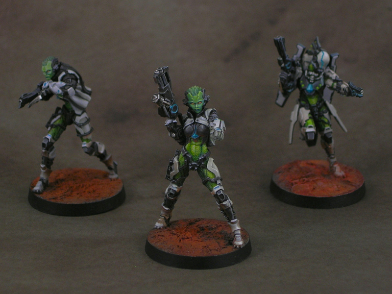
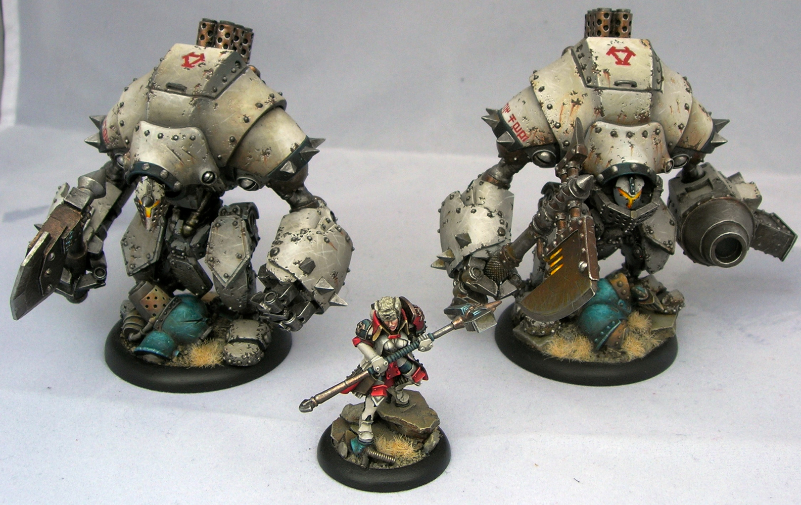
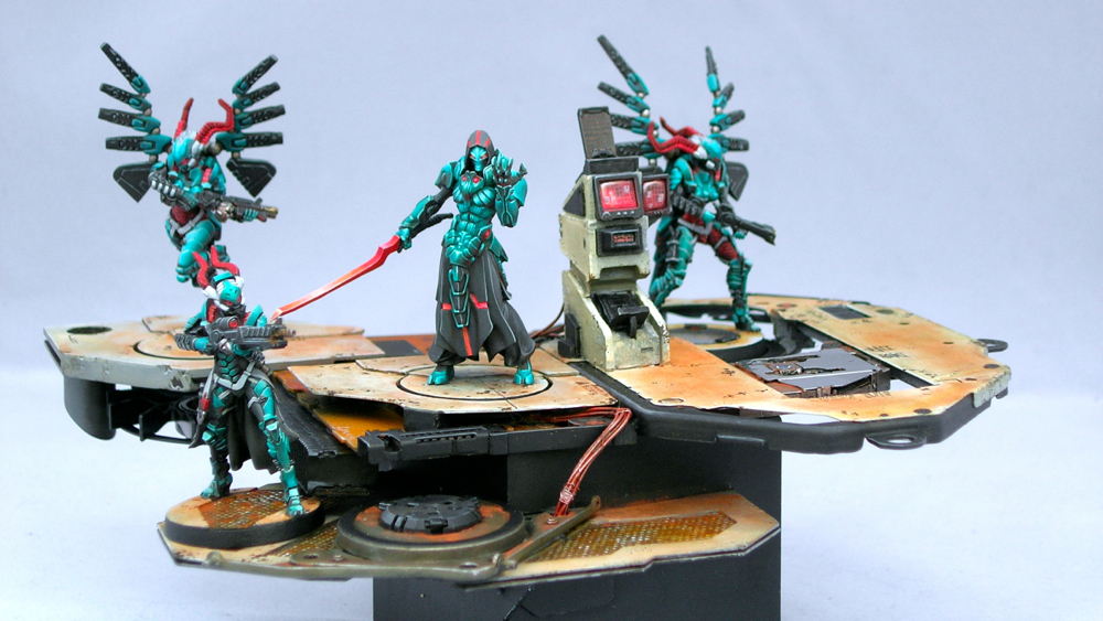
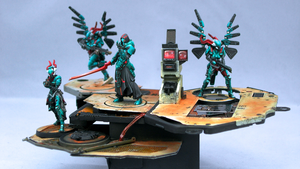
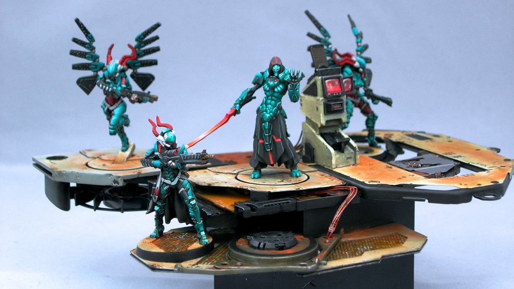
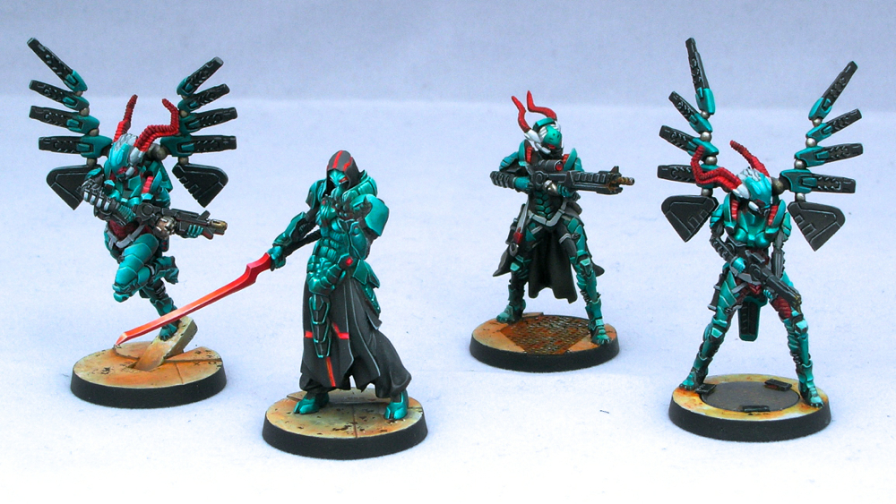
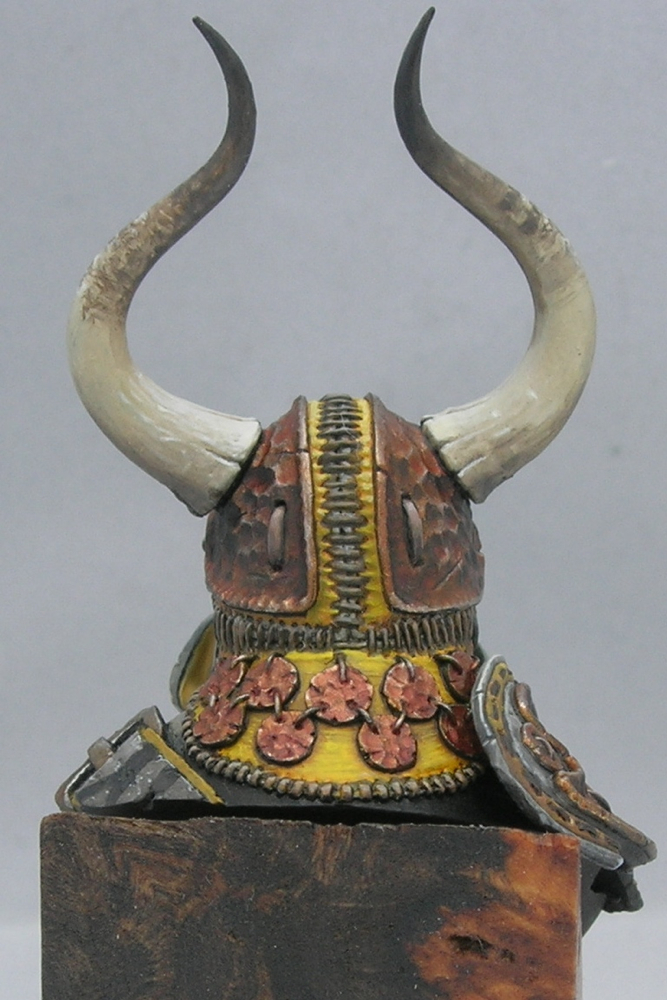
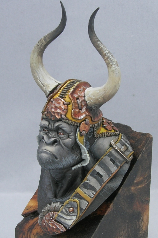
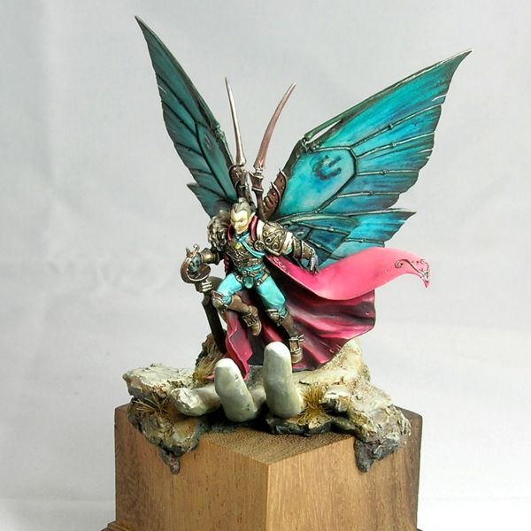
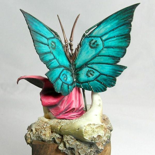
Infinity are a lot of fun to paint up. They are all very finely cast metal minis, with lots of bits so that you get interesting, three dimensional poses. The models are on the small side, so they paint up relatively quickly, but they are packed with detail which makes them look bigger than they are.

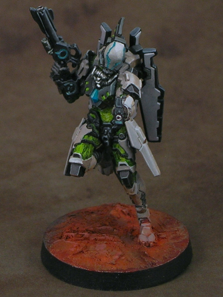
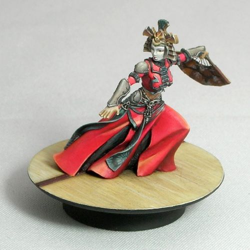
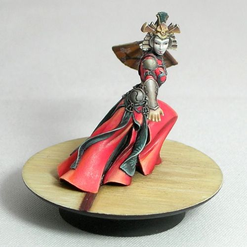
For this little Tohaa group, I decided to stay fairly close to the official color scheme, but I swapped the usual orange for green to give them my own spin.

tohaa_group

They are not painted to a super-high standard, as I was focusing more on the color scheme and overall light situation rather than making all of the details perfect. I’m really pleased with how they came out though!

tohaa_rasail_1

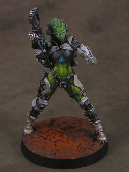
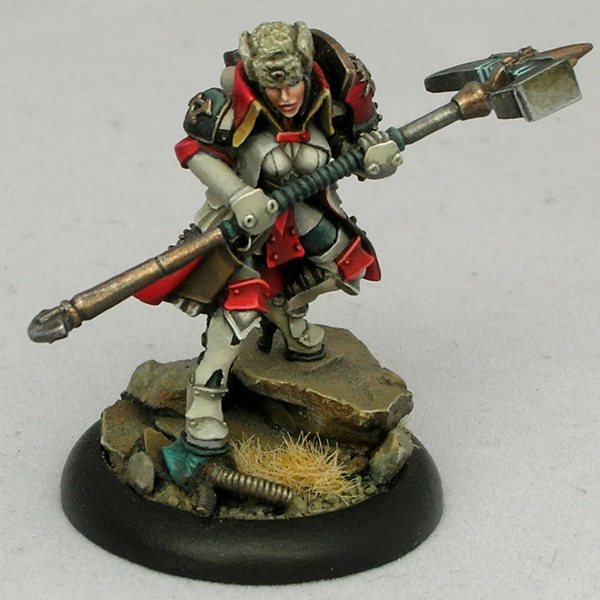
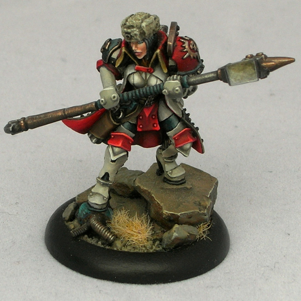
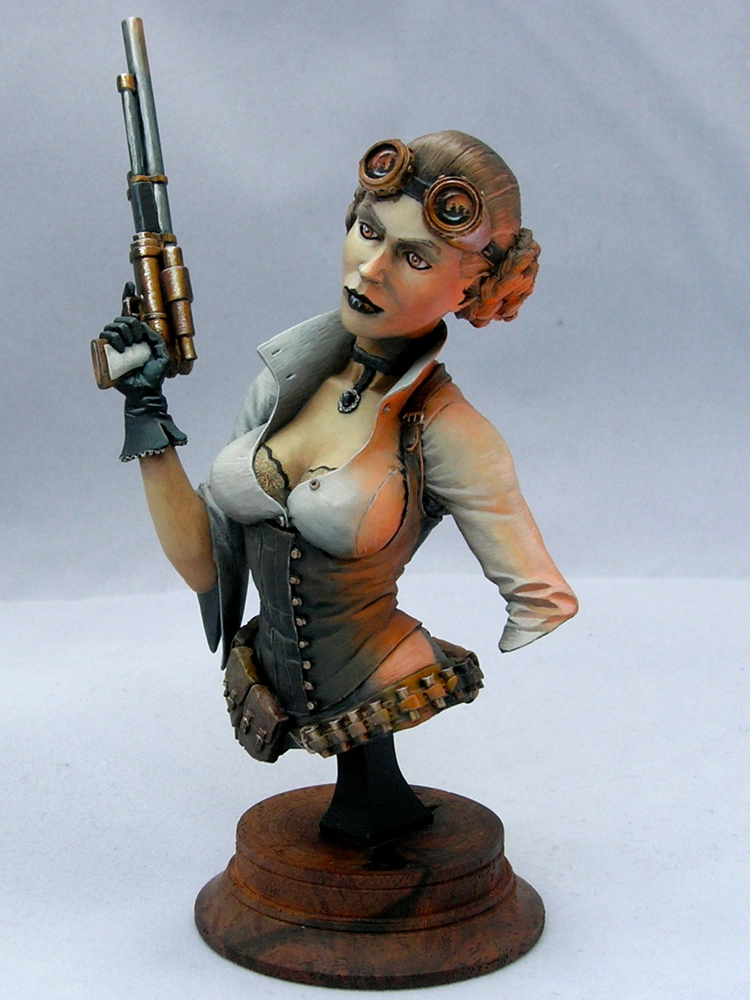
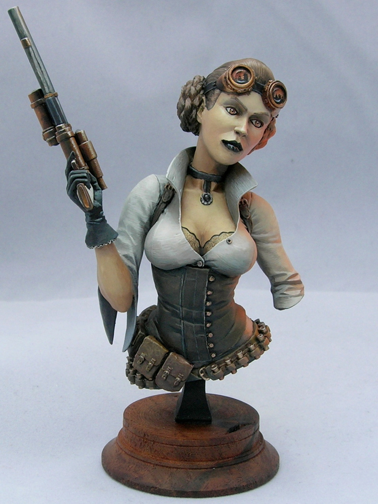
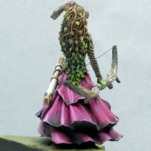
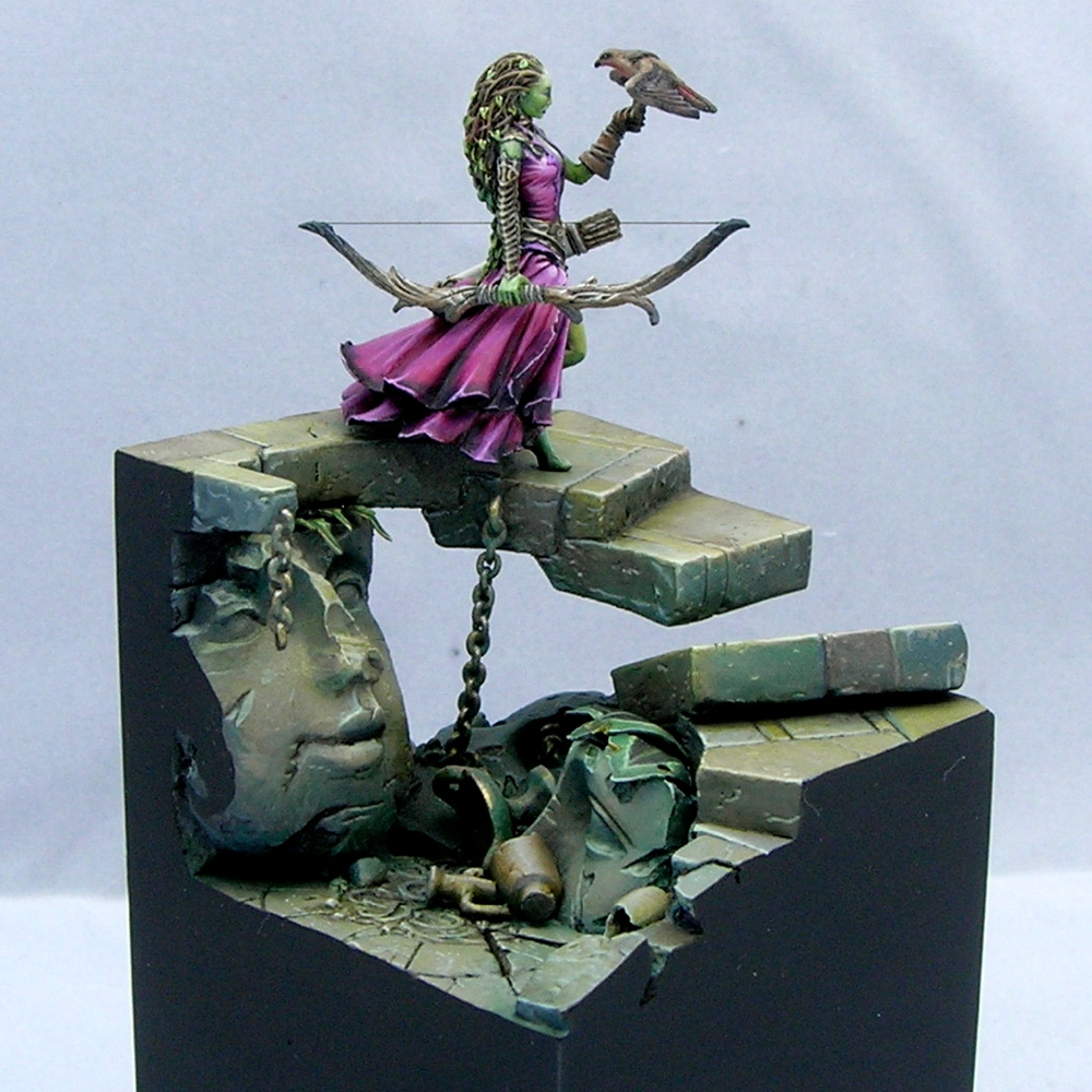
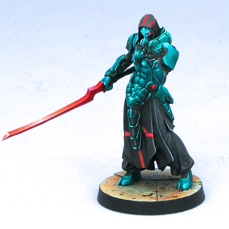
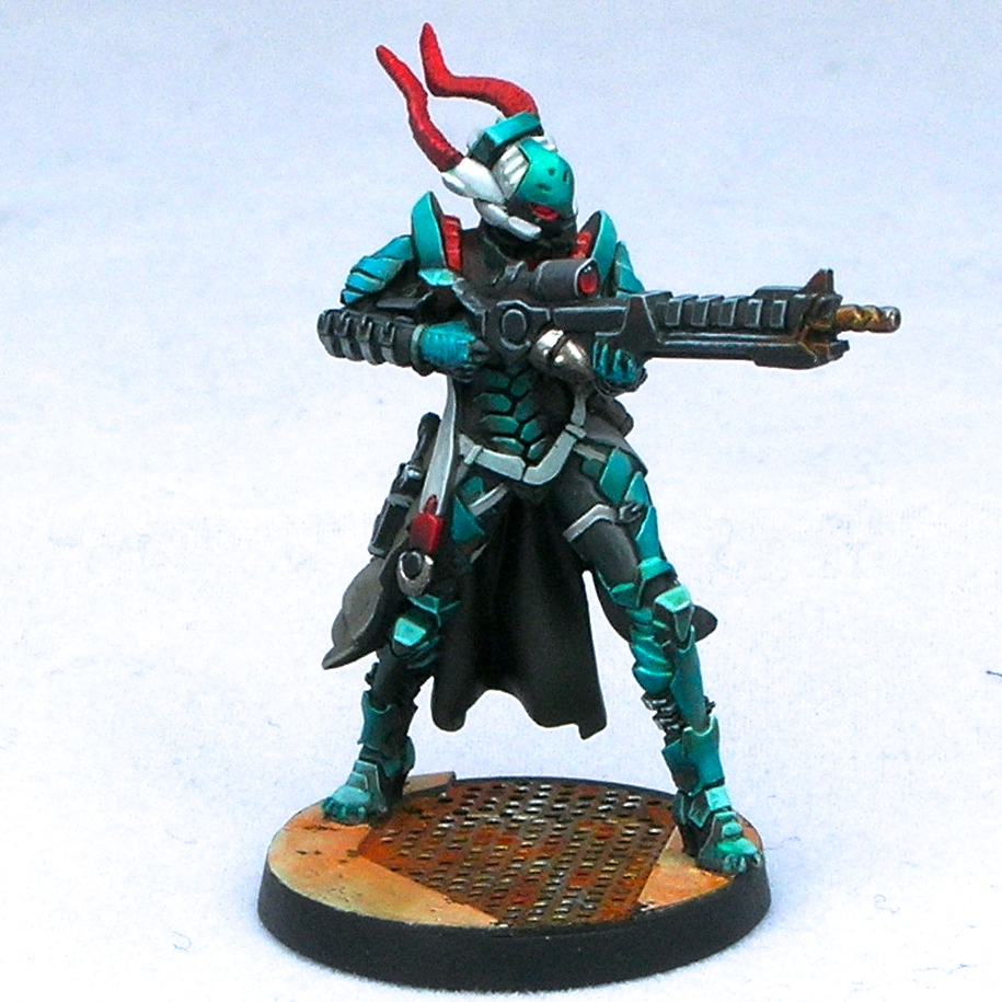
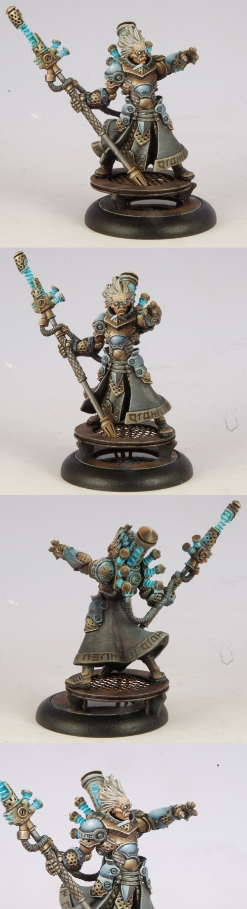
The leader was the most fun to paint up. She has a very nice face, and all of the areas are easily accessible when fully assembled making her easy to paint.

tohaa_rasail_2

It’s kind of subtle in these photos, but I threw some red into all of the shadows on the white armor. With a giant red planet underneath her, you would expect some of the reflected light to show up in the whites of her clothing!

tohaa_rasail_3

I decided on very simple basing—I really just scraped some putty around to give a rough texture, painted them quickly with mostly black and white, and then applied a bunch of red pigments to give a martian desert effect.

tohaa_rasail_4

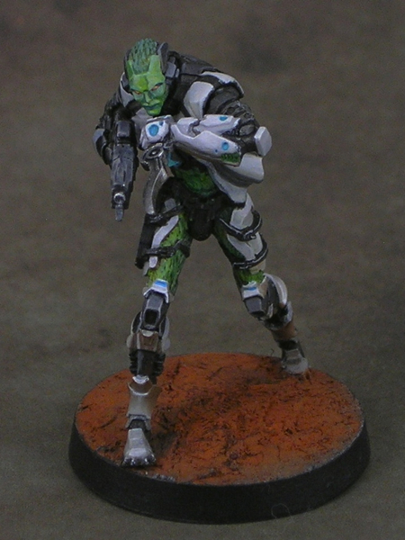
Apart from the neutral colors of the armor, the main colors are green and turquoise, so red was a natural color for the base as it’s a complementary color to both, making the overall color scheme “split complementary”. Adding red into the whites of the armor, as well as being ‘correct’ from the perspective of physics, helps tie everything together.

gao_tarsos_1

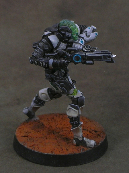
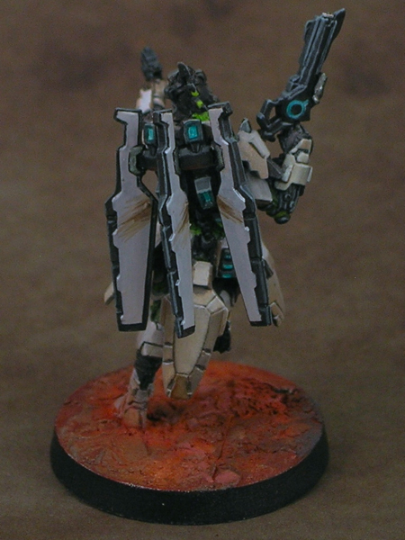
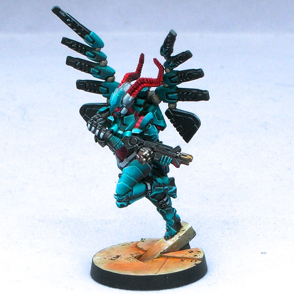
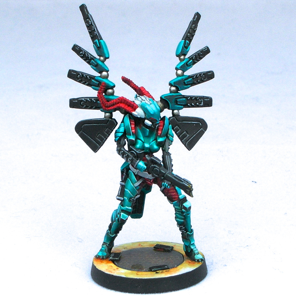
This guy was super fiddly to paint. He has a bajillion tiny details, and many areas are impossible to reach with a brush when he’s fully assembled while still being annoyingly visible. Also, there are six different fins that are too small to pin and all attach with an area of one square micron. I think I broke the fins off three times each while painting him.

gao_tarsos_4

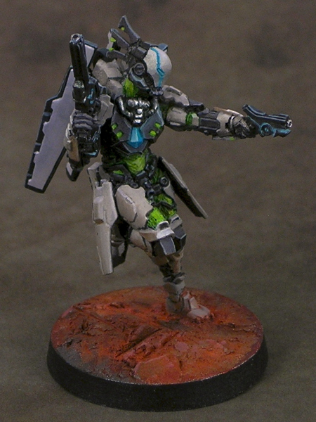
He came out really well, but I basically needed to design a display base for the group just to avoid handling him any more and breaking more fins off. I wouldn’t want to use this guy in a game ever! Maybe I just need smaller drills so I can pin tiny Infinity bits.

gao_tarsos_3

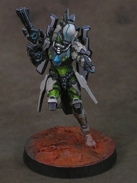
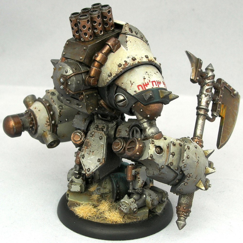
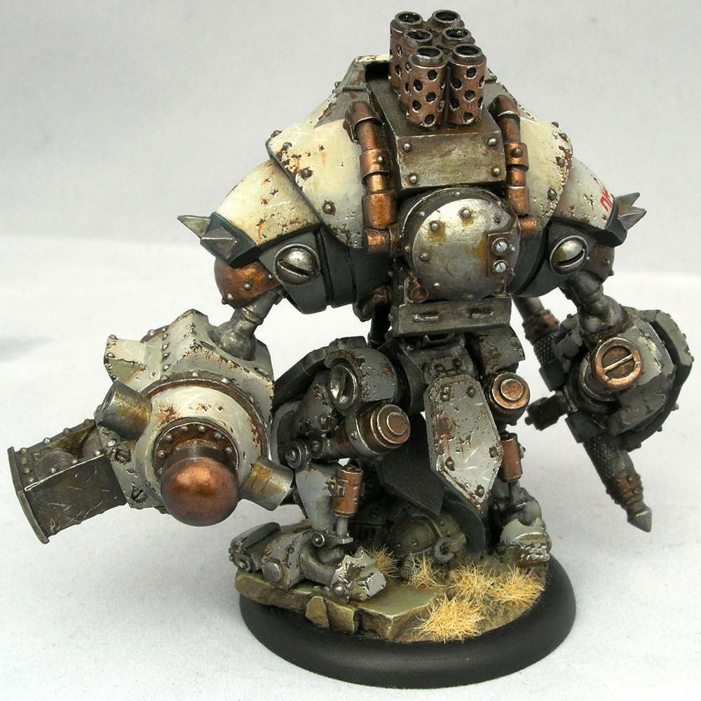
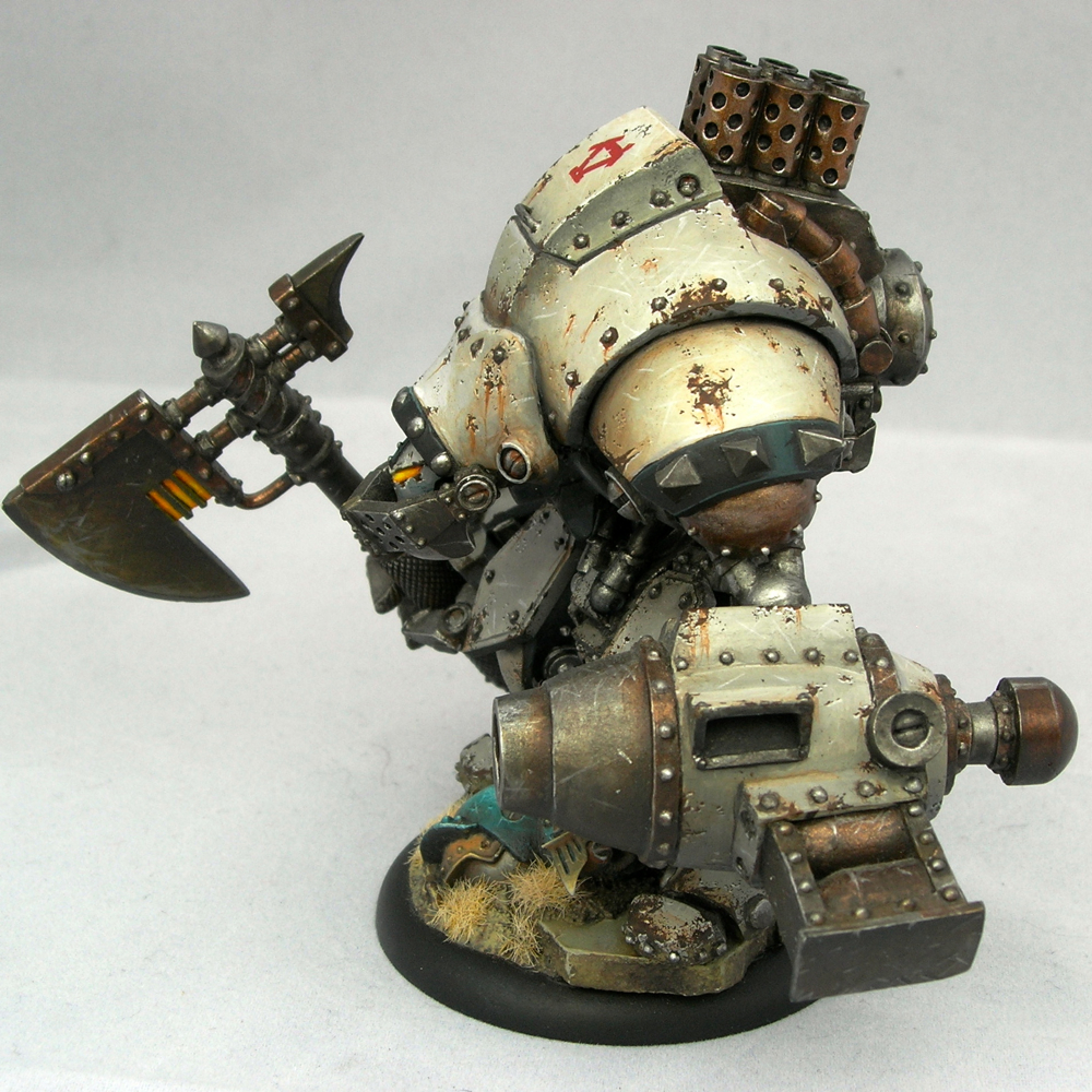
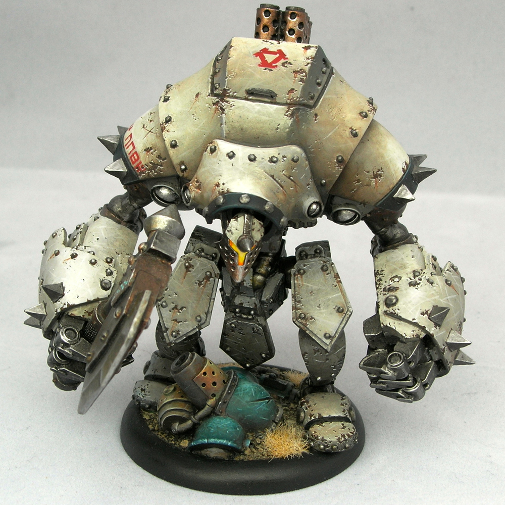
Decided to add some quick weathering from the rocket exhaust. To Infinity and Beyond!

gao_tarsos_2

I would not want to run into this guy on a lonely rock in deep space. He looks hostile.

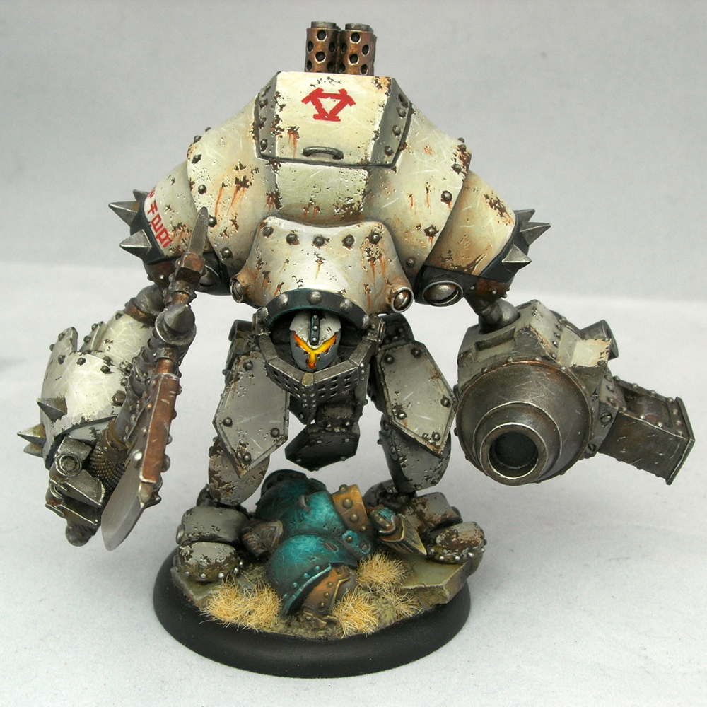
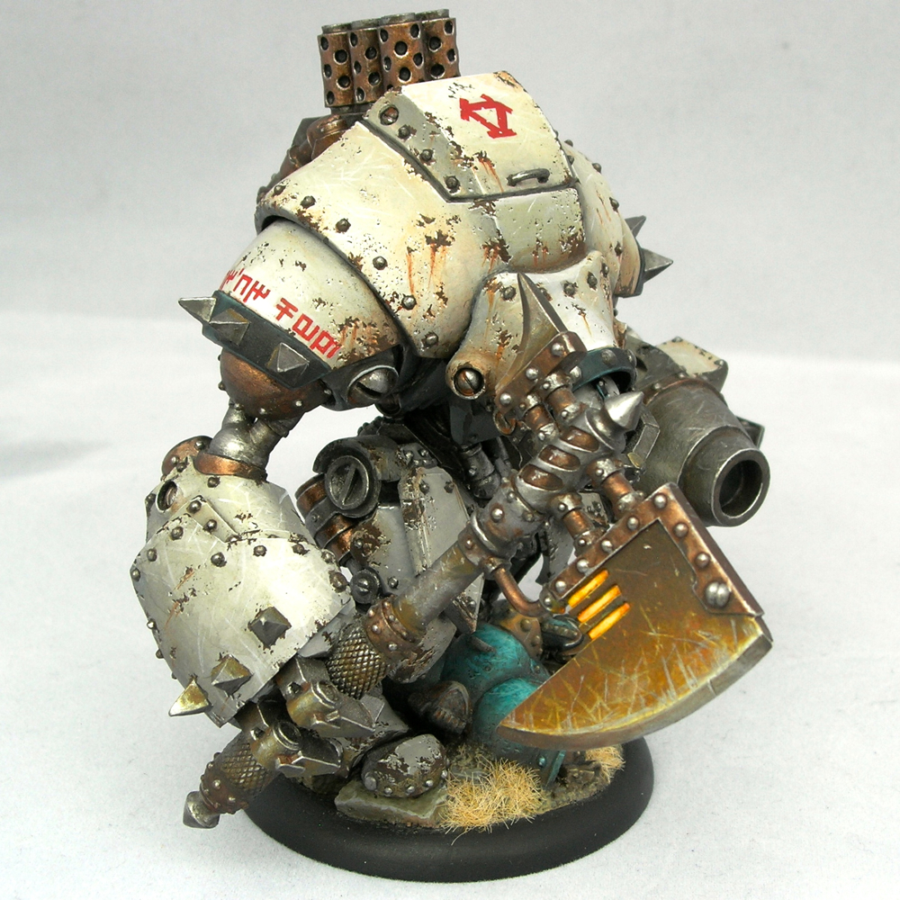
This group is one of my entries into the painting competition at Gen Con. I have six entries total (and maybe even time to finish one more), split between the general competition and the Privateer Press one. But I’m going to wait to share most of them after the convention. Sorry I’m such a tease, but I don’t want to give up the element of surprise for my main entries!

Khador Extreme Battlegroup

I painted this group several years ago, but it took me a long time to take any decent photos (and even longer to remember that I did and get around to posting them, it seems).

khador_bg

This group won the best battlegroup award in Privateer Press’s 2014 Gen Con Grandmaster Painting Competition, and appeared in No Quarter 57. Unfortunately the picture taken by Privateer Press at the convention wasn’t that great. You can see it in my battle damage tutorial, which goes over the technique I used to damage the ‘jacks.

khador_destroyer_1

Then again, since it took me over two years to finally take decent photos of my own, I probably shouldn’t be complaining about what Privateer Press could do in the middle of a busy convention. Subtle white shading is hard to photograph, and the metallic work is even harder to photograph.

khador_destroyer_2

I’m really happy with how the metals turned out, especially the axe blades. Since the axes on the extreme ‘jacks are really big and flat, I knew I needed to do something to make them more interesting to look at. Painting them involved a lot of time-consuming back and forth between painting scratches and glazing over everything with inks, but the end result was worth the effort.

khador_destroyer_3

I had half of a hunter lying around from my Caine battlegroup, since I replaced it with a grenadier chassis, and a plastic Cygnar battlegroup box that Privateer Press gave away at Adepticon one year. I thought they would work well as battlefield rubble. Having a well-stocked bits box is a godsend for more ambitious projects.

khador_destroyer_4

Even though the models in this battlegroup are all painted using metallics, I used nmm to paint the destroyed Cygnar models on their bases. I did this for a few different reasons. First, I thought it would be fitting for the destroyed Cygnar jacks to be less shiny than the Khador ones, which were already quite gritty and corroded. Second, I thought it was a nice callback to the Nemo I’d entered in a prior year. And finally, I wanted to show off that I can paint both metallics and nmm (since many painters seem to stick with one or the other).

khador_destroyer_5

This worked well with the extremely scratched effect I did for the turquoise parts, to make the Cygnar ‘jacks look extremely beat up and damaged, but in a completely different way from the Khador ‘jacks.

khador_juggernaut_1

To get the bright glowing effect for the ‘jack visors, I first filled them almost entirely with green stuff, since normally there’s a big recess there. It’s very difficult to paint a believable glow effect in a deep recess, since you’re fighting against the shadow that the recess creates. Filling it first makes painting a glow much easier.

khador_juggernaut_2

The rust drips are going “down” in different directions. I imagined that the rust would drip down and collect most with the ‘jack in its resting pose, and I tried to imagine what that would be when painting the drips.

khador_juggernaut_3

The Khadoran runes on the ‘jacks’ shoulders read “Br’er Fox” and “Br’er Bear,” named after the main antagonists in the traditional Br’er Rabbit stories. The Cygnaran runes on the hunter’s shoulder pad say “Fire.” Warmachine faction fonts can be found here.

khador_juggernaut_4

I painted the Juggernaut first, and I think it came out slightly better. Normally the models I paint later, once I’ve figured out my color scheme, turn out better, so this is unusual. But I think playing around with the whites a bit added an extra bit of texture and randomness that worked really well with the effect I was going for. It’s much easier to create randomness by accident than intentionally.

khador_juggernaut_5

I painted Sorscha last, and she is much cleaner than the ‘jacks. I imagined the armor of a powerful and important warcaster would be carefully tended, unlike the warjacks.

khador_sorscha_1

I left off the ice-formation base she comes with, since it wouldn’t match the other bases, and instead sculpted something to match, using the head that belongs to the hunter on the juggernaut’s base.

khador_sorscha_3I said in my previous post that I’m planning to teach a class on painting “tricky colors”—white, black, and red—at KublaCon and again at Gen Con. I think I can consider my street cred for teaching that class pretty well established.

Abalám

I finished painting this sweet little bust from Hera Models. I might still tweak a few things, so if you have any comments or critiques, please let me know in the comments!

abalam-3

The more I paint busts the more I find I enjoy them. They are large enough to give you lots of room to work and play with things like textures and freehand, but they still paint up very quickly, and you can focus on the fun bits like the face.


abalam-2

Abalám ended up quite close to my initial vision. There were only two minor changes that happened as I painted. Originally I planned to have an Oni Kanji on his breast plate. I tried painting it three times, once in red, once in black, and once in gold, and each time I decided I wasn’t really happy with it; eventually I ended up just painting over it and bringing back the beaten metal texture I had. The other change was the shirt, which was originally painted as brown leather, then became yellow, then green, before finally ending up as black cloth.

abalam-1

Unfortunately the large metallic areas make this guy difficult to photograph. This set of photos came from my third attempt. I’m still not entirely happy with them, but they’re a big improvement over the first two sets.

abalam-4

The lighting study I did before priming him didn’t end up being quite as helpful as I hoped, but I did make some use of it. I wanted the red glow to be much stronger than the one in the study (which was just reflected light from a red coffee mug, not an actual red light source). Still, it’s a useful trick and I recommend it for anyone who has difficulty painting lighting effects.

I’m really looking forward to my next bust!

Steampunk Leia—finished

Sorry I’ve been so quiet lately. The holidays are always a busy time of year, and this will be my last post of the year.

In honor of Star Wars, I’m finally posting the finished shots of Steampunk Leia. I posted the initial WIPs over a year ago, and finished her last summer, but it took a long time to finally post photos. Sorry!

Without further ado, here are the pictures.

steampunk-leia-2

steampunk-leia-1

steampunk-leia-6

steampunk-leia-5

steampunk-leia-4

steampunk-leia-3

After the second WIP post, I ended up painting over all of the non-metallic metals with metallics. At this large scale, I just couldn’t get NMM that I was happy with. I’m much happier with how the metallics turned out. But my favorite part is the orange light effect – I think I learned a lot about how to pull off a realistic glow effect by trying to execute it at this large scale.

“Negative Space”—finished

Negative Space

As soon as I saw the new Infinity—Combined Army starter pack in my local game store, I wanted to paint it. In fact, that was the box that ended up getting me started on my recent Infinity kick. I have to say the models are fantastic, light-years ahead of the older Infinity models; they are very easy to clean, and tremendously fun to paint.

Negative Space

The base was the first thing I built, and is primarily composed of parts of the optical drive and heat sink from my old MacBook (which I replaced once it started constantly crashing), mounted on a resin block from Secret Weapon miniatures. The base presented some interesting engineering challenges, to make it structurally sound where a thin piece of plasticard was sticking out from a resin block and just attached at the edge, so I added some plasticard braces and carved a groove in the resin block for extra support.

Negative Space

The miniatures are all magnetized to the base, so that they can be removed to be usable as gaming pieces or just be appreciated on their own, but snap nicely onto the base in the appropriate position and orientation for group display. This was especially nice for entering into the Gen Con competition, which requires units to be presented together on a display base. Making everything nice and stable as a unit also makes things safer when being handled by the judges and their minions.

Negative Space: Fraacta, Umbra Legates, Maakrep, Fraacta

From left to right: Fraacta, Umbra Legates, Maakrep, Fraacta.

Negative Space: Umbra Legates

Originally I intended to paint the entire box up as a unit, but ended up dropping the Unidrons and adding an extra Fraacta. The base I built was not really large enough for six models, I wasn’t really happy with the first Unidron I painted up, and I really liked the new Fraacta model that had just come out.

Negative Space: Fraacta

The running Fraacta was the last model I painted, and turned out the best because I had the color scheme down at that point. In the sculpt, the Fraacta is jumping off of some weird, pseudo-organic piece of rock. In order to make it match the base, I had to completely resculpt that rock to look mechanical, and then incorporate it into the base in such a way that it looked at least plausible for it to be mounted at that angle. I ended up cutting a big hole in the base to make it look like a part which could be rotated out to provide access to something underneath.

Negative Space: Fraacta

It’s hard to appreciate from the photos, but three of the four models have holes going all of the way through the bases. My favorite is the base of the standing Fraacta, where I carved out a circle from the middle of the base, and mounted a brass-etch grate and a clear piece of plastic (from a blister pack). I think incorporating negative space into most of the miniatures’ bases as well as the group display base makes them hang together really well as a unit.

Negative Space: Maakrep

The Maakrep was the first miniature I painted of the group, and ended up much greener than the others. I painted the standing Fraacta second, and that was when I really nailed the color scheme down. I ended up having to go back to the Maakrep and add a lot of turquoise glazes so that the colors would match.


This piece won first place in the unit category of the Gen Con painting competition, and was awarded a gold under their open judging format. Additionally, Angel Giraldez, the studio painter for Infinity, was at the con, and told me that he really liked my entry, which was very flattering. Thanks Angel!

“2084”—finished

This figure by Studio McVey is so much fun to paint, I’ve painted it twice.

lisbeth0

lisbeth1

Some of the pictures came out better than others. I really need to improve my photography skills. But I think you can get the idea.

lisbeth2

lisbeth3

I had so much fun with the graffiti. I discussed what it all means in my WIP blog post about the base, in case you missed that one. Some of it is quite obvious, but other bits are more niche references.

lisbeth4

lisbeth5

Painting the hoverboard was also a lot of fun. One of the things that makes Lisbeth such a neat mini to paint is all of the different surfaces that just cry out for freehand. The characters at the top read “freedom” (not that I can read Chinese).

lisbeth6

The other thing I had fun with is different textures – weathered concrete, scuffed plastic helmet, aged sign, scratches on the edges of the board. More and more I’m trying to convey textures when I paint minis. Sometimes it comes out great, but others not so well. But that’s always how it goes!

This was one of the pieces I entered in the Gen Con mini painting competition, which is why I waited so long to post it. It placed third for technical merit in the “Rainbow Brush” contest that Marike organized in response to Indiana’s terrible anti-gay “religious freedom” bill, and won a judge’s award and a bronze in the single figure category.

Tribe Chief Morrow—finished

tribe-chief-morrow-final-5

tribe-chief-morrow-final-1

tribe-chief-morrow-final-2

tribe-chief-morrow-final-4

tribe-chief-morrow-final-3

I only made a few changes since the last workbench post, the most significant being the addition of a plinth. This was done by a friend of mine, and it came out great. Thanks!

I managed much better photos this time, which is kind of amazing since I never take good photos. I’m still kind of shocked by how well they came out. So I did something I never do, which is upload really high res pictures. You can see all the brushstrokes!

I also entered him into the painting competition at KublaCon, and was thrilled to take home best in show, despite some other very nice stuff in the case. Now I have a cool dragon trophy.

New photo setup

I finally have a more-or-less permanent photo setup in my apartment, which should make it a bit easier to post photos for the blog. I broke it in by taking some new photos of miniatures I painted a while ago, but never had any decent photos of. Hope you like them!

Akarui – Studio McVey

akarui-1

akarui-2

akarui-3


Ar-Fienel – Studio McVey

ar-fienel-1

ar-fienel-2

ar-fienel-3


Kifaro – Studio McVey

kifaro-3

kifaro-4

kifaro-1

kifaro-2


Queek – Games Workshop

queek-1

queek-2

queek-3


Ur-Fildyr – Studio McVey

ur-fildyr-1

ur-fildyr-2

ur-fildyr-3


Comments and critiques are always welcome.

Newer posts »

© 2024 Light Miniatures

Theme by Anders NorenUp ↑