Never be afraid to paint outside the lines

Category: Showcase (Page 2 of 3)

The White Orc

This is the third and final installment of my series on my entries into Crystal Brush. Make sure to check out part 1 and part 2.

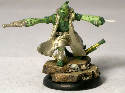
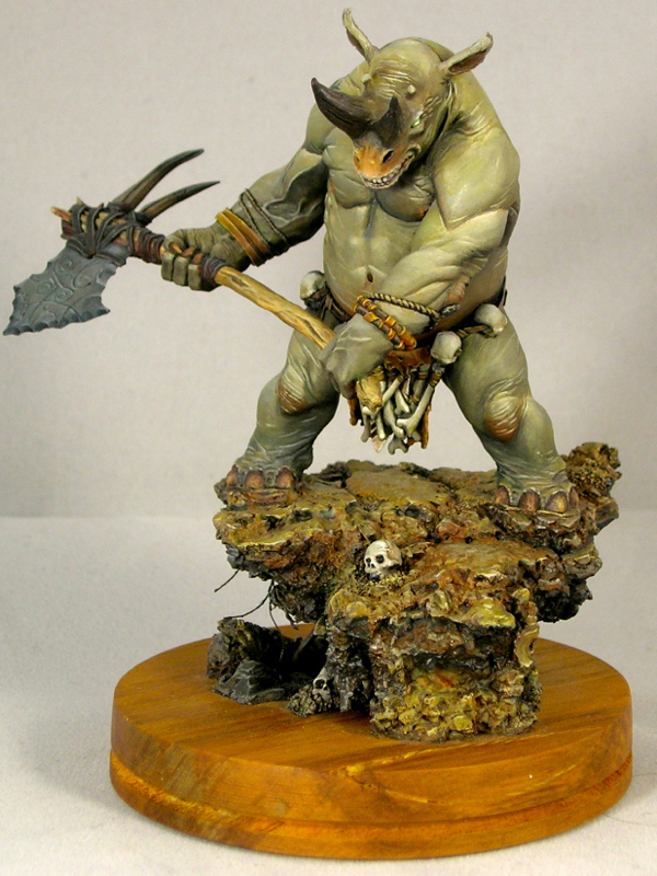
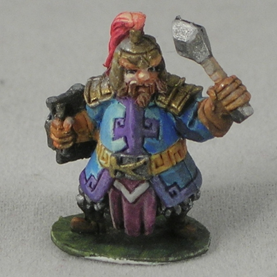
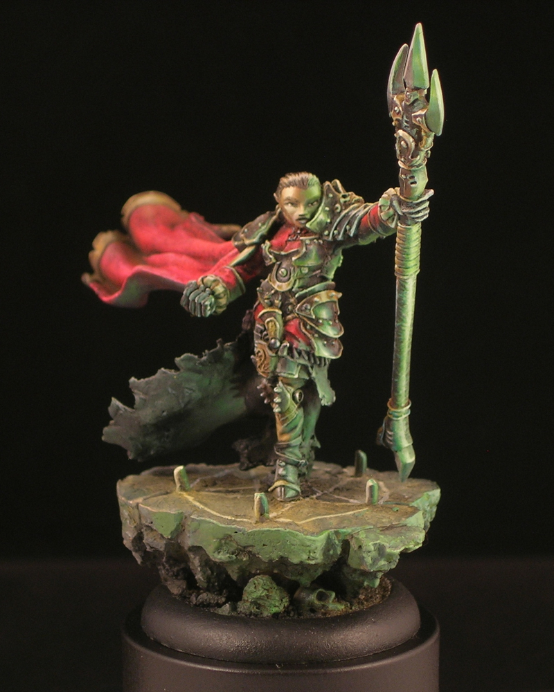
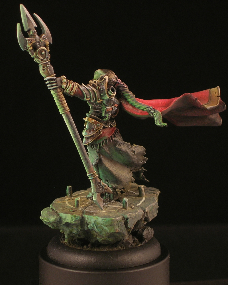
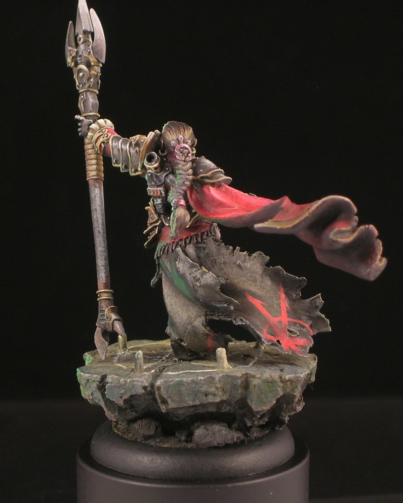
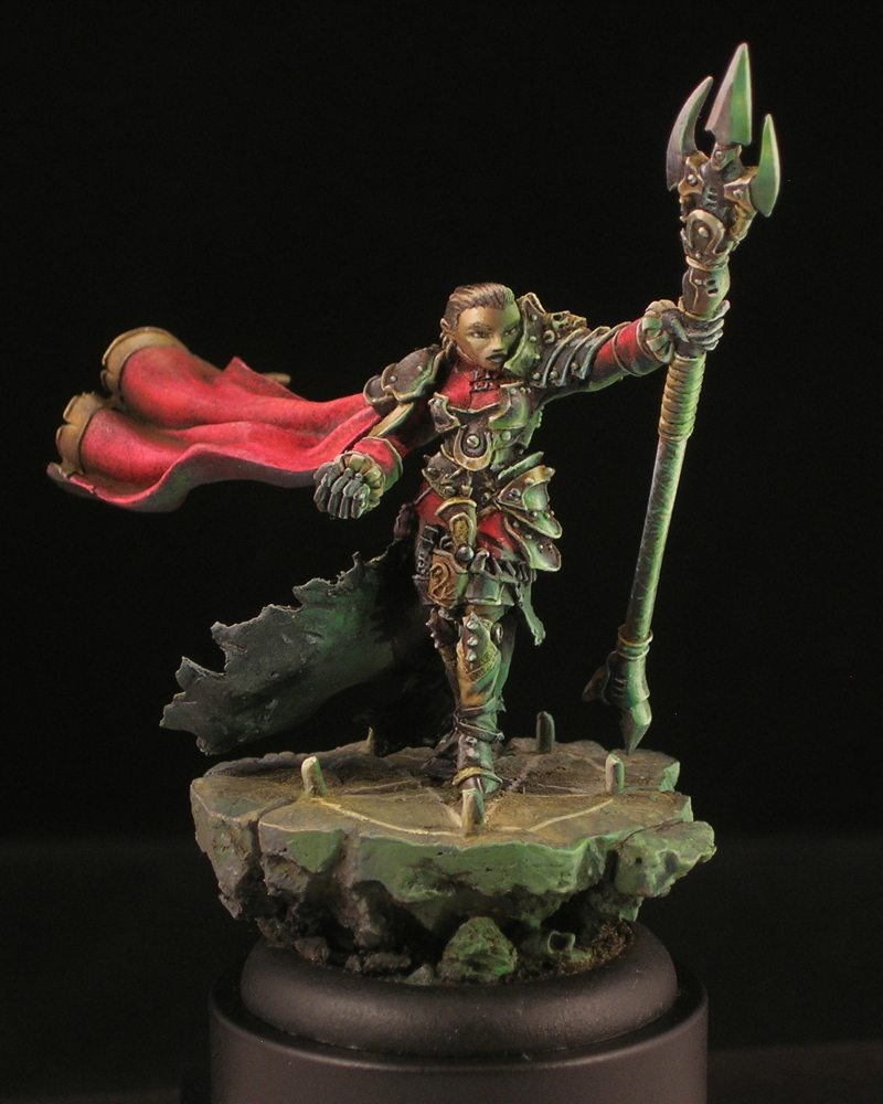
“The White Orc” was my main entry into the Crystal Brush competition this year, the one I spent by far the most time on.

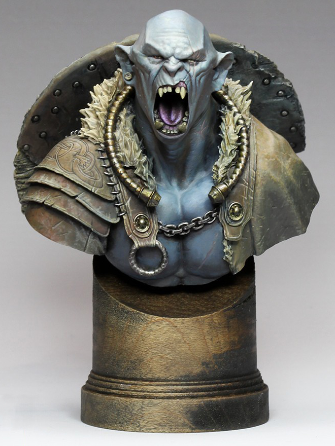
Sometimes a miniature just goes right from the start, and this was one of those miniatures. I started the bust not long after taking a class with Alfonso Giraldes, and had a chance to watch him execute his style of sketching, and gradually turning the sketch into a finished painting. It was quite inspiring to watch, and I knew I wanted to have a go at it; this bust was the result.

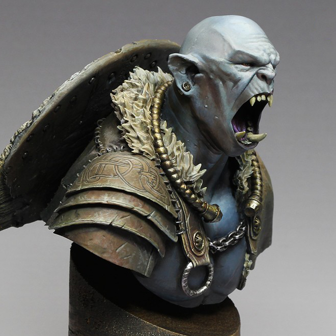
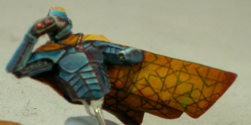
I decided to paint the orc’s skin a light, neutral color that would be strongly influenced by his environment, and do a warm/cold ambiance. I really like complicated lighting situations, and study the way light is used in film in order to later recreate interesting situations with paint. Light neutral tones are perfect when you are playing with complicated lighting situations, since they will be most influenced by the light. I placed a strong white light almost directly overhead, with a warm ambiance from one side, and a cold ambiance on the other. The warm/cold contrast is extremely strong in the initial sketch. I eventually decided the contrast was too strong, and added more warmth to the cool side with some purple. The contrast is still quite apparent if you’re looking for it, but is now subtle enough that you might not notice it.

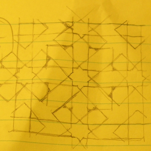
The shield was a lot of fun to paint, with all the battered wood texture. The freehand was one of the parts I struggled with a bit. I started out painting a bloody handprint, and it was just awful. I wasn’t the least bit happy with it, so started Googling alternative ideas for inspiration. Once I hit upon the idea of doing Celtic knot-work for the shield it all fell into place.

I like to get a lot of critiques on my miniatures, as other people often spot things I miss or have ideas I didn’t think of. One of the comments that kept coming up again and again in critiques was, the shield is too clean! So I kept dinging it up more and more. In the end, it ended up really with a really interesting weathered appearance.

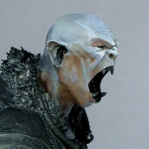
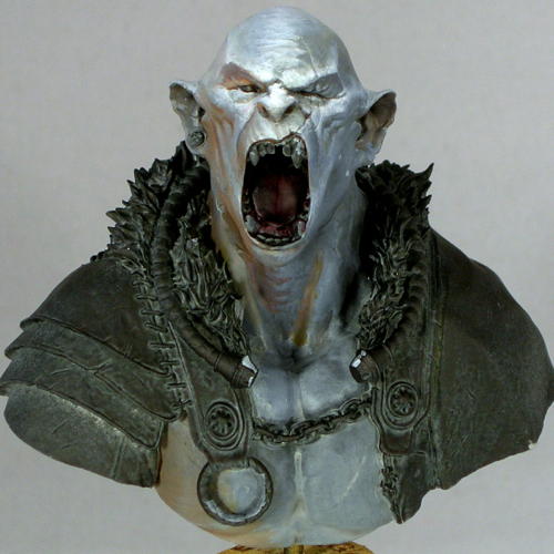
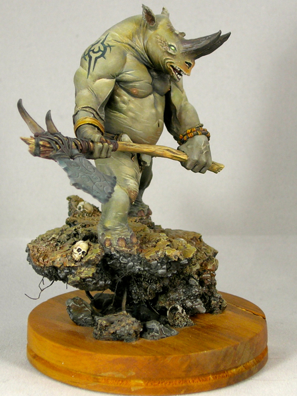
It’s interesting to compare the initial face sketch with the finished product. I actually left a lot of the sketchiness in, especially in the cheeks. I tend to focus a lot more effort on areas that are meant to be focal points—the forehead, eyes, and mouth in this case—and leave things sketchier in areas which are less important. That may have been a mistake in retrospect, since I think it was one of the things the judges dinged me for, and may be part of why he finished just out of the medals. (My understanding is he finished 4th in his category.) I do plan to fix a few things that were bugging me in the photos (mostly where the neck meets the chest) and then enter him in another competition, so hopefully he’ll win some awards before too long. But in the end, I paint for me, not for the judges.

On a more positive note, he’s currently my top ranked model on CoolMiniOrNot, and even made the top 10 of the year as the score fluctuated between 9.5 and 9.6. That made me pretty happy.

The bust is by Hera Models, which has a fantastic little line of sci-fi and fantasy busts. They also make Abalam, which I painted last year. The miniature is now sold out; apparently it sold out in the last couple of weeks, after I presented my own version at Crystal Brush. I like to think I sold at least a few copies, wink.

Even though this bust is sold out, Hera’s “academic orc” bust is still available, and is a modified version of the same bust, without the armor. I can definitely recommend it, as the face is extremely well sculpted and a joy to paint.

Voting links, for those so inclined:

Crystal Brush Entries, part 2

Today I’m continuing my three-part series on my Crystal Brush entries with my single figure entry. If you missed part 1, please check it out here. This figure is titled “Space Pirate Kaelyssa.”

The figure is Kaelyssa, from Privateer Press’ steampunk game Warmachine. I got a big kick out of doing her up in true sci-fi fashion, not at all steampunk. Since she belongs to the Retribution faction, which already have a rather sci-fi look, this was quite easy. All I did was a very simple conversion to add a hose connecting her gun and backpack. The only other thing it took was paint. I was amused how many people asked me if it was an Infinity figure.

Part of the inspiration came from James Wappel’s excellent Professor Karrick. I absolutely love dramatic lighting and glow effects, and James’ take on Professor Karrick’s two light sources is excellent. The base he did complements it really well, providing a nice backdrop to catch the light. For my version, I kept the base but used a different figure from the same sculptor (Patrick Keith), converting it slightly to have a similar hose.

I tend to do simpler color-schemes on most of my figures, with two or three main colors dominating. In my experience, the easiest color-schemes to pull off are those that have at most two bright colors in them, and the rest of the colors are more muted. Here I was able to come up with a more complicated color scheme, with many very saturated colors in it, and I still think it works.

I was really surprised when Kaelyssa didn’t make first cut. I spoke with one of the judges, and he said that she was right on the bubble but the judges felt that the blending on the orange was not smooth enough and that kept her out. I’ve never been the smoothest blender, preferring to take my time creating textures and dramatic ambiance rather than glazing and glazing until I have really really ridiculously smooth blends. I think that hurt me here.

While I think there are some weaker elements, like her left arm and sword, I’m really happy with how the ambience and light effect came out. I think that overall Kaelyssa is good work, but given her poor result in Crystal Brush I plan to rework some of the weaker elements and enter her in another competition in the future (probably the Privateer Press competition at Gen Con).

Kaelyssa is sculpted with some fairly simple, round armor plates. Simple surfaces can be wonderful for an ambitious miniature painter, because they provide a good opportunity to make them much more complicated and interesting using paint. I took the opportunity to do a comic-book-style chrome effect, reflecting the glowing sword and ray-gun. I think the comic-book style art complements the sci-fi vibe really well.

There are a lot of debates between non-metallic metals vs. the use of metallics in miniature painting, with hard-line adherents on either side arguing their way is “better”. Personally I use both, but I think this miniature is a good example of some of the advantages of non-metallic metals. I could never have portrayed the interaction of shiny metals and a light source using metallic paints, the way I was able to do it here using nmm.

Crystal Brush Entries, part 1

I’m back from Crystal Brush, and wanted to share my entries!

I came with a bust, a unit, and a sci-fi single, putting the most time into the bust. Disappointingly, the bust was the only one which made first cut. I think that means that when you go to Crystal Brush, either you need to go all-out on your entry, or you might as well not bring it! That seems fitting for a contest as competitive as it is.

In sharing my entries with the blog, I’m going to start with the unit, which was definitely the weakest of the three entries. These are really gaming models, although I do have high standards for my gaming models. I didn’t even do any basing for them, just painting the 25mm bases they come with and calling that good enough!

I went with a classic red-and-military-green color scheme, which is really a very effective color scheme (yay color theory!) For the reds, I went with a high-contrast NMM look, which I think works really well for infinity models. The green cloth is subtly textured to better complement the shiny metals.

I still have another 4 models from this group to paint, since I got the Operation: Icestorm box set. Doing small tabletop gaming figures can be a nice break from larger projects, so I will probably finish the unit gradually in between other projects.

Next up is my sci-fi single entry, which I’ll be posting later this week!

Gurka Firewater

A lot of people get in to miniature painting through RPGs. When you play the same character weekly in a regular game, it’s a good motivation for painting a figure to represent the character, and doing a good job on it.

This is Gurka Firewater, my character in a weekly Unleashed game. I was disappointed with the available pygmy troll options in the Privateer Press miniatures line, so ended up converting my own, using Captain Allister Caine as the starting point. Since I started with a human figure, this involved extension conversion work.

The head, arms, and feet are full scratch. I sculpted one of the hands around one of Caine’s pistols, but the kukri and the rifle on the base are also fully scratchbuilt. I used a rotary tool to remove the head and grind down the breastplate so I could sculpt a troll belly over it.

Yes, that’s a baguette sticking out of his backpack. In the lore, trolls eat a lot and tend to carry food with them everywhere they go. I guess they’re sort of the hobbits of the Iron Kingdoms? A baguette seemed like a fun and fitting way of giving him some extra character. Perhaps I should also have added a flask, given his name. 😉

I ended up doing a very gritty paint-job with lots of texture. Somehow that seemed appropriate for a bushwhacker character. No smooth blending for this guy.

I entered Gurka in the “open” category at ReaperCon. Usually when I enter competitions, I use stock or near-stock models that are judged only on the quality of the painting. In the “open” category, they give roughly equal weight to both sculpting and painting, making it a much more challenging category. This is especially true for me, as I’m a much better painter than I am a sculptor. Luckily I was able to compensate somewhat for my sculpting deficiencies through my paintwork, and managed to eke out a gold medal.

It’s always good to push yourself, as that’s the best way to improve. With this miniature, I pushed myself to do a much larger amount of sculpting than I had before on any model, and that was definitely a challenge. But it also gave me the confidence to tackle more challenging sculpting projects in the future, since now I know I can do a project that involves significant sculpting, and still end up with a decent result.

Kifaro

This is a miniature I painted a few years ago, in 2012 actually, but never managed to take decent photos of. My camera really doesn’t like him for some reason. These photos are a definite improvement over my last attempt, at least.

Kifaro comes from Studio McVey’s resin line (which I miss very much, since they stopped making them). He is sculpted by Allan Carrasco, who is probably the best monster sculptor in the world of miniatures and has a wonderful feel for anatomy, of both the real and fantastical variety.

Because he is rhino-ish, I went with a realistic rhino coloring, which is a plain, slightly yellowish gray. This presented a bit of a challenge, to keep things interesting despite the plain gray coloring. One of the things I did to add interest is add a tattoo. I was inspired by “tribal tattoo” designs, but ended up with something abstract of my own invention.

The other thing I did was add color into the grays. I used a lot of very dilute ink glazes to vary the gray tones, and also added red-orange colors to places which often have a bit of extra fleshy color in other animals (though not rhinos, as it happens).

The base is built mostly of cork tile, with sand and putty added to vary the texture a bit, and hide the flat parts of the tile. I quite like building bases this way, because it’s very easy to rip parts off and glue them back in a slightly different position to alter the overall form. Because this sort of moving and reforming is similar to natural processes, you can also get great organically random textures as a nature side-effect of doing this.

Kifaro’s base was the first I built which just sort of rises up out of a wooden plinth, without filling it to the edges. It’s not something you see very often, but I quite like the effect. I have done it several times since, most recently with Desert Wanderer.

Of course, when the sculptor is a master of anatomy, it’s important that the sculpture is anatomically correct. Actually, Kifaro’s caster decided that right between the legs would be a marvelous place to place an injection point, leaving a big chunk of resin there, rather than accurately sculpted anatomy. Some very delicate reconstructive surgery was required to correct the deformity. Just one of the joys of being a perfectionist in this hobby. 😉

He’s posted here on Putty & Paint. Not

Time-traveling Haley

Sorry it’s been so long since I’ve updated the blog! Between ReaperCon, non-miniature things, and the holiday season, I just haven’t had the chance. But today I find myself stuck at the airport, with a delayed flight, and it seemed like a perfect opportunity to update the ol’ blog. Rest assured, I have much more new material planned for January.

Those of you who have seen my work probably know I’ve long been a fan of Privateer Press’ games and miniatures, especially Cygnar, which was my first faction. So when I saw the epic time-traveling version of Victoria Haley, I was instantly sold. It’s a great new spin on a classic, iconic Cygnaran leader.

For my take on this classic, I decided to go for a much sketchier and more painterly style than my usual. After painting miniatures for two decades, this was a pretty radical change of style for me, but sometimes that’s the best way to grow.

I think using this sketchier style helped me push a lot of things, and in some ways this group of miniatures was a breakthrough for me. I think I took some big steps forward in my ability to sell the appearance of metal with non-metallic paints (nmm) through contrast and highlight placement alone, without smooth blends. I think it was also a big step forwards in my use of color, subtle gradations of warm and cold tones that add complexity, interest, and realism, especially in the whites.

In the end, however, it was not entirely successful. The end result is just too rough, and I should have taken more time to clean things up and smooth them out. (Compare how future Haley looks in the group shot, where she’s slightly out of focus, to how she looks here.) This was fairly quick work by my standards, less than 10 hours per character I estimate. I entered them in the Privateer Press competition at Gen Con, and ended up with a disappointing silver.

Past Haley ended up being my favorite of the three to paint. I love her facial expression, screaming in rage and defiance. Getting the tiny bits of nmm, like the goggles and hair cuffs, to look metallic was a challenge, but I think I managed to pull it off.

In the end, this group was a great learning experience, and it was great to push myself in a new direction, even if it didn’t entirely succeed. I think I can take what I learned about from painting this group, but blend it more with my usual, cleaner, smoother style, and end up a much better painter as a result.

Jeanne d’Arc

Infinity miniatures have come a long way since their first releases. For the last couple of years, they are doing all digital sculpts, which is perfect for sci-fi figures with their machined power-armor and gadgets. Their line is 100% metal, and are among the nicest metal casts I have worked with.

jeanne_d_arc_1

For this miniature, I was inspired by the beautifully smooth non-metallic metals on the version by Gareth “glazed over” Nicholas. The resemblance is quite apparent, although my blends are not nearly as smooth. I just don’t have the patience for that much glazing. I’m pretty happy with the effect I was able to get.

jeanne_d_arc_2

Although I stayed quite close to Gareth’s version for the metals, for everything else I decided to go my own way. I painted this while I was still working on Desert Wanderer, and decided to go with the same color scheme and Islamic-inspired freehand, since it worked so well for Wanderer. Because of the Islamic freehand, I ended up entering Jeanne along with Wanderer in the Rainbow Brush competition, but when Wanderer won, she was out of the running. Yes, I did end up entering two figures named after Christian saints in an Islam-themed painting competition. Irony is ironic that way.

jeanne_d_arc_3

The fine texture of the cloth came out really well I think. I like to contrast different textures in my miniatures, in this case the weave of the fabric against the smooth metal of the armor.

jeanne_d_arc_4

I’m a big sucker for reflected light, and love including it in my figures. Non-metallic metals are a great opportunity for this, especially when the metal surface is right next to a brightly colored element, as is the case with Jeanne‘s loin cloth. You can see it in this view on the silver woven metals, and in other views on the blue armor plates. In most places you see just the color, but on the flat plates immediately adjacent to the loin cloth you can also see the shape of the fabric in the reflection.

jeanne_d_arc_5

I had a lot of fun with the base. I often like simple bases for my miniatures, especially gaming figures, but which are evocative enough to provide a setting for the figure. To make this base, I used a standard Infinity gaming base, but cut a big hole in the middle of it, which I replaced with a brass-etch grating and a clear piece of blister pack that I painted with transparent orange ink. I really enjoy using negative space when basing miniatures.

jeanne_d_arc_top

I used a clear acrylic plinth from TAP Plastics to accentuate the negative space in the base.

jeanne_d_arc_6

I frequently ignore the manufacturer awards at Gen Con, because I’m more interested in painting what I want to paint rather than maximizing my chances to win awards. This year I lucked out though, and when I went to enter the painting competition I found out that Infinity was supporting it with manufacturer awards.

I went down to the Infinity booth later on, and was seriously tempted to get Operation Red Veil. I think the sales guy was a bit miffed when I said I’d wait, “just in case” I won their manufacturer award (which included the game). He may have been astonished at my hubris, but I thought I had a pretty good shot at winning.

jeanne_d_arc_7

It turns out I was right to hold off, since I was awarded best Infinity figure with this model. 😉

Voting links, for those who want them:

Desert Wanderer

I began working on this miniature last fall, shortly after Gen Con 2015, but only recently finished it, for Gen Con 2016. (WIPs: part 1, part 2, part 3.)

desert_wanderer_01
It’s really a fantastic miniature, from the game Dark Age, and I love how much energy there is in the sculpt. I did some conversion work on the rider, twisting the cloak and moving the arm to give him a more three-dimensional pose, and also because I liked the feeling that binoculars gave the miniature (as opposed to a pistol).

desert_wanderer_02

As I mentioned back in October, I was thinking about using south asian or west asian fabric patterns to decorate the cloak. I did a lot of image searches looking for inspiration, and eventually ended up settling on an Islamic geometric design, even though those are more commonly seen in architecture rather than on fabrics. Amusingly, though I spent hours googling possible designs, the one I settled on was from my office cafeteria rather than image search.

costa_window

Before transferring the design onto the cloak, I did a sketch (and modified the pattern slightly, adding more symmetry).

desert_wanderer_cloak_sketch

The inside of the cloak has a large flat area, which is really perfect for this sort of intricate freehand design. Here is a work-in progress picture of the cloak. When this photo was taken, I still needed to make the line thicknesses more consistent. But first it’s more important to get the entire pattern laid out, since you don’t want to spend a lot of time getting a line straight and even only to realize it’s in the wrong place.

desert_wanderer_cloak_wip

The green spot on the cloak is actually intentional, though it looks totally weird in this picture. Once the rider is mounted, that part of the cloak is right above a piece of blue metal, the back of the shoulder-mounted gatling gun. So it’s an entirely natural place to see reflected blue light; yellow and blue makes green. I’ve been thinking about light a lot in my miniature painting for the last couple years, and I’m a big fan of reflected light. In some of the other pictures, you can also see ground reflections in the metals, particularly on the legs. The effect is quite subtle, but I think it adds a certain amount of realism and keeps things from being too cartoony.

desert_wanderer_03

The other big change since the last in-progress post, besides the freehand on the cloak, is the addition of a lot of dirt and grime to the mount. I have a friend who I like to ask for critiques, and he always tells me my miniatures are too clean and I need to make them dirtier. But he is helpfully specific in how I need to make the miniature dirtier, so his comments are very useful. For this mini, he complained that someone wandering through the desert riding a powerful beast would churn up a lot of dirt, so why does the mount look so clean? He was absolutely right, as usual.

desert_wanderer_04

I used the same pigments I used on the base in order to add the dirt. I kept it focused around the joints and in the cracks between armor plates and other mechanical elements. This is, of course, where you would expect dust to accumulate. But I also didn’t want to obscure the beautiful blue metals, and the brilliant white reflections, and keeping the dust confined to joints and cracks helps this happen. It’s sometimes a tricky balancing act, trying to get a realistically weathered appearance while still maintaining strong contrasts and making shapes that are easy to read at miniature scale. I think I was able to reach a good balance with this miniature.

desert_wanderer_05

The dead tree is just some cool roots I found while walking near my office. Roots tend to work better than above-ground parts of plants in miniature scale, since they look like miniature versions of the above-ground bits. This piece was really cool and twisted looking, which I thought made it look like it had been warped by powerful winds.

desert_wanderer_06

The sculptor did a fantastic job on the drapery on the back of the cloak, so I decided not to add freehand to the back, which would only distract from the great sculpt. Instead, I used very strong highlights and shadows to really bring out the details of the drapery work. It’s lovely when you get a beautiful sculpt like this which doesn’t need any freehand decoration, but I’m also happy that the sculptor left a broad flat surface on the inside of the cloak which was perfect for adding a pattern.

desert_wanderer_07

I did add a bit of texture to the fabric to add some interest to the lower half where the sculpt is less detailed. Smooth blends are for smooth surfaces only, and I imagined my desert wanderer would need a coarse garment which could stand up to sandstorms.

desert_wanderer_08

The bones on the base are mostly rodent bones from ebay. I assume they came from an owl pellet, but I bought pre-cleaned bones since I didn’t really want to dissect an owl pellet. The exception is the ribs—I really wanted a ribcage sticking up out of the dirt, but there weren’t any appropriate bones in the set I ebayed so I sculpted some out of green-stuff.

desert_wanderer_09

In this picture  you can see where I added some control panels for the rider to see readouts from the mount’s sensors. These were added with freehand. That surface is smooth in the sculpt, but I figure that robotic dragons need dashboards so I added some screens.

desert_wanderer_10

I entered this figure into the painting competition at Gen Con, where he was eligible for both the overall awards and the Rainbow Brush competition. Rainbow Brush, which is organized by one of the best miniature painters in the world, was started last year to express support for groups facing oppression and marginalization in the wake of anti-gay legislation that was passed in Indiana, where Gen Con is held. This year the theme was Islam, chosen because of the extreme and appalling anti-Muslim sentiment which has been particularly virulent this election season. As it happens, I had already decided on the Islamic pattern for the Desert Wanderer’s cloak before the theme was announced, but I thought he made a fitting entry.

desert_wanderer_11

Desert Wanderer won a gold medal in the open judging at Gen Con, and placed first in the Rainbow Brush competition.

You can also see him on CoolMiniorNot and Putty & Paint, where you can rate him if that’s your jam.

Speed-painting!

I love speed-painting, both competitive speed-painting at conventions and just for fun at home. I think it’s great as a palette cleanser between longer projects. It’s a good way of getting playable, tabletop-quality figures on the table quickly, and allows you to focus on overall impact and feel rather than on getting all of the details perfect.

speedpaint_05

In speed-painting, the name of the game is high contrast, dramatic paintjobs which will catch the eye from a distance. Don’t try to make the mini look good up close, that’s just not something you can really accomplish in an hour of painting. Go for eye-catching techniques such as lighting effects and freehand, strong contrasts, and a passable face, and don’t worry about quality blending.

For Karzoug, I went for a strong lighting effect—the mini basically begs for it. The other versions I’ve seen use ordinary flame-colored flames, so for my version I opted for a more unnatural fire, as befits a necromancer.

speedpaint_06

Unlike the rest of the minis I’m showing today, Karzoug was not painted at a convention, so I actually got to give him a half-decent prep job instead of having to deal with giant mold-lines and dusty primer, and I got to use my own brushes. (Bringing your own sables to convention speed-painting events is generally considered cheating.)

speedpaint_11

Every convention has its own speed-painting rules, but the basic idea is that everyone is given the same miniature—contestants usually have no idea what it will be ahead of time—and have to paint it as well as they can within the time allotted. You normally get 45 minutes; championship rounds often last an hour. Use of personal materials is generally not permitted, so you’re sometimes painting with really terrible brushes, though sometimes you get lucky. Provided minis are assembled and primed (often not terribly well, since the people prepping them have several hundred other minis to prep and don’t care much about the end result). Getting a decent finished product in this environment is challenging, to say the least. So please don’t judge these minis too harshly. 🙂

speedpaint_10

Zombies make very good speed-paints. Messiness is usually inevitable, but on zombies it’s a plus. This zombie was painted in the speed-paint at KublaCon, which only provides contestants with one brush each. My favorite speed-painting technique being two-brush blending, I had to improvise. Fortunately, if you are sufficiently practiced, it is possible to two-brush blend with a single brush. 😛

speedpaint_03

I had the good fortune of painting this anteater twice, in two consecutive years of speed-painting at KublaCon. He is a tiny one-piece mini, produced by Zombiesmith who are great for always sponsoring KublaCon mini events. Small one-piece sculpts are ideal for speed-painting, because it’s very fast to cover the entire mini with paint. This gives you plenty of time to pull off more inventive  decorations such as freehand, and causes me to occasionally annoy other contestants as I wonder aloud, “What am I going to do with all this time?”

speedpaint_04

In the case of this anteater (technically a Quar) and his large flat back, that would be freehand decoration, of course. The first year I went with “hell angel” (it was faster and easier to leave off the esses, and still makes sense) and a pentagram, which seemed appropriate for a gun-toting bad-guy. The second year I wanted to do something different, so I ended up going in totally the opposite direction with a peace symbol on tie-dye. The idea cracked me up when I thought of it, so I hoped the judge would like it too. Both placed first in their respective rounds.

speedpaint_07

This is Kubla, con mascot for KublaCon. For the championship speed-paint round, they always use the convention figure, which is fun and gives you some extra time to plan (not that I ever remember to use it). This was not my best speed-paint however, and I only placed third that year (2015).

Karzoug, Runelord (Reaper), 75 minute speedpaint

I did much better in 2016, when I managed to win all four of the rounds I entered, including the championships. This grot was from the first round I entered, and was a great little blast from the past. He’s another tiny one-piece model,  so I had lots of time to freehand in horrible ’90s-style checkerboards and hazard stripes. I think it suits the model.

speedpaint_02

You can tell I spent way more time on the front than the back. Strategy!

Sadly this grot and the tie-dyed Quar are the only figures I managed to hang onto from KublaCon 2016. One figure I gave away, and the championship round figure I either misplaced or it, erm, wandered off.

speedpaint_08

Privateer Press’ gobber rogue, another tiny one-piece figure! This was from the speed-painting competition at Gen Con, which tends to be a bit more competitive than the speed-painting at KublaCon since it draws a bigger audience. I’m really happy with how the face and the rusted daggers came out, and I stole the idea for flowers on the base from another speed-painter. Sadly he only came in second, but that was enough to qualify me for the championship round… where I again came in second. Phooey!

speedpaint_12

And finally, this is perhaps my favorite speed-paint of all time. It’s a bit impressionistic, but I managed really strong contrasts and the overall colors work pretty well. I’m especially happy with how the rocket came out. One of my painter friends complained about the very visible brush-strokes on the back, but those were intentional, to show the gleam of the metal, and also a bit of the texture (if you look closely, you can see the brushstrokes are horizontal on the nose-cone and vertical along the shaft of the rocket).

speedpaint_13

This was from the Wyrd championship speed-paint at Gen Con, where I managed to finish first, beating the woman who beat me in the Privateer Press championships (and collecting a bounty!)

P.S. I promise to be back showing actually-well-painted models (and not just well-painted-for-45-minutes models) later this week. I have lots of minis from the Gen Con painting competitions that I’ve been dying to show off.

“Black Arts”

This was one of those miniatures that sat around half-painted for a very long time, over a year in fact, before I finally finished it.

black_arts_2

Initially I didn’t have the lighting effect, just red fabrics with black armor. The result was a deadly dull miniature with the cloak stealing all of the focus and the armor a muddy mess. It took me a year to figure out how to fix it, but when I came up with the idea of a strong green light from some dark ritual Fiona was performing, I knew it would be perfect.

black_arts_3

I really like the result – it brings the focus back to Fiona’s weapon and face, where it should be, and also has a strong story-telling element when combined with the pentagram Fiona is standing in.

black_arts_4

The old Fiona the Black miniature has a lot of things going for it, but I never much liked its spindly legs. When someone on the Privateer Press forums suggested doing a conversion with the legs from the satyxis sea witch, I knew I had to try it. Since the Satyxis have a matching pirate theme and the same sculptor (Werner Klocke) as Fiona, the converted parts work well together, and the result is a great, powerful pose.

black_arts_1

I entered this mini into the Privateer Press painting competition at Gen Con, where she finished with a disappointing silver. I honestly think she deserved better than that, but I guess you can’t win them all.

« Older posts Newer posts »

© 2024 Light Miniatures

Theme by Anders NorenUp ↑