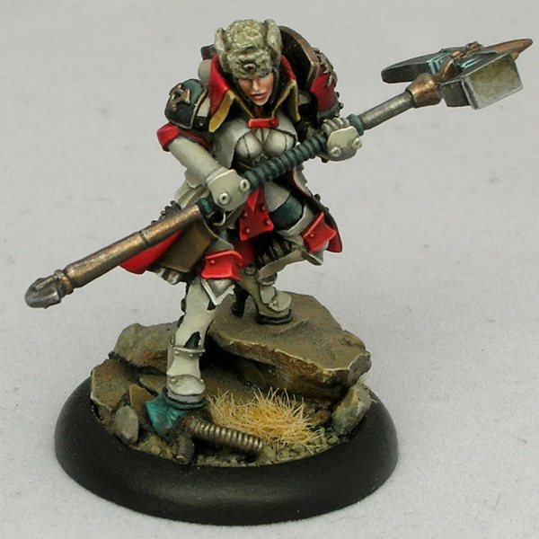
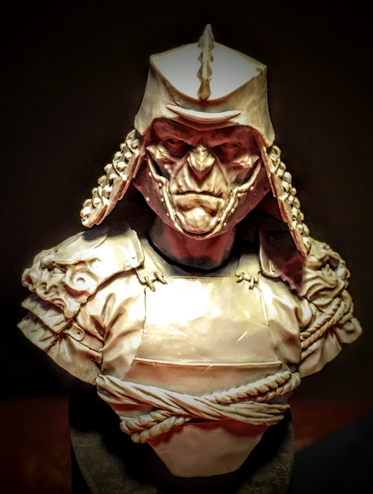
When I posted Abalám on Putty & Paint, one of the comments I received was from Roman Lappat (of Massive Voodoo fame) who wrote,
Great piece. Love the light situation, even I think there are minor parts missing here and there, but this does not make the bust bad. If you want me to point out my thoughts about the light shot me an Emal 🙂
Let me just say I love this reaction. “I like this mini, but see some ways it could be better. I must tell the painter!” Constructive criticism is fantastic, and I’m thankful for all of it I can get, especially when it comes from as knowledgeable a source as Roman. As I wrote in Thoughts on painting competitions, constructive criticism is extremely valuable in improving your work.
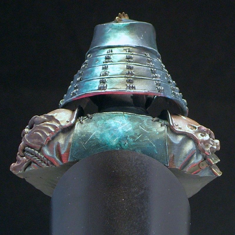
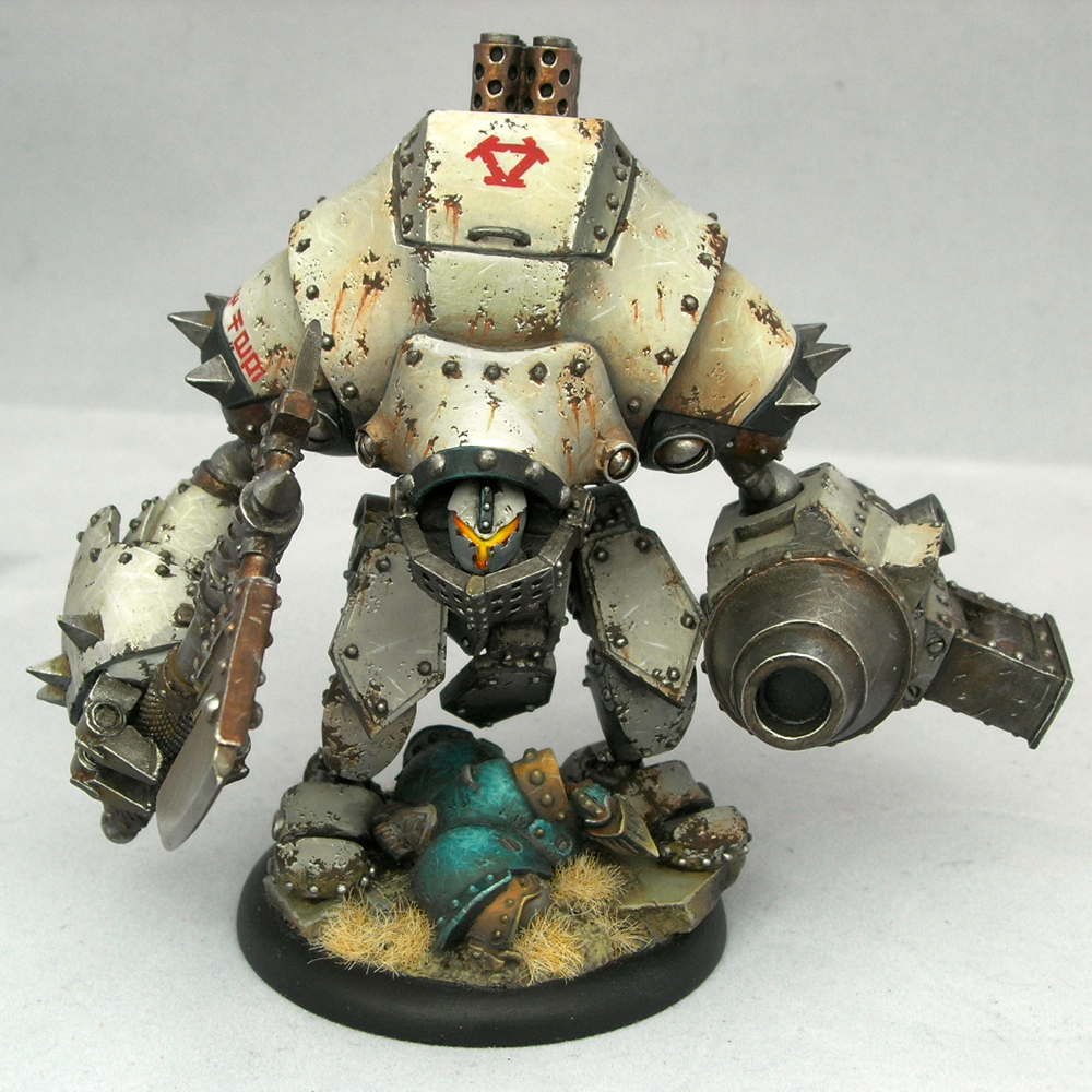
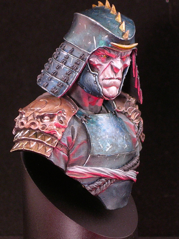
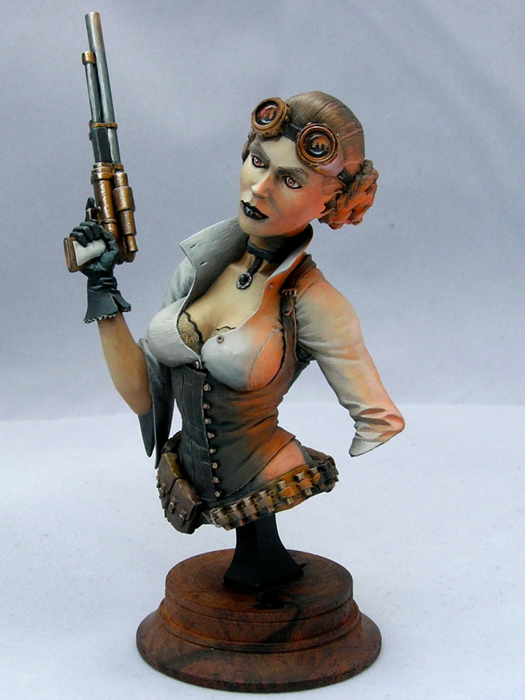
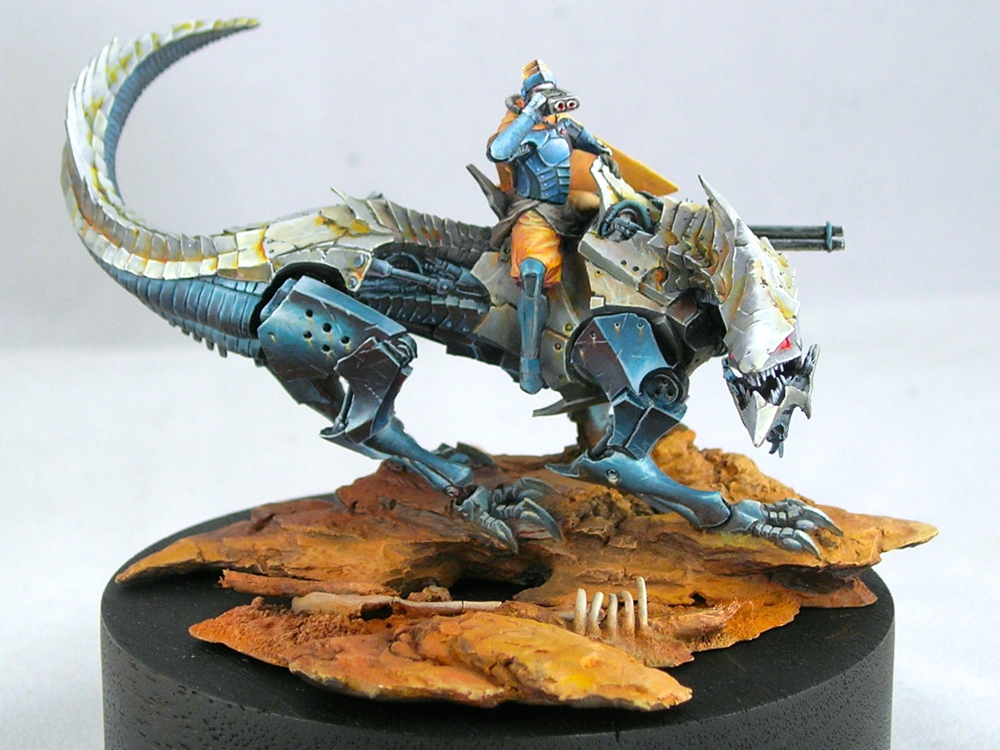
When I emailed Roman, he sent me a very helpful diagram showing the areas he felt the light was missing or not strong enough.
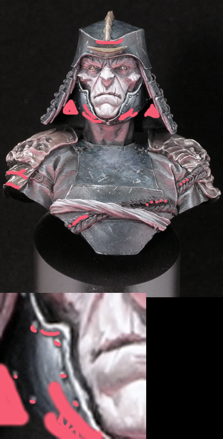
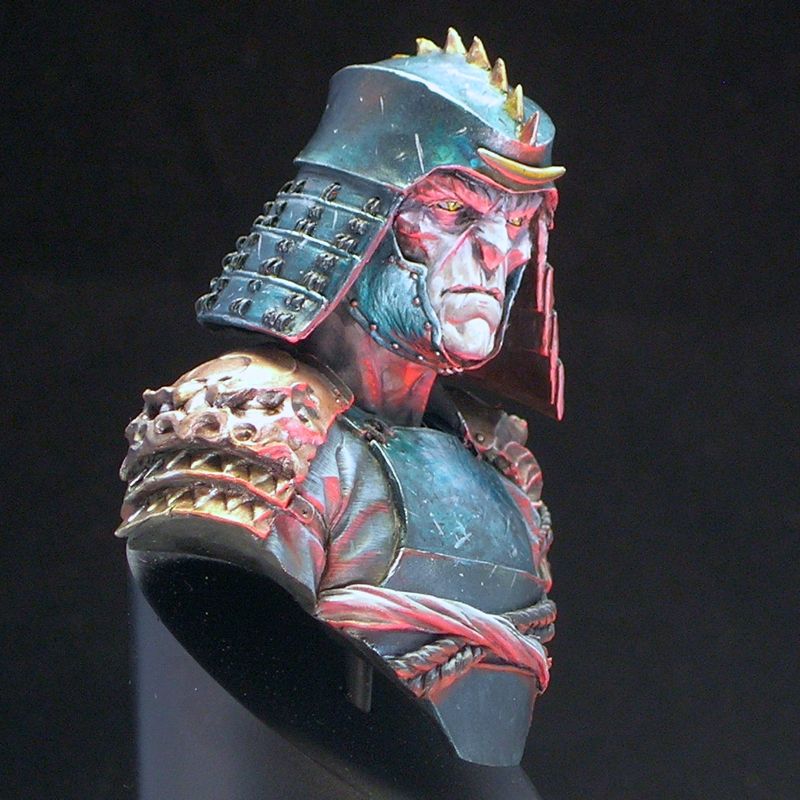
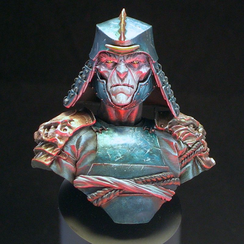
Armed with this sketch, my brush, and some red paint, I went back to my figure, and intensified.
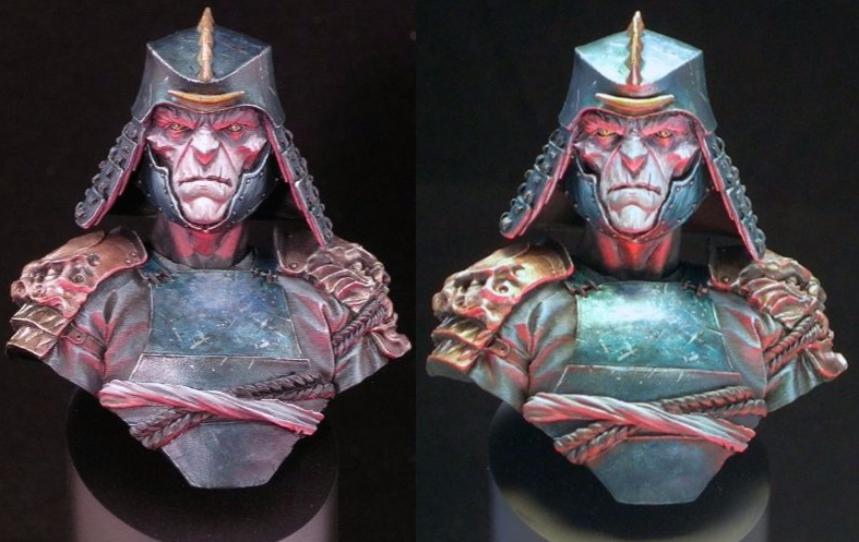
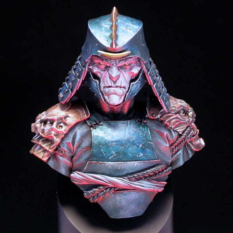
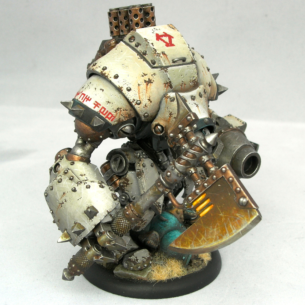
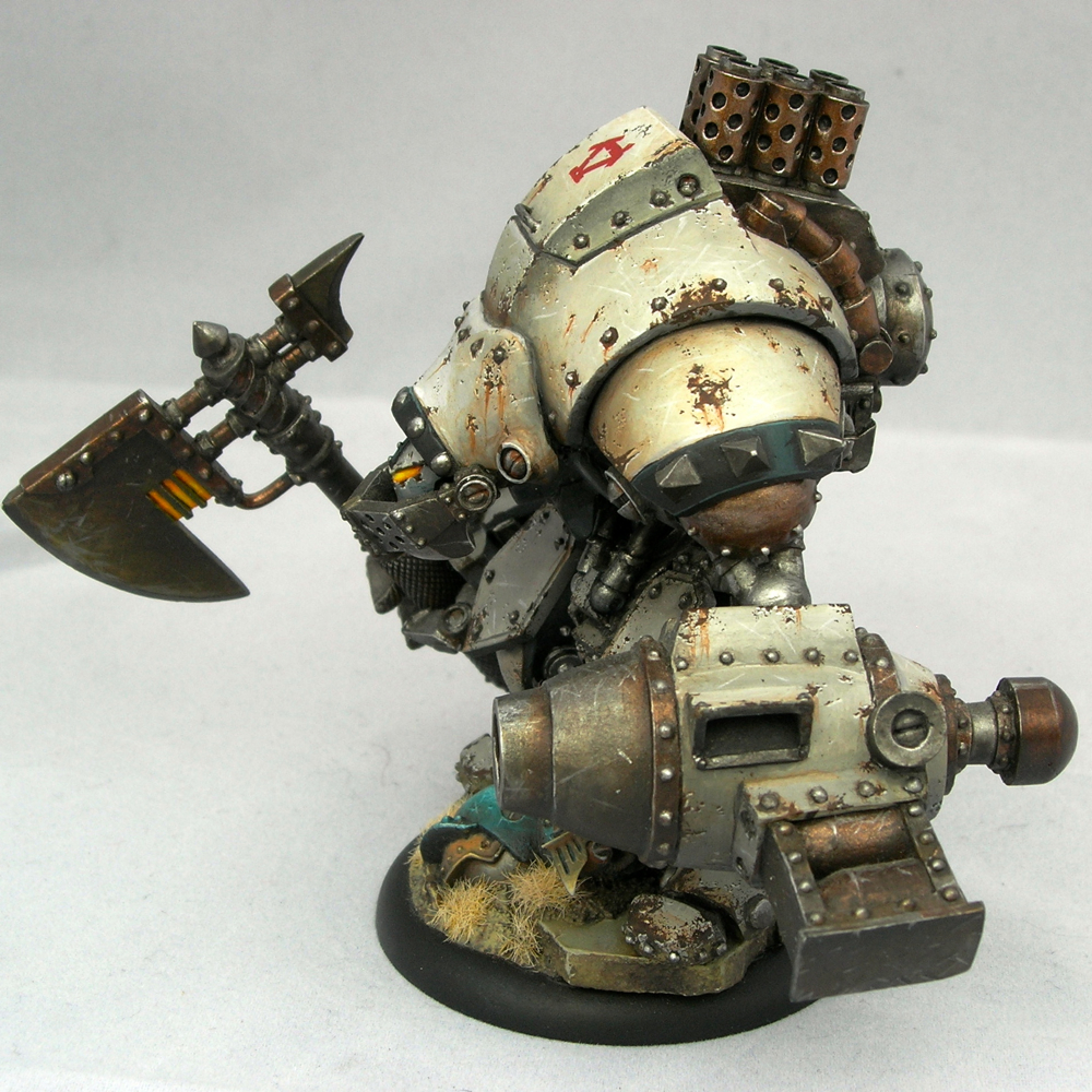
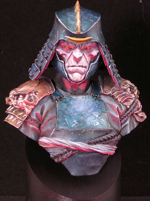
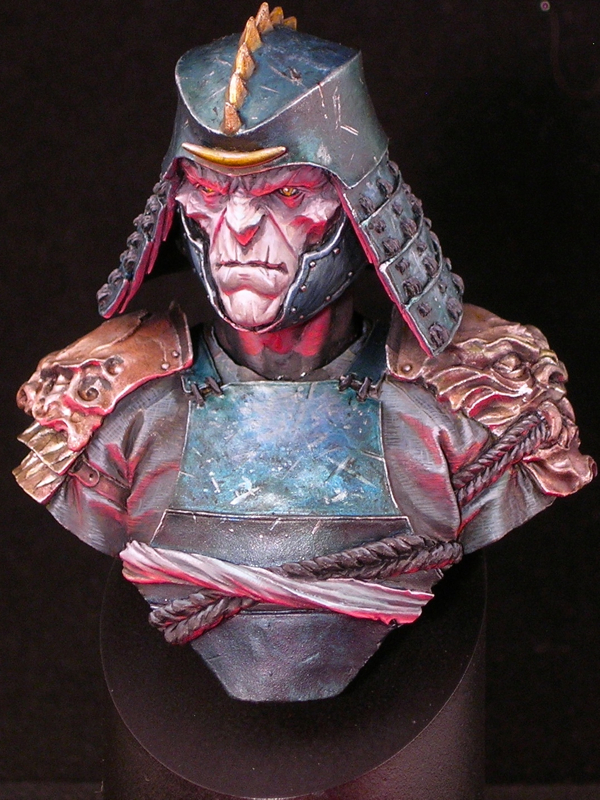
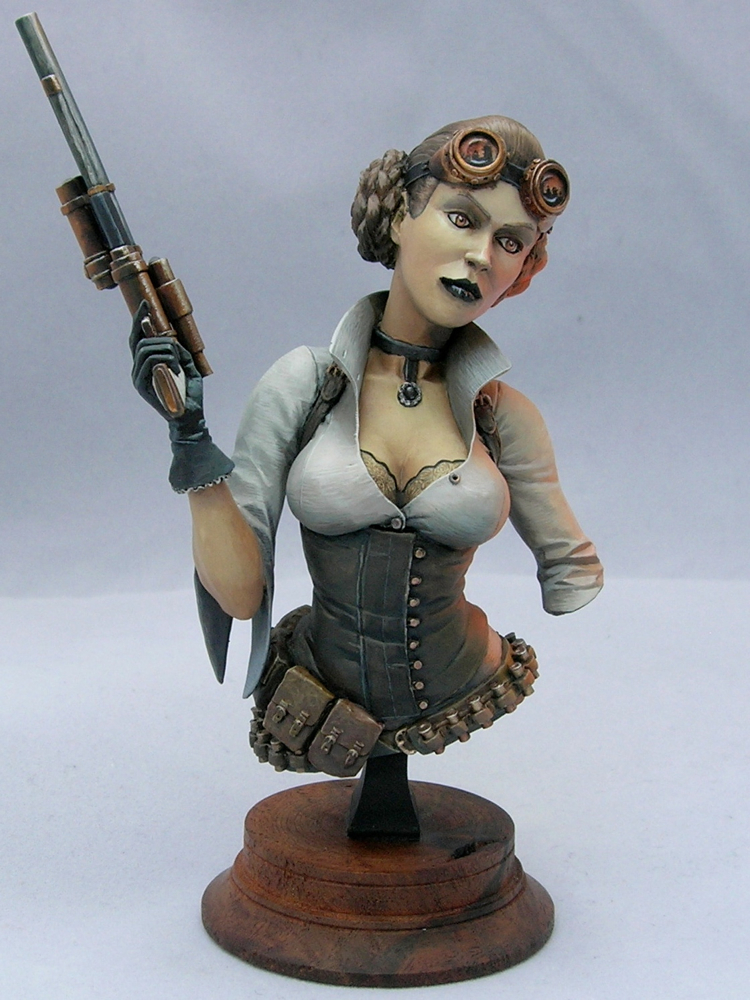
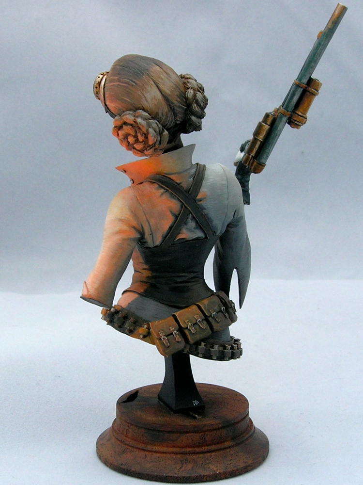
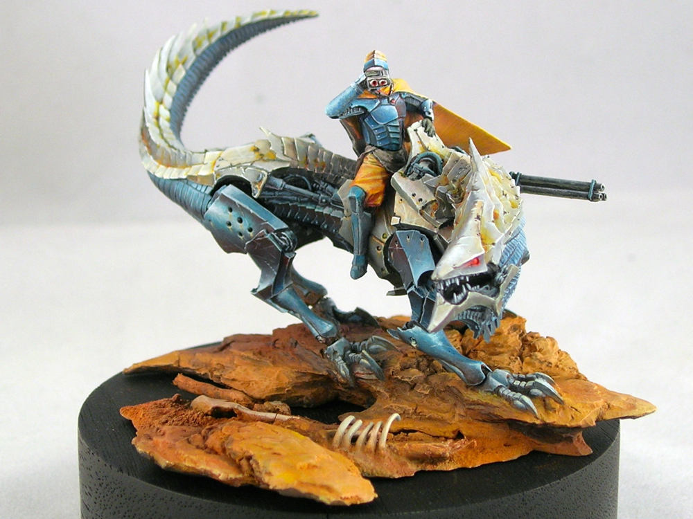
Of course, the lighting is also rather different between the two photos. I’m terrible at miniature photography, sorry! I think the new pictures are somewhat closer to life, but this guy is really tricky to photograph.
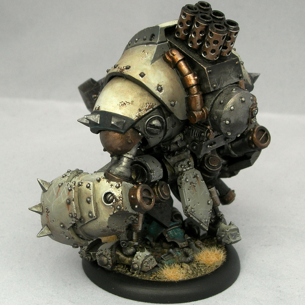
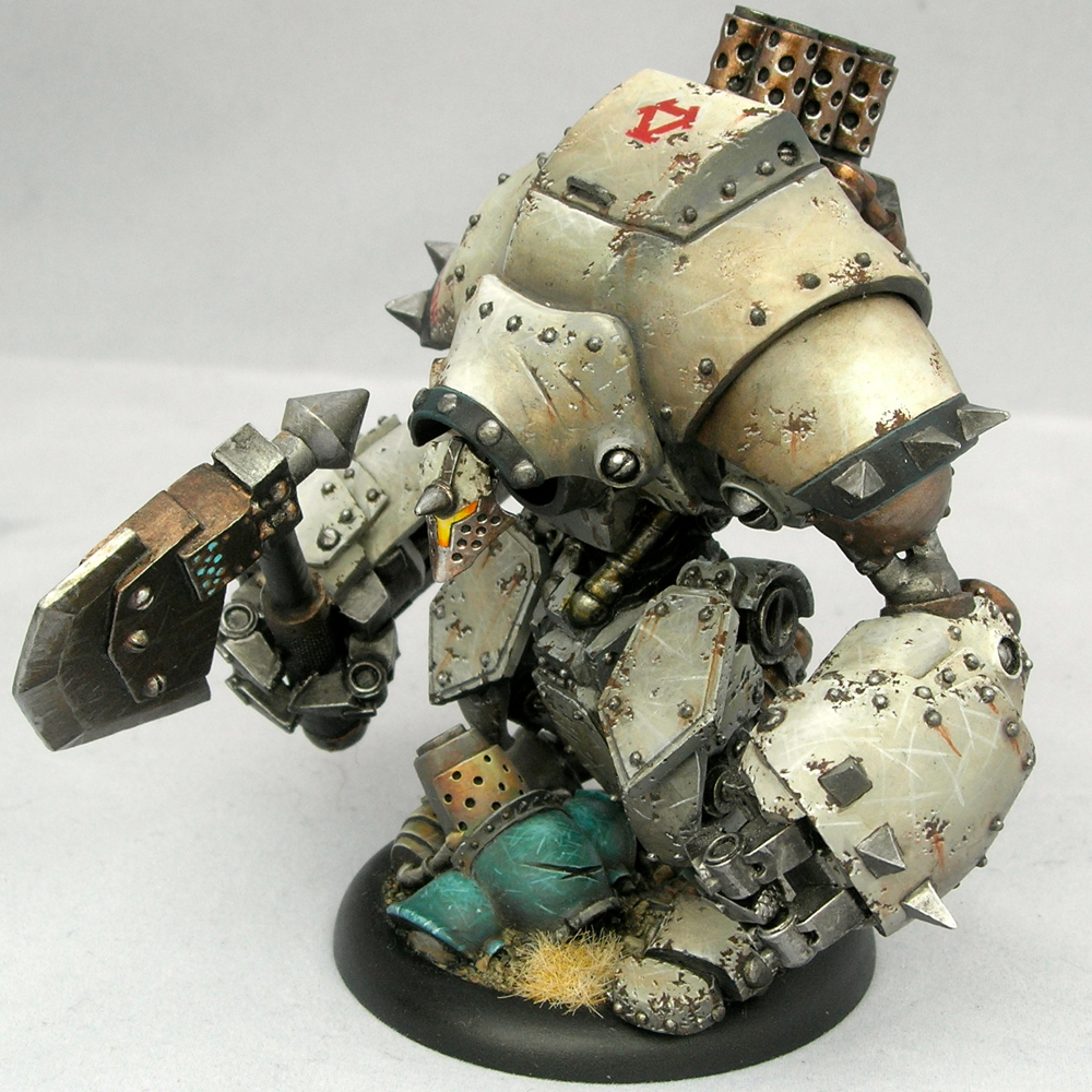
I followed all but one of Roman’s suggestions, which was the back of the helmet. It’s just so recessed that I didn’t feel it would receive very much light, so the very strong light that Roman suggested would look out of place. Also, you have to be very careful painting lighting effects in heavily recessed areas of a miniature, because you are fighting against the shadows of the miniature itself. In the end, I did retouch the back of the helmet, but with a dull, dark red, instead of the strong effect that Roman suggested.
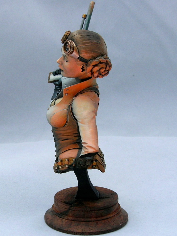
I did add light on the rivets, but it’s subtle, and hard to make out in these photos.
In addition to following Roman’s advice, I also intensified in some areas he didn’t highlight. I made the light on the neck much more dramatic, since it looked flat and poorly painted in the original. I added light on the lower-most armor plate, as that was one of the areas that lit up in my original study but where I had not added a glow effect. And I intensified the light on all of the ropes and the sash, and not only the parts Roman indicated.
Many people, when confronted with criticism, are resistant towards it, and try to find reasons to ignore it. I think this is a very good example of how one can benefit from not only being open to criticism, but trying to look further, and explore how you can use the insight in the criticism to improve upon things that the critique did not specifically identify.
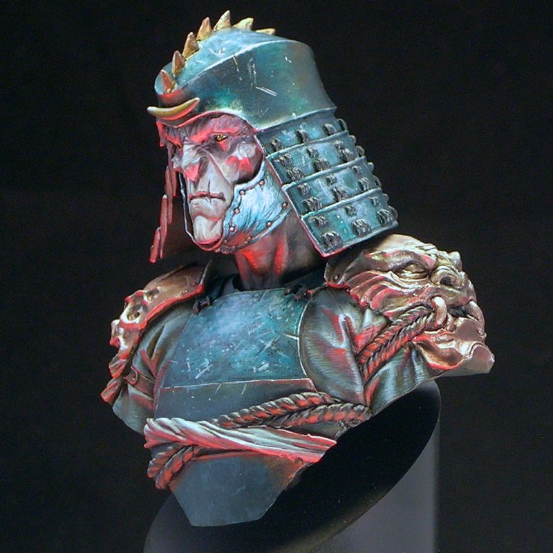
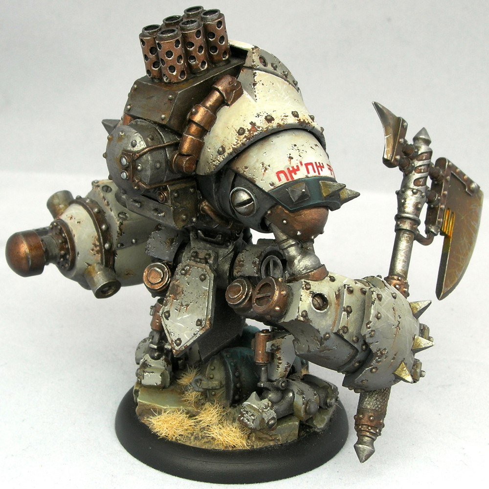
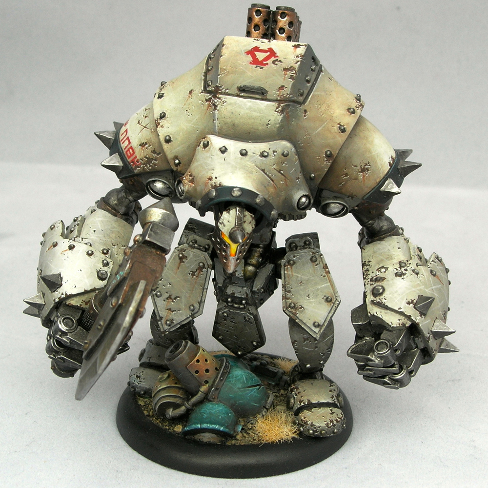
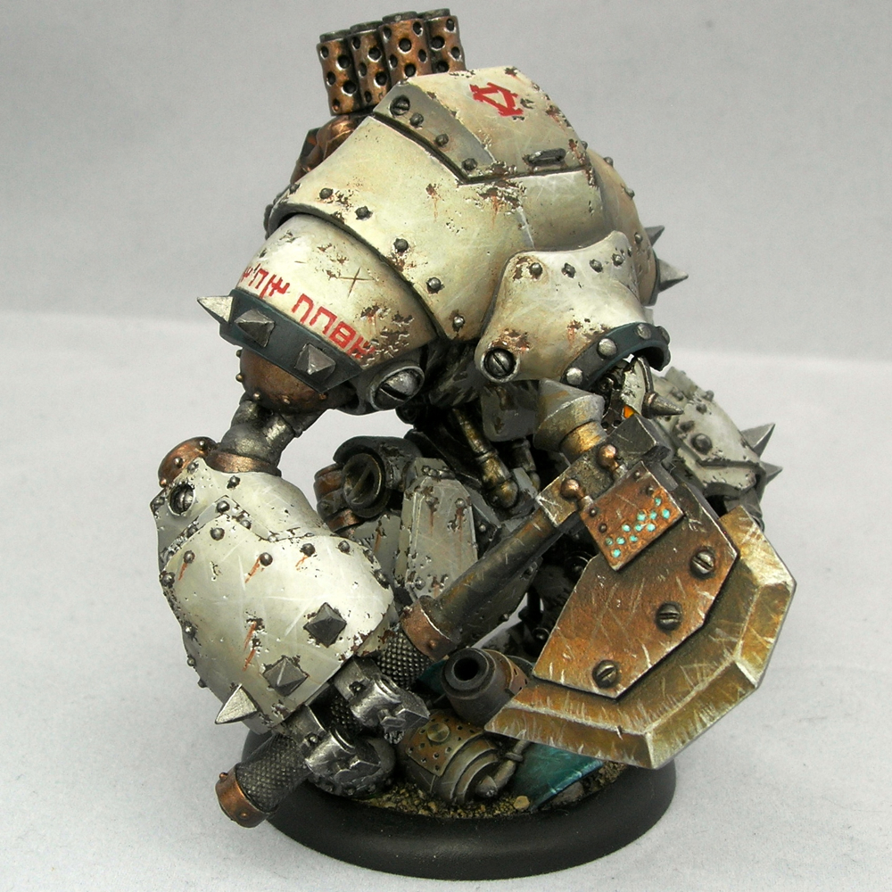
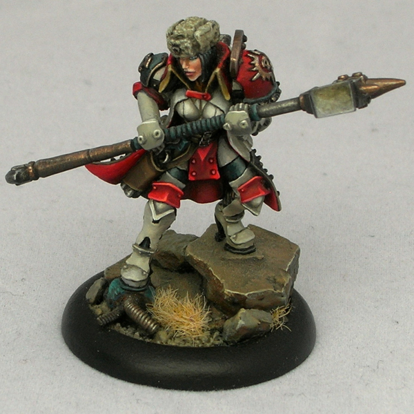
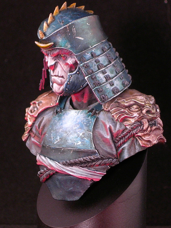
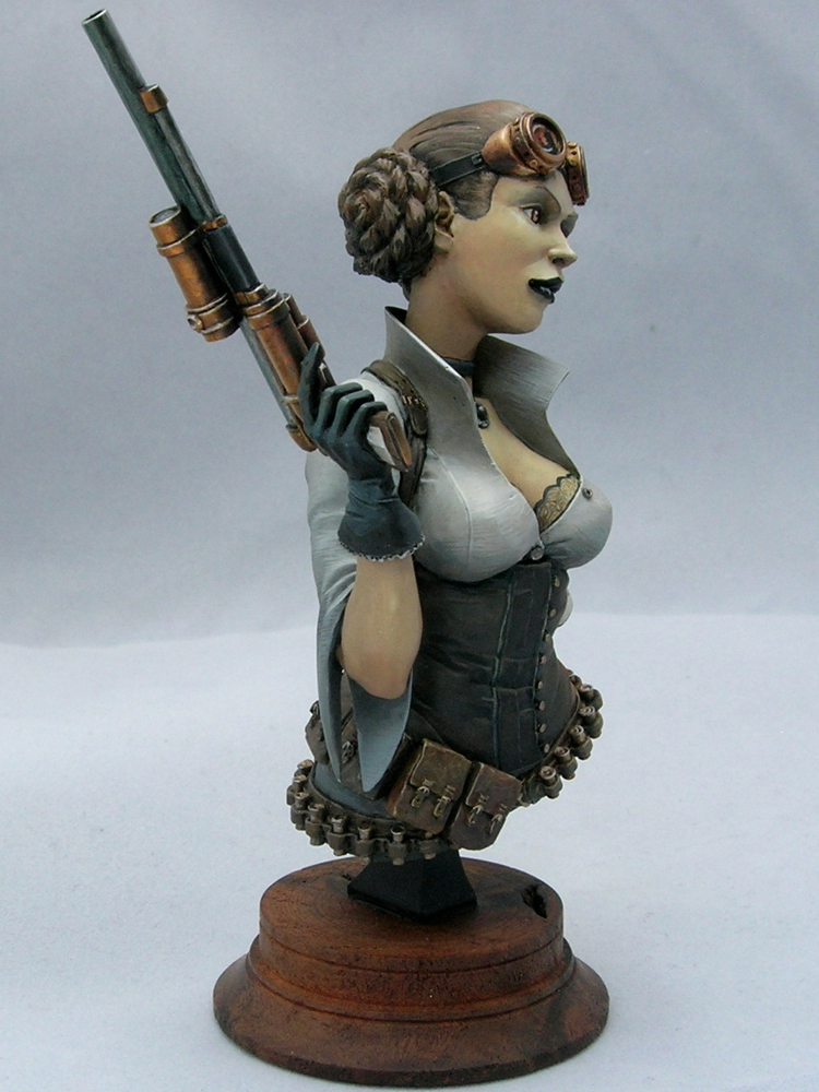
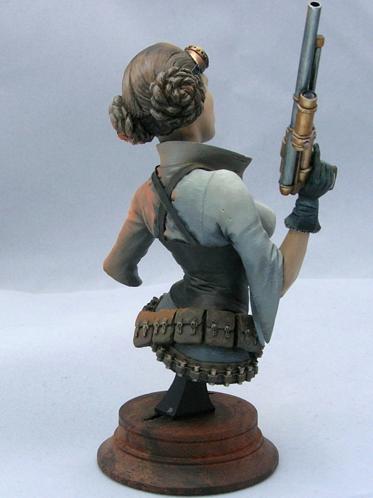
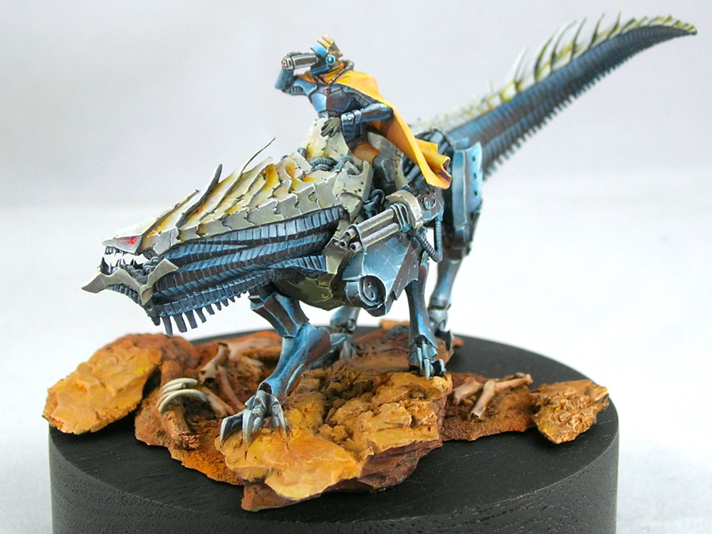
Now that I’ve posted the back view, Roman’s probably going to point out all of the areas I’m missing here! I’m joking of course, but in truth, I think I can guess which areas he would point out.
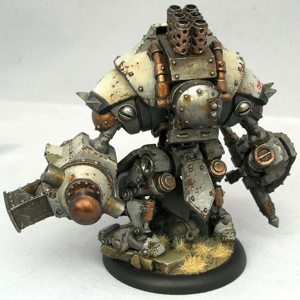
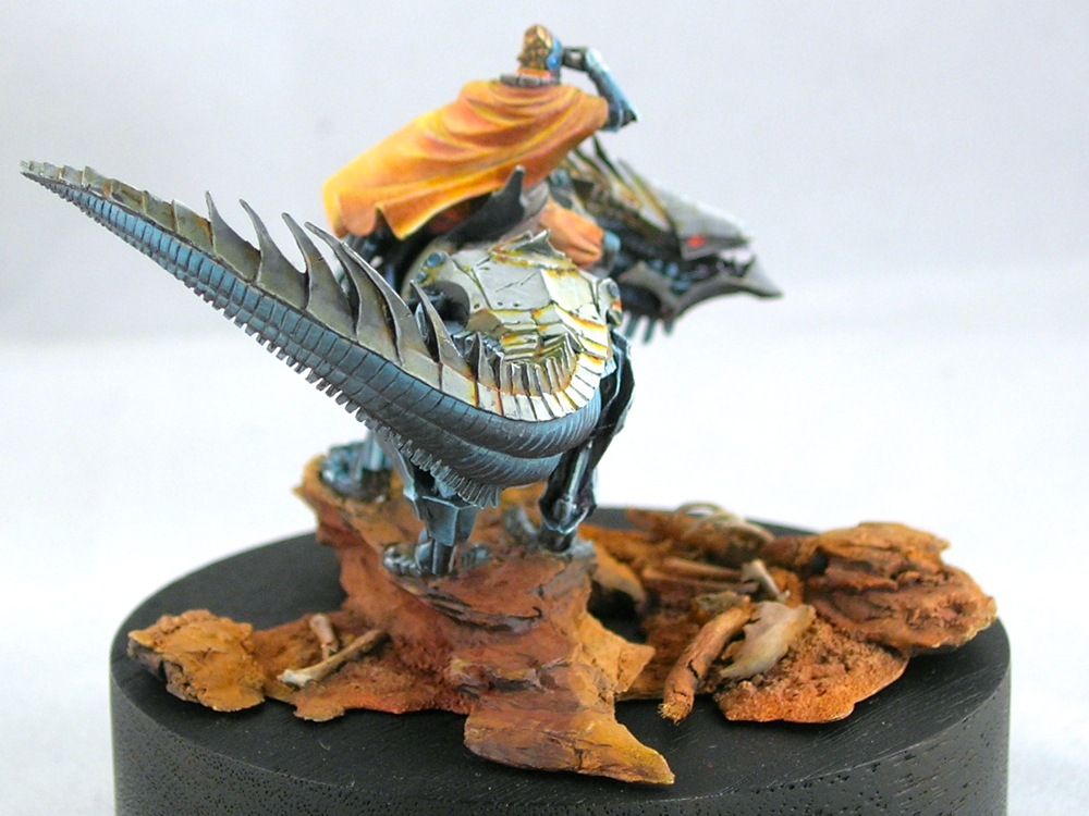
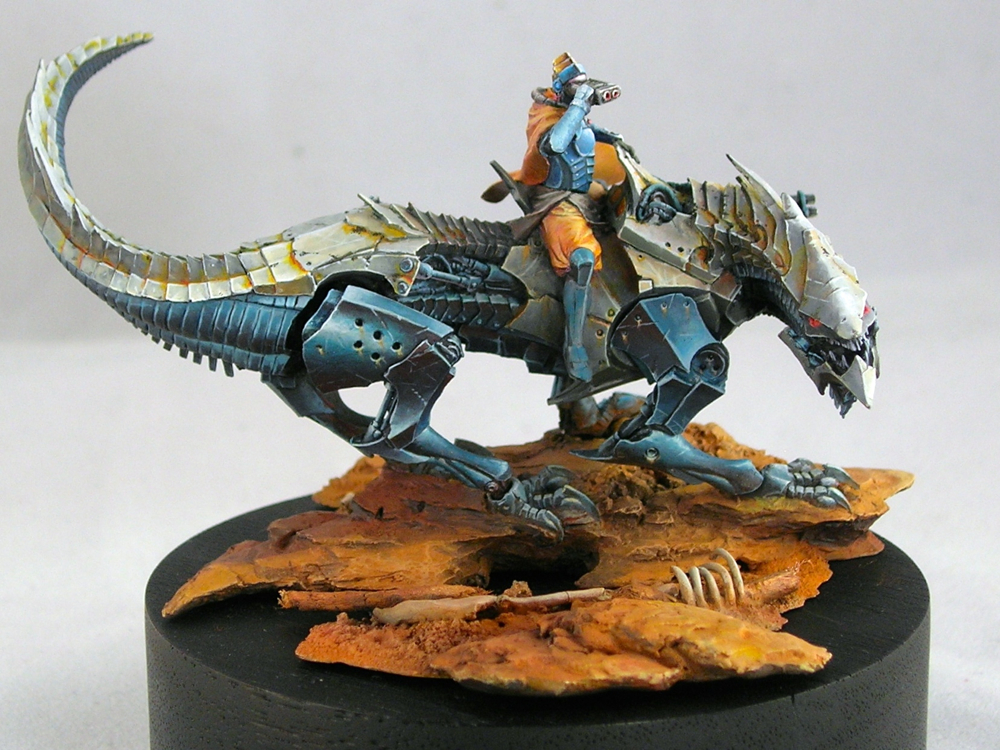
I intentionally took a lot of shortcuts on the back, because a bust like this will normally be seen mostly from the front. Also, I have a policy never to retouch figures after they win awards!
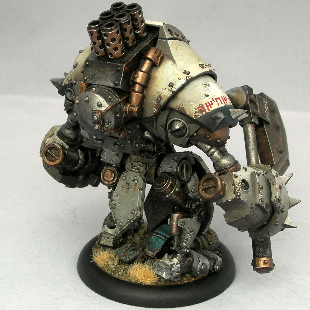
I entered the bust into the KublaCon painting contest last weekend, and was fortunate enough to win Best in Show and one of the People’s Choice awards. This is my second KublaCon win in a row, as Tribe Chief Morrow won Best in Show last year. KublaCon is a Crystal Brush qualifier, which means that my award comes with round-trip airfare to Chicago for Crystal Brush. This will be my second time going, since I lived in Chicago for the first year of the competition, but moved away and missed the other years.
Word from the judges is that the decision between my entry and the second-place winner was very close. This just goes to show the importance of getting feedback on your work. Without Roman’s advice, I probably wouldn’t have won.
Thanks again, Roman!
Recent Comments