Never be afraid to paint outside the lines

Category: Tutorials

Step-by-step and how-to articles

Mermaid – Part 1 – Building the Water

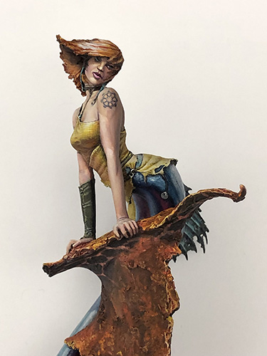
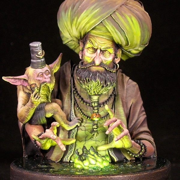
I’ve wanted to paint the Origen Art Siren for ages, but getting my hands on the figure itself proved a challenge. How I hate limited edition figures!

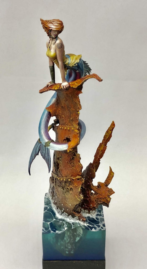
One of my goals with this figure was to achieve a really realistic water effect on the base. Since I’d never done anything like this before, I knew this would involve a fair bit of trial-and-error. I looked for water tutorials online, and while I found several on YouTube and elsewhere, none had quite the look I was going for. To get the result I wanted, I felt that two things would be critical: the transparency, and the shape of the waves. All of the tutorials I found failed on one account or the other. Some had you sculpting waves out of an opaque material and varnishing them, which lets you get the shape right but not the transparency. Others involved sculpting with layers of thick gloss gel over the flat surface of a resin pour, which gives the right transparency but not a realistic shape.

Instead, I chose to follow an approach which was not in any of the online tutorials I found, but which must be something like the way Robert Blaha did the water for Frutti di Mare. My approach was to first sculpt the waves out of Kneadatite putty, use that sculpt as a master to make a mold, and finally make a cast using clear resin. Since I was using a technique that was totally new to me, and working without a tutorial, I knew it would take a few tries to get the effect I wanted.

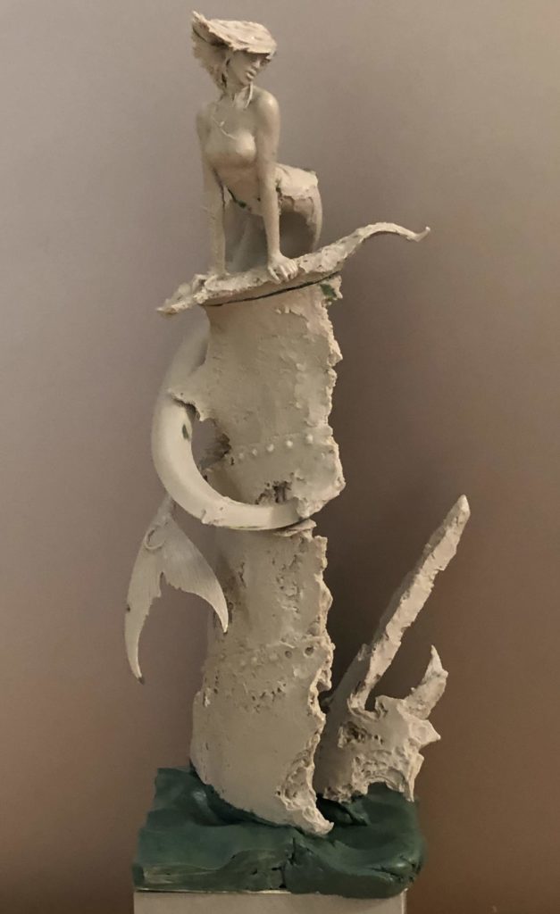
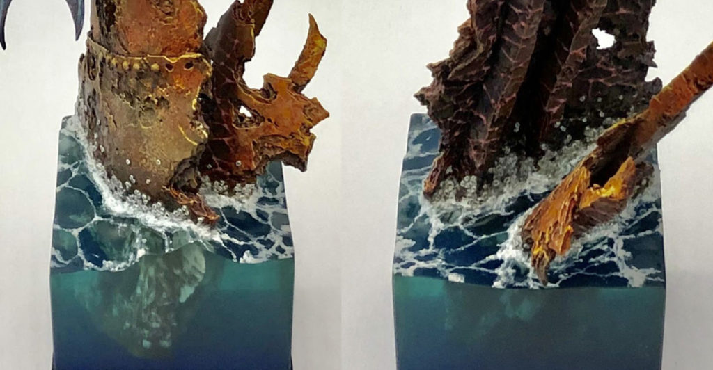
The sculpt of the wave forms was fairly simple. I made sure to look at examples, keep it from being too regular or symmetric, and sculpt more than I needed in each direction so I could cut it down to the size I wanted. In addition to sculpting the water’s surface, I also sculpted a bit of the rusted iron shipwreck to mate with the pieces that came with the figure. I decided against casting those figures into the block, since I wasn’t expecting to get things right with the first attempt.

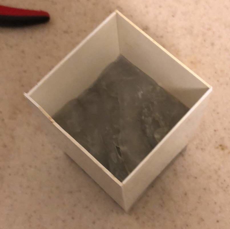
To cast the water, I took the easy way by using instant mold. Instant mold is great for ease of use, but doesn’t produce a very accurate cast, and doesn’t work at all if you need more than a one-sided mold. For the water, neither of those drawbacks mattered. I used plastic card for the sides of the water, cut to rectangles of the right width to slightly overlap each other, and forced the instant mold down as hard as I could to fill all the recesses, using a second resin cube as a plunger.

Instant-mold on the left, mounted on one resin cube, with the original master sculpt on the right, also on a resin cube.
The completed mold was mounted to a resin cube for stability, and had plastic card sides. I covered the inside of the plastic card sides with packing tape so they would release the resin more easily, and carefully taped all around the outside to keep resin from leaking out while it was hardening.

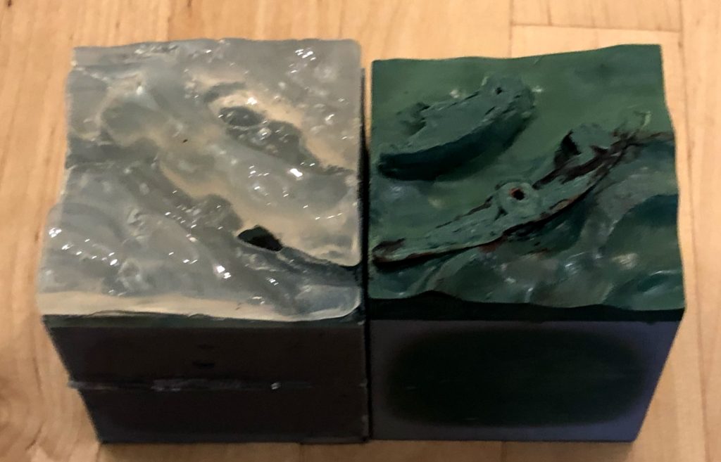
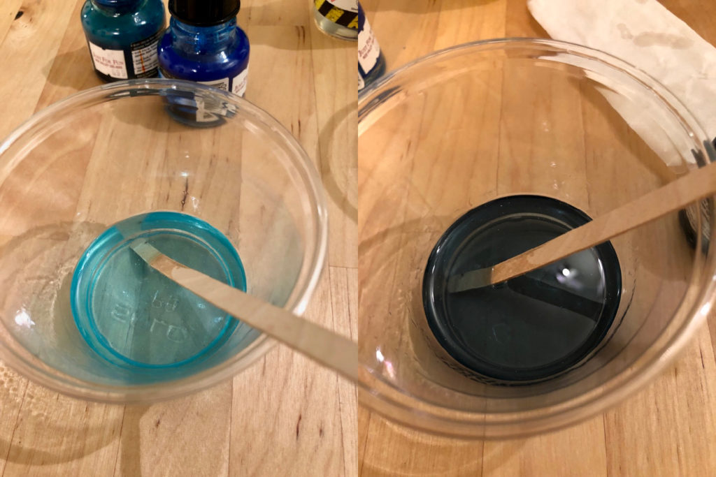
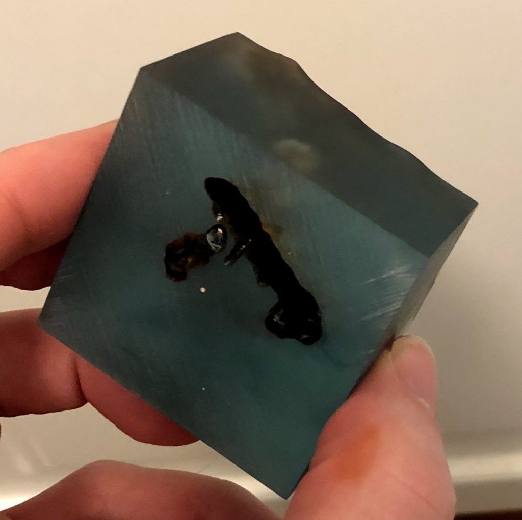
In the end, it took me three attempts to get the water looking right. In all three casts, to get some color variation in the final result, I mixed up resin in two separate cups, colored them differently, and mixed them together in the mold. In the first attempt, for the darker resin, I used a mixture of process cyan and payne’s gray inks from Daler Rowney, and for the lighter I used a mixture of process cyan and dark green inks, with a drop of white acrylic paint.

The idea with the white paint was to replicate the look of submerged air bubbles, as in this photo. However, it did not work at all.

This one had three issues: it was too dark, it was too thin, and it had flecks from the white paint I used. For my second attempt, I tried oil paints instead of acrylics in the hopes that resin would mix better with an oil-based material than a water-based one, but actually it was even worse.

Both of my first attempts were too opaque. The second stuck to the plastic-card mold sides, and I couldn’t get it out.

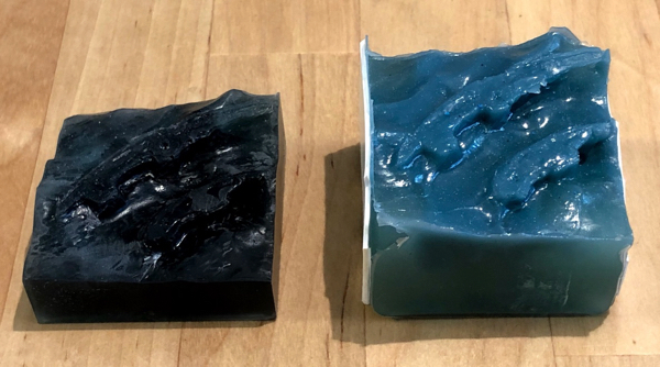
So for the third attempt, I left out the white entirely, skipped the payne’s gray, and just went really easy on the inks to maintain a lot of the transparency of the plain resin. This proved to be the right approach, and I was very happy with the third pour.

I mixed two different colors of resin, and combined them in the mold without mixing them together, to add some non-uniformity to the water color.
I cast the water upside down, then sanded the base flat to remove air bubbles and the lip around the edge.

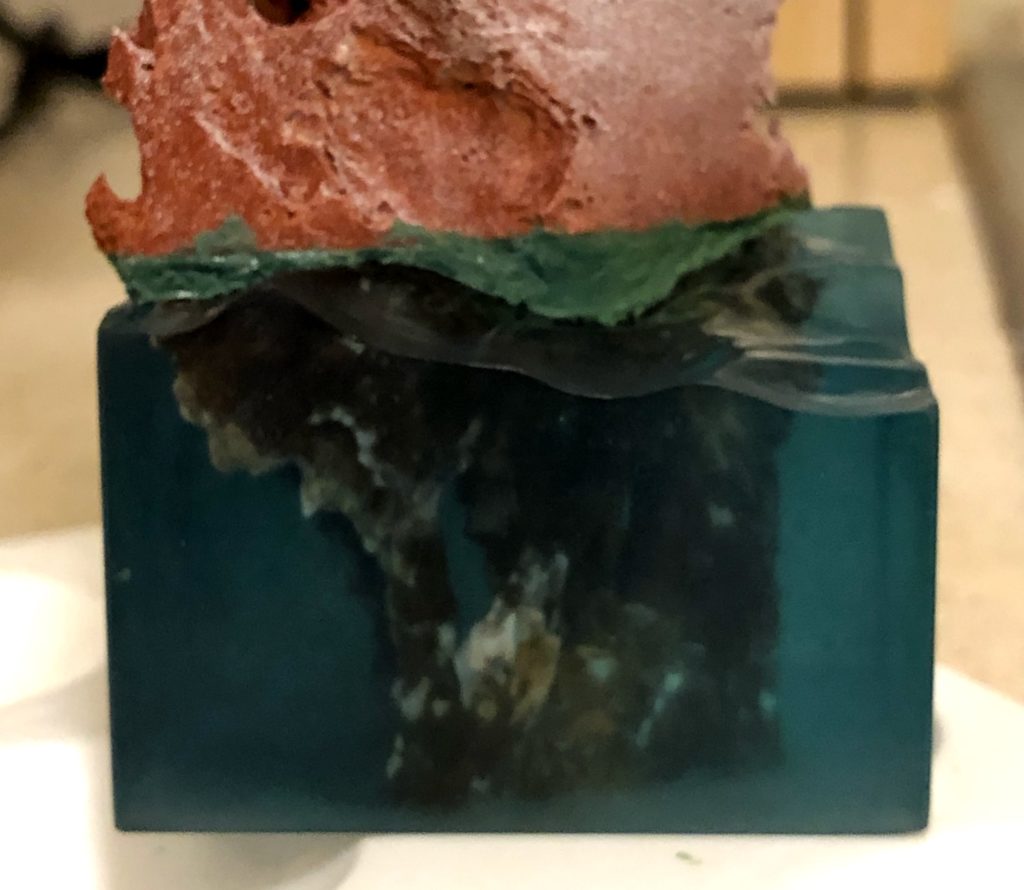
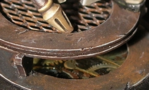
My one challenge at this point was how to manufacture the submerged part of the shipwreck. The obvious way to do it would be to sculpt and paint it ahead of time, and do a fourth the resin pour around it, now that I had figured out how to get the resin pour to work correctly. But I figured, I have a successful resin pour, so I might as well use it if I can. So I decided I would try to hollow out the right shape with a dremel tool, and fall back on the other approach if that didn’t work.

Once I had created the right shape for the submerged part of the shipwreck, I painted the inside with rust colors by using a big cheap brush and shoving in as much paint as I could.

In the end, the dremel approach worked quite well. I tried to make the shape really random and disguise the shape of the tool I used, and it mostly worked. Once the shape was hollowed out, I shoved a bunch of different rust-colored paints inside the hollowed-out volume, using lots and lots of paint and a large crappy brush I was not afraid to abuse. Then, to give a solid anchor for the rest of the shipwreck, I filled in the hole (using a kneadatite brown in case any of it showed through the resin), before mounting the rest of the shipwreck above the water using a nice thick brass rod pin. Finally I hid the join and matched the surface texture of the shipwreck with putty.

You can see the submerged shape I hollowed out quite well from the outside.

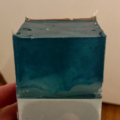
To prevent one of the disasters of the second pour, where I couldn’t even get the water free of the plastic card mold sides, I used clear shipping tape to cover the plastic of the mold. This worked well to make the walls of the mold release the resin, but the packing tape wasn’t quite flat and it showed in the cast. I wanted the resin sides to be perfectly smooth, so I had to sand them down to remove the imperfections. I then used finer and finer grits of sandpaper, down to 2000 grit, followed by polishing compound to get the sides as smooth and shiny as possible. I couldn’t completely remove all of the sanding lines, so I made sure to do my final round of sanding (with the 2000 grit sandpaper) against a metal ruler to keep all of the lines horizontal.

The white parts of the submerged wreck are where the paint didn’t quite cover the inside. I think this gives a surprisingly natural appearance.

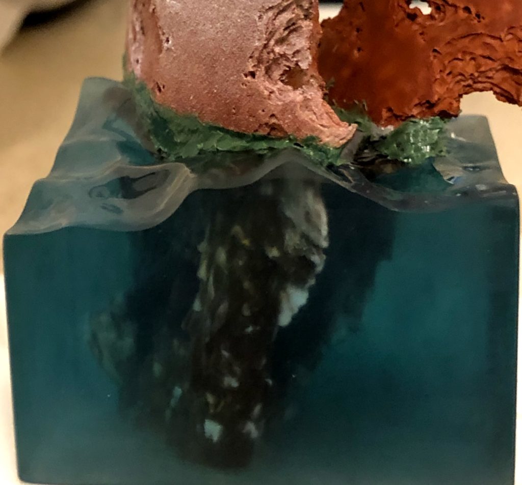
The final step to complete the look of the water was to finish the surface. For this, I used a mixture of white paint, gloss gel medium, and snow effects, painted onto the water’s surface to match reference photos I found online. This was a relatively quick and easy step compared to the rest.

I painted the bottom of the resin blue, and used multiple thick layers of paint for opacity. Internal reflection has weird physics, and even though you don’t really see the blue paint, it has a surprisingly large impact on the final appearance of the water.

I’m really happy with the effect I was able to get through this approach. Eventually I may write a tutorial with a more step-by-step explanation, but sometimes it’s more interesting to read about the process of figuring things out.

Tutorial: Object Source Lighting (OSL) and Other Lighting Effects

One of my favorite effects in miniature painting is when the artist uses paint to create the illusion of a light source which is not actually there. These lighting effects can be extremely fun and eye-catching, but they can also be very tricky to pull off. In this tutorial I will outline a set of rules which, when followed, will make your depictions of light sources much more believable and impactful. I will also show a step-by-step painting process which is one way you can follow these rules and achieve a good result.

A quick note on terminology and history.
Object-source lighting, or OSL, refers to when one of the light sources depicted by your painting is an actual object on the figure or its base, such as a torch, lamp, or glowing sword. Lighting effects is a more general term I use to cover any use of paint to suggest a light source which is present in the scene, but may be “off camera” rather than being depicted on the miniature.

The miniature painting community was introduced to OSL by Slayer-Sword-winning painter Victoria Lamb, whose creations The Rescue of Sister Joan and Firey Angel are two of the best examples of this effect.

To the extent that miniature painting is a genre of art, there are no hard-and-fast rules. However, when painting a miniature to simulate the behavior of a light source, you are trying to create an illusion of something which is not really there—the light that you imagine being cast on your miniature, from an object it is holding or from its environment. In order to create a convincing illusion, you must follow the same physical laws that govern how light behaves, or you risk spoiling the illusion because something will look “off” to the viewer. These rules about how light behaves are part of how you understand the world, but are often instinctive and subconscious. By taking these rules and making them explicit, it becomes easier to see when a lighting-effect illusion is not working, understand why it is not working, and fix it.

Continue reading

Tutorial: True Metallic Metals

tmm-bane-thrall-teaser

In the miniature painting community, there are two broad types of approaches to representing metallic surfaces, “non-metallic metal” (nmm) and “true metallic metal” (tmm). In non-metallic metal, the painter represents a metallic surface without using metallic paints by painting the reflections by hand, in the manner of 2-dimensional art. True metallic metal, in contrast, involves the use of metallic paint, which contains little bits of mica or other reflective material to gain a metallic look. I have no interest in debating which is “better”; the two techniques have very different aesthetics and lend themselves to different styles, but both can look amazing when done well. Personally, I have used both in my work [tmm, nmm], although generally I think I get better results when using metallic paints.

In this article I will share my standard technique for painting metals with metallic paints, by painting all of the metals on a bane thrall from start to finish. (Why do all of my tutorials seem to be on Cryx minis?)

Continue reading

Step-by-step: clockwork base

clockwork_base_closeup

When I painted Commander-Adept Nemo, I was inspired by Natalya “Alexi-Z” Melnik’s amazing version of Nemo from the previous Gen Con. I really liked the non-metallic metal armor and the elaborate base she used, so I decided to do something similar for my version. It’s a fair bit different from hers, but I really liked her idea of putting Nemo on a raised platform with technological elements. For my version, I wanted to create a clockwork mechanism you could see into, like a skeleton watch.

Continue reading

Tutorial: Object-Source Lighting

This tutorial is quite old. Please check out my new one instead!

Really! The new one is much better!


One of the most eye-catching effects in miniature painting is source lighting, where a glowing object casts light on the rest of the miniature. Especially in the fantasy and science-fiction genres, it’s a great way to show that a sword is imbued with magical energy, or a plasma cannon is charged and ready to fire. Let’s face it: glowing weapons are just cool. This technique is often called “object-source lighting” (OSL) by figure painters, as the source of the light is represented on the miniature (an “object-source”).

Pulling off believable glow effects is tricky, however, and there are many examples of poorly done lighting effects on the internet. In this article, I will show a step-by-step sequence of how I paint source lighting effects, using a Cryxian Slayer by Privateer Press as the demo mini. I’ll also provide plenty of tips and additional examples to help you give your models that eye-catching glow.

Continue reading

Tutorial: Painting Battle Damage

damage

We all love tabletop wargames, and our miniatures often see many battles. As hobbyists, we want our miniatures to look it! Well-done battle damage effects can make miniatures look more realistic on the battlefield, and also more fun to look at. In this tutorial, I will demonstrate a couple different techniques for giving your models that battle-hardened appearance. The miniature I’ve chosen to demonstrate them on is a Deathripper, a Cryxian bonejack from Privateer Press.


Realistic Chipped Paint

The first technique I’m going to demonstrate is called the blister-foam technique. Its purpose is to give the appearance of chipped paint. A warrior or war machine in the field is going to be scraping against the terrain and other combatants, not to mention getting pelted with gunfire and hacked with melee weapons, and its paint will not remain intact long. That is the effect this technique will achieve.

You will need a small piece of foam, like the “blister-foam” that comes packaged with most miniatures.

Continue reading

© 2024 Light Miniatures

Theme by Anders NorenUp ↑