Never be afraid to paint outside the lines

Month: May 2016

Abalám, revisited

When I posted Abalám on Putty & Paint, one of the comments I received was from Roman Lappat (of Massive Voodoo fame) who wrote,

Great piece. Love the light situation, even I think there are minor parts missing here and there, but this does not make the bust bad. If you want me to point out my thoughts about the light shot me an Emal 🙂

Let me just say I love this reaction. “I like this mini, but see some ways it could be better. I must tell the painter!” Constructive criticism is fantastic, and I’m thankful for all of it I can get, especially when it comes from as knowledgeable a source as Roman. As I wrote in Thoughts on painting competitions, constructive criticism is extremely valuable in improving your work.

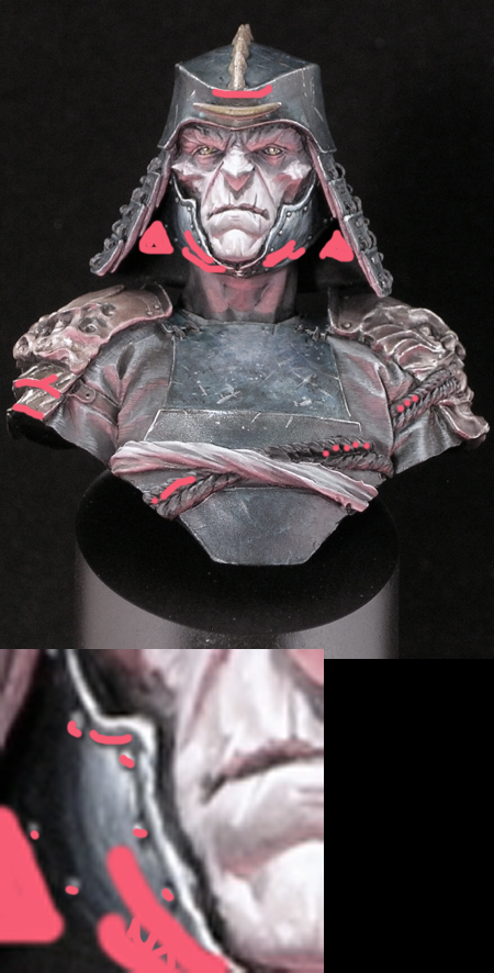
When I emailed Roman, he sent me a very helpful diagram showing the areas he felt the light was missing or not strong enough.

Roman's critique

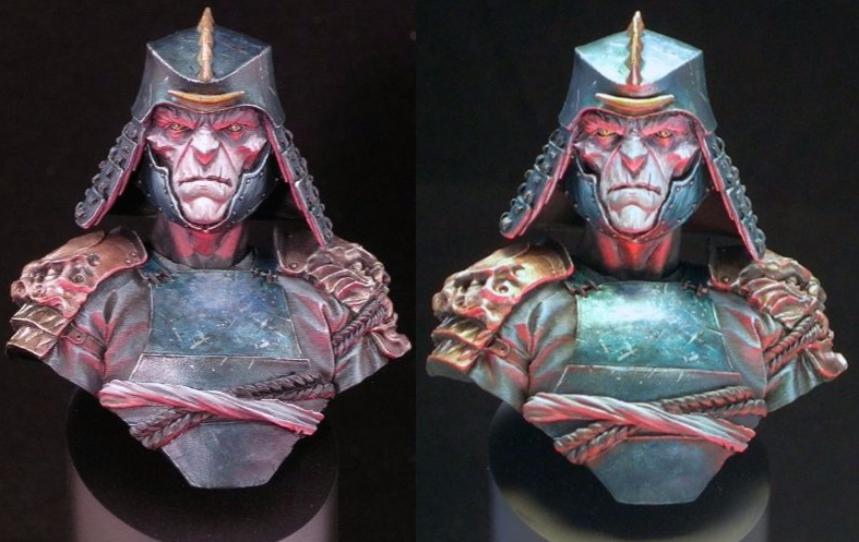
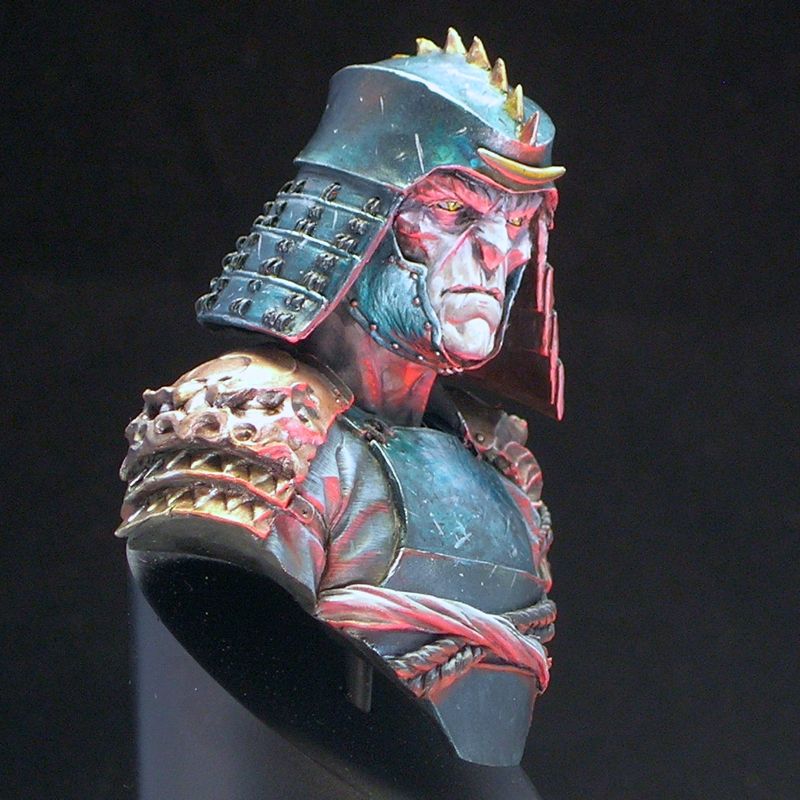
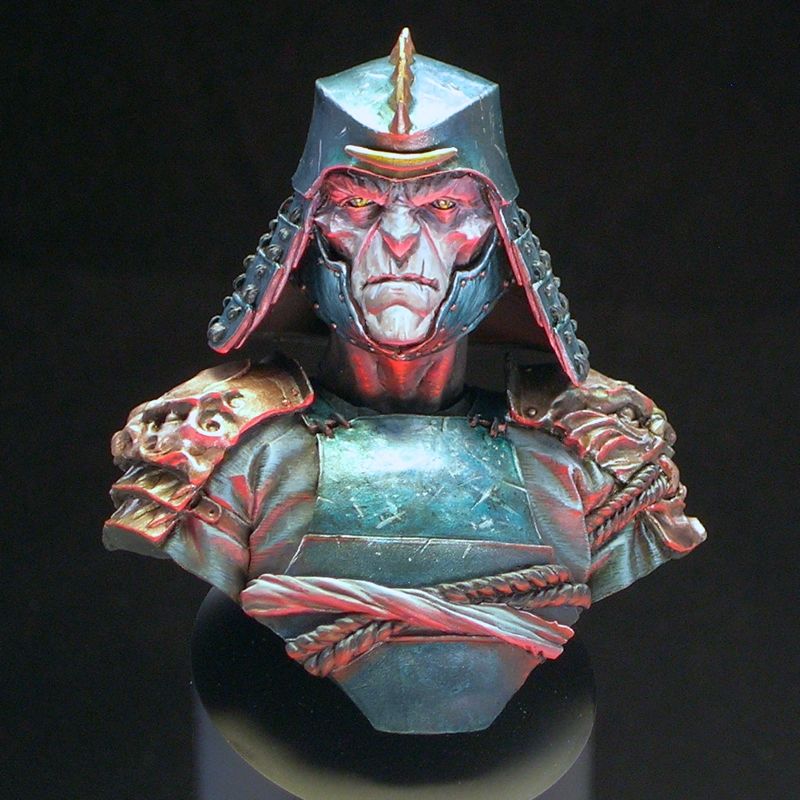
Armed with this sketch, my brush, and some red paint, I went back to my figure, and intensified.

abalam-before-after

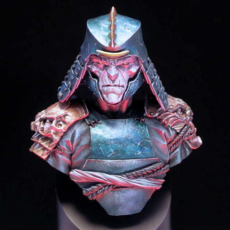
Of course, the lighting is also rather different between the two photos. I’m terrible at miniature photography, sorry! I think the new pictures are somewhat closer to life, but this guy is really tricky to photograph.

abalam-revisit-5

I followed all but one of Roman’s suggestions, which was the back of the helmet. It’s just so recessed that I didn’t feel it would receive very much light, so the very strong light that Roman suggested would look out of place. Also, you have to be very careful painting lighting effects in heavily recessed areas of a miniature, because you are fighting against the shadows of the miniature itself. In the end, I did retouch the back of the helmet, but with a dull, dark red, instead of the strong effect that Roman suggested.

I did add light on the rivets, but it’s subtle, and hard to make out in these photos.

abalam-revisit-3

In addition to following Roman’s advice, I also intensified in some areas he didn’t highlight. I made the light on the neck much more dramatic, since it looked flat and poorly painted in the original. I added light on the lower-most armor plate, as that was one of the areas that lit up in my original study but where I had not added a glow effect. And I intensified the light on all of the ropes and the sash, and not only the parts Roman indicated.

Many people, when confronted with criticism, are resistant towards it, and try to find reasons to ignore it. I think this is a very good example of how one can benefit from not only being open to criticism, but trying to look further, and explore how you can use the insight in the criticism to improve upon things that the critique did not specifically identify.

abalam-revisit-4

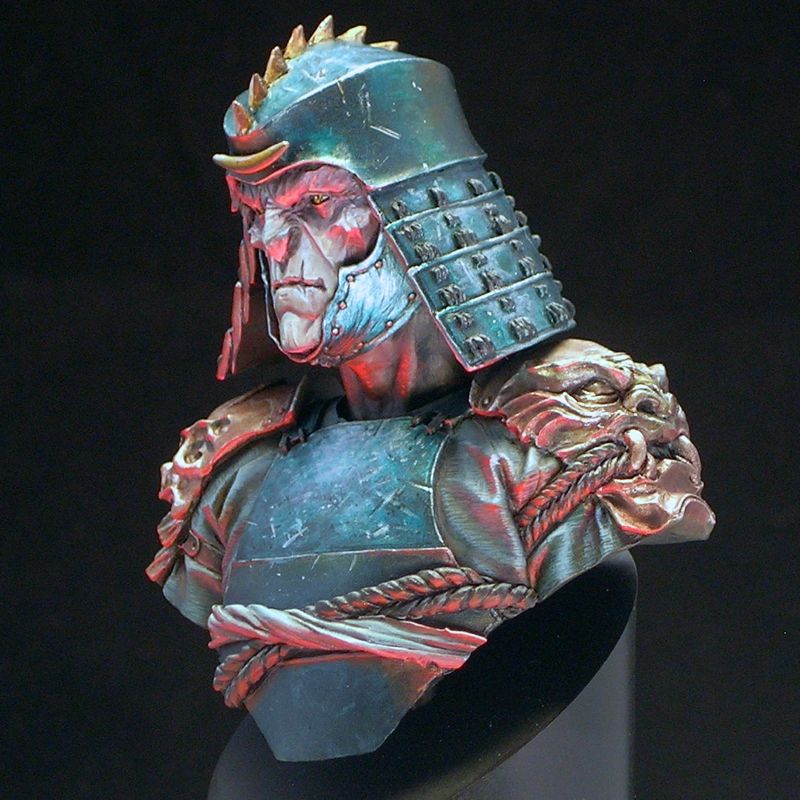
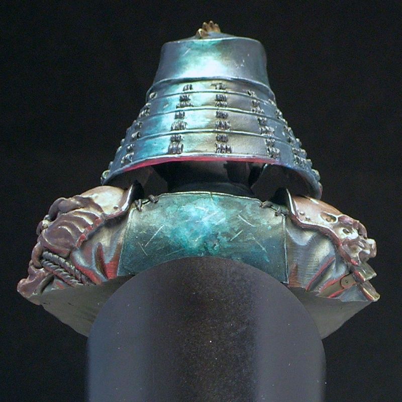
Now that I’ve posted the back view, Roman’s probably going to point out all of the areas I’m missing here! I’m joking of course, but in truth, I think I can guess which areas he would point out.

I intentionally took a lot of shortcuts on the back, because a bust like this will normally be seen mostly from the front. Also, I have a policy never to retouch figures after they win awards!

abalam-revisit-2

I entered the bust into the KublaCon painting contest last weekend, and was fortunate enough to win Best in Show and one of the People’s Choice awards. This is my second KublaCon win in a row, as Tribe Chief Morrow won Best in Show last year. KublaCon is a Crystal Brush qualifier, which means that my award comes with round-trip airfare to Chicago for Crystal Brush. This will be my second time going, since I lived in Chicago for the first year of the competition, but moved away and missed the other years.

Word from the judges is that the decision between my entry and the second-place winner was very close. This just goes to show the importance of getting feedback on your work. Without Roman’s advice, I probably wouldn’t have won.

after

Thanks again, Roman!
Khador Extreme Battlegroup

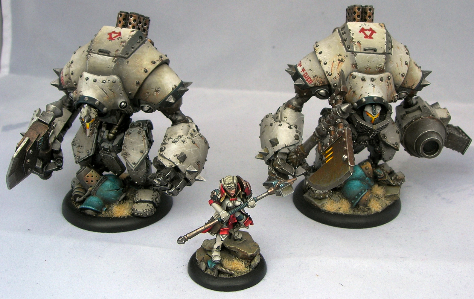
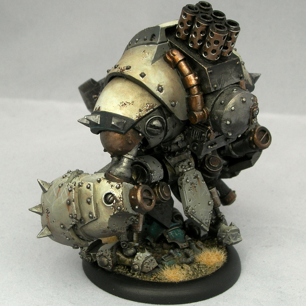
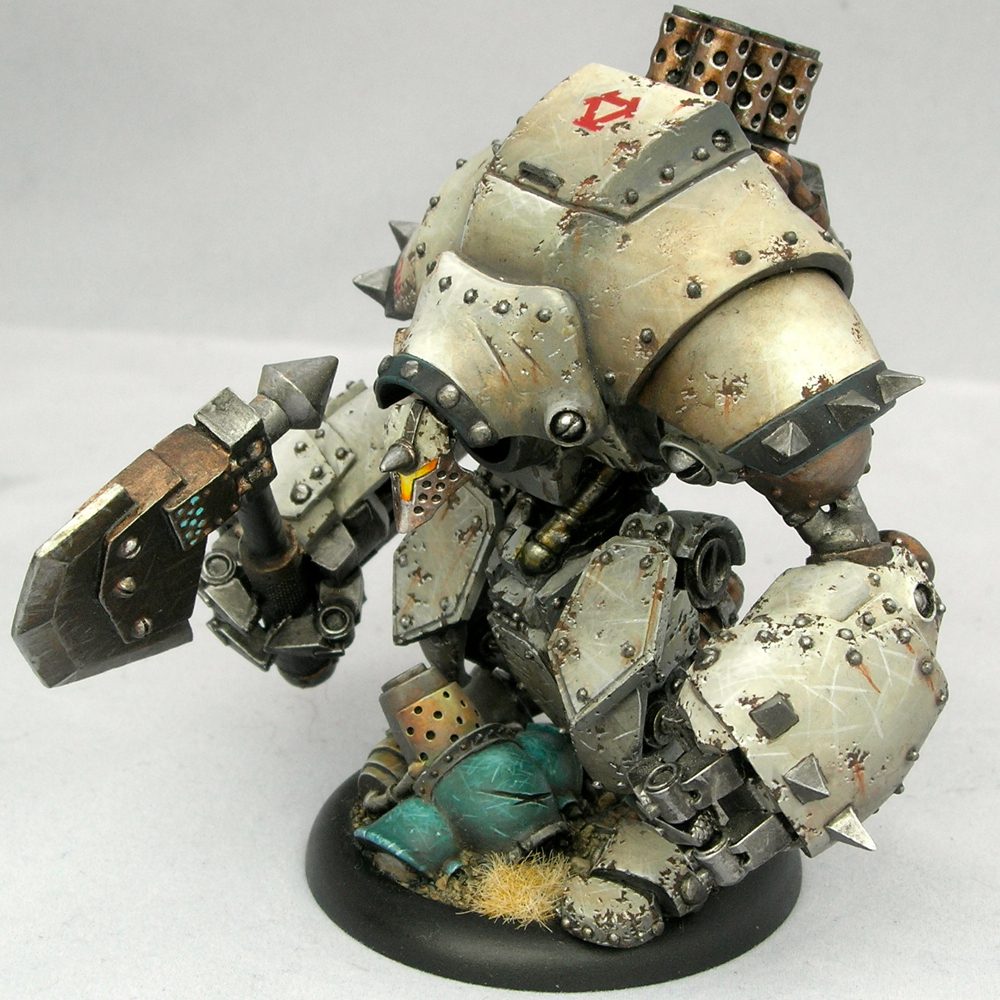
I painted this group several years ago, but it took me a long time to take any decent photos (and even longer to remember that I did and get around to posting them, it seems).

khador_bg

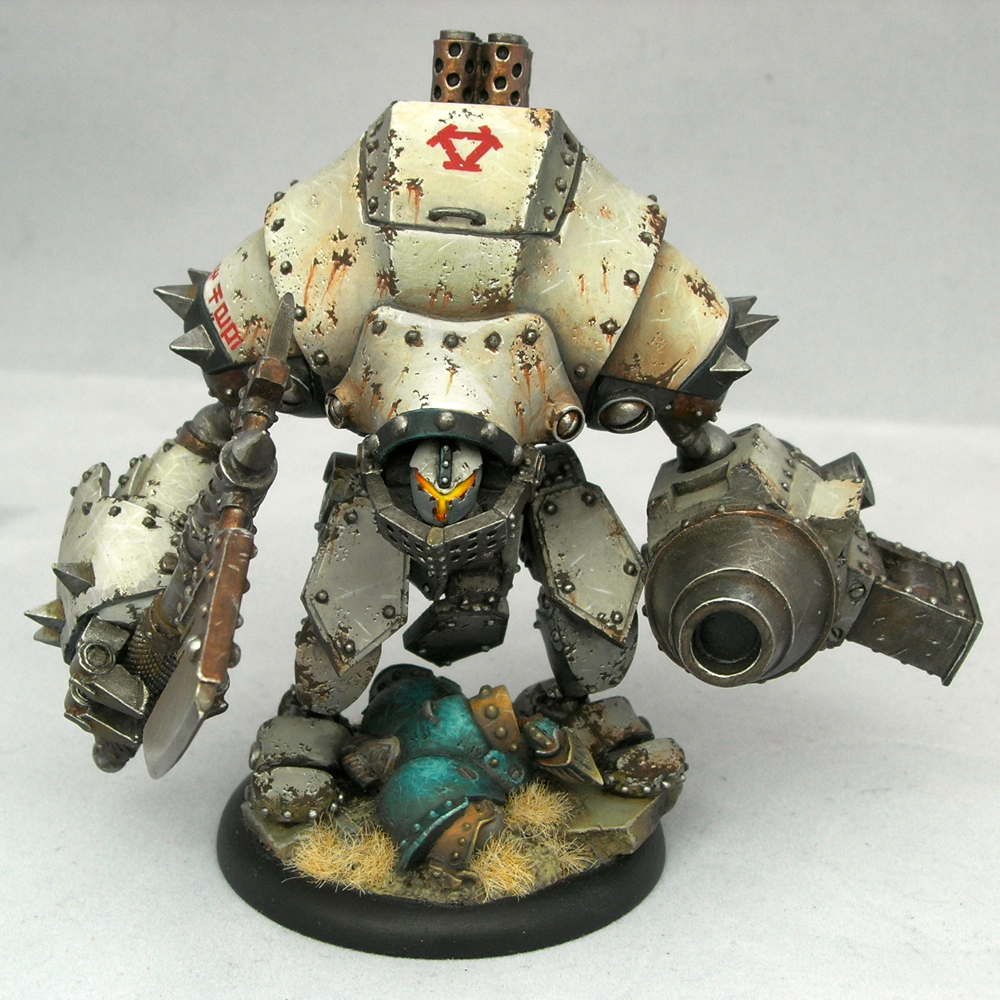
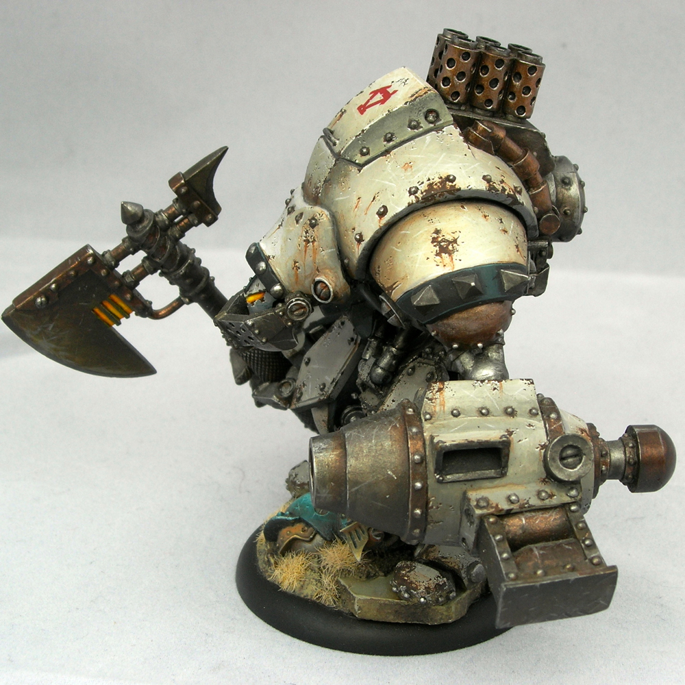
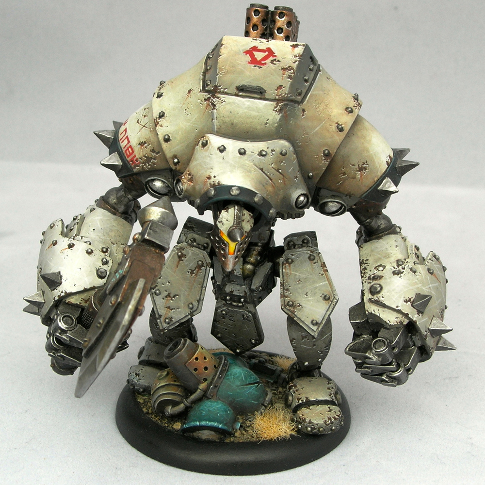
This group won the best battlegroup award in Privateer Press’s 2014 Gen Con Grandmaster Painting Competition, and appeared in No Quarter 57. Unfortunately the picture taken by Privateer Press at the convention wasn’t that great. You can see it in my battle damage tutorial, which goes over the technique I used to damage the ‘jacks.

khador_destroyer_1

Then again, since it took me over two years to finally take decent photos of my own, I probably shouldn’t be complaining about what Privateer Press could do in the middle of a busy convention. Subtle white shading is hard to photograph, and the metallic work is even harder to photograph.

khador_destroyer_2

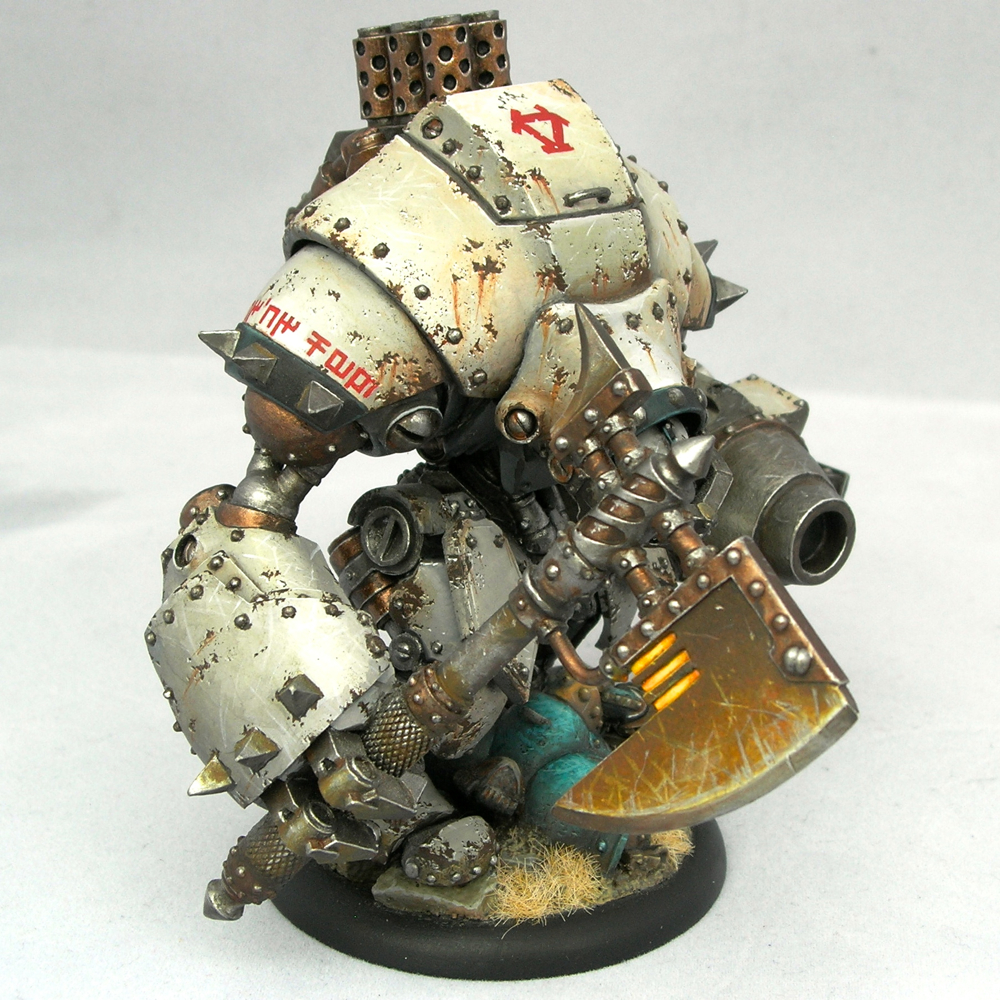
I’m really happy with how the metals turned out, especially the axe blades. Since the axes on the extreme ‘jacks are really big and flat, I knew I needed to do something to make them more interesting to look at. Painting them involved a lot of time-consuming back and forth between painting scratches and glazing over everything with inks, but the end result was worth the effort.

khador_destroyer_3

I had half of a hunter lying around from my Caine battlegroup, since I replaced it with a grenadier chassis, and a plastic Cygnar battlegroup box that Privateer Press gave away at Adepticon one year. I thought they would work well as battlefield rubble. Having a well-stocked bits box is a godsend for more ambitious projects.

khador_destroyer_4

Even though the models in this battlegroup are all painted using metallics, I used nmm to paint the destroyed Cygnar models on their bases. I did this for a few different reasons. First, I thought it would be fitting for the destroyed Cygnar jacks to be less shiny than the Khador ones, which were already quite gritty and corroded. Second, I thought it was a nice callback to the Nemo I’d entered in a prior year. And finally, I wanted to show off that I can paint both metallics and nmm (since many painters seem to stick with one or the other).

khador_destroyer_5

This worked well with the extremely scratched effect I did for the turquoise parts, to make the Cygnar ‘jacks look extremely beat up and damaged, but in a completely different way from the Khador ‘jacks.

khador_juggernaut_1

To get the bright glowing effect for the ‘jack visors, I first filled them almost entirely with green stuff, since normally there’s a big recess there. It’s very difficult to paint a believable glow effect in a deep recess, since you’re fighting against the shadow that the recess creates. Filling it first makes painting a glow much easier.

khador_juggernaut_2

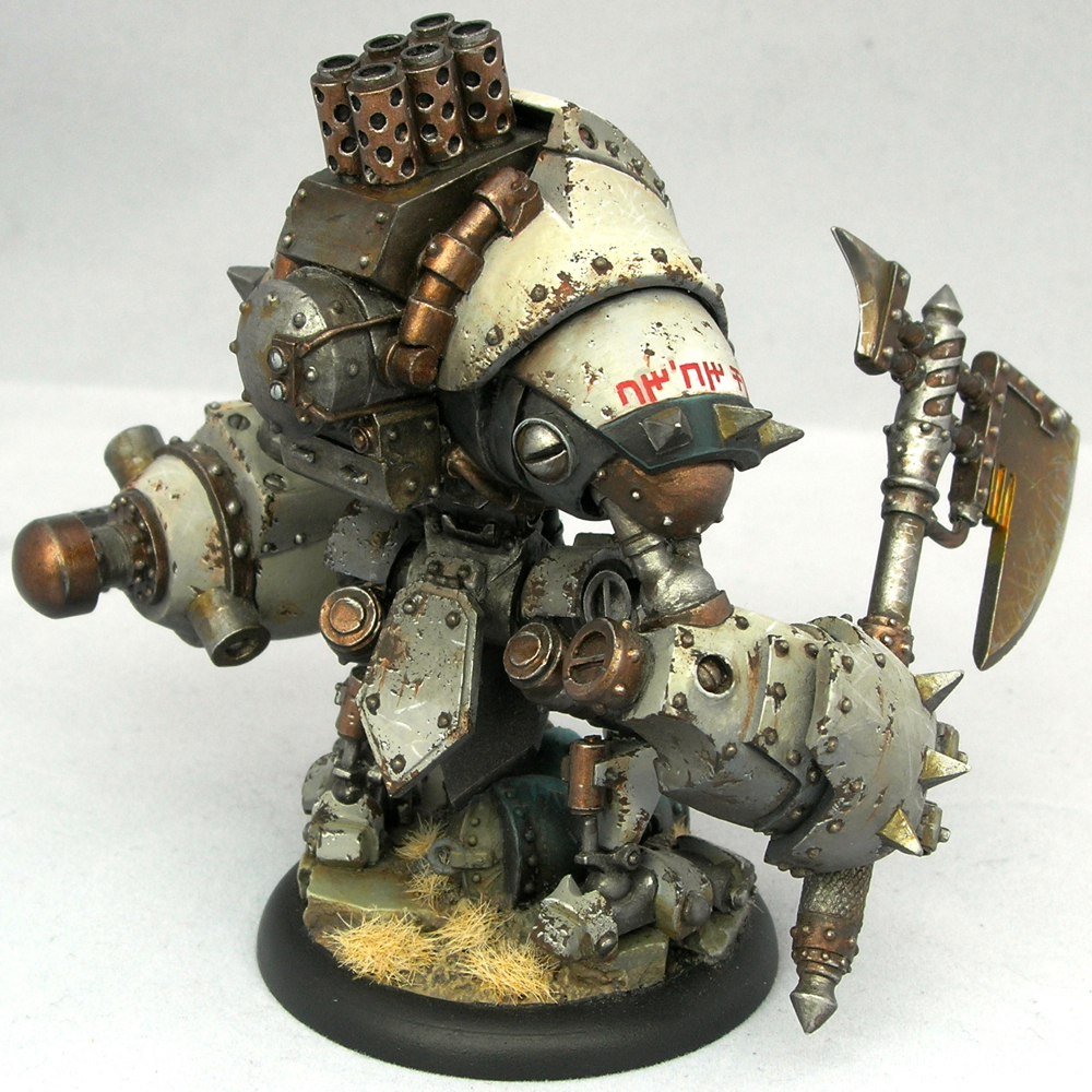
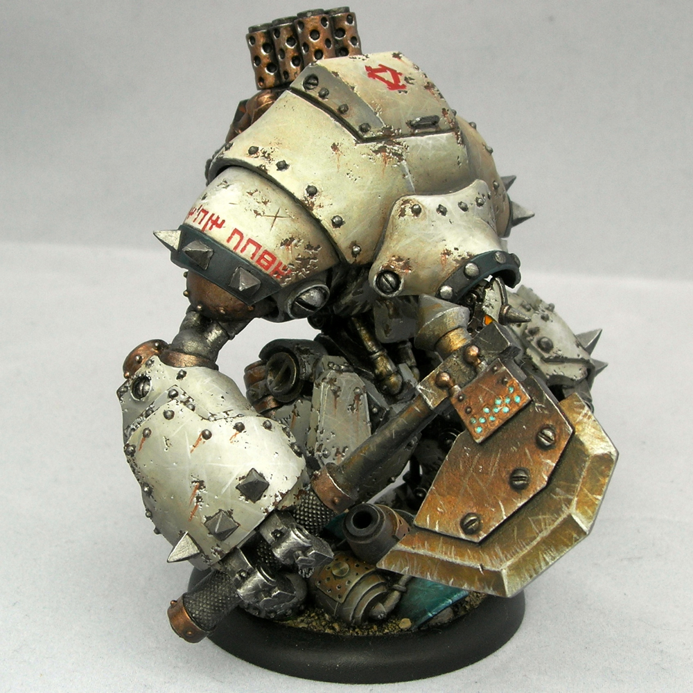
The rust drips are going “down” in different directions. I imagined that the rust would drip down and collect most with the ‘jack in its resting pose, and I tried to imagine what that would be when painting the drips.

khador_juggernaut_3

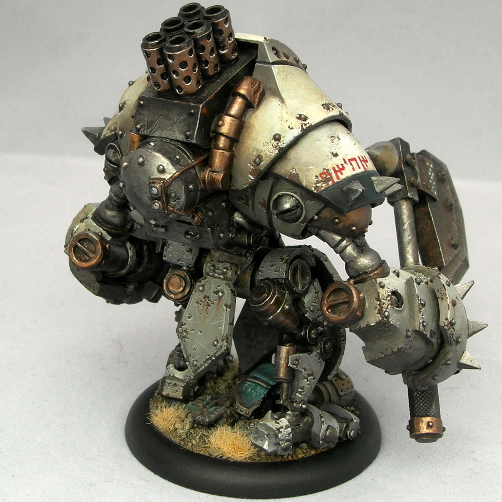
The Khadoran runes on the ‘jacks’ shoulders read “Br’er Fox” and “Br’er Bear,” named after the main antagonists in the traditional Br’er Rabbit stories. The Cygnaran runes on the hunter’s shoulder pad say “Fire.” Warmachine faction fonts can be found here.

khador_juggernaut_4

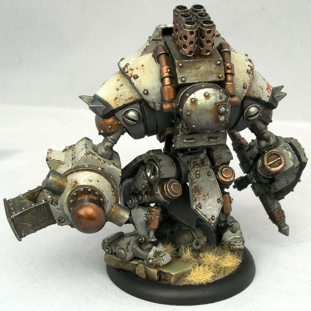
I painted the Juggernaut first, and I think it came out slightly better. Normally the models I paint later, once I’ve figured out my color scheme, turn out better, so this is unusual. But I think playing around with the whites a bit added an extra bit of texture and randomness that worked really well with the effect I was going for. It’s much easier to create randomness by accident than intentionally.

khador_juggernaut_5

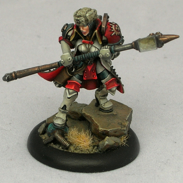
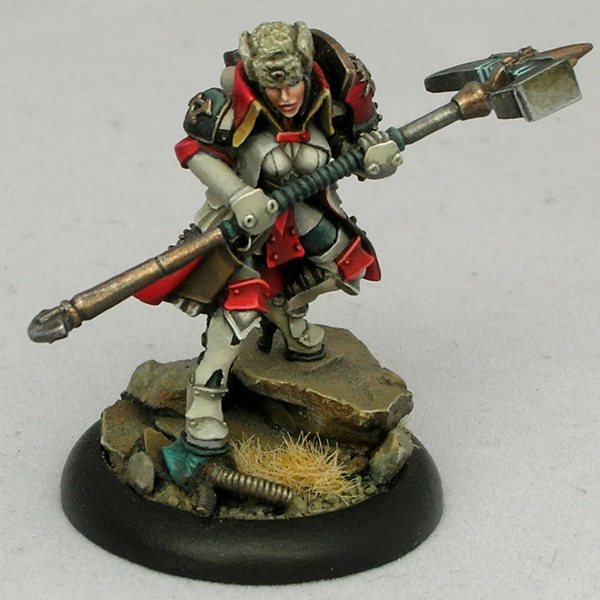
I painted Sorscha last, and she is much cleaner than the ‘jacks. I imagined the armor of a powerful and important warcaster would be carefully tended, unlike the warjacks.

khador_sorscha_1

I left off the ice-formation base she comes with, since it wouldn’t match the other bases, and instead sculpted something to match, using the head that belongs to the hunter on the juggernaut’s base.

khador_sorscha_3I said in my previous post that I’m planning to teach a class on painting “tricky colors”—white, black, and red—at KublaCon and again at Gen Con. I think I can consider my street cred for teaching that class pretty well established.

What’s going on with the blog?

I guess I’ve been pretty quiet lately. I’m working on competition entries for the summer convention season, and this year I’m going to wait to post them until after the conventions, in order to keep the element of surprise.

In addition to painting, I’ve been working on a couple of longer articles for the blog. One is a two-part article on color theory, which will talk a bit about the science of color, as that’s an element missing from a lot of the color theory articles you see. I’m a big science nerd, so I loved researching it. The text is mostly finished, but I’m also creating some visualizations for it, and the code for generating those is only about half done. So that will take a bit longer.

The other article is on painting tricky colors: white, black, and red. I’ve just started that one, but I want to finish it by KublaCon since I will be teaching a class based on it.

On that note, I will be teaching classes, both at KublaCon and at Gen Con. More on that shortly. I’m going to be teaching my two-brush blending class again, which I’ve now taught several times. It’s great fun to teach and my students seem to get a lot out of it. I’ll also be teaching a class on painting tricky colors, to go with the article.

One last note—I finally got a Putty & Paint account. Check it out at www.puttyandpaint.com/althai.

© 2024 Light Miniatures

Theme by Anders NorenUp ↑