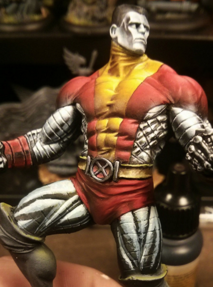
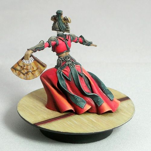
Here is a great step-by-step tutorial of what is truly some of the best NMM out there. Thanks, Arnau!
Never be afraid to paint outside the lines
Posts with miniatures painted using the non-metallic metal technique.
Here is a great step-by-step tutorial of what is truly some of the best NMM out there. Thanks, Arnau!
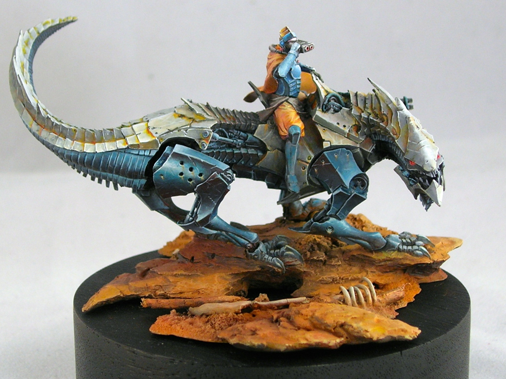
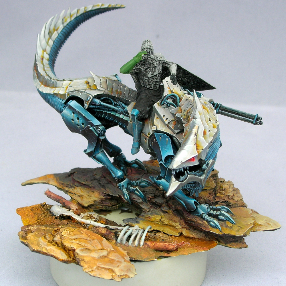
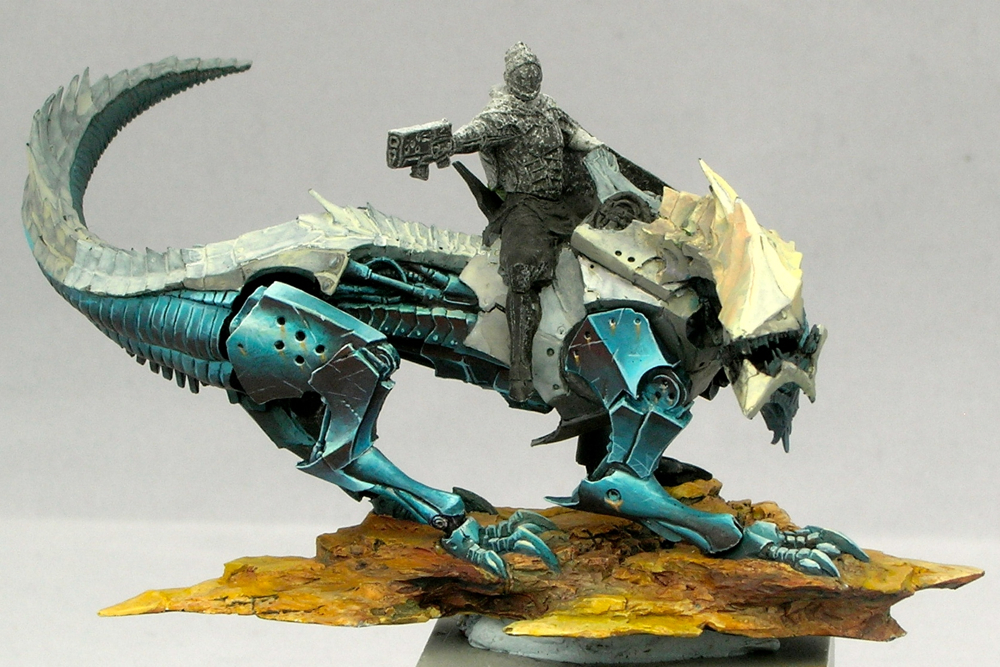
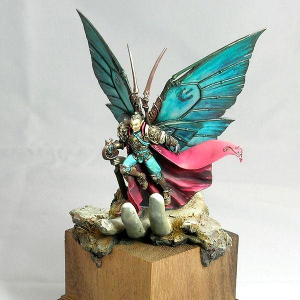
I reached an important milestone since part 2. There’s no more primer showing! There’s still lots of work to be done, but all of the main elements are now in place, so you can see how it all looks together.
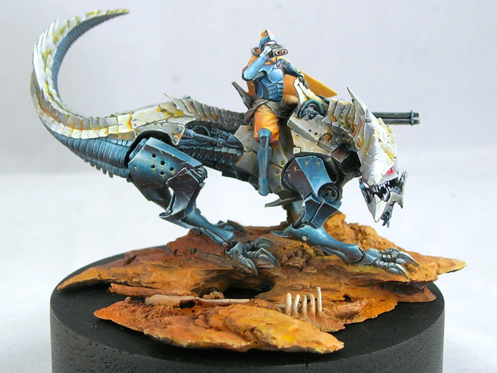
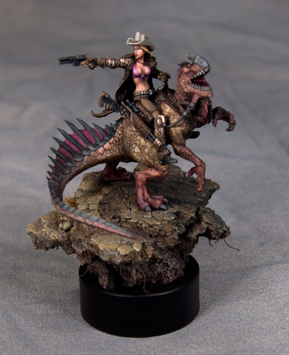
I can’t decide which side is the front of this mini. I’m not sure if that’s a good or a bad thing, but I think it’s good. There’s a lot of energy moving in several different directions, which I think is one of the things that drew me to the mini originally.
The most obvious change since the last post is the rider of course. Originally, I painted his cloak and pants pink rather than orange. The color worked okay in the color scheme, I think, but I couldn’t get over my societal hangups about pink.
Fortunately a thin glaze with yellow ink was enough to change the color completely without destroying all of the highlighting and shading, and my careful texturing work.
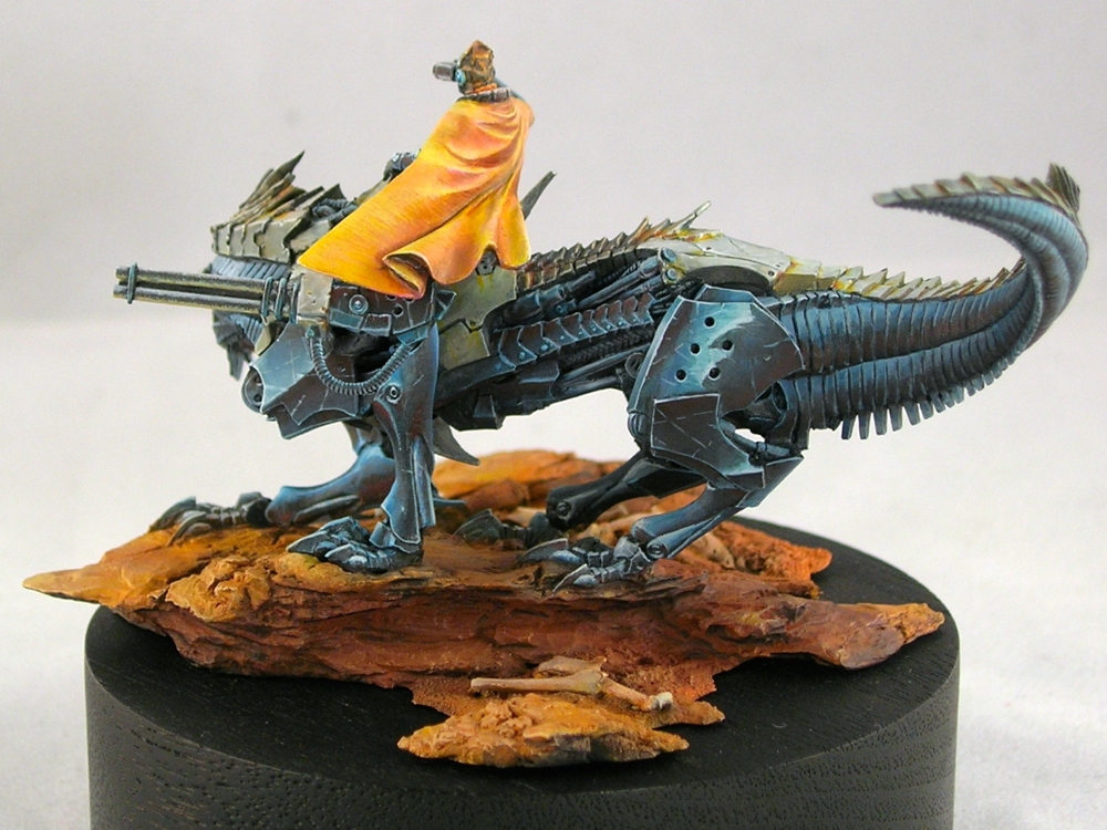
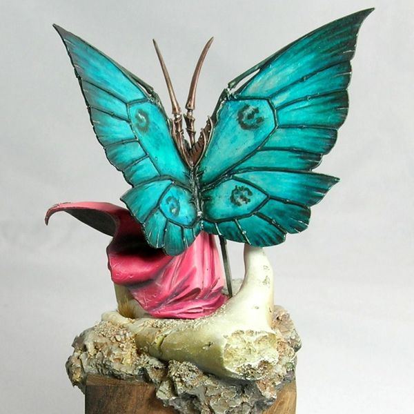
The other main change is the addition of pigments to the base. I don’t think it photographs as well now, but it looks way better in person and that’s the main thing. Pigments create a wonderful dusty effect which makes the base look much more realistic as dirt and stone.
The pigments I used are mostly from the Secret Weapon “wet earth” set, which is somewhat ironic since I created a dry dusty effect using the pigments. Just goes to show you never to take names too seriously, since at the end of the day they are just colors. I used terracotta as the main color for the lit areas and violet (which is an awesome color!) in the shadows, with a few spots of red brick to provide variety.
I screwed up when I added the pigments, since I added the pigments first, then sprayed the whole mini with dullcoat (which it needed to kill the shine from the inks I used). Unfortunately the dullcoat ruined the lovely dusty effect. I added another layer of pigment, but that pretty much obliterated the highlighting and shading I had done before. So I had to re-paint the highlights and shadows over the pigment, and then add pigments a final time. Oy.
At least thick paint is not much of an issue for the rocks and dirt. But next time it’s definitely dullcoat first, then pigments, rather than the other way around.
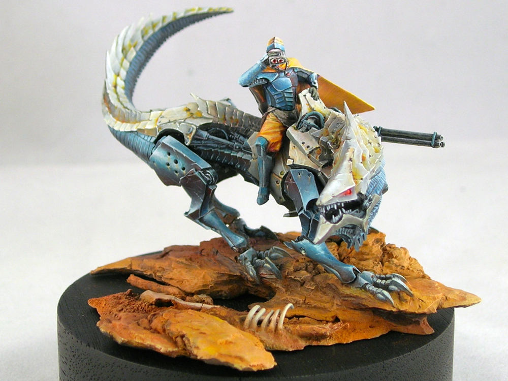
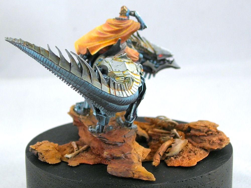
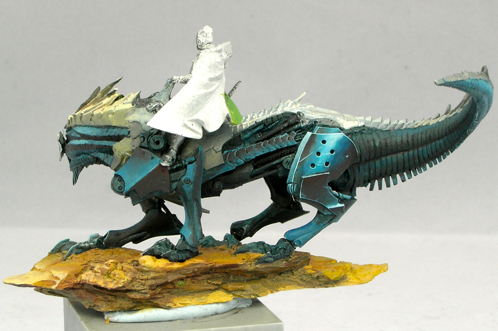
There’s been a lot of progress since part 1. The dragon body is nearly finished, and I’ve built out the base a bit.
I haven’t really put any paint on the rider yet, but I converted his arm holding a pistol into binoculars, which involved a fair amount of resculpting.
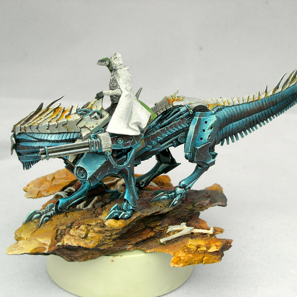
The round resin plinth he’s sitting on is only temporary, for holding him while I paint. I’m planning on putting him on a larger wood plinth eventually.
I’m not sure about the highlighting I did on the back leg in this shot. It doesn’t really make sense from a physics standpoint, but it also provides a sense of energy and motion which I like (and which was inspired by something Alfonso “Banshee” Giraldes said in a class I took from him). I’m going to leave it for now, and see how I feel about it when the rest of the mini is closer to finished.
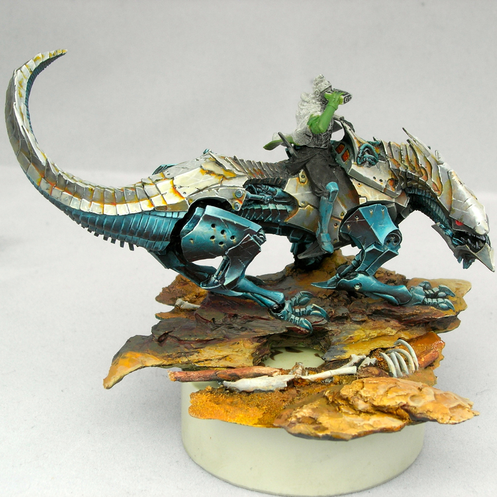
On to the rider! I’m off to Google some fabric reference for his clothing, since I still haven’t figured out what I’m going to do with it. I’m thinking about doing something inspired from West Asian or South Asian fabric patterns. I visited the Victoria and Albert Museum in London a couple of weeks ago while traveling for work, and there was a show on the Fabrics of India which got me thinking along those lines.
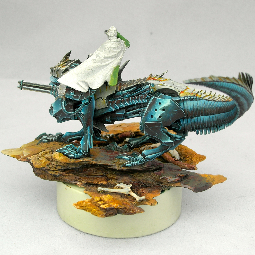
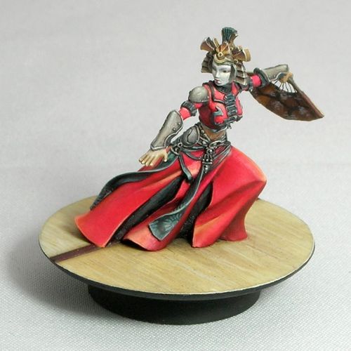
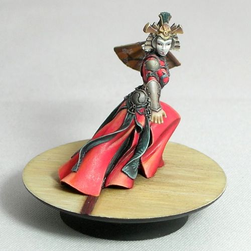
I saw this Dark Age figure at Gen Con, and just had to have it.
It’s a lovely resin figure, which makes me very happy. Unfortunately the pieces don’t fit together quite as nicely as some of the resin figures I’ve had the pleasure of working with, so I had to do a bit of green-stuff work to hide the joins.
The blue metals on the one side are close to finished, but everything else is (obviously) still very WIP. I’m really happy with how the metals are coming out. I’ve been shading my blues with red a lot lately. It’s only barely visible in these photos, but in real life I think it adds a lot of energy to them. I usually start by adding black to the mix to desaturate the blues, which aids the transition, and then add red or glaze with pure red in the deepest shadows. The result is clearly blue shaded with red this way, rather than looking purple.
According to traditional color theory, blue and orange are complements, as are red and green, but according to more modern color theory, cyan and red are complements. Since my blue hue is close to cyan, and I’m countering it with a primary red, this color scheme is more in line with modern than traditional color theory. Maybe.
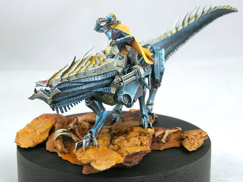
I finally have a more-or-less permanent photo setup in my apartment, which should make it a bit easier to post photos for the blog. I broke it in by taking some new photos of miniatures I painted a while ago, but never had any decent photos of. Hope you like them!
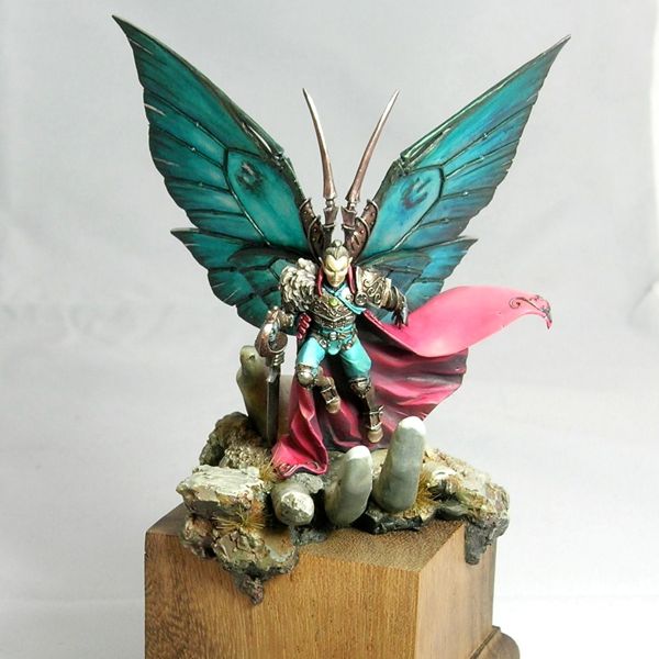
Akarui – Studio McVey
Ar-Fienel – Studio McVey
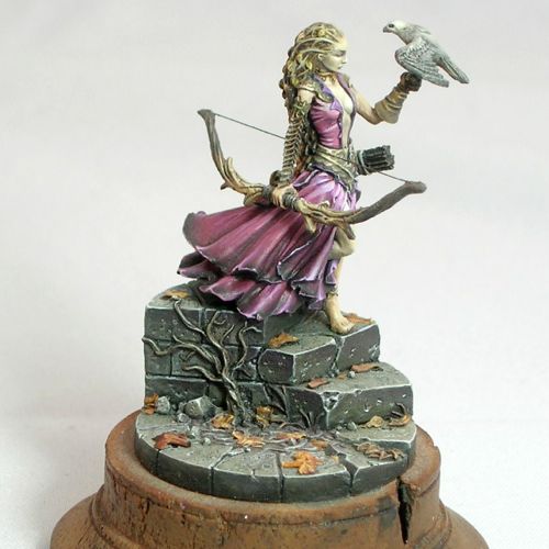
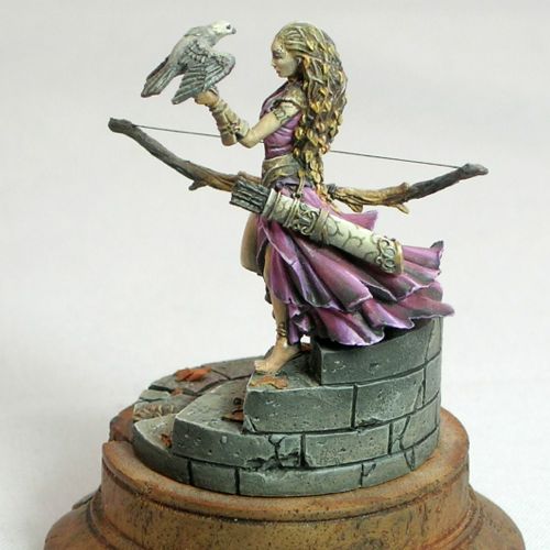
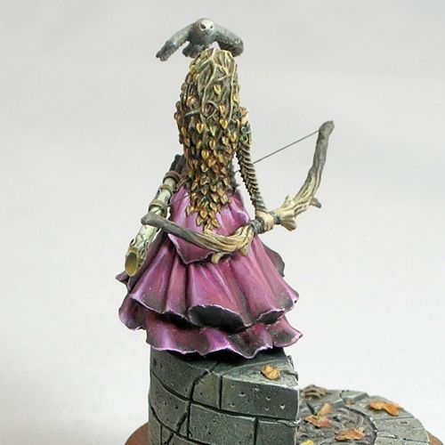
Kifaro – Studio McVey
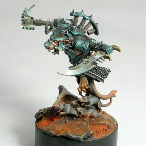
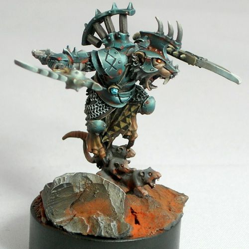
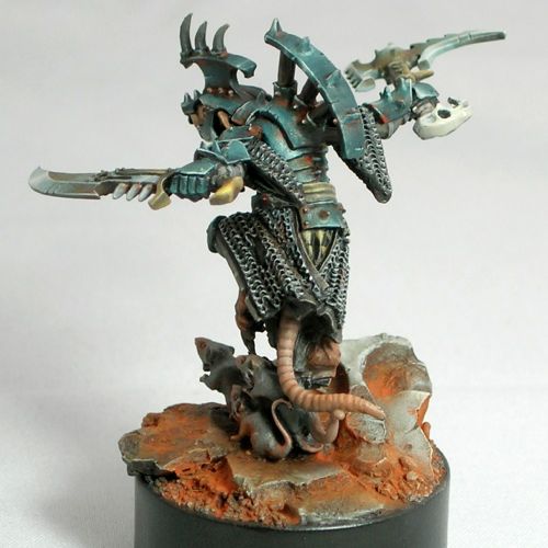
Queek – Games Workshop
Ur-Fildyr – Studio McVey
Comments and critiques are always welcome.
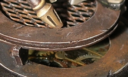
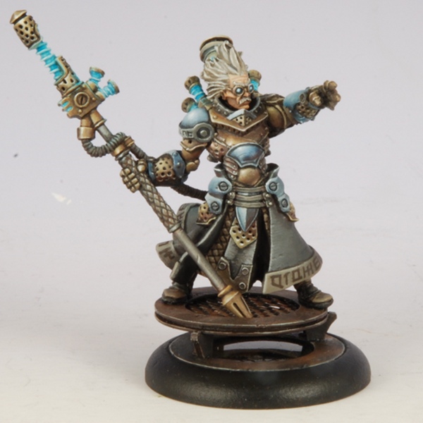
When I painted Commander-Adept Nemo, I was inspired by Natalya “Alexi-Z” Melnik’s amazing version of Nemo from the previous Gen Con. I really liked the non-metallic metal armor and the elaborate base she used, so I decided to do something similar for my version. It’s a fair bit different from hers, but I really liked her idea of putting Nemo on a raised platform with technological elements. For my version, I wanted to create a clockwork mechanism you could see into, like a skeleton watch.
I’ve made a bit more progress, and taken a few more photos.
You can see the lighting effect a bit better now. I’m really happy with how that came out. She’s still WIP, but at least there’s no more primer visible (except a few spots where the paint rubbed off, but those will get fixed).
Sorry about the inconsistent lighting on the photos. They were taken outside since I still need to obtain a decent photography setup. But at least they weren’t taken by my phone this time, so there’s that.
Please comment if you have any questions or comments. Critiques are always welcome and appreciated!
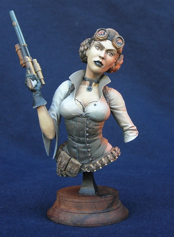
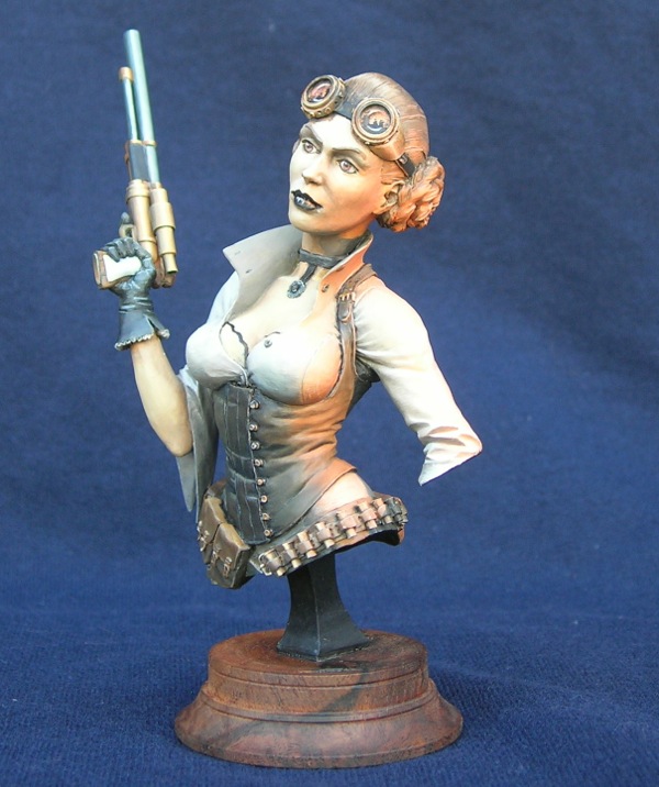
My current project is a steampunk version of a certain famous character.
Steampunk Princess, work-in-progress
This is actually the first bust I’ve painted, and has been a lot of fun so far because it’s a much bigger scale than I usually paint. My normal fare is 30mm models, which is about 1:60 scale. This bust is closer to 1:10 scale. It’s a lot of fun to be able to put in details like irises and eyelashes. The miniature is Steampunk Princess Bust, by Cool Mini or Not, cast in resin.
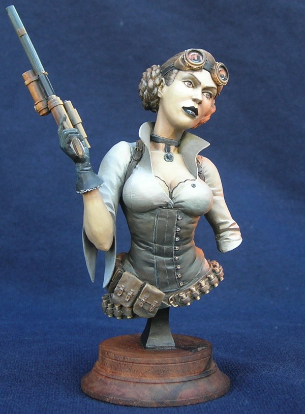
The color scheme (with the orange lighting effect) was inspired by a scene from Star Wars:
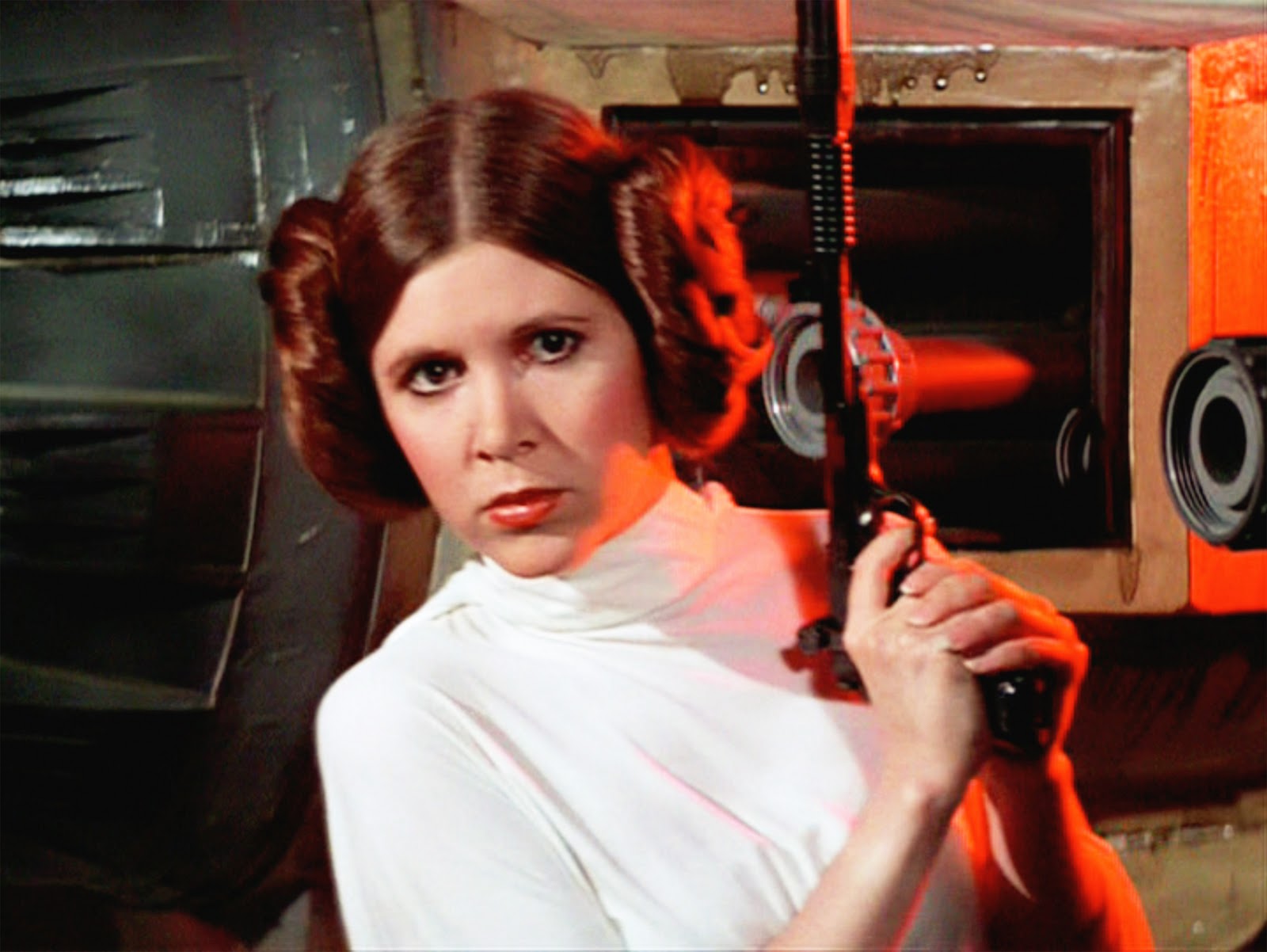
Image copyright 20th Century Fox; used without permission
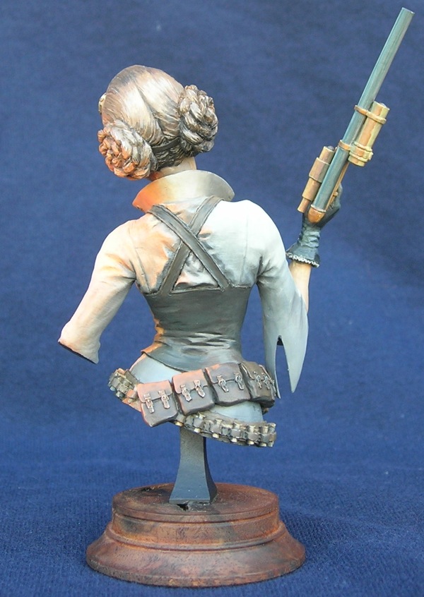
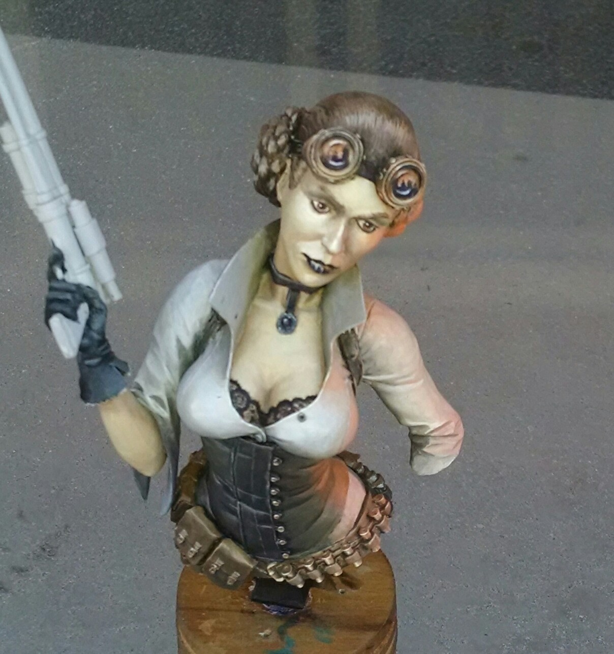
The lighting effect is not too dramatic from this angle, but it’s much more dramatic from her left side. I’ll take some more photos from different angles when I’ve made a bit more progress. There’s still lots to do, not just the pistol!
Please comment if you have any questions or comments. Critiques are always welcome and appreciated!
I’m a miniature painter best known by my online moniker “Althai”. I thought about saying a bit about myself, but I decided I’d rather let my work speak for itself.
Ruby – Studio McVey
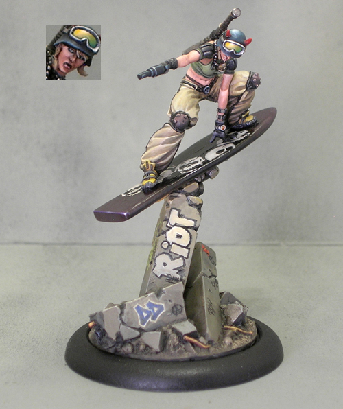
“Riot Grrrl” Lisbeth – Studio McVey
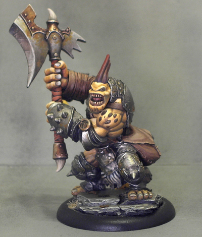
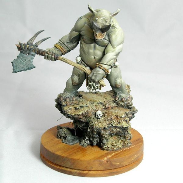
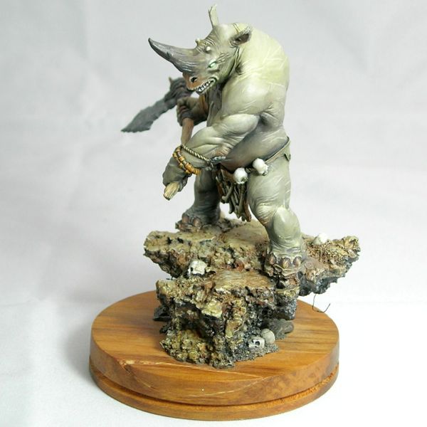
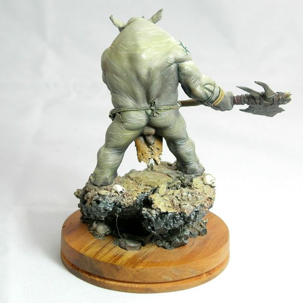
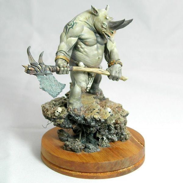
Troll Axer – Privateer Press
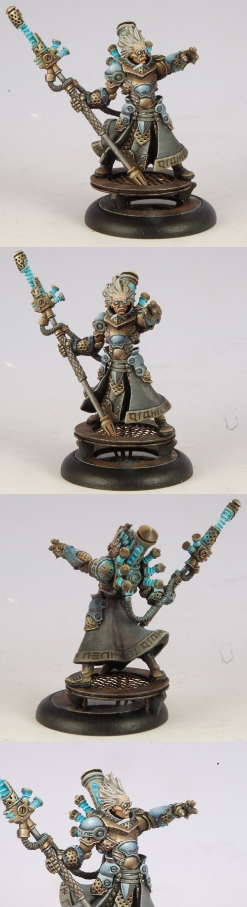
Commander-Adept Nemo – Privateer Press
© 2026 Light Miniatures
Theme by Anders Noren — Up ↑
Recent Comments