Never be afraid to paint outside the lines

Tag: OSL

Object-source lighting

The Alchemist

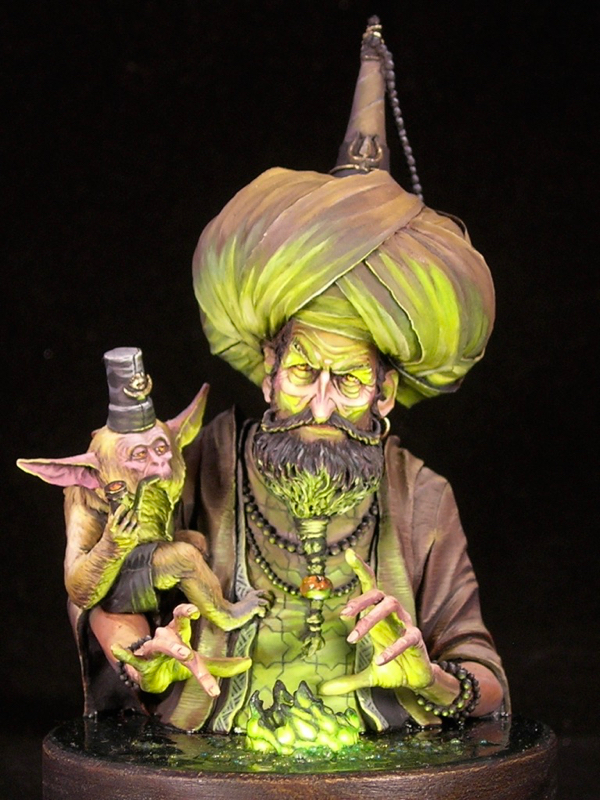
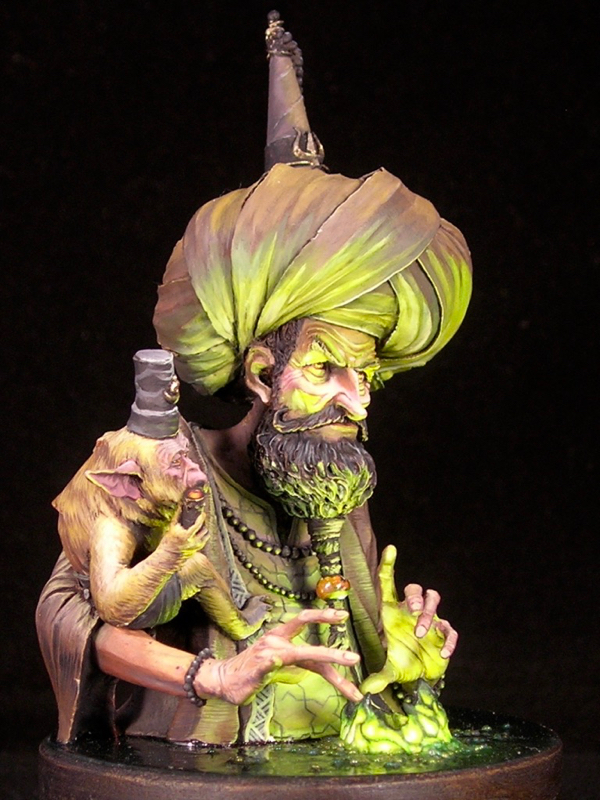
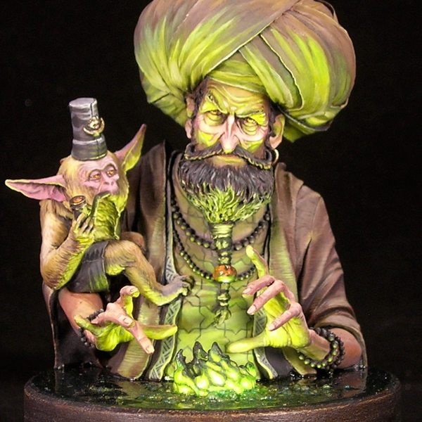
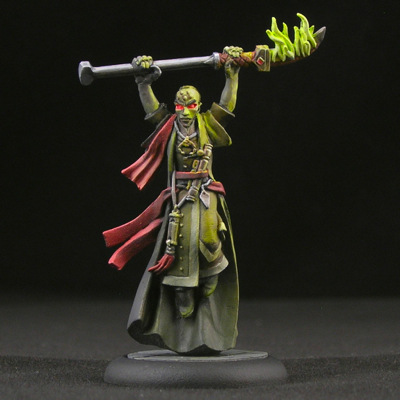
The sculpt is “The Wizard of Agni,” by Ben Komets Miniatures (sculpted by Lucas Pina Penichet), but I call my version The Alchemist. This was one of those figures that I fell in love with the second I saw it, and immediately knew how I wanted to paint it. The figure practically screams for OSL, and with the magical, alchemical vibe he gives off, using a magical flame color just seemed natural.

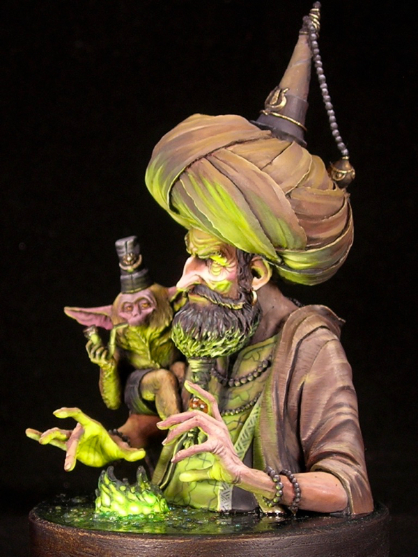
When OSL is one of the main light sources, you can get very different results depending on whether the light is a natural light source (like fire, which gives off all colors of light) or a colored artificial light source, and if it’s colored, whether it’s a primary or secondary color. Using a light source of a secondary color, like the green fire I used for The Alchemist, lends itself to simple color schemes with a very limited color palette. This is because when green (or another secondary color) mixes with other colors, you will either end up with something quite similar to the original color, or a desaturated, muddy color.

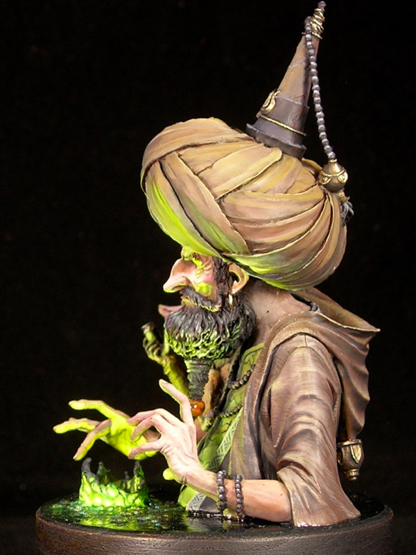
For The Alchemist, I decided to pair a strong saturated yellow-green with mostly desaturated colors, generally reddish and purplish browns in order to play with complementary colors. I also made very limited use of a saturated orange in just a few places: the eyes of the monkey and alchemist, the monkey’s pipe, and the bead in the alchemist’s beard.

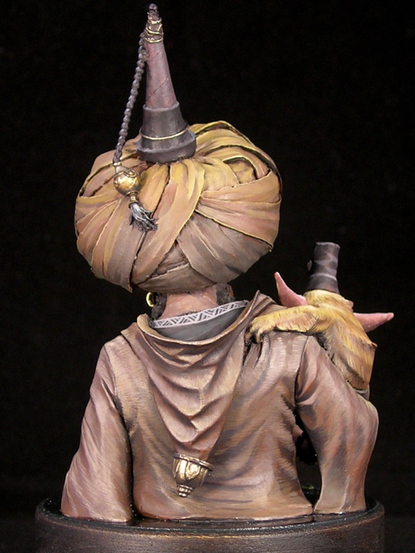
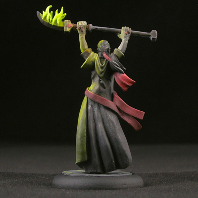
With a very large scale figure like a bust, you have the opportunity to add far more detail than you can in 25 or 30mm scale. So I think it’s important to play with textures and freehands to take advantage of that opportunity. I generally like to do some of each. I had a lot of fun with the textures, especially the monkey fur and wrinkled hands. The monkey fur was very simple to do, just lots of little lines, but came out extremely well. The sculpt even has a tiny bit of fur sculpted in some places, to suggest the direction. I found the appearance was better if I painted the fur to be a bit matted, rather than smooth.

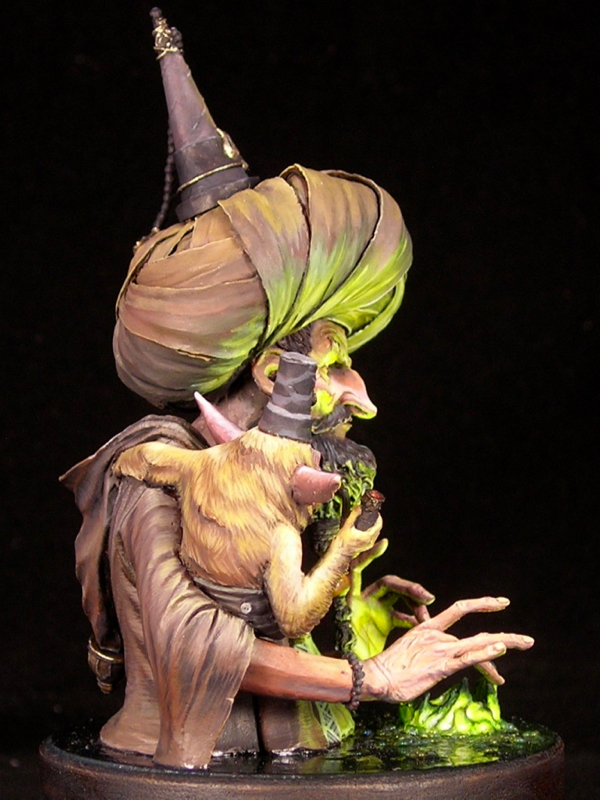
For the freehands, I went with muslim geometric patterns, which I very much like and have used before. Not only do they go well with the Turkish vibe of the sculpt, they also fit the subject matter: alchemy and chemistry have a long history in the muslim world, and even the world alchemy derives from the Arabic al-kīmiyā’ (الكيمياء‎). The pattern on the alchemist’s shirt was a bit of a pain to get right, since the lines need to be very precise due to all the regularity. I started with a square grid, then added the triangles, and had to do a number of minor adjustments to fix imperfections. On the other hand, the border on the vest was simple and easy. Both were painted before adding the beard and arms to allow easy access for all that precision work.

I entered “The Alchemist” into the painting competition at Kublacon, and was lucky enough to take best of show amidst some of the stiffest competition I’ve seen there. If you would care to voice your own opinion, he’s up on Putty & Paint and CoolMiniOrNot, or leave a note in the comments!

Tutorial: Object Source Lighting (OSL) and Other Lighting Effects

One of my favorite effects in miniature painting is when the artist uses paint to create the illusion of a light source which is not actually there. These lighting effects can be extremely fun and eye-catching, but they can also be very tricky to pull off. In this tutorial I will outline a set of rules which, when followed, will make your depictions of light sources much more believable and impactful. I will also show a step-by-step painting process which is one way you can follow these rules and achieve a good result.

A quick note on terminology and history.
Object-source lighting, or OSL, refers to when one of the light sources depicted by your painting is an actual object on the figure or its base, such as a torch, lamp, or glowing sword. Lighting effects is a more general term I use to cover any use of paint to suggest a light source which is present in the scene, but may be “off camera” rather than being depicted on the miniature.

The miniature painting community was introduced to OSL by Slayer-Sword-winning painter Victoria Lamb, whose creations The Rescue of Sister Joan and Firey Angel are two of the best examples of this effect.

To the extent that miniature painting is a genre of art, there are no hard-and-fast rules. However, when painting a miniature to simulate the behavior of a light source, you are trying to create an illusion of something which is not really there—the light that you imagine being cast on your miniature, from an object it is holding or from its environment. In order to create a convincing illusion, you must follow the same physical laws that govern how light behaves, or you risk spoiling the illusion because something will look “off” to the viewer. These rules about how light behaves are part of how you understand the world, but are often instinctive and subconscious. By taking these rules and making them explicit, it becomes easier to see when a lighting-effect illusion is not working, understand why it is not working, and fix it.

Continue reading

Crystal Brush Entries, part 2

Today I’m continuing my three-part series on my Crystal Brush entries with my single figure entry. If you missed part 1, please check it out here. This figure is titled “Space Pirate Kaelyssa.”

The figure is Kaelyssa, from Privateer Press’ steampunk game Warmachine. I got a big kick out of doing her up in true sci-fi fashion, not at all steampunk. Since she belongs to the Retribution faction, which already have a rather sci-fi look, this was quite easy. All I did was a very simple conversion to add a hose connecting her gun and backpack. The only other thing it took was paint. I was amused how many people asked me if it was an Infinity figure.

Part of the inspiration came from James Wappel’s excellent Professor Karrick. I absolutely love dramatic lighting and glow effects, and James’ take on Professor Karrick’s two light sources is excellent. The base he did complements it really well, providing a nice backdrop to catch the light. For my version, I kept the base but used a different figure from the same sculptor (Patrick Keith), converting it slightly to have a similar hose.

I tend to do simpler color-schemes on most of my figures, with two or three main colors dominating. In my experience, the easiest color-schemes to pull off are those that have at most two bright colors in them, and the rest of the colors are more muted. Here I was able to come up with a more complicated color scheme, with many very saturated colors in it, and I still think it works.

I was really surprised when Kaelyssa didn’t make first cut. I spoke with one of the judges, and he said that she was right on the bubble but the judges felt that the blending on the orange was not smooth enough and that kept her out. I’ve never been the smoothest blender, preferring to take my time creating textures and dramatic ambiance rather than glazing and glazing until I have really really ridiculously smooth blends. I think that hurt me here.

While I think there are some weaker elements, like her left arm and sword, I’m really happy with how the ambience and light effect came out. I think that overall Kaelyssa is good work, but given her poor result in Crystal Brush I plan to rework some of the weaker elements and enter her in another competition in the future (probably the Privateer Press competition at Gen Con).

Kaelyssa is sculpted with some fairly simple, round armor plates. Simple surfaces can be wonderful for an ambitious miniature painter, because they provide a good opportunity to make them much more complicated and interesting using paint. I took the opportunity to do a comic-book-style chrome effect, reflecting the glowing sword and ray-gun. I think the comic-book style art complements the sci-fi vibe really well.

There are a lot of debates between non-metallic metals vs. the use of metallics in miniature painting, with hard-line adherents on either side arguing their way is “better”. Personally I use both, but I think this miniature is a good example of some of the advantages of non-metallic metals. I could never have portrayed the interaction of shiny metals and a light source using metallic paints, the way I was able to do it here using nmm.

Speed-painting!

I love speed-painting, both competitive speed-painting at conventions and just for fun at home. I think it’s great as a palette cleanser between longer projects. It’s a good way of getting playable, tabletop-quality figures on the table quickly, and allows you to focus on overall impact and feel rather than on getting all of the details perfect.

speedpaint_05

In speed-painting, the name of the game is high contrast, dramatic paintjobs which will catch the eye from a distance. Don’t try to make the mini look good up close, that’s just not something you can really accomplish in an hour of painting. Go for eye-catching techniques such as lighting effects and freehand, strong contrasts, and a passable face, and don’t worry about quality blending.

For Karzoug, I went for a strong lighting effect—the mini basically begs for it. The other versions I’ve seen use ordinary flame-colored flames, so for my version I opted for a more unnatural fire, as befits a necromancer.

speedpaint_06

Unlike the rest of the minis I’m showing today, Karzoug was not painted at a convention, so I actually got to give him a half-decent prep job instead of having to deal with giant mold-lines and dusty primer, and I got to use my own brushes. (Bringing your own sables to convention speed-painting events is generally considered cheating.)

speedpaint_11

Every convention has its own speed-painting rules, but the basic idea is that everyone is given the same miniature—contestants usually have no idea what it will be ahead of time—and have to paint it as well as they can within the time allotted. You normally get 45 minutes; championship rounds often last an hour. Use of personal materials is generally not permitted, so you’re sometimes painting with really terrible brushes, though sometimes you get lucky. Provided minis are assembled and primed (often not terribly well, since the people prepping them have several hundred other minis to prep and don’t care much about the end result). Getting a decent finished product in this environment is challenging, to say the least. So please don’t judge these minis too harshly. 🙂

speedpaint_10

Zombies make very good speed-paints. Messiness is usually inevitable, but on zombies it’s a plus. This zombie was painted in the speed-paint at KublaCon, which only provides contestants with one brush each. My favorite speed-painting technique being two-brush blending, I had to improvise. Fortunately, if you are sufficiently practiced, it is possible to two-brush blend with a single brush. 😛

speedpaint_03

I had the good fortune of painting this anteater twice, in two consecutive years of speed-painting at KublaCon. He is a tiny one-piece mini, produced by Zombiesmith who are great for always sponsoring KublaCon mini events. Small one-piece sculpts are ideal for speed-painting, because it’s very fast to cover the entire mini with paint. This gives you plenty of time to pull off more inventive  decorations such as freehand, and causes me to occasionally annoy other contestants as I wonder aloud, “What am I going to do with all this time?”

speedpaint_04

In the case of this anteater (technically a Quar) and his large flat back, that would be freehand decoration, of course. The first year I went with “hell angel” (it was faster and easier to leave off the esses, and still makes sense) and a pentagram, which seemed appropriate for a gun-toting bad-guy. The second year I wanted to do something different, so I ended up going in totally the opposite direction with a peace symbol on tie-dye. The idea cracked me up when I thought of it, so I hoped the judge would like it too. Both placed first in their respective rounds.

speedpaint_07

This is Kubla, con mascot for KublaCon. For the championship speed-paint round, they always use the convention figure, which is fun and gives you some extra time to plan (not that I ever remember to use it). This was not my best speed-paint however, and I only placed third that year (2015).

Karzoug, Runelord (Reaper), 75 minute speedpaint

I did much better in 2016, when I managed to win all four of the rounds I entered, including the championships. This grot was from the first round I entered, and was a great little blast from the past. He’s another tiny one-piece model,  so I had lots of time to freehand in horrible ’90s-style checkerboards and hazard stripes. I think it suits the model.

speedpaint_02

You can tell I spent way more time on the front than the back. Strategy!

Sadly this grot and the tie-dyed Quar are the only figures I managed to hang onto from KublaCon 2016. One figure I gave away, and the championship round figure I either misplaced or it, erm, wandered off.

speedpaint_08

Privateer Press’ gobber rogue, another tiny one-piece figure! This was from the speed-painting competition at Gen Con, which tends to be a bit more competitive than the speed-painting at KublaCon since it draws a bigger audience. I’m really happy with how the face and the rusted daggers came out, and I stole the idea for flowers on the base from another speed-painter. Sadly he only came in second, but that was enough to qualify me for the championship round… where I again came in second. Phooey!

speedpaint_12

And finally, this is perhaps my favorite speed-paint of all time. It’s a bit impressionistic, but I managed really strong contrasts and the overall colors work pretty well. I’m especially happy with how the rocket came out. One of my painter friends complained about the very visible brush-strokes on the back, but those were intentional, to show the gleam of the metal, and also a bit of the texture (if you look closely, you can see the brushstrokes are horizontal on the nose-cone and vertical along the shaft of the rocket).

speedpaint_13

This was from the Wyrd championship speed-paint at Gen Con, where I managed to finish first, beating the woman who beat me in the Privateer Press championships (and collecting a bounty!)

P.S. I promise to be back showing actually-well-painted models (and not just well-painted-for-45-minutes models) later this week. I have lots of minis from the Gen Con painting competitions that I’ve been dying to show off.

Steampunk Leia—finished

Sorry I’ve been so quiet lately. The holidays are always a busy time of year, and this will be my last post of the year.

In honor of Star Wars, I’m finally posting the finished shots of Steampunk Leia. I posted the initial WIPs over a year ago, and finished her last summer, but it took a long time to finally post photos. Sorry!

Without further ado, here are the pictures.

steampunk-leia-2

steampunk-leia-1

steampunk-leia-6

steampunk-leia-5

steampunk-leia-4

steampunk-leia-3

After the second WIP post, I ended up painting over all of the non-metallic metals with metallics. At this large scale, I just couldn’t get NMM that I was happy with. I’m much happier with how the metallics turned out. But my favorite part is the orange light effect – I think I learned a lot about how to pull off a realistic glow effect by trying to execute it at this large scale.

Tutorial: Object-Source Lighting

This tutorial is quite old. Please check out my new one instead!

Really! The new one is much better!


One of the most eye-catching effects in miniature painting is source lighting, where a glowing object casts light on the rest of the miniature. Especially in the fantasy and science-fiction genres, it’s a great way to show that a sword is imbued with magical energy, or a plasma cannon is charged and ready to fire. Let’s face it: glowing weapons are just cool. This technique is often called “object-source lighting” (OSL) by figure painters, as the source of the light is represented on the miniature (an “object-source”).

Pulling off believable glow effects is tricky, however, and there are many examples of poorly done lighting effects on the internet. In this article, I will show a step-by-step sequence of how I paint source lighting effects, using a Cryxian Slayer by Privateer Press as the demo mini. I’ll also provide plenty of tips and additional examples to help you give your models that eye-catching glow.

Continue reading

© 2024 Light Miniatures

Theme by Anders NorenUp ↑