Never be afraid to paint outside the lines

Tag: CMoN

CoolMiniOrNot – miniatures manufacturer and photo website

Desert Wanderer

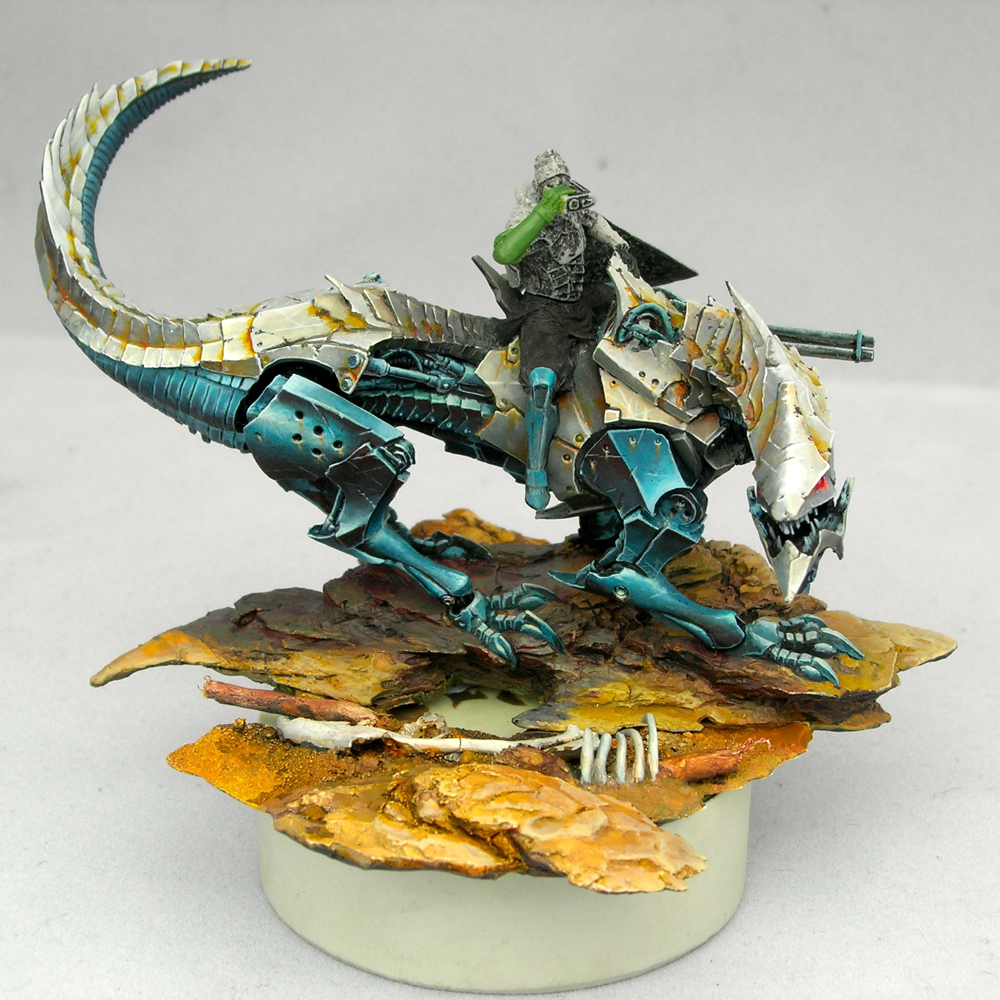
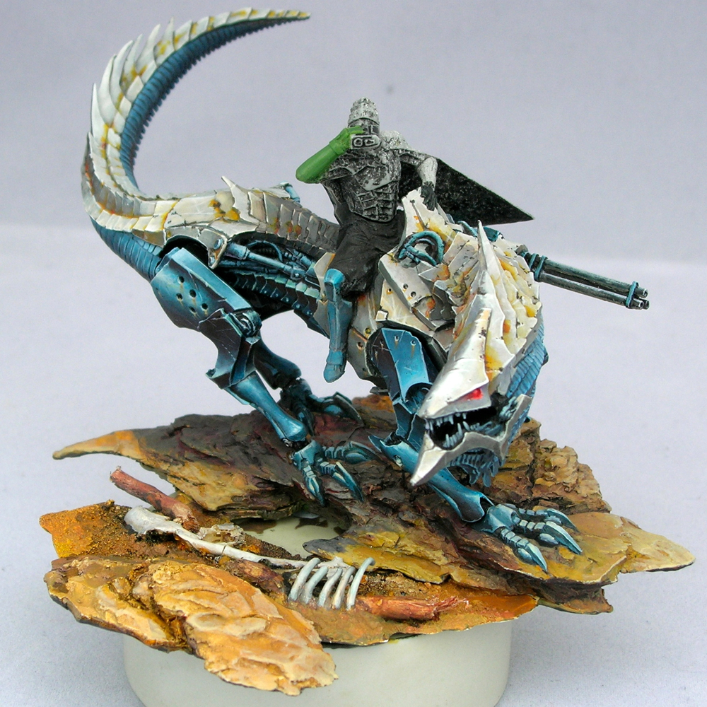
I began working on this miniature last fall, shortly after Gen Con 2015, but only recently finished it, for Gen Con 2016. (WIPs: part 1, part 2, part 3.)

desert_wanderer_01
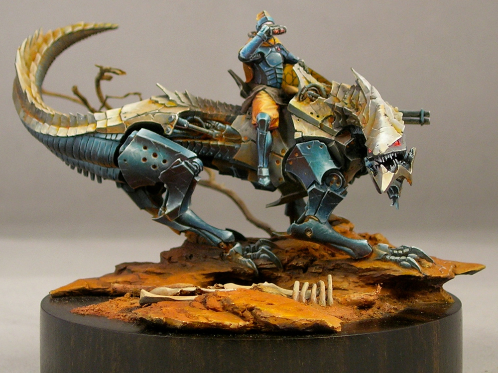
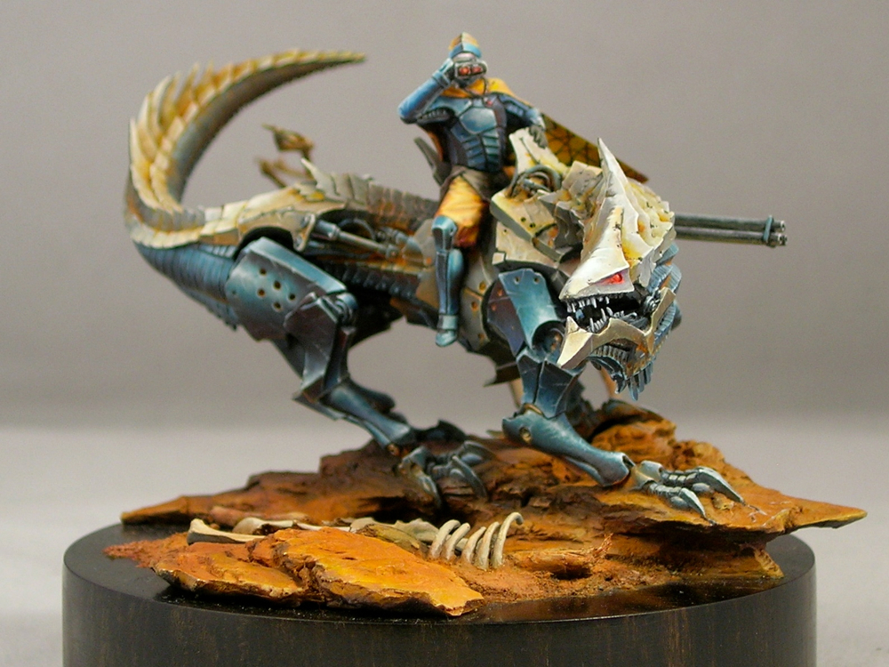
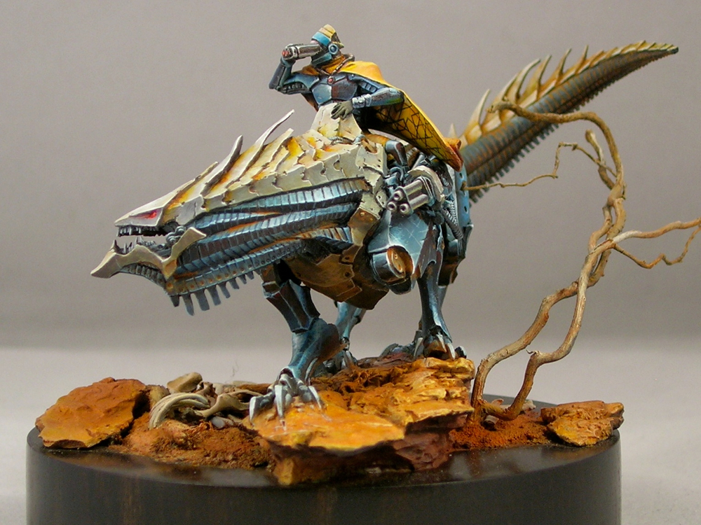
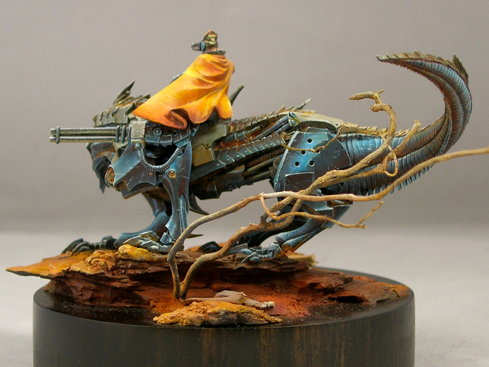
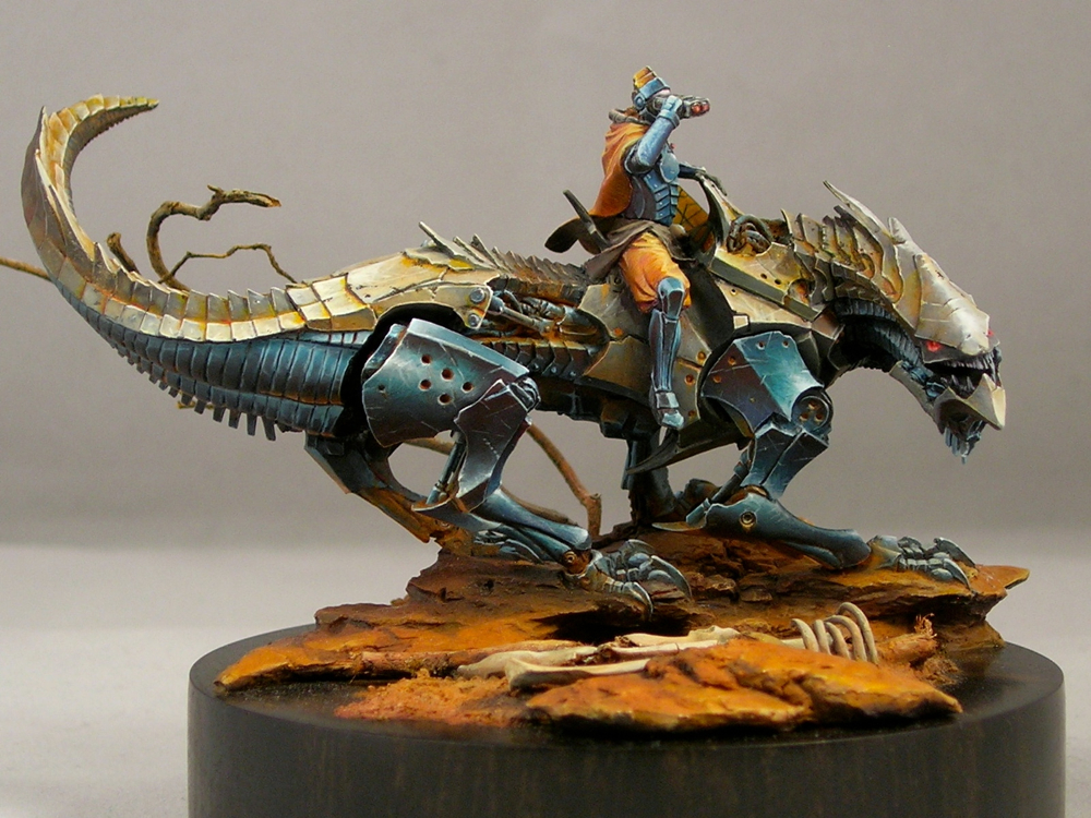
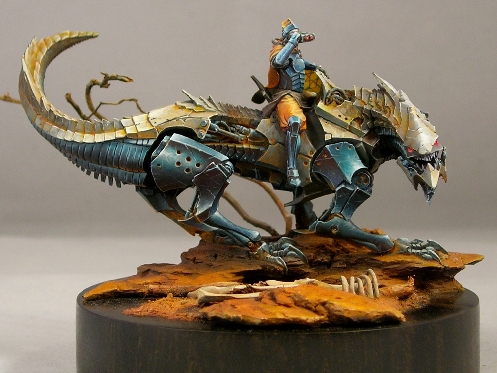
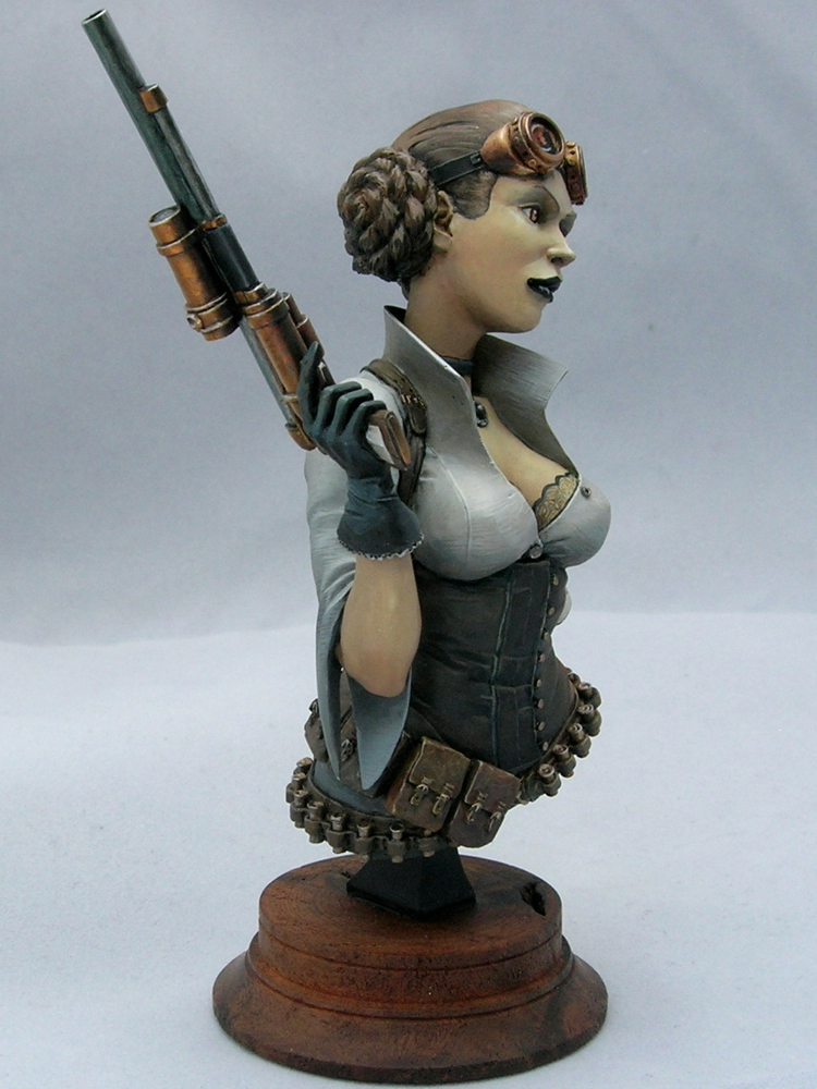
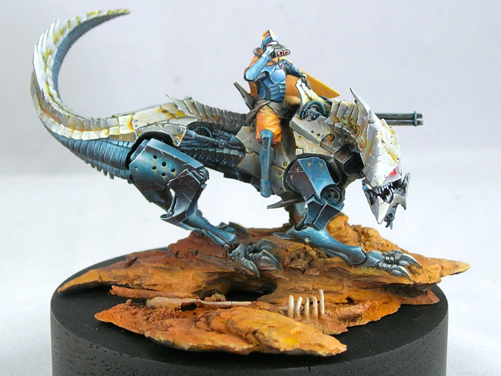
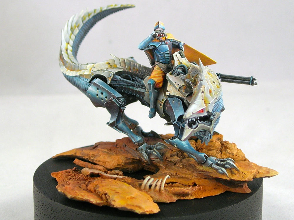
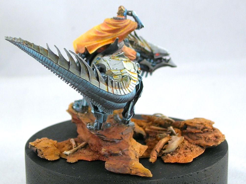
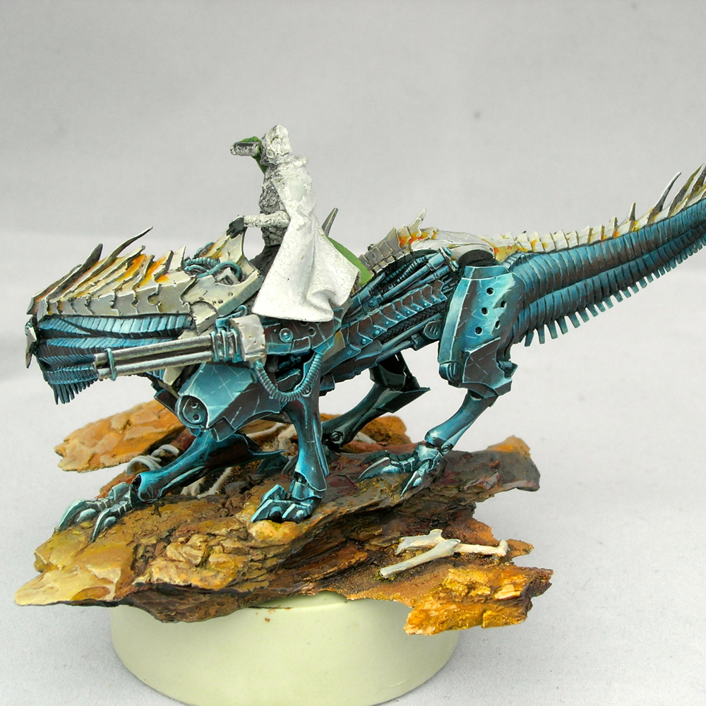
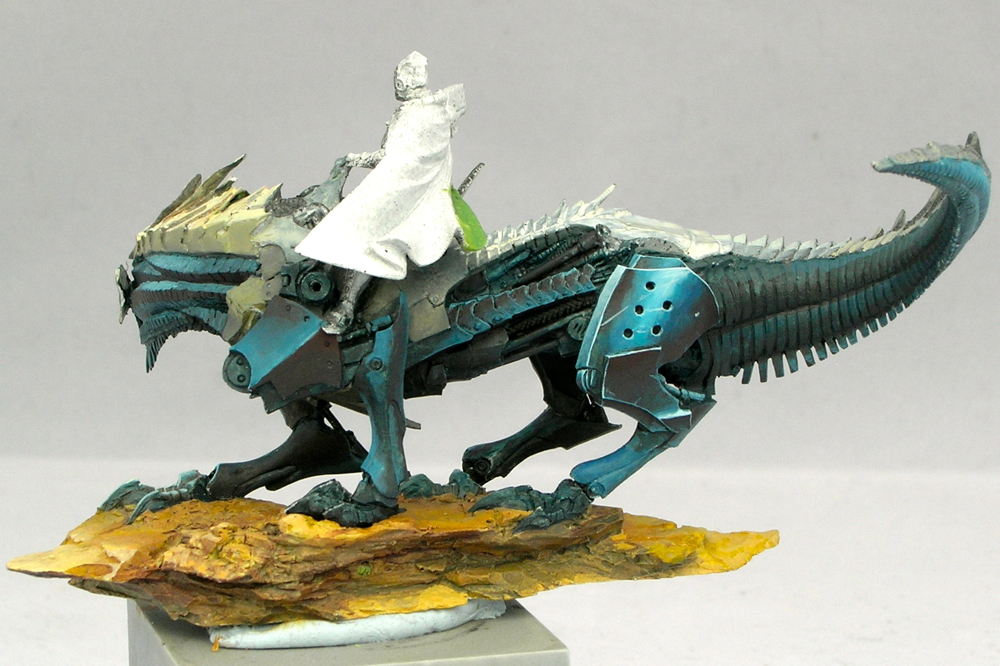
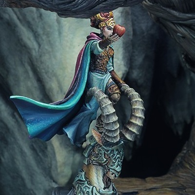
It’s really a fantastic miniature, from the game Dark Age, and I love how much energy there is in the sculpt. I did some conversion work on the rider, twisting the cloak and moving the arm to give him a more three-dimensional pose, and also because I liked the feeling that binoculars gave the miniature (as opposed to a pistol).

desert_wanderer_02

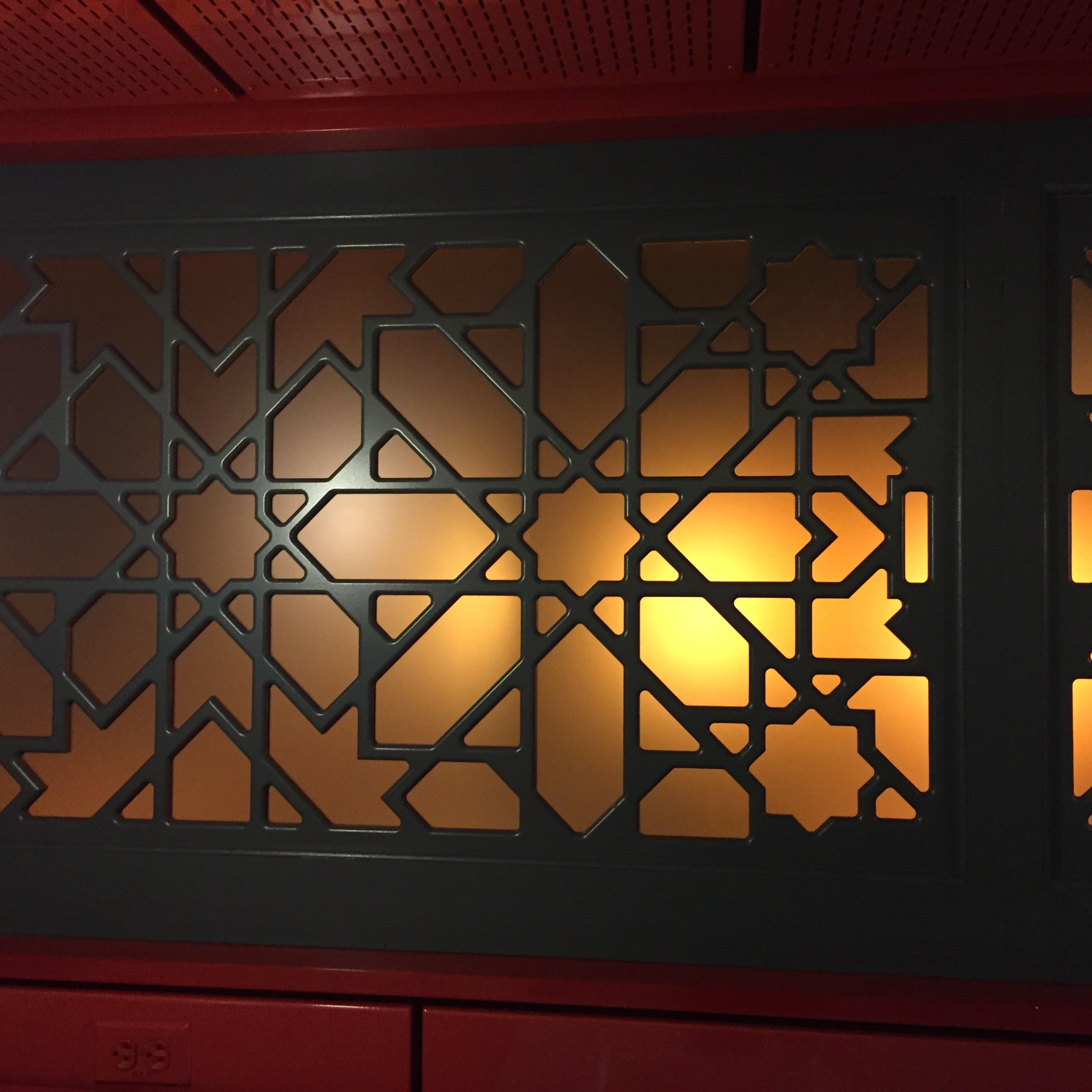
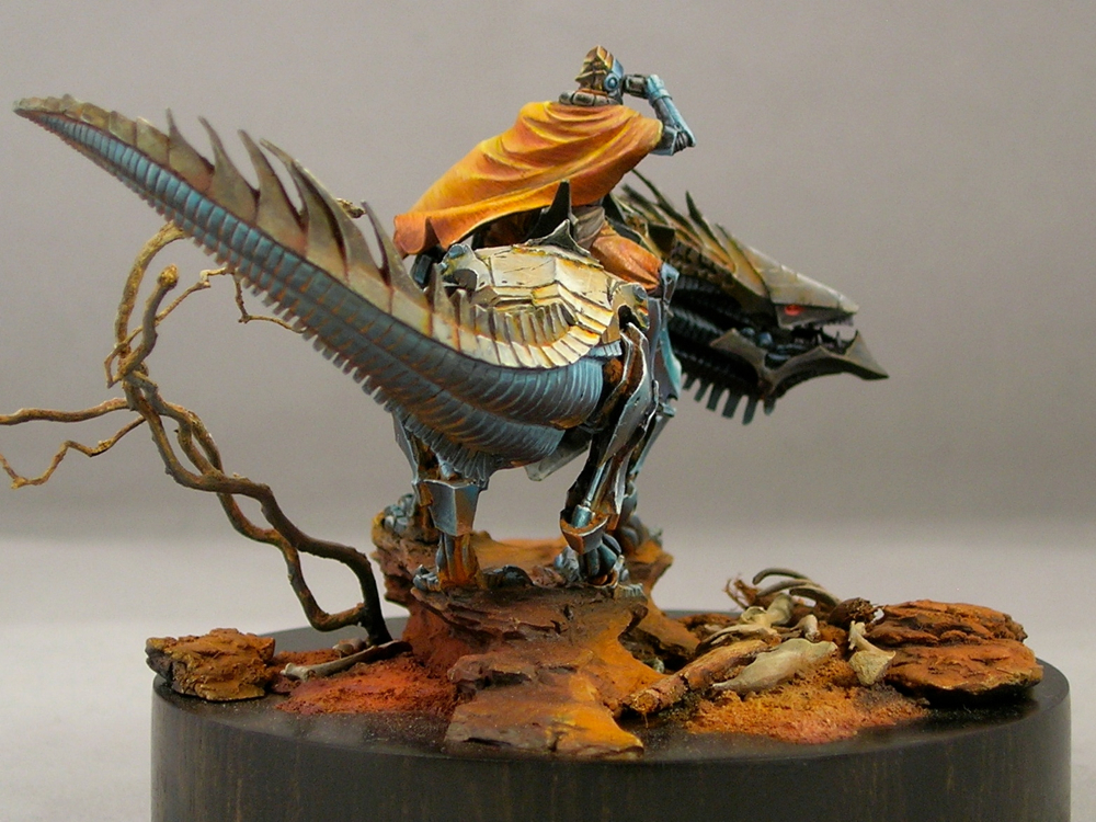
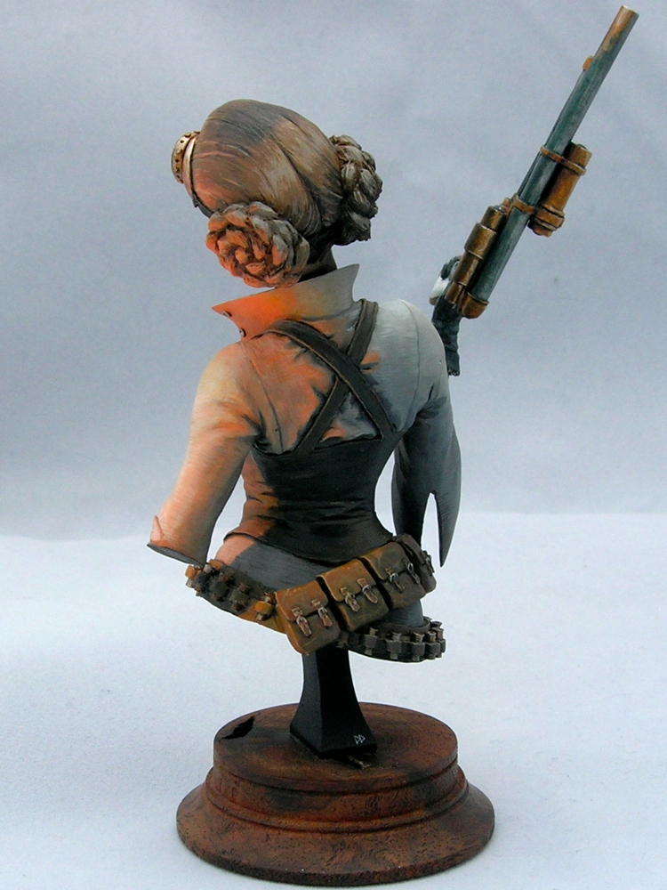
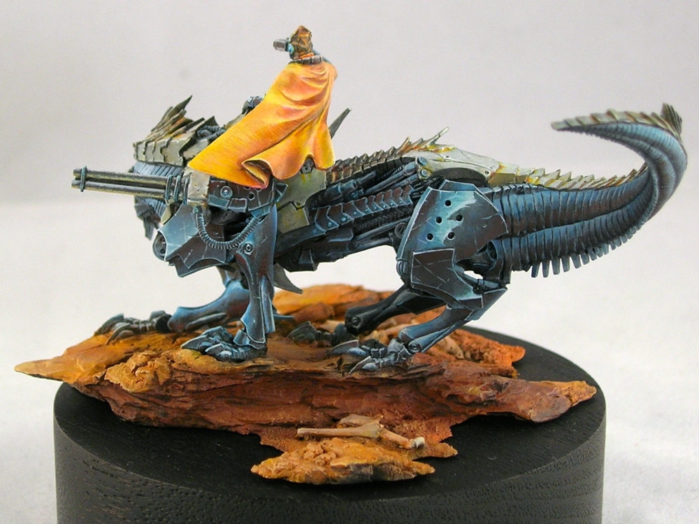
As I mentioned back in October, I was thinking about using south asian or west asian fabric patterns to decorate the cloak. I did a lot of image searches looking for inspiration, and eventually ended up settling on an Islamic geometric design, even though those are more commonly seen in architecture rather than on fabrics. Amusingly, though I spent hours googling possible designs, the one I settled on was from my office cafeteria rather than image search.

costa_window

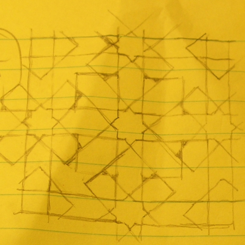
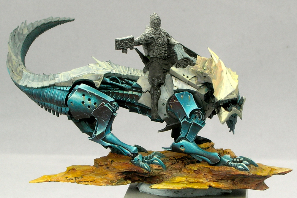
Before transferring the design onto the cloak, I did a sketch (and modified the pattern slightly, adding more symmetry).

desert_wanderer_cloak_sketch

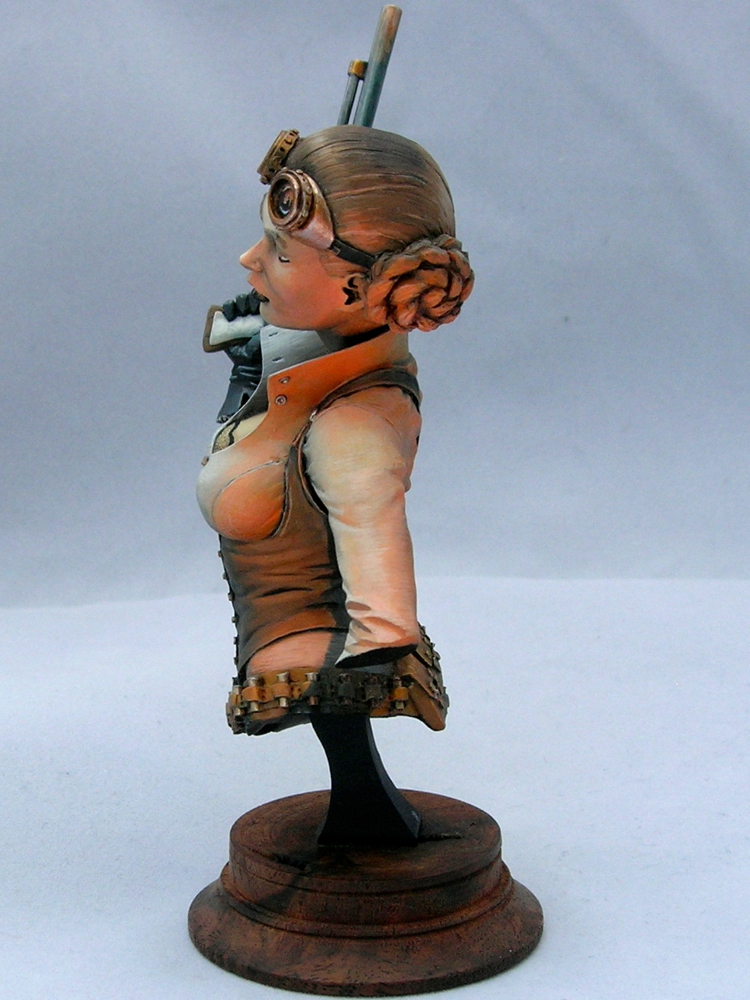
The inside of the cloak has a large flat area, which is really perfect for this sort of intricate freehand design. Here is a work-in progress picture of the cloak. When this photo was taken, I still needed to make the line thicknesses more consistent. But first it’s more important to get the entire pattern laid out, since you don’t want to spend a lot of time getting a line straight and even only to realize it’s in the wrong place.

desert_wanderer_cloak_wip

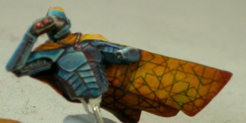
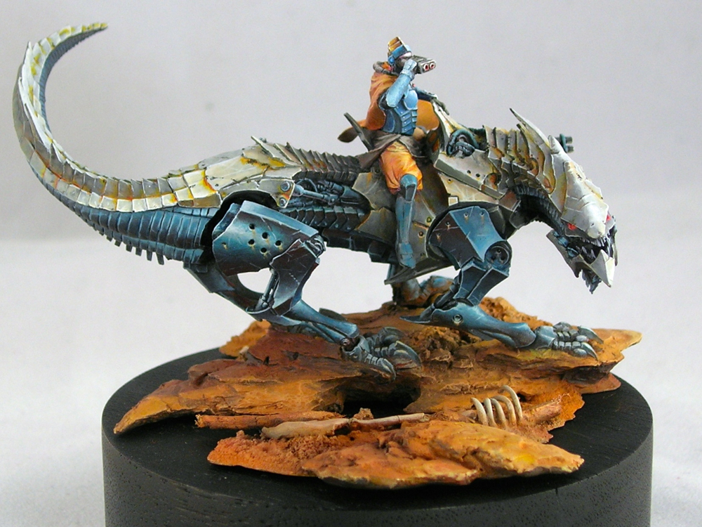
The green spot on the cloak is actually intentional, though it looks totally weird in this picture. Once the rider is mounted, that part of the cloak is right above a piece of blue metal, the back of the shoulder-mounted gatling gun. So it’s an entirely natural place to see reflected blue light; yellow and blue makes green. I’ve been thinking about light a lot in my miniature painting for the last couple years, and I’m a big fan of reflected light. In some of the other pictures, you can also see ground reflections in the metals, particularly on the legs. The effect is quite subtle, but I think it adds a certain amount of realism and keeps things from being too cartoony.

desert_wanderer_03

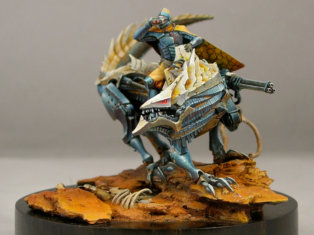
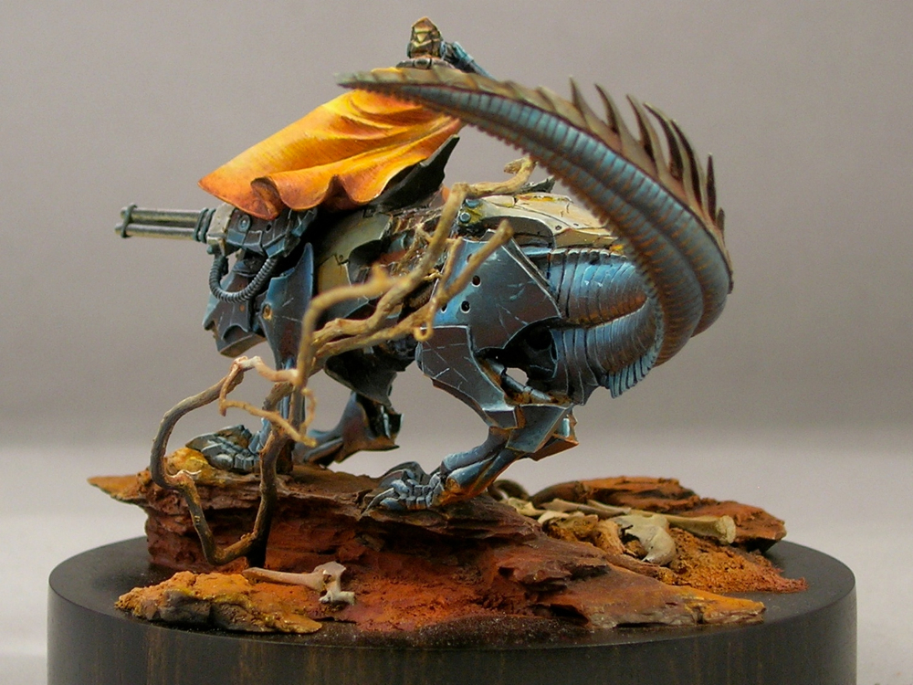
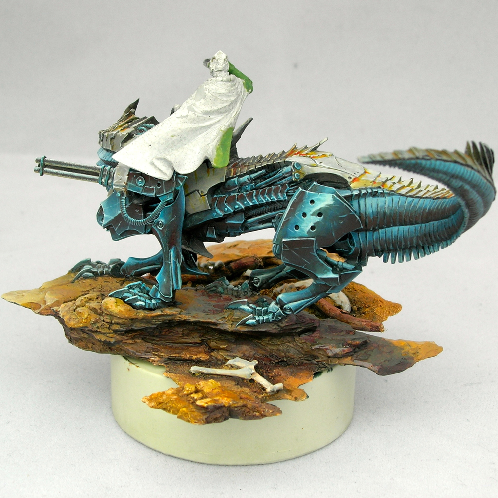
The other big change since the last in-progress post, besides the freehand on the cloak, is the addition of a lot of dirt and grime to the mount. I have a friend who I like to ask for critiques, and he always tells me my miniatures are too clean and I need to make them dirtier. But he is helpfully specific in how I need to make the miniature dirtier, so his comments are very useful. For this mini, he complained that someone wandering through the desert riding a powerful beast would churn up a lot of dirt, so why does the mount look so clean? He was absolutely right, as usual.

desert_wanderer_04

I used the same pigments I used on the base in order to add the dirt. I kept it focused around the joints and in the cracks between armor plates and other mechanical elements. This is, of course, where you would expect dust to accumulate. But I also didn’t want to obscure the beautiful blue metals, and the brilliant white reflections, and keeping the dust confined to joints and cracks helps this happen. It’s sometimes a tricky balancing act, trying to get a realistically weathered appearance while still maintaining strong contrasts and making shapes that are easy to read at miniature scale. I think I was able to reach a good balance with this miniature.

desert_wanderer_05

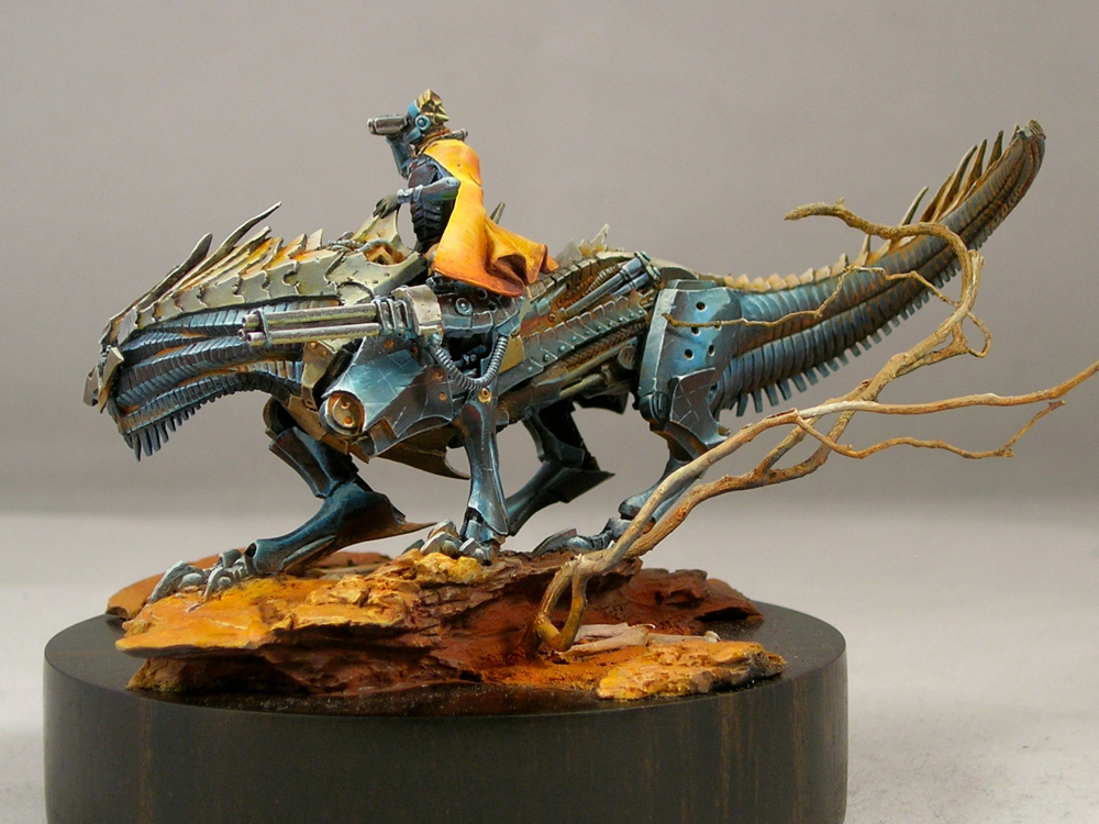
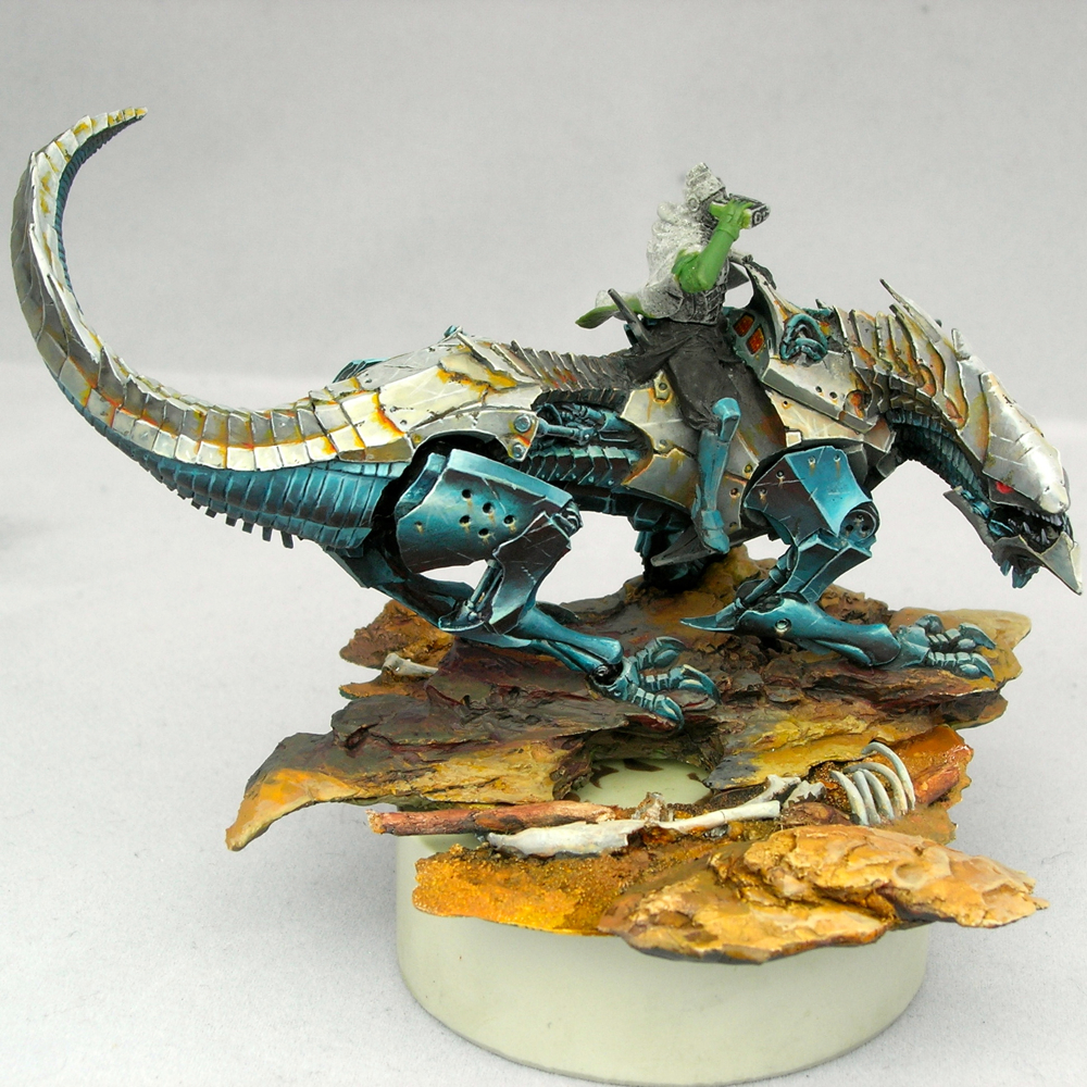
The dead tree is just some cool roots I found while walking near my office. Roots tend to work better than above-ground parts of plants in miniature scale, since they look like miniature versions of the above-ground bits. This piece was really cool and twisted looking, which I thought made it look like it had been warped by powerful winds.

desert_wanderer_06

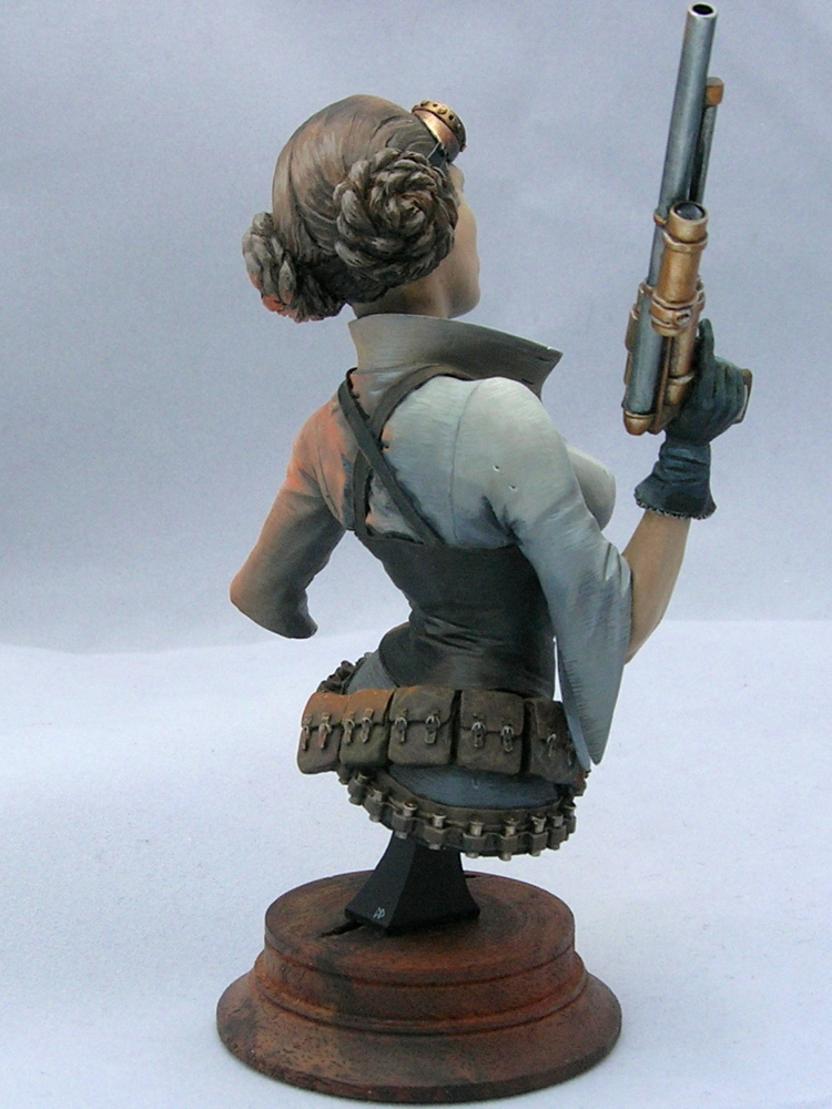
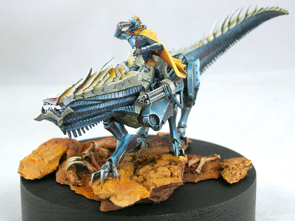
The sculptor did a fantastic job on the drapery on the back of the cloak, so I decided not to add freehand to the back, which would only distract from the great sculpt. Instead, I used very strong highlights and shadows to really bring out the details of the drapery work. It’s lovely when you get a beautiful sculpt like this which doesn’t need any freehand decoration, but I’m also happy that the sculptor left a broad flat surface on the inside of the cloak which was perfect for adding a pattern.

desert_wanderer_07

I did add a bit of texture to the fabric to add some interest to the lower half where the sculpt is less detailed. Smooth blends are for smooth surfaces only, and I imagined my desert wanderer would need a coarse garment which could stand up to sandstorms.

desert_wanderer_08

The bones on the base are mostly rodent bones from ebay. I assume they came from an owl pellet, but I bought pre-cleaned bones since I didn’t really want to dissect an owl pellet. The exception is the ribs—I really wanted a ribcage sticking up out of the dirt, but there weren’t any appropriate bones in the set I ebayed so I sculpted some out of green-stuff.

desert_wanderer_09

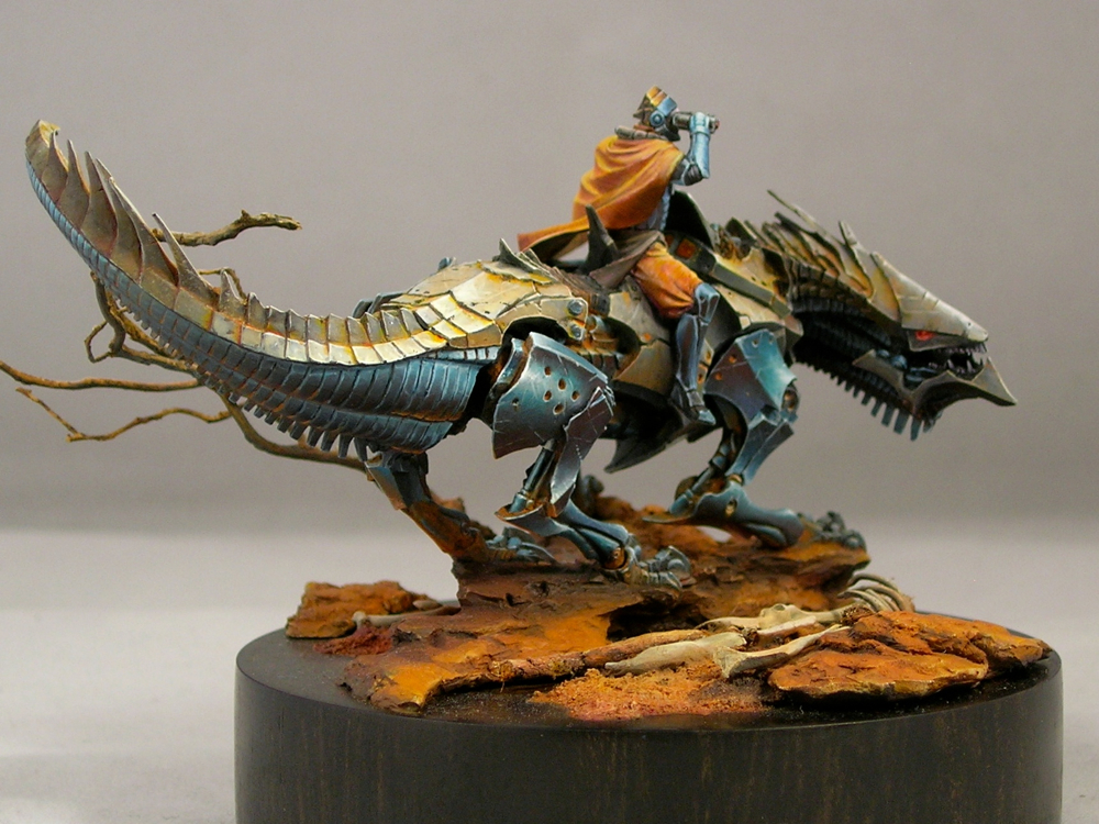
In this picture  you can see where I added some control panels for the rider to see readouts from the mount’s sensors. These were added with freehand. That surface is smooth in the sculpt, but I figure that robotic dragons need dashboards so I added some screens.

desert_wanderer_10

I entered this figure into the painting competition at Gen Con, where he was eligible for both the overall awards and the Rainbow Brush competition. Rainbow Brush, which is organized by one of the best miniature painters in the world, was started last year to express support for groups facing oppression and marginalization in the wake of anti-gay legislation that was passed in Indiana, where Gen Con is held. This year the theme was Islam, chosen because of the extreme and appalling anti-Muslim sentiment which has been particularly virulent this election season. As it happens, I had already decided on the Islamic pattern for the Desert Wanderer’s cloak before the theme was announced, but I thought he made a fitting entry.

desert_wanderer_11

Desert Wanderer won a gold medal in the open judging at Gen Con, and placed first in the Rainbow Brush competition.

You can also see him on CoolMiniorNot and Putty & Paint, where you can rate him if that’s your jam.

Steampunk Leia—finished

Sorry I’ve been so quiet lately. The holidays are always a busy time of year, and this will be my last post of the year.

In honor of Star Wars, I’m finally posting the finished shots of Steampunk Leia. I posted the initial WIPs over a year ago, and finished her last summer, but it took a long time to finally post photos. Sorry!

Without further ado, here are the pictures.

steampunk-leia-2

steampunk-leia-1

steampunk-leia-6

steampunk-leia-5

steampunk-leia-4

steampunk-leia-3

After the second WIP post, I ended up painting over all of the non-metallic metals with metallics. At this large scale, I just couldn’t get NMM that I was happy with. I’m much happier with how the metallics turned out. But my favorite part is the orange light effect – I think I learned a lot about how to pull off a realistic glow effect by trying to execute it at this large scale.

From the workbench: St. Mark on Dragon, part 3

I reached an important milestone since part 2. There’s no more primer showing! There’s still lots of work to be done, but all of the main elements are now in place, so you can see how it all looks together.

st_mark_dragon_3rd_wip_1

I can’t decide which side is the front of this mini. I’m not sure if that’s a good or a bad thing, but I think it’s good. There’s a lot of energy moving in several different directions, which I think is one of the things that drew me to the mini originally.

st_mark_dragon_3rd_wip_6

The most obvious change since the last post is the rider of course. Originally, I painted his cloak and pants pink rather than orange. The color worked okay in the color scheme, I think, but I couldn’t get over my societal hangups about pink.

st_mark_dragon_3rd_wip_5

Fortunately a thin glaze with yellow ink was enough to change the color completely without destroying all of the highlighting and shading, and my careful texturing work.

st_mark_dragon_3rd_wip_4

The other main change is the addition of pigments to the base. I don’t think it photographs as well now, but it looks way better in person and that’s the main thing. Pigments create a wonderful dusty effect which makes the base look much more realistic as dirt and stone.

st_mark_dragon_3rd_wip_3

The pigments I used are mostly from the Secret Weapon “wet earth” set, which is somewhat ironic since I created a dry dusty effect using the pigments. Just goes to show you never to take names too seriously, since at the end of the day they are just colors. I used terracotta as the main color for the lit areas and violet (which is an awesome color!) in the shadows, with a few spots of red brick to provide variety.

st_mark_dragon_3rd_wip_2

I screwed up when I added the pigments, since I added the pigments first, then sprayed the whole mini with dullcoat (which it needed to kill the shine from the inks I used). Unfortunately the dullcoat ruined the lovely dusty effect. I added another layer of pigment, but that pretty much obliterated the highlighting and shading I had done before. So I had to re-paint the highlights and shadows over the pigment, and then add pigments a final time. Oy.

At least thick paint is not much of an issue for the rocks and dirt. But next time it’s definitely dullcoat first, then pigments, rather than the other way around.

From the workbench: St. Mark on Dragon, part 2

st_mark_dragon_2nd_wip_1

There’s been a lot of progress since part 1. The dragon body is nearly finished, and I’ve built out the base a bit.

st_mark_dragon_2nd_wip_3

I haven’t really put any paint on the rider yet, but I converted his arm holding a pistol into binoculars, which involved a fair amount of resculpting.

st_mark_dragon_2nd_wip_4

The round resin plinth he’s sitting on is only temporary, for holding him while I paint. I’m planning on putting him on a larger wood plinth eventually.

st_mark_dragon_2nd_wip_5

I’m not sure about the highlighting I did on the back leg in this shot. It doesn’t really make sense from a physics standpoint, but it also provides a sense of energy and motion which I like (and which was inspired by something Alfonso “Banshee” Giraldes said in a class I took from him). I’m going to leave it for now, and see how I feel about it when the rest of the mini is closer to finished.

st_mark_dragon_2nd_wip_2

On to the rider! I’m off to Google some fabric reference for his clothing, since I still haven’t figured out what I’m going to do with it. I’m thinking about doing something inspired from West Asian or South Asian fabric patterns. I visited the Victoria and Albert Museum in London a couple of weeks ago while traveling for work, and there was a show on the Fabrics of India which got me thinking along those lines.

From the workbench: St. Mark on Dragon, part 1

I saw this Dark Age figure at Gen Con, and just had to have it.

st_mark_dragon_1

It’s a lovely resin figure, which makes me very happy. Unfortunately the pieces don’t fit together quite as nicely as some of the resin figures I’ve had the pleasure of working with, so I had to do a bit of green-stuff work to hide the joins.

st_mark_dragon_2

The blue metals on the one side are close to finished, but everything else is (obviously) still very WIP. I’m really happy with how the metals are coming out. I’ve been shading my blues with red a lot lately. It’s only barely visible in these photos, but in real life I think it adds a lot of energy to them. I usually start by adding black to the mix to desaturate the blues, which aids the transition, and then add red or glaze with pure red in the deepest shadows. The result is clearly blue shaded with red this way, rather than looking purple.

According to traditional color theory, blue and orange are complements, as are red and green, but according to more modern color theory, cyan and red are complements. Since my blue hue is close to cyan, and I’m countering it with a primary red, this color scheme is more in line with modern than traditional color theory. Maybe.

Congratulations to the Crystal Brush winners!

Congratulations to the three overall winners of the 2015 Crystal Brush Awards, Kirill Kanaev, Ben Komets, and Jessica Rich. There were many fantastic entries this year, and it was a pleasure looking through the galleries. I would like to highlight some of my favorites, in addition to the overall winners.

The Archivist - Katie Martin

The Archivist by Katie Martin

I wasn’t familiar with Katie Martin’s work before this, but I’ll be paying attention now. She took home trophies in several categories, but my favorite was this archivist. I adore the archivist’s green cloak, with it’s pointillism texture and freehand patterns.

CatManDu - James Wappel

CatManDu by James Wappel

Jade Knight - Damon Dreschler

Jade Knight by Damon Dreschler

This titan may be my favorite piece in the competition. Everything is executed flawlessly, and all of the elements are perfectly in line with the theme.

Serina - Mary Profitt

Serina by Mary Profitt

The Fruits of Sacrifice - Matt DiPietro

The Fruits of Sacrifice by Matt DiPietro

I hope to have the chance to see this piece in person at some point, because I have the feeling the pictures are not doing it justice. I love the dark take on the fairy tale, Grimm, not Disney.

Sad Panda Restaurant - Justin McCoy

Sad Panda Restaurant by Justin McCoy

This is a very cool, atmospheric piece. I can almost smell the stir-fry cooking. It’s amazing how Mr. Justin scratch-built all of the cookware and even the vegetables for this floating restaurant. Check out his blog for some WIP photos of the construction process.

I haven’t made it to Chicago for Crystal Brush since the first year it was held, but after seeing this year’s crop of entries, I really want to go back.

From the workbench: steampunk Leia, part 2

I’ve made a bit more progress, and taken a few more photos.

Steampunk Leia WIP 2 - front

You can see the lighting effect a bit better now. I’m really happy with how that came out. She’s still WIP, but at least there’s no more primer visible (except a few spots where the paint rubbed off, but those will get fixed).

Steampunk Leia WIP 2 - left

Steampunk Leia WIP 2 - right

Steampunk Leia WIP 2 - rear

Sorry about the inconsistent lighting on the photos. They were taken outside since I still need to obtain a decent photography setup. But at least they weren’t taken by my phone this time, so there’s that.

Please comment if you have any questions or comments. Critiques are always welcome and appreciated!

From the workbench: steampunk Leia, part 1

My current project is a steampunk version of a certain famous character.

Steampunk Princess, work-in-progress

Steampunk Princess, work-in-progress

This is actually the first bust I’ve painted, and has been a lot of fun so far because it’s a much bigger scale than I usually paint. My normal fare is 30mm models, which is about 1:60 scale. This bust is closer to 1:10 scale. It’s a lot of fun to be able to put in details like irises and eyelashes. The miniature is Steampunk Princess Bust, by Cool Mini or Not, cast in resin.

The color scheme (with the orange lighting effect) was inspired by a scene from Star Wars:

Princess Leia; image copyright 20th Century Fox

Image copyright 20th Century Fox; used without permission

The lighting effect is not too dramatic from this angle, but it’s much more dramatic from her left side. I’ll take some more photos from different angles when I’ve made a bit more progress. There’s still lots to do, not just the pistol!

Please comment if you have any questions or comments. Critiques are always welcome and appreciated!

© 2024 Light Miniatures

Theme by Anders NorenUp ↑